How to Present OpEx Analysis with Visual Impact in PowerPoint
Need to present an operating expenses analysis outcomes?
Check out our examples of OpEx analysis slides for inspiration. Discover how to showcase your organization’s OpEx financial data to improve readability and engagement.
For first the OpEx analyzing presentation can have an agenda. Below are three different meeting agenda proposals tailored for various types of businesses.
1. Tech Startup Operational Costs presentation example structure
- Overview of funding, spending, and market
- OpEx Costs Breakdown and their analysis
- R&D
- Sales
- Marketing
- G&A
- Variance Analysis
- End with Future Projections of OpEx costs and startup financial performance
2. Manufacturing Firm example of OpEx presentation
- Executive Summary of company financial status
- OpEx cost breakdown, comparison with previous periods, and trend forecasts
- Raw Materials costs
- Labor costs
- Maintenance expenses
- Plants efficiency improvements
- Finish with Cost-Saving Initiatives
3. Healthcare Provider OpEx presentation topics example
- Financial status and market overview
- Departmental Expenses
- Clinical
- Support
- Facilities
- Cost Management Strategies
- Impact on Healthcare Service Quality
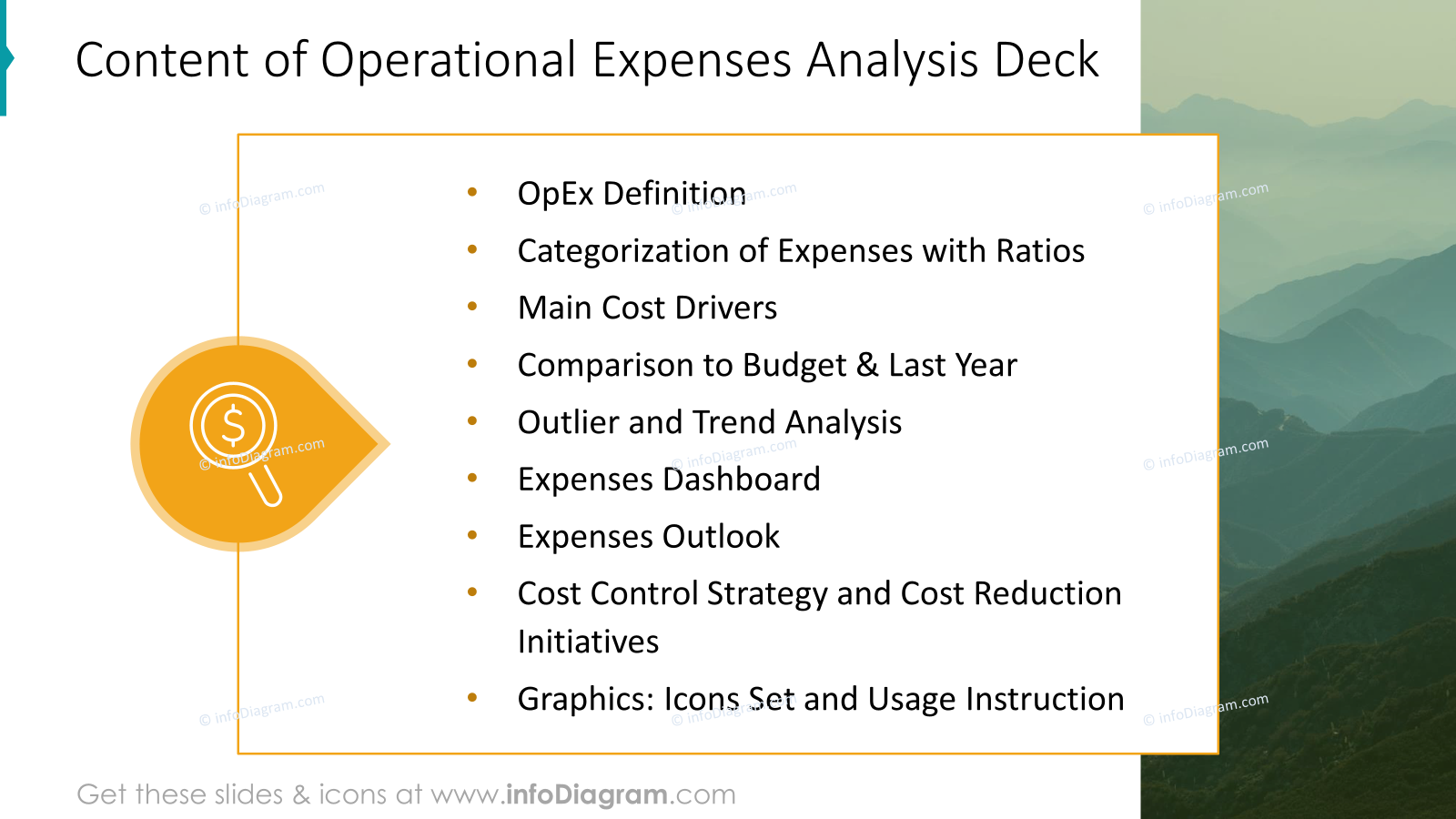
4. Generic OpEx analysis presentation agenda
A more universal agenda for presenting the status of operational expenses could look like this
- definition of OpEx term
- categorization of expenses with ratios
- main cost drivers
- comparison to budget & last year
- outlier and trend analysis
- expenses dashboard
- expenses outlook
- cost control strategy and cost reduction initiatives
Let’s see how you can visually present such OpEx topics to create an impactful presentation.
Get all the graphics presented here – click on the slide pictures to see and download the source illustration. Check the full OpEx Costs Analysis Financial Report
What is OpEx – defining the term visually
If your presentation audience includes also people who are not familiar with financial terms, you may want to add an OpEx explanation.
To define the term “OpEx” consider creating an attractive visual slide. This approach can capture attention and make the information more memorable for your audience.
You could write it only as a pure text, presenting what OpEx stands for:
OpEx, or Operating Expenses, refers to the ongoing costs that a business incurs as part of its day-to-day operations to generate revenue. These expenses are not directly associated with the production of goods or services.
If you want a more attractive visual way to present this term, look at the example below.
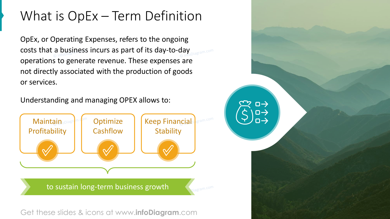
As designers, we suggest presenting the term by using simple shapes to highlight the most important key points. For illustration purposes of OpEx, we used the icon referring to the ongoing costs. Additionally, we ensured a good balance between text and graphics to keep the slide engaging. On the right side, we added the image. It is not a necessary element, but it’s a good way to find harmony in the composition.
Show a breakdown of company operational costs with a data chart
To better present OpEx costs not as numbers in the table but as something more engaging, use data chars. If you want to show only a generic distribution of costs, a pie chart can work for you.
Illustrate typical expenses categories, for example:
- personnel with a symbol representing people’s costs
- office or building rental costs
- expenses for electricity, water, gas, and other utilities
- business travel, such as flights, accommodation, and meals
- marketing and promotional activities
- legal services and consultations
- software, journals, and other subscription-based services
You can see below how we illustrated such a data chart.
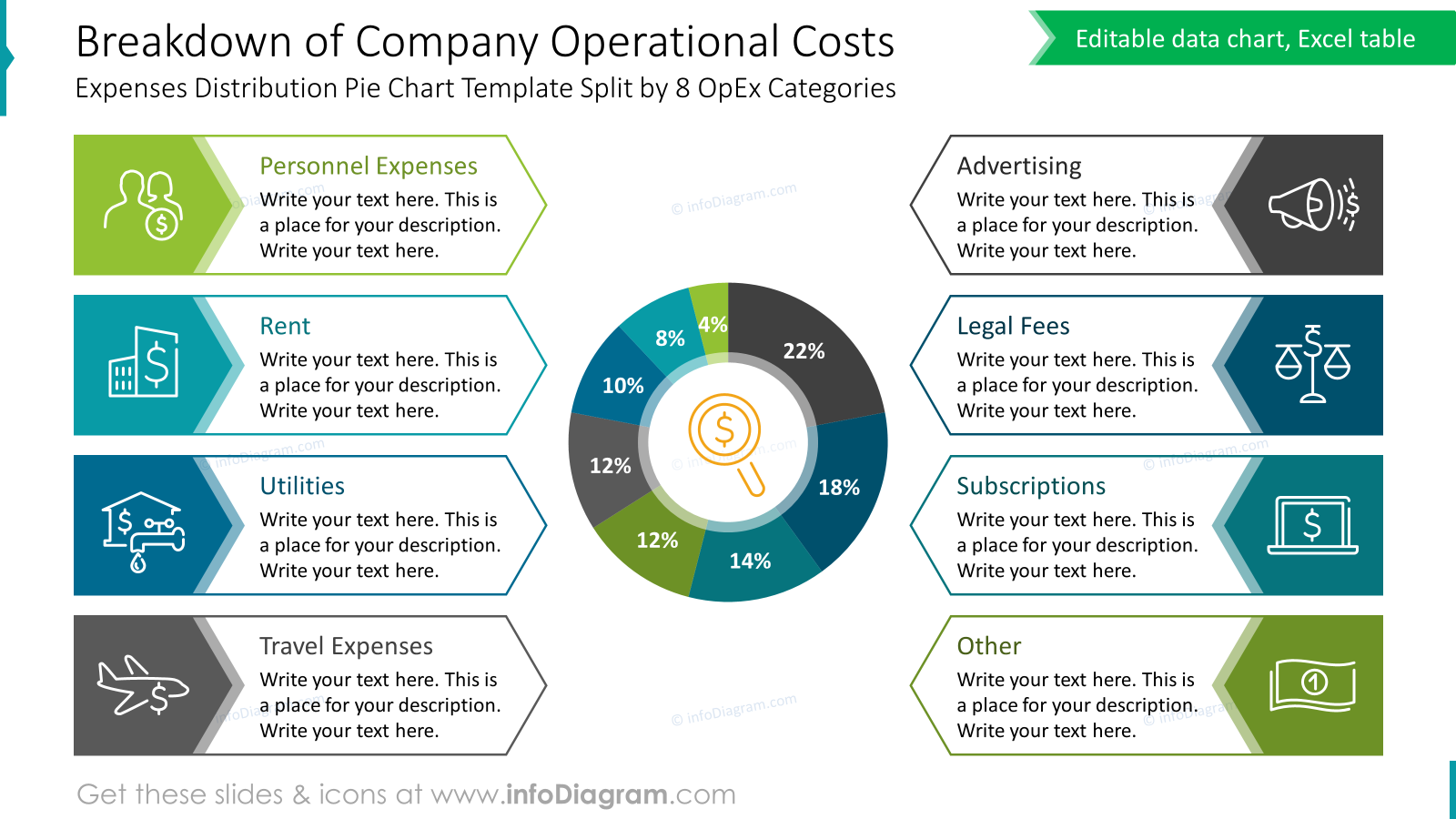
In the middle, we decided to place a pie chart. Thanks to this we got a good flow of design. Each category is a separate label. Remember to use a consistent color scheme to differentiate categories and maintain a cohesive look. If you want to add some descriptions of each category, and there are more long texts, ensure the text size is legible.
This is a strength of a custom PowerPoint design. You would not be able to do it, using only standard Excel chart legend.
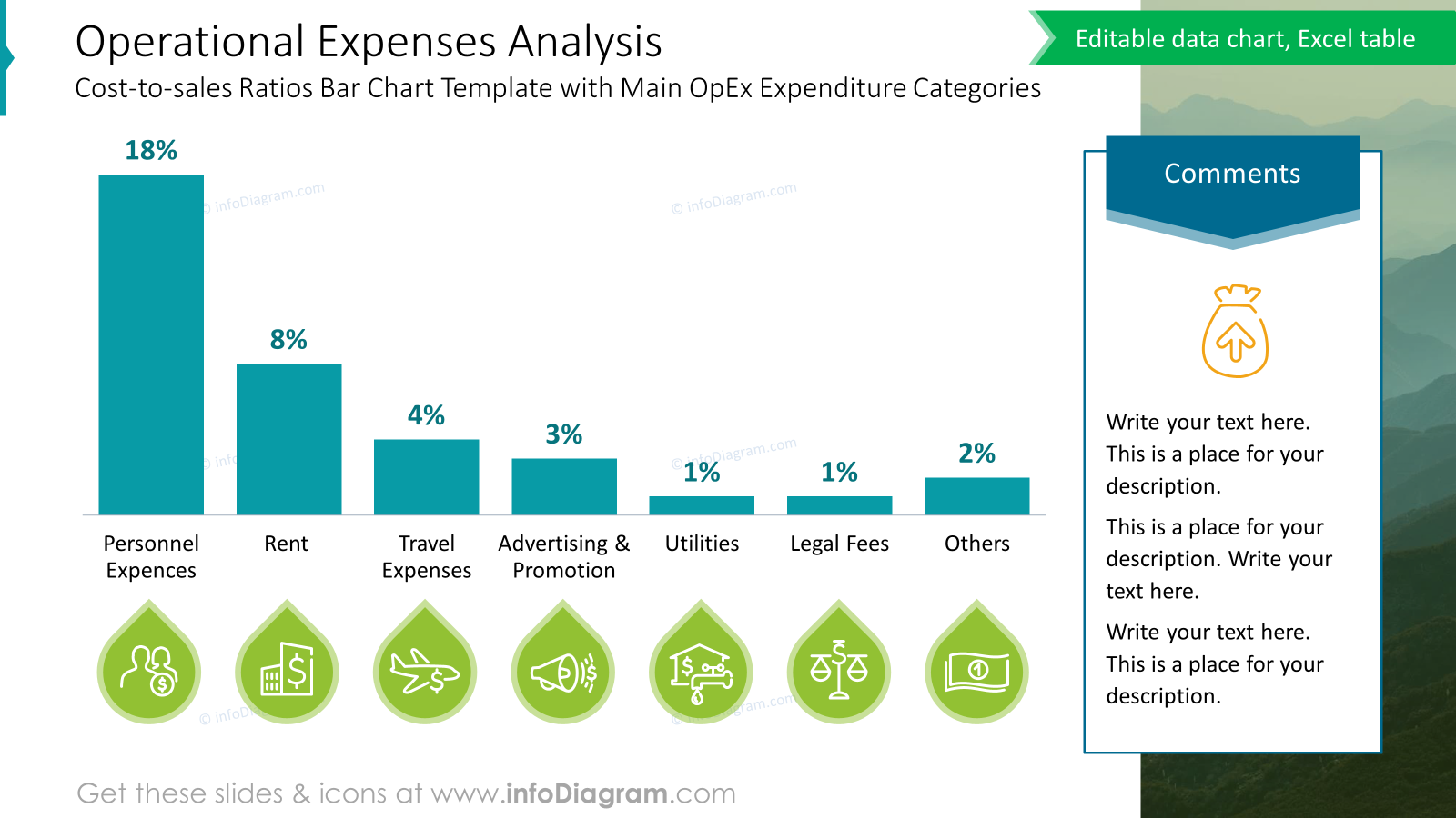
On the other way, if you want to show a more precise comparison of operational cost values, use a column chart. Notice another way to use icons to show cost categories.
There is also a place for a summary of the data. That is an important element, especially if you are sending such a presentation as a report to be read without the narration.
Presenting Costs Outlier Graph
If you want to present a data ratio of real operational expenses versus budget, to highlight the outliers, we can show you a custom way to make data more digestible.
Notice an idea, how to show the area where CC – cost center values are above or below 90% – 110% percentile. We created a negative whitespace, to show a window of costs within the limit range.
See an elegant way how you can mark those cost centers that are within the limit. Similarly, you could use the color of bars or show with X sign CCs that are outliers.
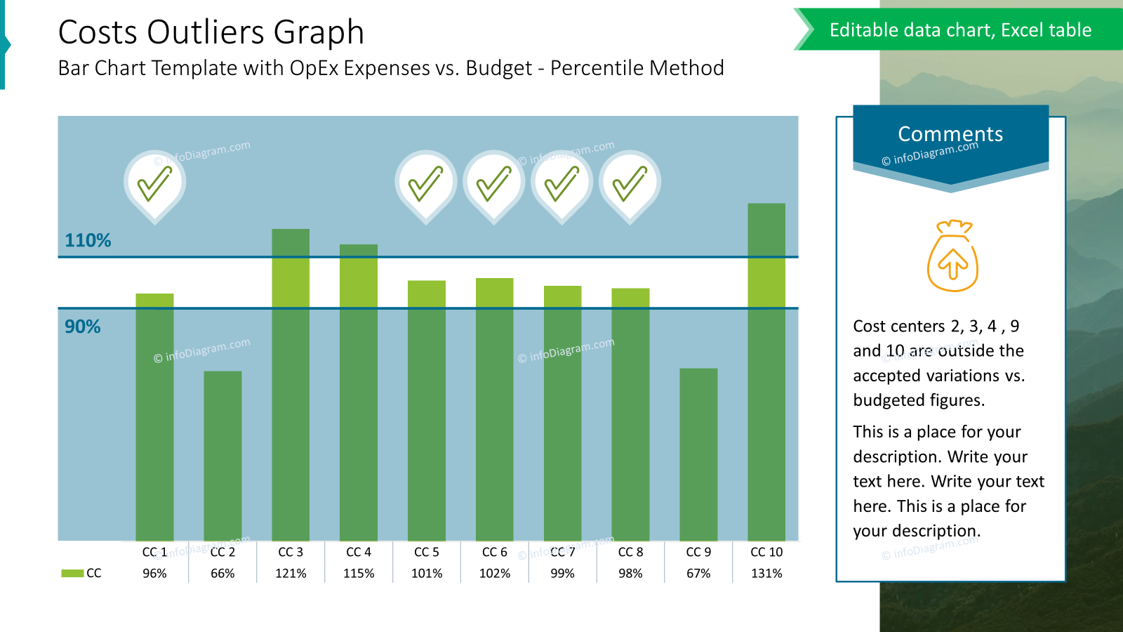
In this sample, we added custom layers to highlight the status of the budget. As you can see it’s a more creative way to show your data and analysis of them. Moreover, above some bars, we used checkmarks for better visualization which costs are good. This helps in quick identification and makes the slide more engaging.
Additionally, we included a summary of key points at the right of the slide to highlight major variances or areas of concern.
Show Year-to-Date Operational Costs Overview on one slide
If you need to put more data charts or tables on one slide together it requires extra focus on consistency and alignment.
Notice how we use color coding to show cost categories
- planned costs – by turquoise but you can also use your major brand colors
- actual costs – by green or your brand colors, just make sure it’s different than the planned
- difference – by outstanding orange
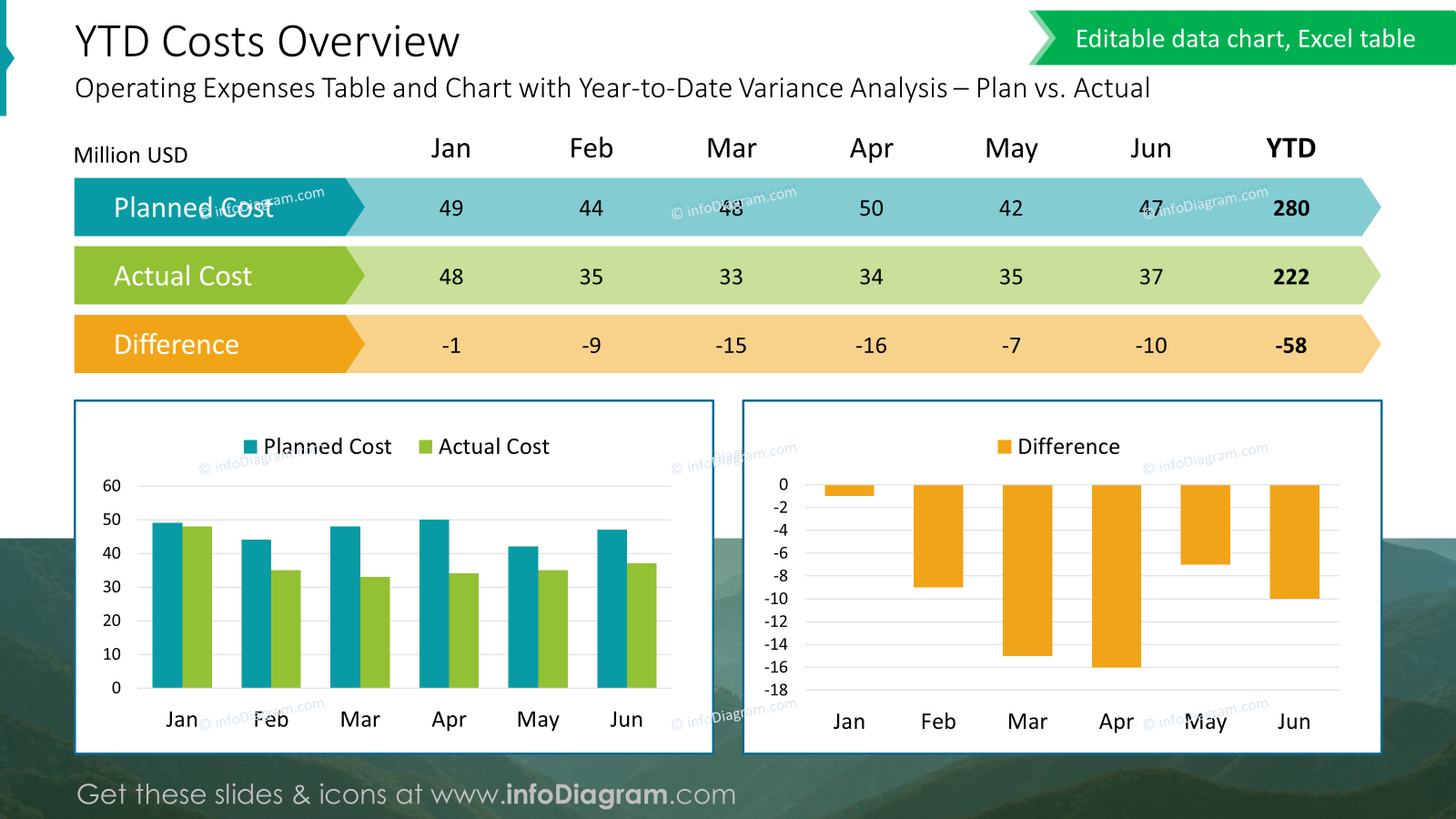
Above we present the proposal of slide layout with more data. Following basic good design tips such as colors consistency, you can create a PowerPoint slide that effectively presents also bigger amount of financial data in a clear and engaging way.
Focus on the most important data points and insights. Avoid overcrowding the slide with too much information. Use bold or color highlights to emphasize summary of data. Ensure all charts have clear legends and labels for easy interpretation.
Present OpEx outlook of remaining months
When you present a monthly report, you may want to show also a table comparing YTD actuals with the financial year (FY) budget.
To present more detailed data, you probably will show it in a table. But even a table does not need to look like an ordinary Excel sheet.
See how you can customize such a table exported from Excel to PowerPoint file. We adapted colors, kept them consistent, and made sure values were readable by setting proper cell margins.
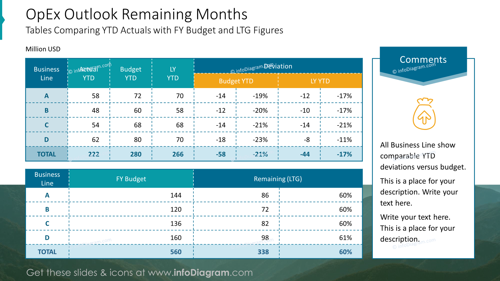
We highlighted the total line main data in bold text and color. The headers stand out by using a different background color.
Such an OpEx outlook table is an effective format for displaying comparative data. Using PowerPoint slides with a data table you can create a clear, concise, and engaging table for your audience.
Show a Gross Margin to EBITDA link with Waterfall Chart
To show such a breakdown bridge link between GM (Gross Margin) data and final EBITDA (Earnings before interest, taxes, depreciation, and amortization) you can use a waterfall data chart.
Make it clean. Again, you can illustrate key categories of costs with a specific symbol such as
- salaries costs – with an icon of a people
- marketing expenses – with a loudspeaker icon, for example
- rents & utilities – with a symbol representing the costs of offices and en energy
To make such slides more interesting you can create your own legend using shapes instead of using the default Excel chart legend. This way you can control its looks, and add more details with the default chart legend which would not be possible.
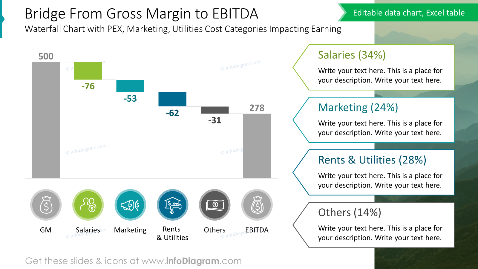
The consistent layout across slides ensures a professional look and easy navigation. We created a visual hierarchy to emphasize critical data. It’s recommended also to simplify charts by removing unnecessary elements like gridlines and using clear labels. Additionally, we used icons for each category. It provides additional context.
Finish OpEx presentation with actionable plan of cost reduction initiatives
At the end of your presentation don’t forget about the discussion of the next steps. You presented the state of the operational expenses and it is time to talk what are the outcomes and actions to be done.
To present such a plan in a structured way, you can use a table, where you explain objectives, action plan, desired results, and responsible person.
To do it in a transparent way that is also eye-catching, you can customize table design with additional visuals.
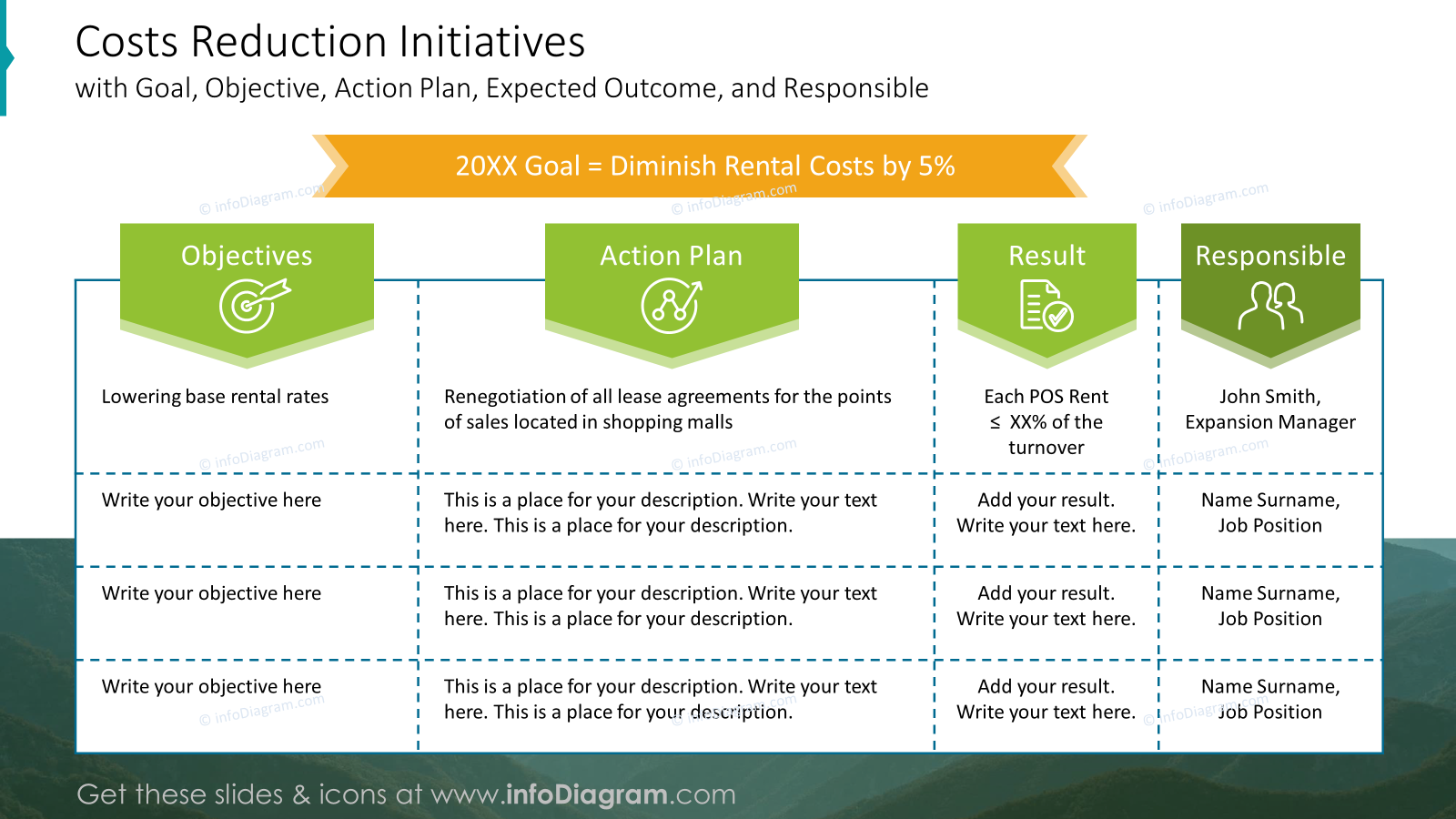
Notice how the table with enough whitespace inside the cells is easy to read. To create a lighter table look you can use dashed and colored lines to improve the table’s overall design.
In this sample, we add an image in the background to create an integrated look of the slide.
What to Remember about Visual Presenting of OpEx Analysis
If you want to present an OpEx analysis on the slide, remember a few simple rules:
- use a highlight color to emphasize key points and headlines,
- adjust and customize tables and data charts for clear structure and readability,
- keep the layout simple and clean,
- remember about white space,
- enrich your data with icons – properly chosen icons can nicely reflect the meaning of your content.
I’m sure that with these basic design rules, you can make a stunning presentation and overall impression.
Resource: OpEx Costs Analysis Financial Report PowerPoint Template
The slide examples above are from one of our financial PowerPoint templates. The full presentation is available in the infoDiagram collection of PPT graphics:
So if you want to create your balanced scorecard presentation quickly and visually appealing you can use this template. Simply add your pictures into predefined placeholders, replace texts, and enjoy a beautifully craft deck.
Subscribe to the newsletter and follow our YouTube channel to get more design tips and slide inspiration.
If you are in financial reporting, you can extend your data presentation with other topics…
See discounted bundles here https://blog.infodiagram.com/financial-reporting-ppt-template-bundles