Product Portfolio with McKinsey Matrix Design Examples
If you are working in the investment area, then likely you are familiar with GE McKinsey Matrix. This simple framework is a powerful marketing strategy and product management portfolio analysis tool. Learn how you can present the McKinsey model by applying some creative matrix design ideas.
What is the McKinsey matrix?
With the rise of multi-business enterprises in the 20th century, companies began to struggle with managing a number of business units profitably. In response, management thinkers developed frameworks to address this new complexity. One that arose in the early 1970s was the GE-McKinsey nine-box framework, following on the heels of the Boston Consulting Group’s well-known growth-share matrix.
Download an editable McKinsey Matrix Framework Diagram here.
We could describe this portfolio management framework as:
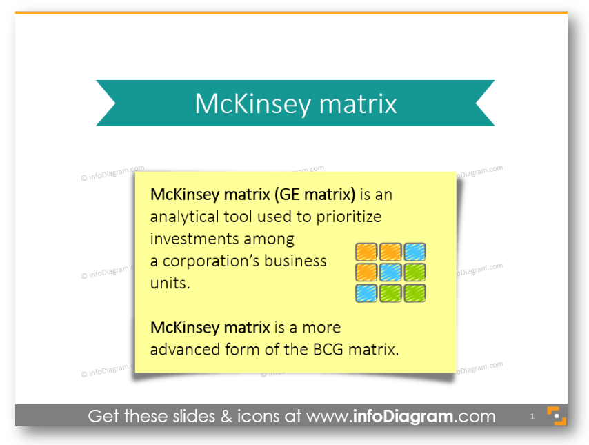
GE-McKinsey nine-box matrix is a strategy tool that offers a systematic approach for the multi business corporation to prioritize its investments among its business units. It is a more advanced variant of BCG matrix.
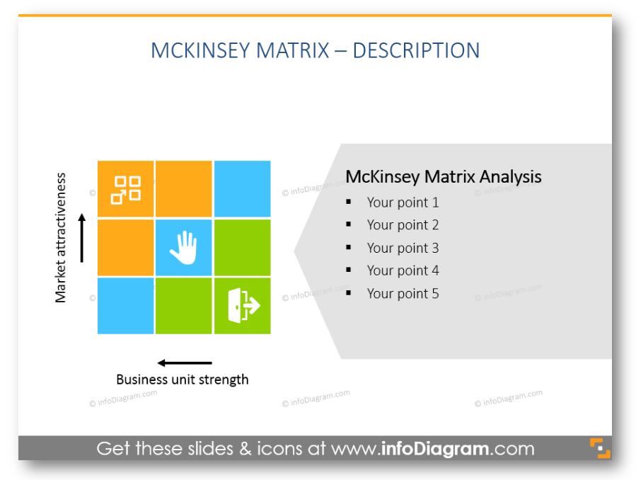
Like with every abstract theory or business framework, the best way to explain and share the idea is using the power of images. Hence we developed a special visuals slide deck, where we included different variants of showing McKinsey matrix and its separate parts:
Understanding the framework
In the business world, much like anywhere else, the problem of resource scarcity is affecting the decisions the companies make. With limited resources, but many opportunities for using them, the businesses need to choose how to use their cash best. The fight for investments takes place at every level of the company. The question of where and how much to invest is an ever-going headache for those who allocate the resources. Read more here.
BCG matrix and its improved version GE-McKinsey matrix came to help – these tools solved the problem by comparing the business units and assigning them to the groups that are worth investing in or the groups that should be harvested or divested.
Examples of presenting McKinsey Matrix
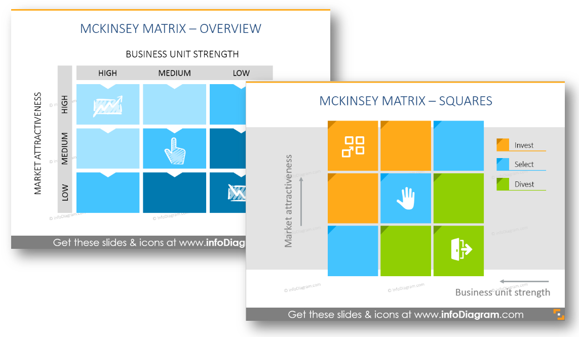
To illustrate the McKinsey Matrix, you can use a simple table or set of shapes to create a matrix structure. However, to make it more eye-catchy, we suggest enhancing the matrix with proper colors and symbols.
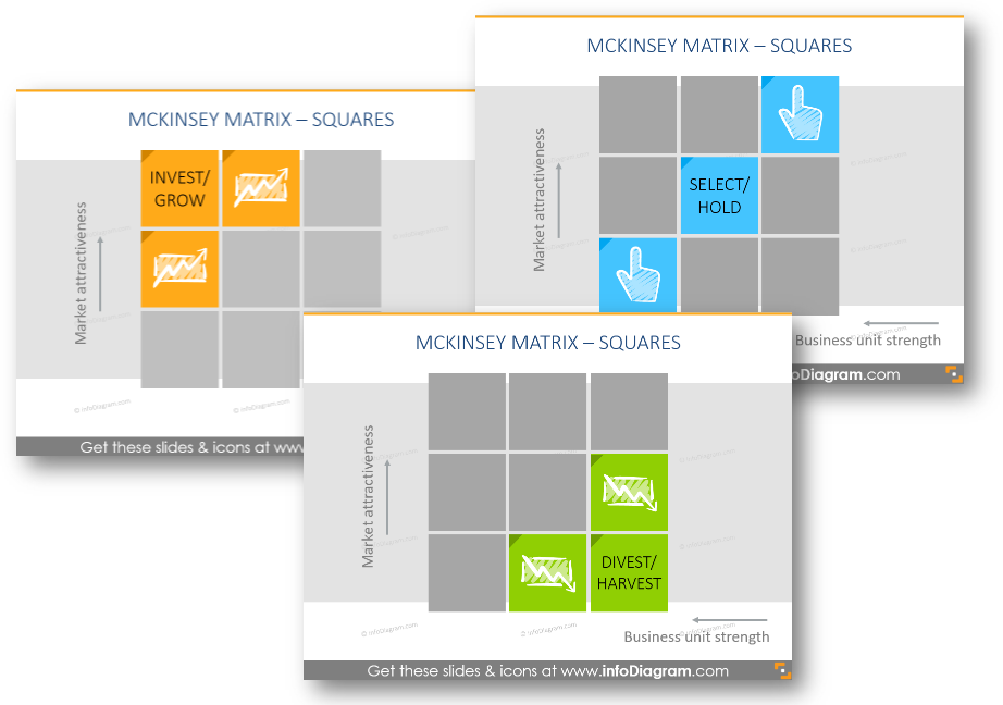
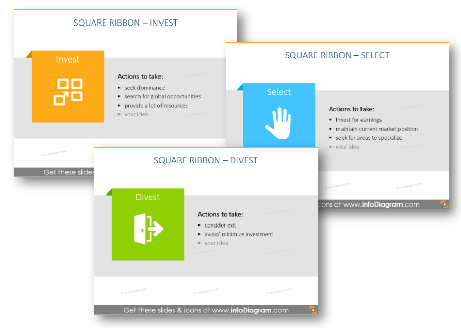
You will find various slides, representing 3 investment strategies: Invest, Select and Divest (click the picture to see the source).
You can show them in the matrix:
Or on separate slides as well (depending on the amount of text you want to include):
Why use this investment visualization tool?
Advantages of using the GE matrix template:
- GE-McKinsey’s nine-box matrix offers a systematic approach for the multibusiness corporation to prioritize its investments among its business units.
- Helps to prioritize the limited resources in order to achieve the best returns.
- Managers become more aware of how their products or business units perform.
- More sophisticated business portfolio framework than the BCG matrix.
- Identifies the strategic steps the company needs to take to improve the performance of its business portfolio.
Summary
What’s inside the McKinsey Matrix diagram visuals deck?
This PowerPoint diagrams collection contains 20 charts representing investment 9 cell risk matrix, extendable pictogram symbols of investment strategies Invest, Select, Grow icons in 2 graphical styles: flat icons and unique hand-drawn scribble graphics, exemplary explanation of recommended investment actions.
You can choose colors to correspond with your brand and the color scheme and layout of your slides. All diagrams and shapes are editable vector artwork so you can adjust them as needed, using standard PowerPoint tools. And they remain razor-sharp also if you resize them, unlike bitmap pictures.
The slide set content details:
- Definition slide of GE / McKinsey matrix, its aims.
- Overview of the McKinsey Matrix: industry attractiveness and competitive strength of units nine-cells matrix
- Nine-cell matrix template with colorful and mono-color squares
- Separate slides with a place for investment strategies description
- Elements of GE matrix, illustrated by scribbled icons
- GE business screen template with place for analysis aside
- Scribbled icons and square ribbons, representing 3 investment strategies: Invest, Select, Divest
- Index of flat and scribbled icons representing McKinsey matrix categories.
All diagrams and icons are in a simple flat style, suitable for Metro UI style graphics. The icons and diagram examples above are from our infoDiagram PowerPoint Diagrams collection:
Check out a practical guide on how to make your McKinsey matrix slides look nice:


