Ideas to Avoid Boring Company Overview Presentation
Presenting your own company is a common part of every business conference, sales meet-up, or investor pitch. However, it is usually hard to keep people attention while you’re talking about yourself, and less about your audience. In this blog, you’ll find visual examples illustrating common parts of a company overview presentation, its profile, and its history in a powerful and attractive visual way.
Explore our Business Performance PPT Reports category on the website for more resources to boost your presentation impact.
If you want to make a good impression, you have to stand out with your company slides. Apply the storytelling approach. Illustrate them with clear and vivid visuals.
Usually, company presentations look the same and let’s face the truth – not modern and thus unattractive. Long texts of vision and mission statements, bullet points of product portfolio, dense tables, and default pie charts…
To help you out we gathered ideas from presentations we had seen and helped to design.
Note: All pictures below can be found in the Company Presentation Template and Slide Deck (see details by clicking the pictures).
Want to present your business as a one-page overview? Check our one-sheet leaflet template.
Here are 11 typical company overview presentation parts:
- introduction: presentation title, logo
- agenda or table of contents
- company profile and philosophy – what and why it does. The vision and mission statements and key activities
- main products and services (website screenshots in case of online products can be included)
- timeline of company history
- information about the key people – owners, managing directors, key consultants or team members
- future plans – new product development, maybe applications mockups
- project calendar
- current or future customers profile
- market and competitors analysis
- walk-out closing slide with the final message, call to action, and contact information
Company presentation tip: Use WIIFM checkout – put yourself in the shoes of the listener, who asks “What’s in it for me” with every slide she sees.
Let’s see a few variants of a graphical representation of those popular sections.
Start with a Catchy Title Slide and Agenda
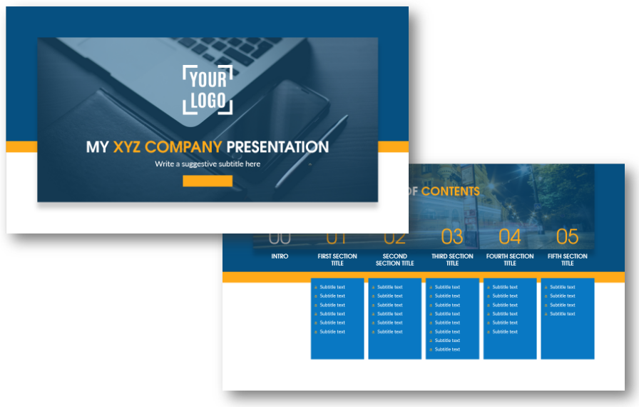
This is the place where a lot of people get stuck. Finding an idea for a title slide can be challenging. We advise you to choose a simple picture for the background, which won’t distract people from the most important – your presentation topic.
Having a hard time coming up with a presentation title? Check our blog for inspiration on crafting catchy titles, which will hook your audience from the first seconds.
Presenting Company Philosophy, Profile, and Geographical Locations
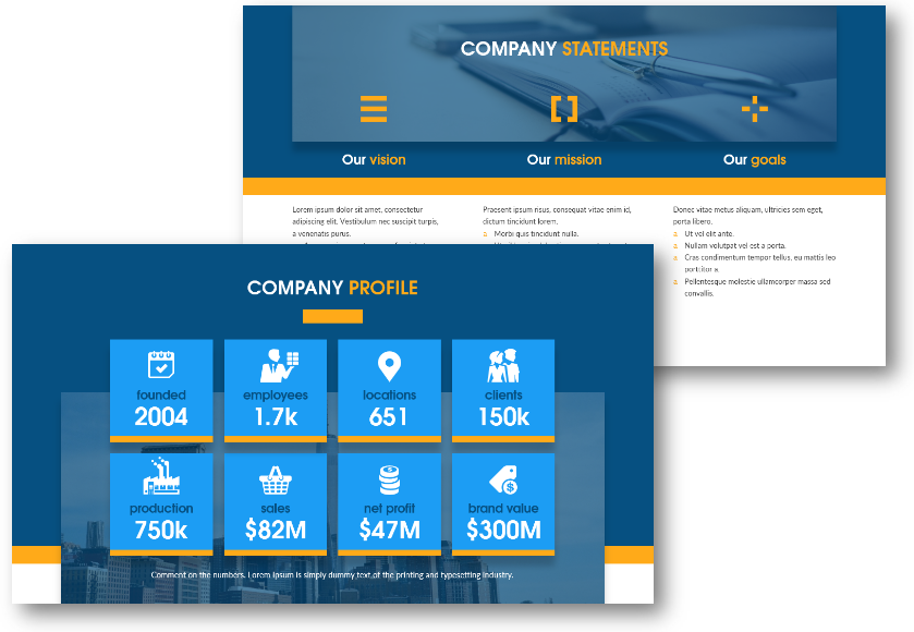
By sharing your vision, mission, and general philosophy you can show your passion and the desired future position. If you want to focus more on these statements, check our vision and mission illustration examples.
After this go straight to numbers – nothing will support your story better. Limit it to max a dozen key numbers. Be ready to briefly describe each one, if asked about details. However, don’t put the details in your main presentation, as it can prolong your speech. Have them in the presentation notes or create backup slides.
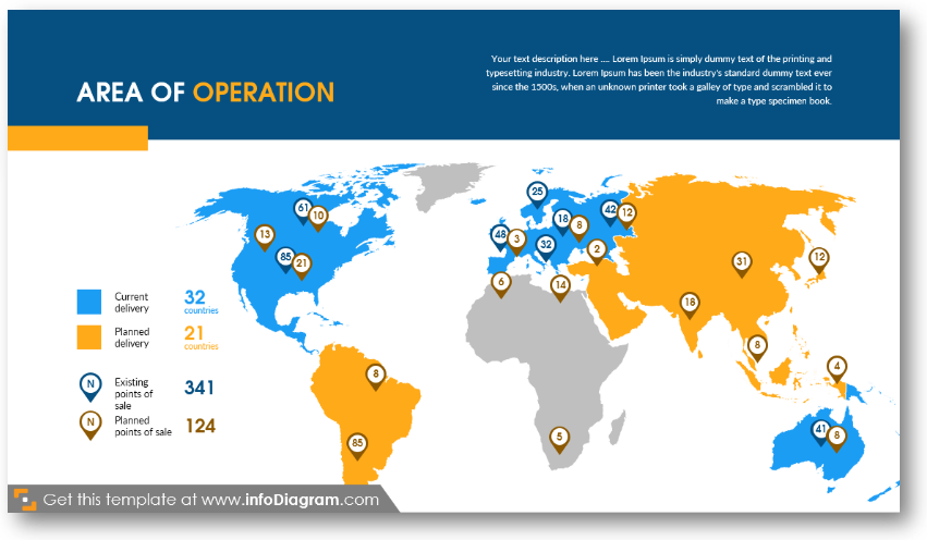
If you also want to show your country branch locations or point out new distribution points, add a map. Having a vector map, you can easily highlight regions or add pins to places you want to point to.
Showcase Key Products and Services in Company Overview Presentation
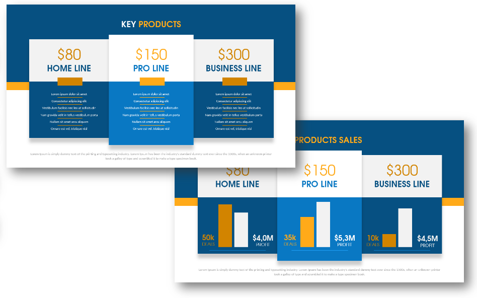
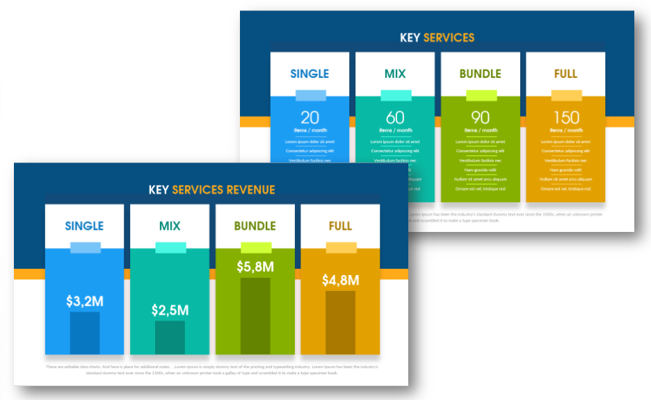
Now it is time to get to the value that your company provides – the products or services you offer. Better to place revenue slides right after and illustrate by bar or pie charts.
Include Product Website or Application Screenshots
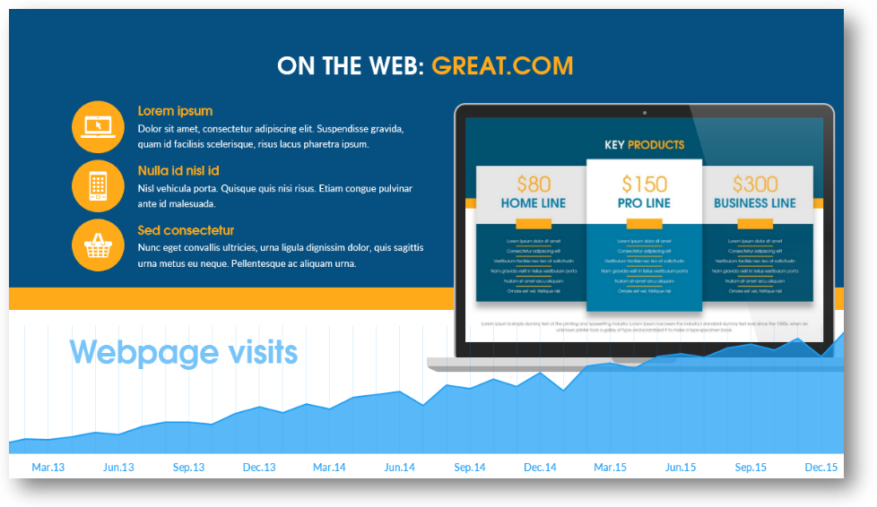
It’s hard to find a company, which doesn’t have a website nowadays. If you want to show it to your audience, don’t just make a print screen – use a laptop or mobile mock-up. This way is more professional.
Tell a Story of a Company or Product
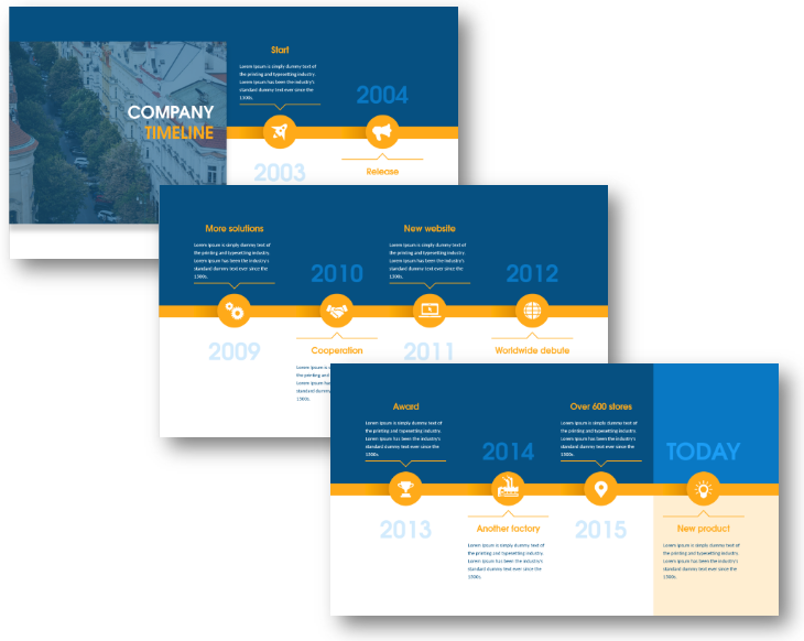
You can see three timeline slides: start and release, key milestones, events, awards, and new product releases. See more ways of illustrating company history.
Presentation advice: don’t talk about history too much, it is better to point out only main events and accomplishments.
Show a human side. Present key company people – founder and a team

People like following examples, so every company should have a face. Nowadays people are brands. This slide is about presenting the main figure of your company – everybody knows garage stories of Steve Jobs, Bill Gates, or Jeff Bezos.
Revealing New Product Development Plans
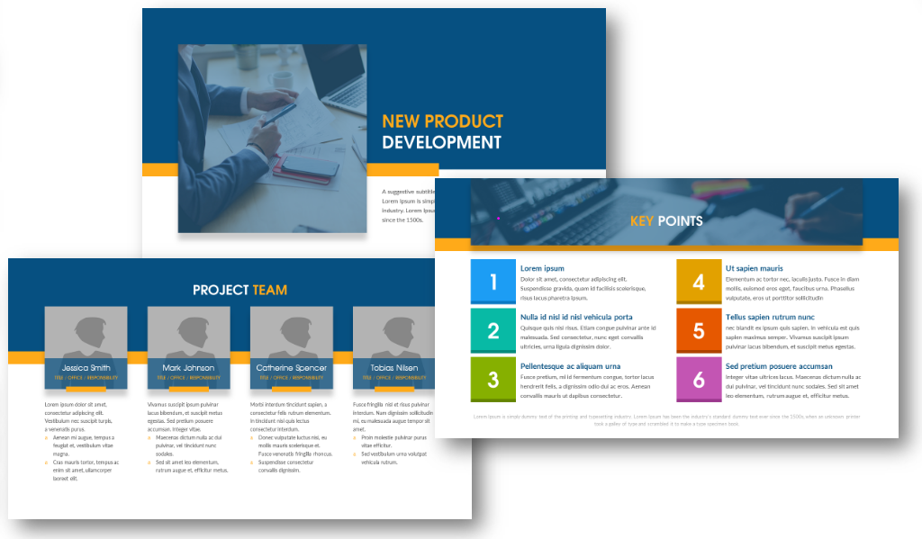
If you’re about to present a revolutionary product, then take a look at the slides above one is for a general product description, another presents the project team, and the last one outlines key points (you can easily change their number).
If you want to include a marketing business plan for your new product, see how you can create engaging marketing strategy slides.
Presenting Project Calendar
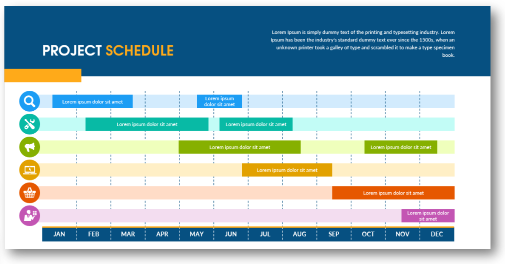
Sure your investors or partners would like to see some deadlines. Gantt chart is a proven management tool for scheduling project steps and watching deadlines.
Market Presentation: Illustrating Key Customers Profile
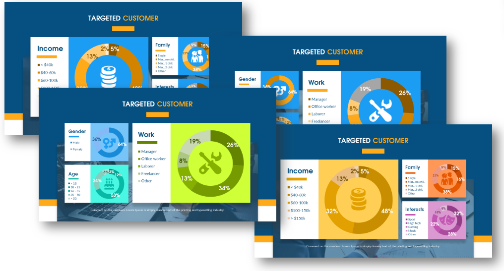
Here’s an example of how you can showcase the information about your existing clients. Or potential ones in the case of releasing a new product or entering new markets. The good idea is to show this information as pie charts and illustrate them with simple icons.
Many professionals and businesses have learned how important customer experience is to success and your bottom line. Communicate your new CX strategy or changes to your team in an easy-to-follow way to ensure everyone’s on the same page.
Design tip: better split statistical data into several charts, don’t use too many indexes in one chart.
Market Analysis: Competitors Comparison
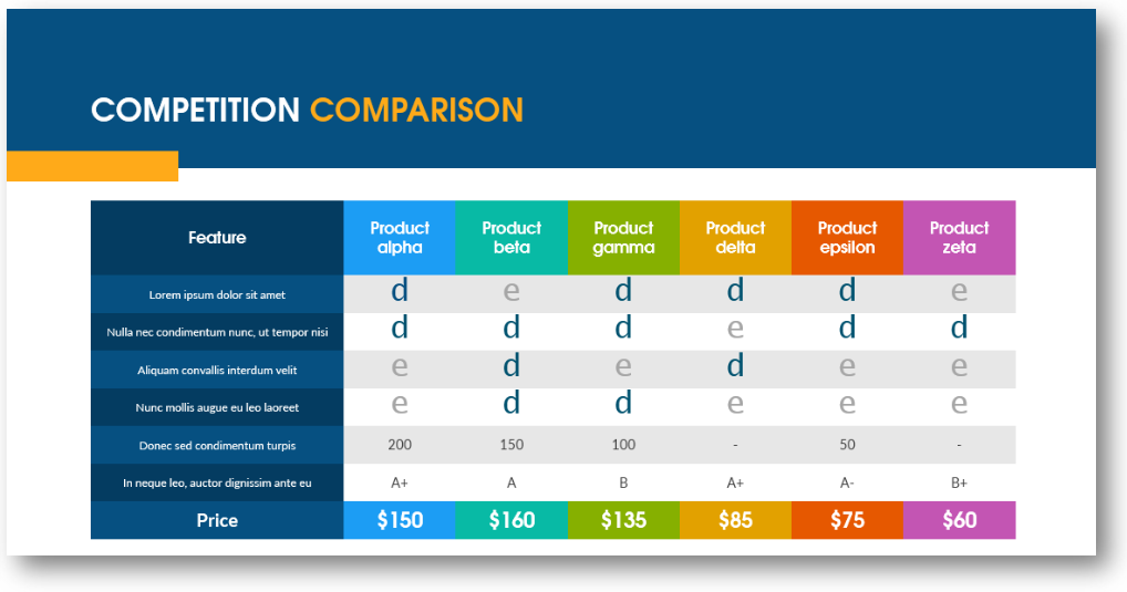
No matter how awesome your product or service is (and we are sure it is 🙂 ), acknowledging your competitors is a must-do task. As Jean Baudrillard said: ‘Information can tell us everything. It has all the answers.
Organizing your competitors’ product features inside a table will allow you to see their weak points and underline your strengths.
Closing Slides: More than a Contact

After finishing your presentation, don’t forget to thank your listeners to show respect. This is a place where everybody adds the obvious contact information. However, you can use the closing slides for more:
- Put your main insight or idea on it for people to remember.
- Add a key client testimonial recommending your company
- State a market fact supporting your presentation takeaway
- Make people act. Add a Call-to-Action, and present a time-limited offer or discount. Some action message examples are “Call us today”, “Learn more”, “Register for the next webinar”, and “Grab a free white paper”…
In this blog, we put together a bunch of graphics ideas for various company overview presentation parts. From the title, navigation slide, throughout a company philosophy and profile, timeline, team presentation, main products, information about future developments, and market intelligence.
If you’re only starting out and seeking financing for your business, ensure your investor pitch is strong and compelling enough.
What sections do you usually use in company presentations? Share in the comments.
For more inspiration, subscribe to our YouTube channel:
Resources: Universal company presentation deck
If you decide to use the PowerPoint template to create your slides, all these graphics are available in the editable form here:
What’s inside?
The predesigned slide deck contains 28 slide layouts, 38 modern icons, and slides with image placeholders for presenting the project team, CEO, and founders. All slides are fully editable by using built-in PowerPoint tools.
If you need to present a more detailed business or market analysis, see our Business & Marketing section, where you’ll find diagrams from the SWOT model to HR topics illustration.


