How to Present Web Analytics Report in a Clear Way Using PowerPoint
Do you need to present web analytics? Whether you’re explaining a website analytics report or sharing the effects of an already implemented digital marketing endeavor icons can help. This PowerPoint icon template set was meant to make it easier to explain web statistics and share campaign successes and failures.
Explore our Business Performance PPT Reports category on the website for more resources to boost your presentation impact.
How can you present web analytics? Use charts and tables to make dense data-rich presentations more engaging and easier to follow.
If you need to make creative presentations on Web Analytics Report and looking for more ideas, check out these unique PPT charts and graphics.
Present Statistics with Tables and Graphs
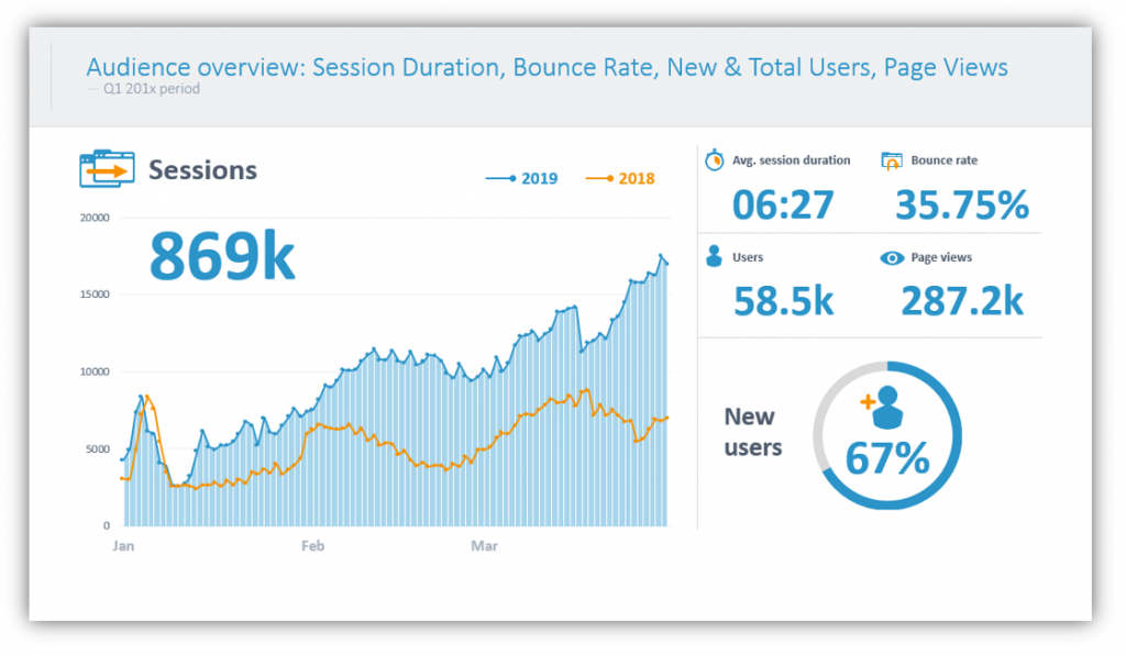
Audience Overview statistics cover a great deal of ground. Highlight things like session duration and bounce rate by incorporating relevant icons. Session duration can be marked with a stopwatch or clock face. The bounce rate could be marked by colorful arrows or an icon meant to represent a browser window. The choice is yours! This slide is much more interesting than a boring one which only shares the performance numbers themselves.
Explain User Acquisition with Charts
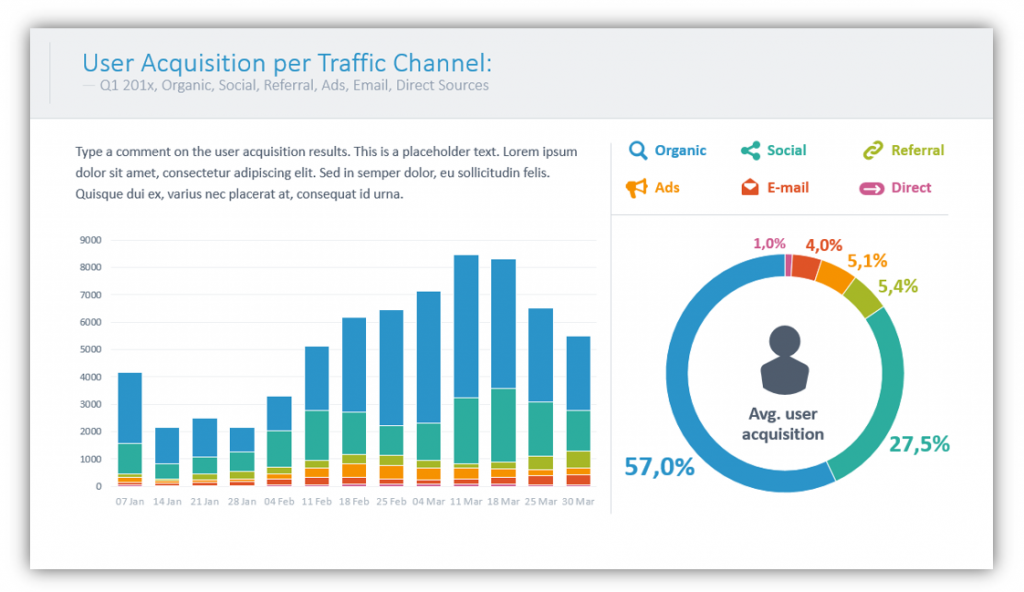
User Acquisition can easily be broken up by the traffic channel involved. The common sources flagged on the report are organic, social, referral, ads, email, and direct. When utilizing bar graphs you can show the many different traffic channels by date. Other charts can show overall numbers for an extended period of time all at once. With color customizing, you can match your color scheme to represent the different channels so the data can be understood at a glance before you even begin to speak. Let the visuals do some of the work for you!
Express Demographic Information with Maps and Other Charts
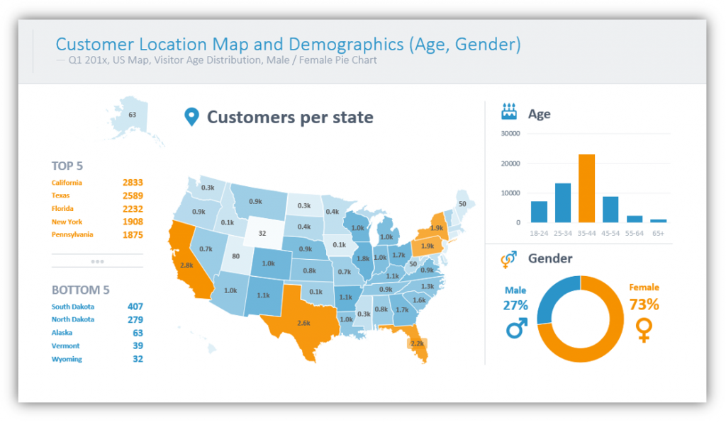
Are the majority of your site visitors in the United States? You can easily create a visual representation of your audience by color-coding a map. By adding additional graphs you can add supplementary age and gender details to paint a clearer picture of who your audience is. If your audience is global, you could accomplish a similar task by incorporating a world map and highlighting high-volume countries.
Explain Successful and Failed Actions
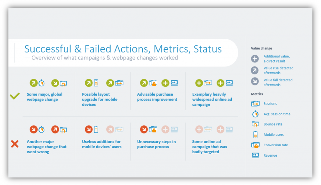
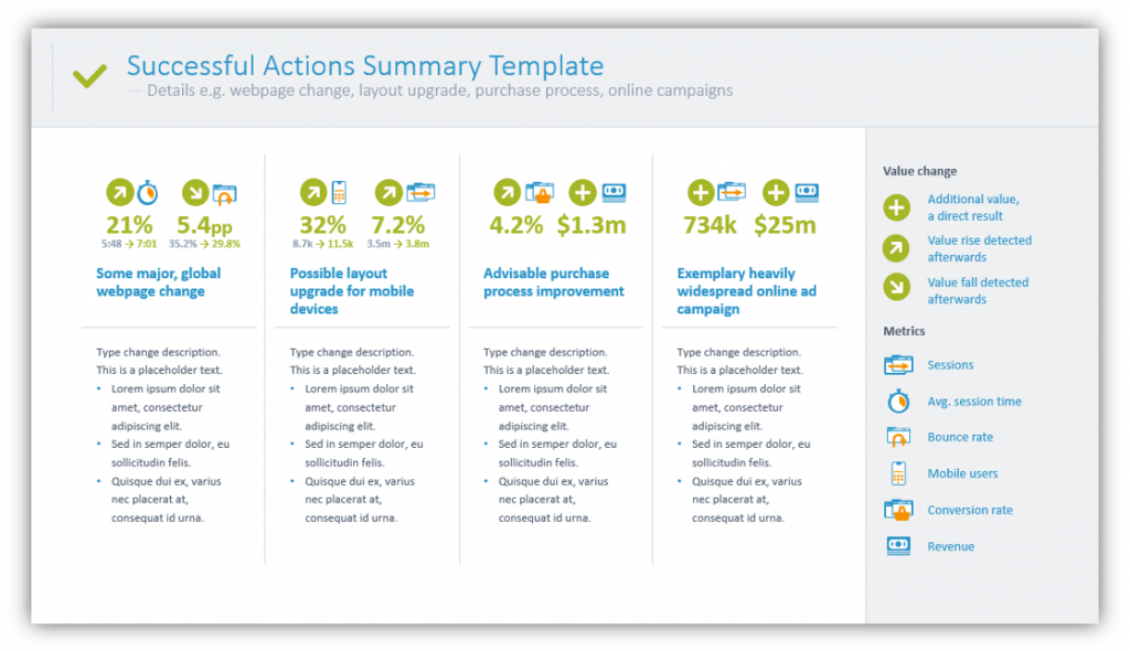
If you’ve sought to accomplish certain goals with your website, you should make a point to share where you’ve succeeded and how you could improve. In these slide examples, you can see major website changes and ways the company in question sought to improve their user experience. In the second slide, you can see how major website changes and layout upgrades have made significant changes to the ways users interact with their website. You can also see how ad campaigns played a role in the website statistic changes.
Explain Your Goals and Timelines for Implementing Changes
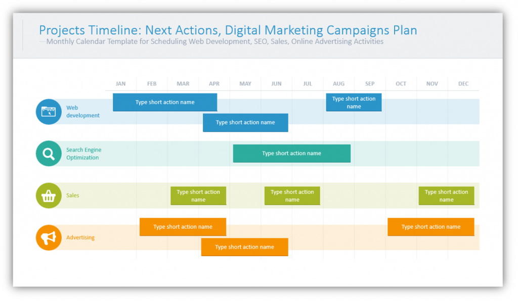
If you have more changes to make after reviewing your website statistics, share your plans. This will be helpful if your audience is expected to take part in making changes. It will also be beneficial if the audience are folks who stand to benefit from the changes being made. They will want to know when you expect to be able to make the changes you describe, and it’s better to have the answer laid out than to try to answer on the fly.
Present statistics in a visually interesting way using tables and graphs. Explain User Acquisition statistics and demographics with charts and maps to make them easier to follow. You can also explain failed and successful actions before you dive into the timelines you’ve planned for making changes to improve your results.
For more inspiration, subscribe to our YouTube channel:
Resource: Web Analytics Report Charts
By sharing your conclusions after reviewing the statistics, you can help others who are not as well-versed in web analytics understand where you’re coming from. If they understand where your findings are coming from they are more likely to agree with your approach and support the actions and potential resolutions you suggest.
Did you benefit from the above examples or do you want more inspiration? You can download the full graphics set here:
If you need more icons or more ideas, you can download the infographics collection for more presentation graphic variety.