3 Design Tips for making Calendar Table Graphics attractive in PowerPoint
It’s this time of the year… Time to make plans! If you’re about to develop a strategy, timeline, or a step-by-step plan for the new year, calendars are what you may need. Creating your own calendar table in PowerPoint can be a time-consuming task.
We advise you to use PowerPoint to create calendar table graphics. Why? Well, from the top of our heads:
- You can see all the projects you have to accomplish, you can plan how to arrange resources and time for them
- Calendar slides are a good way to see what to expect during the next months. Deadlines and key dates can be underlined by adding a hand-drawn marker
- Managing calendars is very simple, even for people who are not experts in PowerPoint
- Slides are easily editable, you can add or remove things as you like
Persuaded? Unfortunately, PowerPoint doesn’t have a built-in option to insert calendars, but let us share with you three easy tips on how to customize a calendar table to explain all your thoughts.
Creating a calendar table in PowerPoint
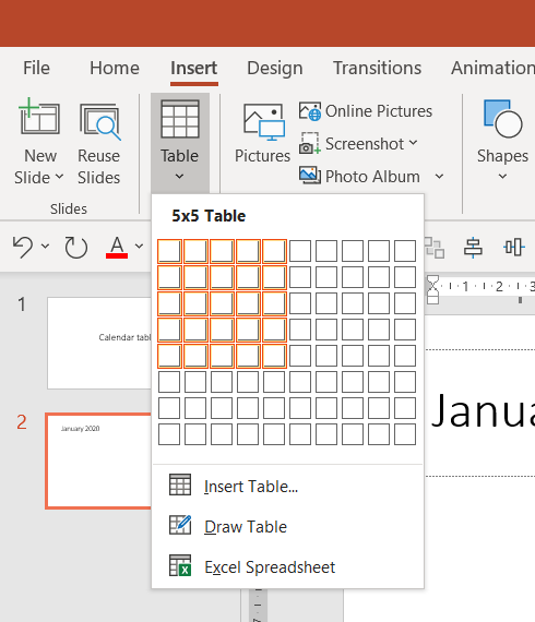
Creating a monthly calendar table in PowerPoint is easy – just go to the Insert tab in the upper menu and add a table of size 7 columns (one for each day) and 6 rows.

The only timely work is inserting dates. For one month it takes a minute, however, if you have 12 months to fill it, you can consider other ways:
- making calendar tables in Excel using formulas to fill dates
- get some already pre-filled calendar tables from the Internet (for example our 2022 Monthly Tables PPT template).
Once you have a table with dates, adjust its size and add some graphical details e.g. make day names different colors, color the table cells, and add an explanatory legend. Below we share three design ideas to make your calendar visually attractive.
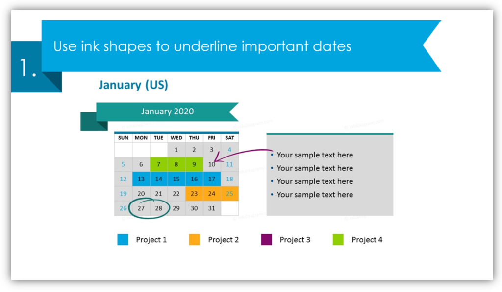
Tip #1: Use ink shapes to underline important dates

You can use markers exactly like you would in a paper calendar or your daily planner. You can highlight any date you need, add an arrow or underline any data.
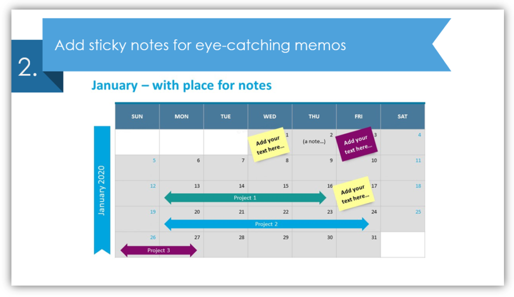
Tip #2: Add sticky notes for eye-catching memos

Unlike markers, elegant post-its will allow you to make short notes on the calendar itself. By using these creative shapes you can freshen up the slide, but it will still look professional.
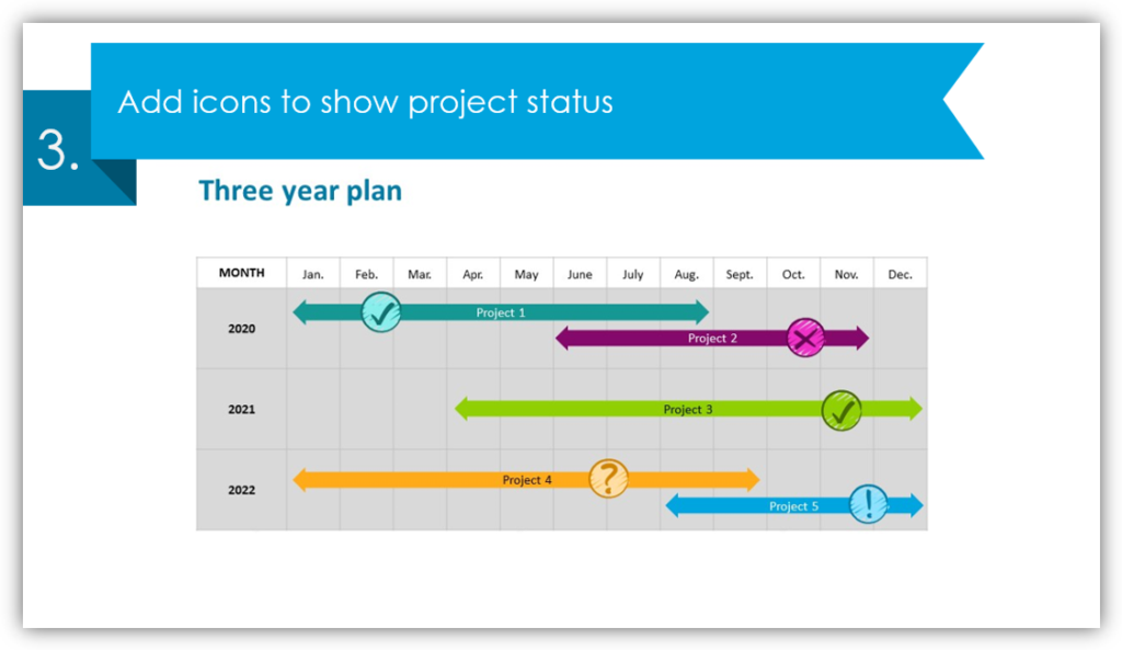
Tip #3: Add icons to show project status

Nothing speaks better than symbols. Look at the example: tick shows that projects 1 and 3 are approved to start, the cross on project 2 illustrates unreadiness, the question mark on project 4 tells us there’s still a discussion around and an exclamation mark show promising project 5. In the calendar table graphics collection, you’ll find more icons you may use, like pins and flags, deadline signs, calendar icons, duration arrows, hand-drawn accomplishment signs.
Check our tips for creating great calendars in this SlideShare:
We hope we inspired you for designing nice PPT slides. Remember that you don’t have to be a designer to create attractive graphics. If you want to save time and need such a presentation for yesterday, download calendar table graphics here:
If you need other infographics, consider adding diagrams and charts from our design templates collection to make your presentations awesome. Good luck with your slides!


