Present Hierarchical Structures Creatively With Onion Layer Diagram Graphics
Providing visual clarity is essential, even when utilizing creative graphics. You can benefit from artistic flair without sacrificing your audience’s understanding. By using an onion layer diagram you can keep your presentation memorable and easy to follow. Simple visual metaphors can allow you to explain a complete system in a reduced number of slides.
Impactful visuals save time and effort
What can you use Onion Layer Graphics for? Not only hierarchies. You can identify the stakeholders involved in your project, show market potential, or any other multilayer relations.
You don’t need to be wordy when you have powerful graphics at your disposal. Avoid text-heavy slides for your presentations. Click here to see the full Onion Layer Diagram graphics set.
Use an Onion Layer Diagram with a Legend
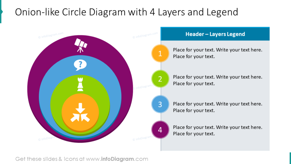
Onion Layer Diagrams don’t need to be perfect circles. In the example, the innermost layer of the onion is at the top of the legend. It represents the most important, centermost layer. Due to the uneven shape of each layer, each one can accommodate a customized icon to represent each level. This will help your audience follow your presentation and understand your message without a great deal of description.
Flat Onion Layer Diagram with Description
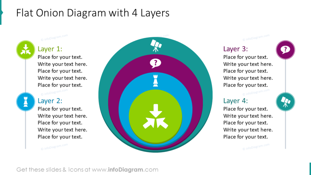
If you don’t want to keep the labels and descriptions of your layers in a table, you can label them individually. In this example the descriptions of each label are separate. In your own presentation, you can custom match the icons on each layer to the labels and descriptions to help your audience follow along and understand your message without a lot of text. The fewer words you can put on your slides, the better for your audience.
Outline Onion Layers create a Different Feel
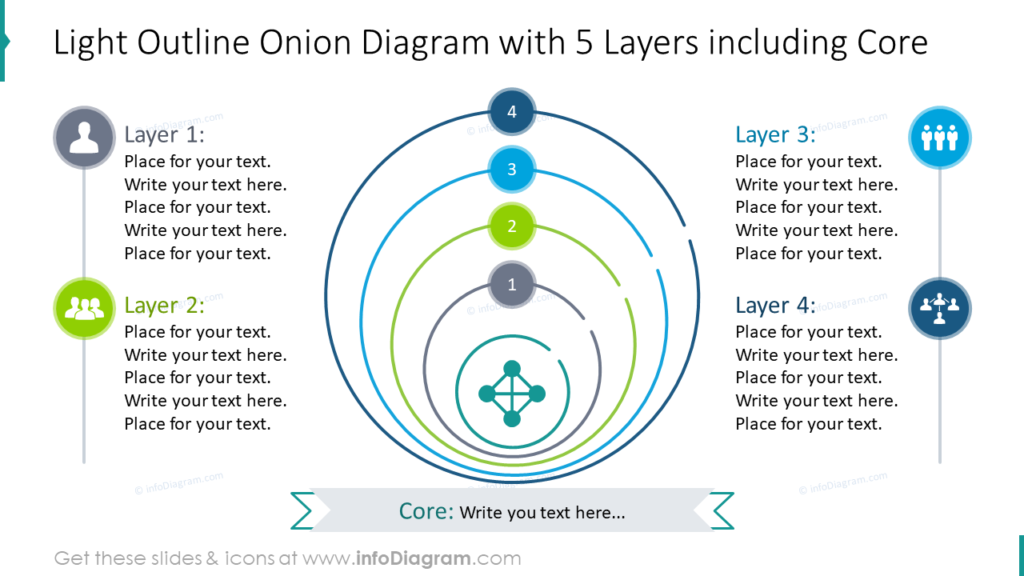
Outline graphics have a different feel than the traditional, filled in onion slices. The thin lines with space between them give the slides a sleek, modern feel. The design is clean and professional. It doesn’t sacrifice the customization options of the other styles. With this layout, you can also explain the significance of the core with a banner, if it is important to your topic. If the core itself isn’t significant, you could always supplement the slide with a title in the banner location.
Orbit-style Onion Layer Graphics are Clear and Concise
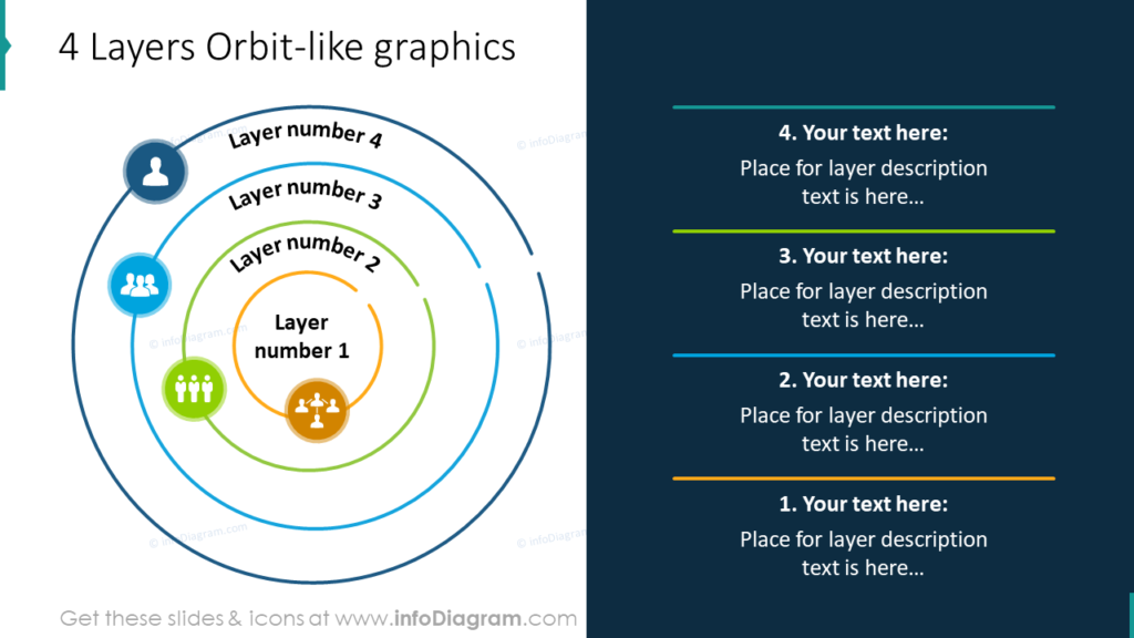
The orbit designs with a place for descriptions like this make beautiful and smart slides. All Onion Layer diagram graphics aren’t the same. In the example, the layers more resemble planets in orbit than slices of an onion. As with the other examples, the different layers can be customized with colors and icons which represent each layer. The legend at the side allows you to easily explain what each orbit represents without bombarding your audience with an excess of text.
Explain Market Potential with Onion Layer Diagram
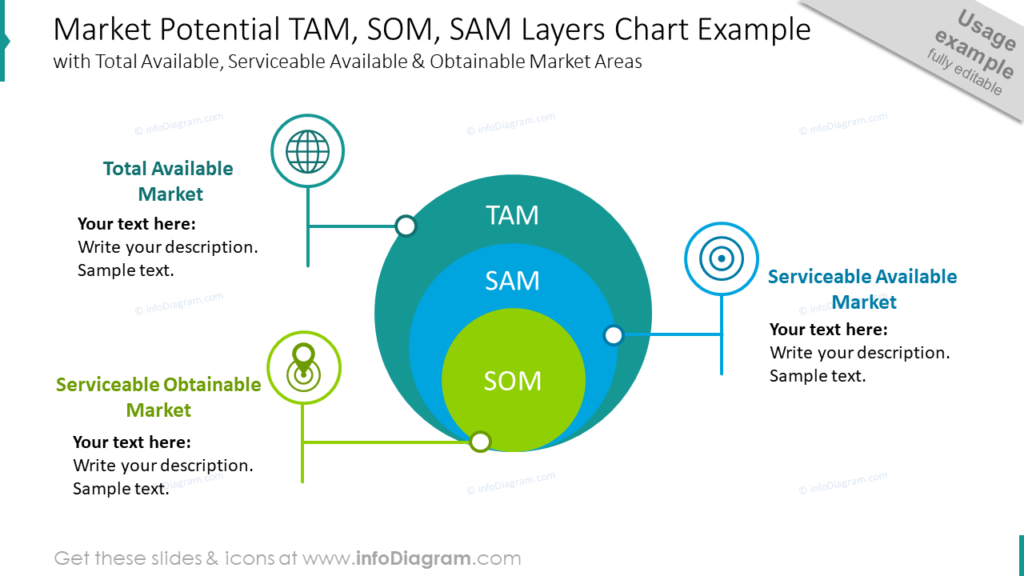
Break down the Total Available Market, Serviceable Available Market, and Serviceable Obtainable Market with a graphic. In this example, the colors chosen to represent these different markets are similar to the ones which might be used for a globe. The icons picked to represent each market were selected carefully. If you need to represent something else with a similar, 3 level diagram, you could modify the colors and icons to represent your needs.
Explain Relationships in a Visually Stunning Way
You might be highlighting the dependencies between departments, analyzing market potential, or describing gradual process development. Either way, onion layer diagram graphics provide you with meaningful, concise visuals. When you use consistent graphical styles and color palettes, you can make a visually engaging, stunning presentation.
Resource: Onion Layer Diagram Graphics
Abstract ideas can be difficult to create slides for. You need impactful, informative visuals that will help your audience understand your message. Even highly technical presentations can benefit from easy to understand graphics.
Onion Layers Diagrams can be used to explain a variety of business concepts. Using standard PowerPoint editing tools will allow you to make any graphics in the Onion Layers set look the way you need it to. Click here to see the full set:
If you’d like to add more specific graphics yo your presentation, check out the ultimate infographics bundle, which contains 225 various diagrams and 92 icons for your choice.