How to Present Retail Sales Report Visually with Impact
Are you about to present a retail sales report? Retail companies usually need to prepare such reports every half a year or annually.
In this article, I am sharing presentation examples and slide design advice on how you can prepare a professional sales presentation describing retail performance using visual PowerPoint slides.
Source of graphics presented here is available for download as editable illustration. You can see the full Half-Year Sales Report, Retail Presentation here
Structure of Typical Half-year Sales Report
In retail teams I work with, the strongest HY presentations always follow a clear, visual storyline. Instead of drowning the audience in tables, they guide leaders through the commercial picture with clean dashboards and focused highlights. A typical structure includes:
- A visual executive summary that instantly shows the HY situation at a glance
- Market trends for Offline and Online retail
- Customer touchpoints highlights
- Retail sales and channel performance
- Key sales effectiveness metrics such as sell-through, conversion, ASP, UPT
Of course, the structure can shift depending on your business context. Some managers go deeper into category performance or omnichannel KPIs. Others keep the focus tight on the strategic message of the meeting. What matters most is presenting each element in a visual, digestible way that shows you as a manager who brings clarity, not complexity.
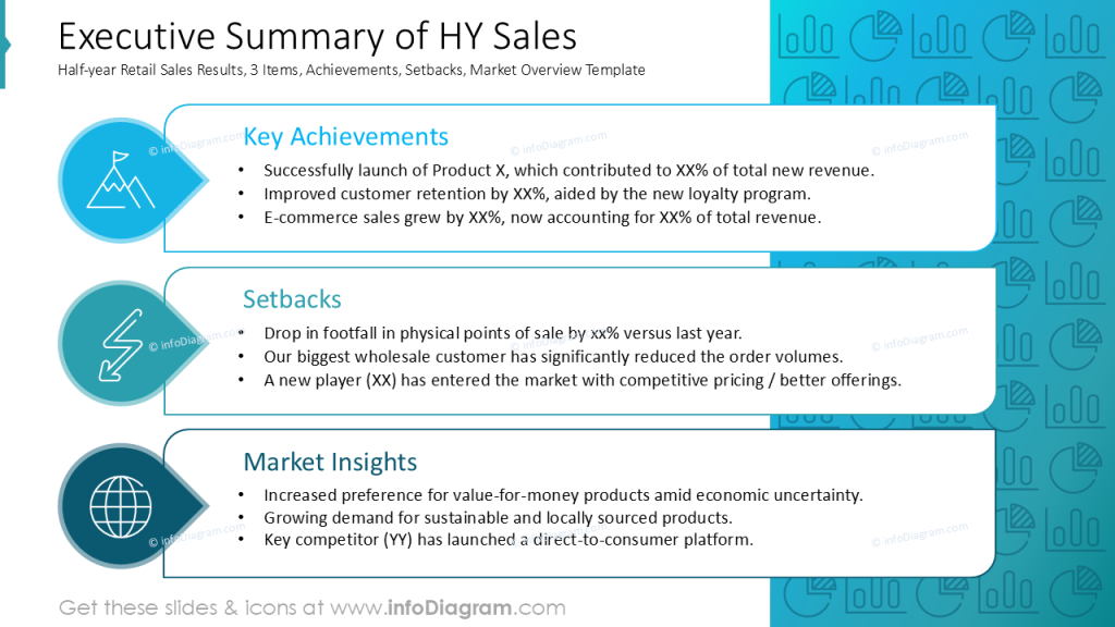
Presenting Executive Summary of HY Sales
Your executive summary is often the slide your audience pays the closest attention to. It needs to be clear, structured, and visually calm. Instead of dense text blocks, I suggest to use graphical blocks that highlight the essentials: achievements, setbacks, and market insights, as in my example below
The use of rounded shapes, consistent alignment, and a clean grid keeps the slide easy to scan, even for a senior audience with limited time.
To support the message, add simple icons for each category, guiding the reader’s eye without overwhelming the content. The visuals should be subtle and complementary, allowing the key points to stand out.
This kind of design not only improves readability but it also reinforces your image as a manager who communicates with clarity and professionalism.
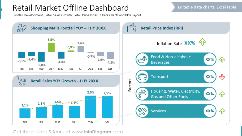
Visualize Retail Market Data
When you need to present market overview slides, I suggest using a dashboard-style layout. Like in these offline and online retail examples below. Such a style lets managers see trends, risks, and opportunities at a glance.
Example of similar dashboard slide, with data about online market:
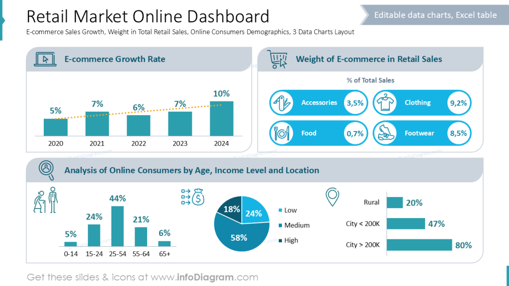
To keep dashboards readable, I rely on using a grid and a clear visual hierarchy, so the eye naturally lands on the most important metrics first. A good dashboard should:
- Group related charts together (e.g., footfall vs. sales, or e-commerce growth vs. category weights).
- Use consistent alignment and spacing to create a calm, structured flow.
- Highlight key insights visually, such as growth markers, up/down indicators, or color-coded categories.
This approach helps your market data look organized and credible. And this positions you as a leader who communicates insights, not clutter.
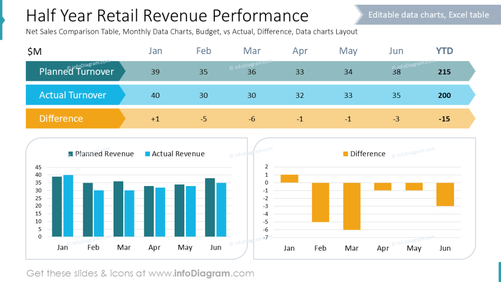
Present HY Retail Performance
If you want to show in your sales report comparison of planned and actual turnovers, you may need to combine presentation of both data format:
- specific numbers organized in a table, where your audience can see values directly
- as a data charts to better see the trend over lat 6 months.
See how we designed such a slide – splitting data chart into to, to more clearly show differences. What’s important is to use consistent color coding, so people can quickly identify the data categories.
Sales Metrics in Depth
To show a retail sales metrics in depth, you can use a similar tabular form as on the slide example below.
We enriched a table by using colors to show offline and online sales data. We also assigned a specific icons for all the column categories that measure retail sale:
- Traffic
- Conversion rate
- Number of transactions
- UPT – Units Per Transaction
- Pieces sold
- ASP – Average Selling Price
- VPT – Value Per Transaction
- Revenue
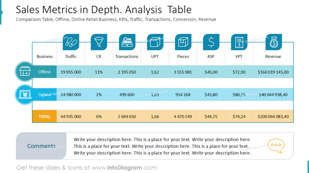
Notice how using enough space between rows and one graphical style creates a professionally looking table that is easy to read.
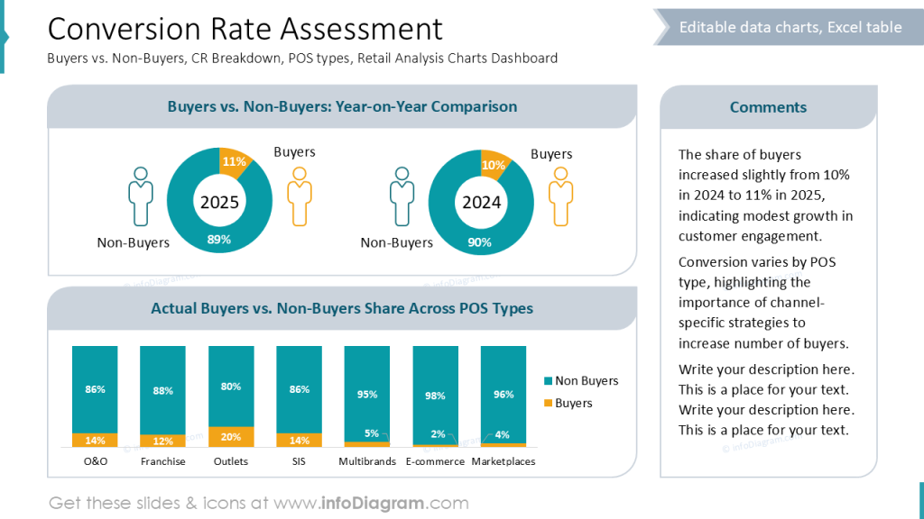
Present Conversion Rates Data Charts
Here is another example you can use in your sales report. A slide presenting assessment of conversion rates across various types of Point-of-Sales and comparing development of Non-buyers vs Buyers over the last years.
See again the use of consistent colors to represent the same categories over the presentation.
Designer Tips for a Professional Sales Report
To present your sales performance with clarity and executive polish, I recommend following a few key design practices:
- Use a clear structure with consistent section slides, so your audience can easily navigate HY results, market trends, and channel performance.
- Visualize data with simple, focused charts and subtle icons, helping people instantly grasp key movements in sales, footfall, or e-commerce growth.
- Apply a clean grid and alignment system to keep dashboards and KPI blocks readable and balanced.
- Use visual hierarchy (color, size, spacing) to highlight the most important figures, such as top-line growth or critical setbacks.
These design choices make your sales report look structured and professional while reinforcing your credibility as a clear and confident communicator.
Resources: Sales Report Templates
The slide examples presented above are part of our PowerPoint slide library. The full presentation is available in the infoDiagram collection of PPT graphics:
Read other related posts featuring examples of presenting sales and finance-related topics: