ESG Storytelling: Visual Frameworks Consultants Can Reuse
ESG storytelling made practical: visual slide ideas, examples, and design tips to turn sustainability data into a clear narrative.
Why visual storytelling for ESG consultants matters? It helps turning sustainability data into a story people remember. Let me show me how.
ESG work is full of information that still gets misunderstood: emissions pathways, materiality topics, governance structures, social impact, and targets that live in spreadsheets. The challenge often isn’t a lack of data. The challenge is helping people connect the dots.
That’s where visuals do the heavy lifting. A well-designed ESG slide doesn’t just “look nice.” It makes complexity navigable, shows relationships, and guides decision-makers through a narrative: what matters, why it matters, what you’re doing, and what changes next.
Below is a practical guide for ESG consultants on using visuals to explain sustainability topics with clarity—plus a set of slide ideas you can apply into your next ESG workshop, report deck, or board update.
Why visuals work well for ESG communication
ESG storylines typically include:
- many stakeholders (investors, regulators, employees, communities, customers)
- multiple time horizons (this quarter vs 2030 vs net-zero pathways)
- interdependent topics (governance enabling action, risks shaping strategy, KPIs proving progress)
Dense text-only slides often flatten this complexity. Visuals do the opposite: they create structure. See example of slide transformation here:
What “good ESG visuals” usually accomplish:
- Reduce cognitive load (people grasp the message faster)
- Show cause-and-effect (why this initiative changes that KPI)
- Make progress tangible (targets → milestones → actions)
- Build trust (transparent logic beats vague claims)
That’s not marketing—it’s comprehension.
A simple ESG deck storyline that works across clients
If you’re building ESG decks for different industries and maturity levels, this story spine is reliable:
- Context & why now
- Material topics & stakeholder expectations
- Baseline & key metrics (where we are)
- Strategy & governance (how we manage it)
- Initiatives & roadmap (what we’re doing)
- Progress tracking (how we’ll prove it)
- Next decisions & asks (what you need from the audience)
Now the key: assign one visual job to each step.
Presentation design advice that supports storytelling
As presentation designers we work a lot with visual slide makeovers to support narration of the presenter. We have put together several tips you should consider when presenting any complex topic.
Slide design rule 1: one slide = one point
If the slide answers multiple questions, it becomes a document—not a story beat.
Try this test:
If your headline can’t be read as a sentence (“We reduced Scope 2 emissions because of X”), rewrite it.
Slide design rule 2: convert lists into structures
When you have any common list of items, replace it with some visual form, for example:
- List of grounding values → show them pillars
- List of ESG initiatives → use circular list diagram
- List of risks → can you show them in a risk matrix structure?
- List of KPIs → present them in a dashboard layout
- Does a list contains a hierarchical structure? → maybe a pyramid or other structure map diagram would do better?
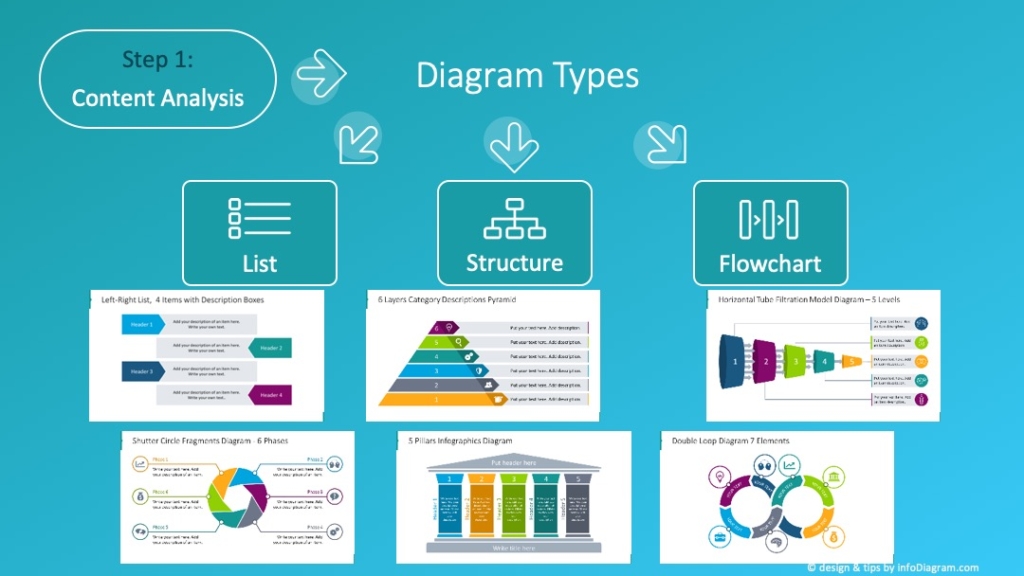
Check our blog with 18 visual diagram categories to use.
Slide design rule 3: keep a consistent visual language
Pick a small system and stick to it:
- 1 icon style
- 1 highlight color for “this matters”
- consistent chart formatting (same units, same baselines)
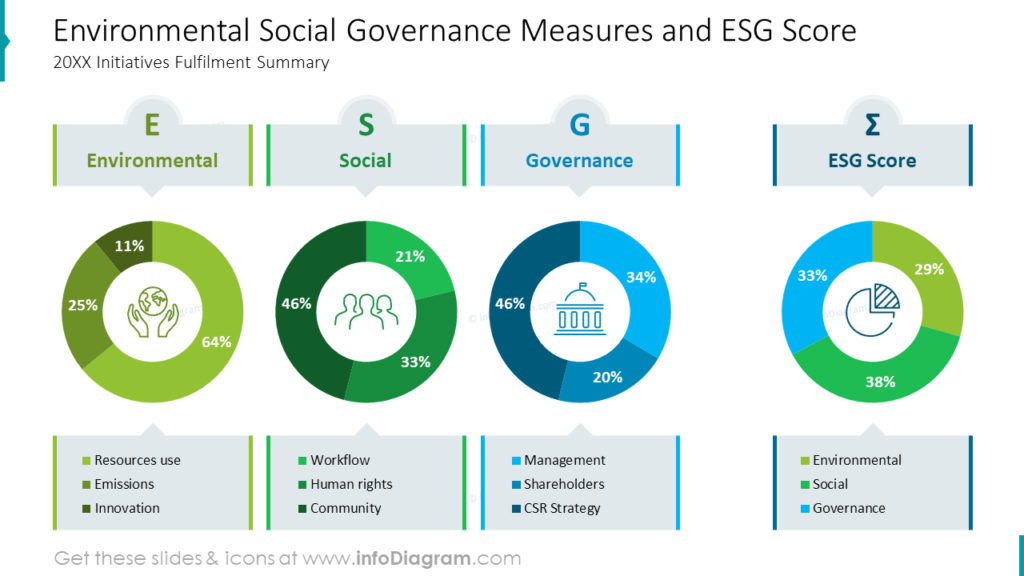
- repeated layouts for repeated sections (Environmental / Social / Governance)
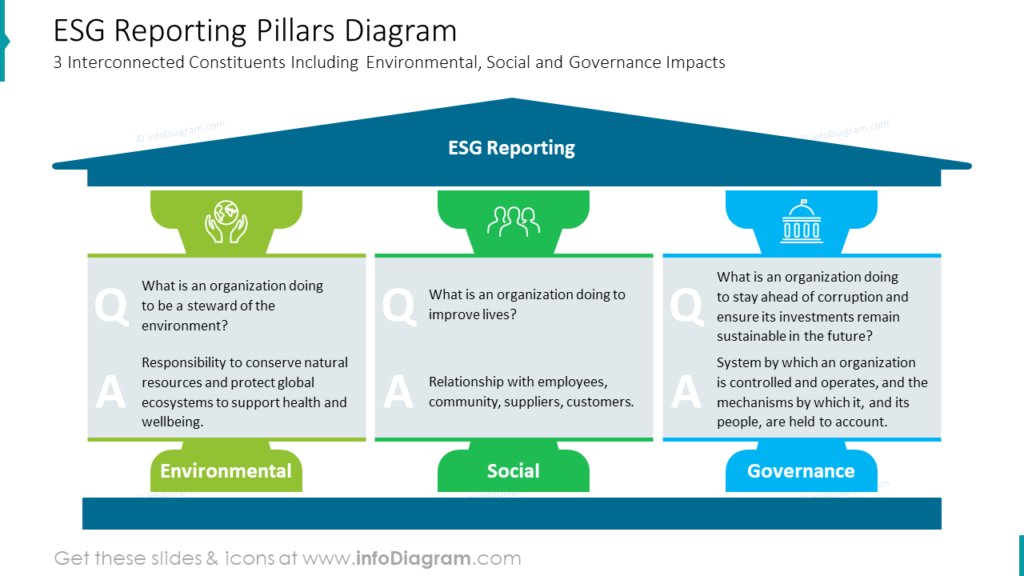
Slide examples: ESG topics that become clearer when visualized
Here are some examples of ESG slides makeovers.
See how you can enhance a table presenting scope and results of Carbon Footprint Reductions
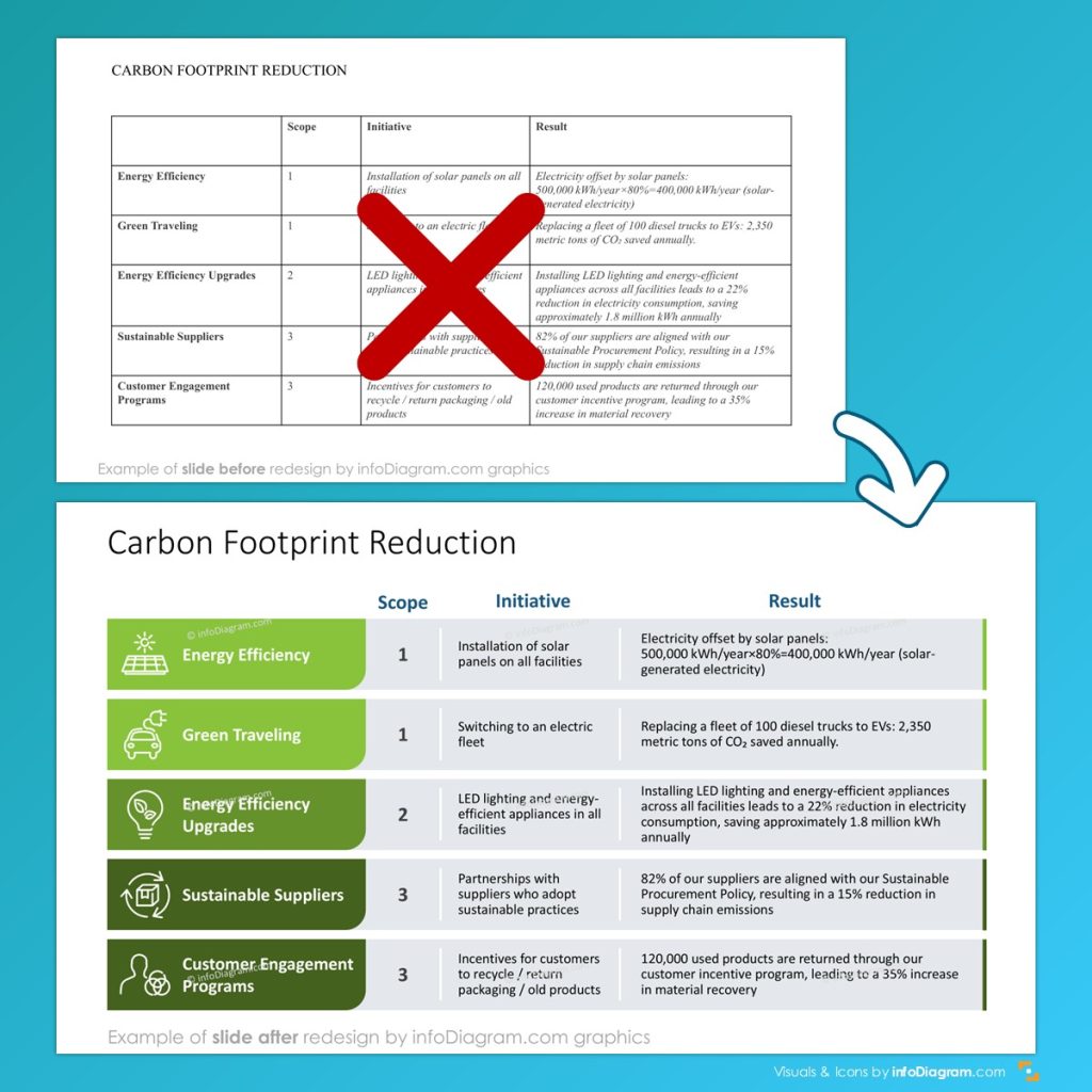
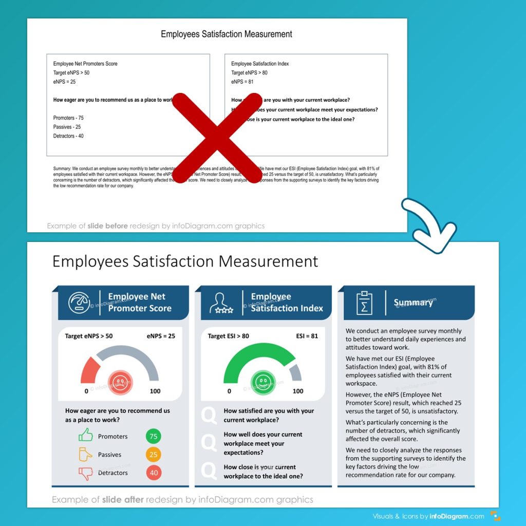
In this presentation slide makeover we used a grid layout and data visualization by gauge chart to make slide more visual:
Governance slide that people can actually follow
Governance is where ESG decks lose audiences. The fix: show structure visually.
- governance org chart (who owns what)
- committee map (oversight vs execution)
- responsibility matrix for ESG programs
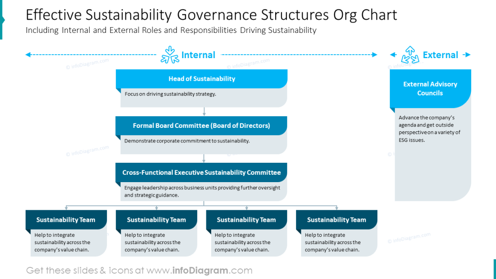
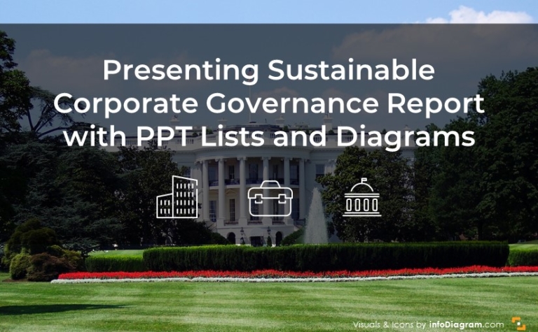
The “Sustainable Corporate Governance” slide sets and governance-structure visuals give a good reference model for this kind of clarity.
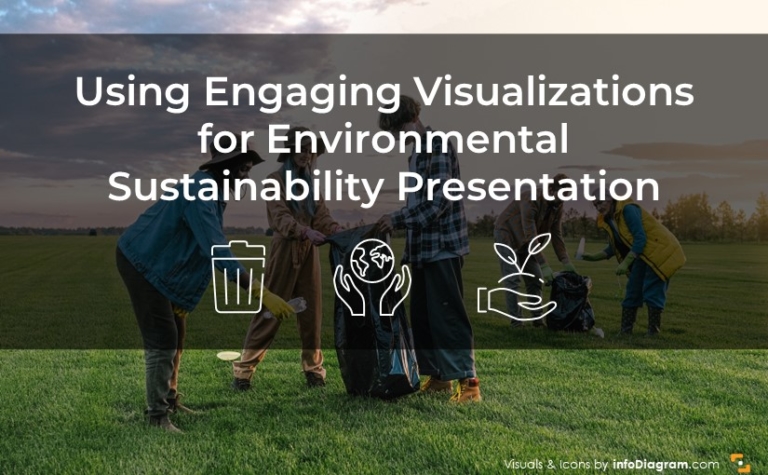
Presenting Environmental policy and actions: from principles to execution
Environmental sections land better when you separate:
- policy pillars (your principles)
- focus areas (energy, water, waste, sourcing…)
- initiatives (what’s funded and underway)
- metrics (how you’ll track progress)
The Environmental Sustainability Policy deck outline (diagrams + icon set) is a strong example of how to package these layers into editable visuals.
ESG metrics visuals that don’t drown the room
A KPI dump isn’t a story. A “metrics narrative” is:
- what we measure
- why we measure it
- what changed
- what we’ll do next
Use visuals like:
- KPI dashboard (3–7 headline metrics only)
- metric definition cards (formula + scope + owner)
- trend charts with annotations (“what caused the change”)
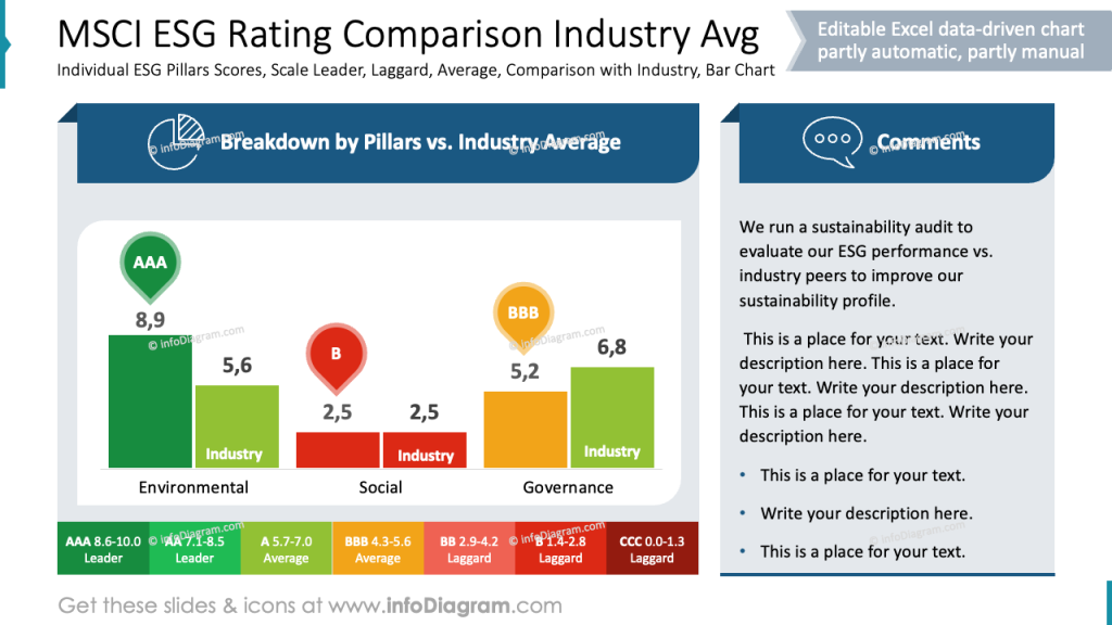
For examples of presenting ESG KPIs and sustainability metrics visually, the ESG metrics blog post and related deck layouts are a helpful benchmark.
Climate risk & opportunity: show the logic, not just the conclusion
Climate slides often sound dramatic but feel abstract. Make them specific with:
- risk/opportunity matrix
- timeline of regulation + market shifts
- action plan calendar linked to milestones
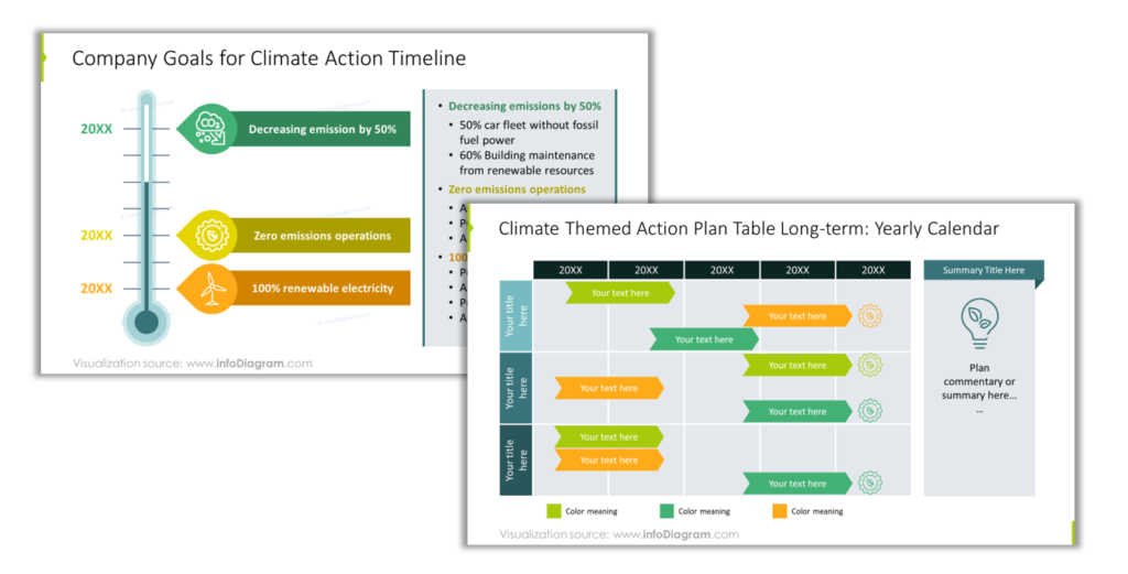
The Climate Change Impacts & Business Actions deck and the climate opportunities/action timeline slides illustrate these patterns well.
Circular economy: use loops, not paragraphs
Circular economy concepts want to be visual:
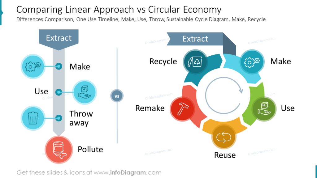
- lifecycle loop (design → use → repair → reuse → recycle)
- “R” models (reduce, reuse, repair…)
- value chain interventions (where impact is reduced)
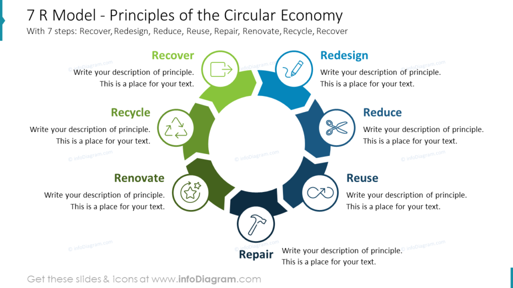
If you need examples, the circular economy blog post and the diagrams slide deck provide clear visual structures you can adapt.
Build your ESG story with visuals (without reinventing every slide)
If you’re updating an ESG report deck, running stakeholder workshops, or preparing board-ready sustainability narratives:
- Explore visual template resources in the sustainability management library for examples and reusable building blocks.
- Browse for inspiration using AI Slide Advisor. Chat freely in your language, ask for ESG slide examples (search for environmental, ESG metrics, circular economy, climate action storytelling).
- Download and adapt slides to match your client content and branding (especially for governance visuals, ESG report structure, climate action roadmaps).
How to integrate ESG report templates into existing corporate materials?
Having ESG templates in PowerPoint format makes it easy to integrate with a client’s corporate identity. A client will usually have its own PPT template with corporate colors and graphics.
Using external visuals that are made as editable vector graphics allow you to control how you merge those ESG graphics with other presentation content of a client.
When you reuse elements from our ESG templates in a client-branded deck, you have a few clean options depending on how strict their visual identity is. If you copy a slide, you can either keep the source theme (so the slide looks exactly like the template) or paste it into the client file and switch to the destination theme so fonts and colors automatically match their corporate style.
When copying a whole slide:
- Keep Source Theme / Formatting → slide keeps the exact look from the ESG template (colors, fonts, layout).
- Use Destination Theme / Formatting → slide adapts to the client deck’s branding (theme fonts + colors update automatically).
When copying specific graphics (icons, diagrams, charts, blocks)
- Paste with Destination Formatting → visuals inherit the client’s theme colors and typography (best for brand consistency).
- Keep Source Formatting → preserves the original design styling (useful for complex diagrams where color balance matters).
In practice, many consultants start by applying the client theme first, then paste visuals using destination formatting, and only keep source styling for standout slides where the original design is part of the message.
Best platforms offering ESG report templates for corporate sustainability
Probably the most universal and practical platform is still good old MS Office PowerPoint. It is a corporation standard used in most of medium and big companies. It also offers high level of flexibility while following the visual identity (assuming a client has properly set PPT template).
What are the best use cases of using visuals for ESG presentations? “Best” depends on what you need:
- For consultant-grade storytelling (structured diagrams, editable frameworks, consistent icon sets): look for libraries built around business reporting visuals and ESG topics (for example, ESG and sustainability-focused slide categories and decks like those in infoDiagram).
- For quick internal drafts: general presentation template marketplaces can help, but you may spend more time fixing consistency and visual logic.
- For brand-perfect outputs: in-house design systems or agency-built slide kits are ideal—templates can still speed up the first 70%.
A good rule: choose the platform that minimizes rework (formatting, icon mismatch, inconsistent charts), not the one with the biggest thumbnail gallery.