How to Make Coronavirus Infographics Using PowerPoint
In the emergence of global coronavirus pandemics, we want to help the way we can. Supporting you communicating with your clients, patients and colleagues.
Therefore, I suggest using the power of visuals to highlight the key take-aways. This way you can make sure your voice is heard, whether you are reminding people how to behave or actions your company should take.
Slide visuals on Coronavirus slides deck presented here are available for download – we gladly share them free of charge for not-for-profit use, such as public healthcare, educational or government institutions. I welcome any feedback and cooperation ideas.
Here are a few examples you can use.
1. Presenting COVID-19 protective instructions clearly
As far as there is no direct medicine for COVID-19, doctors recommend a few hygiene habits to follow.
This is an example of making simple infographics out of text-only instructions.
- Make each point as a separate item. This way your instruction will be more readable. You can do it manually or use the SmartArt tool present in PowerPoint.
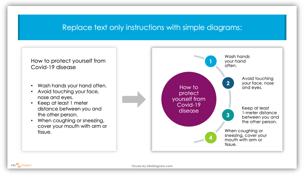
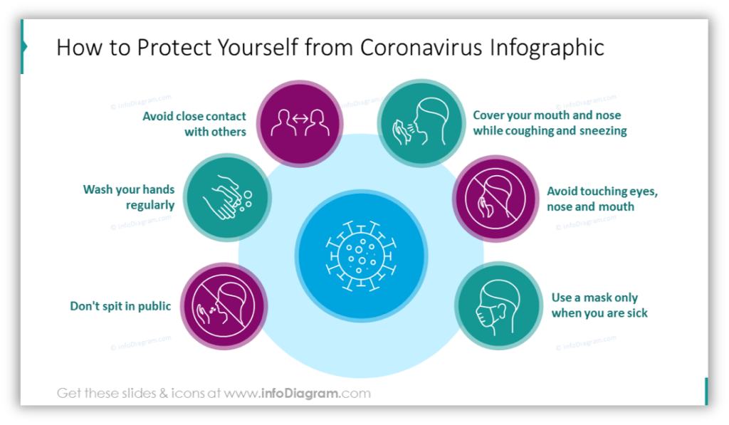
- To help readers remember specific points better, add a picture or symbol to each item.
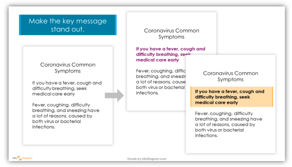
Explaining Coronavirus symptoms – highlighting the key message
In case you have more information to present in your material, make it easy to identify what part is the most important. There are several visual tricks you can use
Let’s say you need to provide more details about the symptoms of coronavirus infection. The easiest way is to make that part bold (Ctrl+B shortcut works in most of the editors). You can additionally add color to text or some light color background:
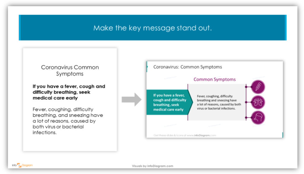
If you have a bit more time, you can play with layout, put each paragraph in the separate textbox and try what flow of elements highlights the best the message you want to pass. You can illustrate the key symptoms by icons, to help the reader create a visual image of those three symptoms – fever represented by higher temperature, coughing and breathing difficulty.
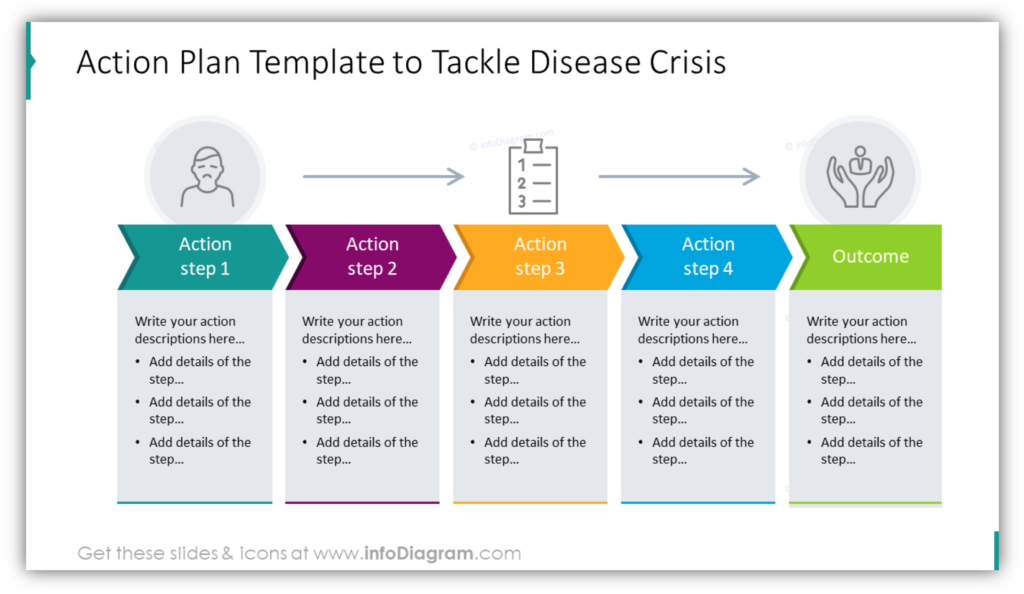
Present Company Actions Visually
Another type of material you may need to prepare is a business action plan. To communicate it clearly with your colleagues, consider giving it a diagram form.
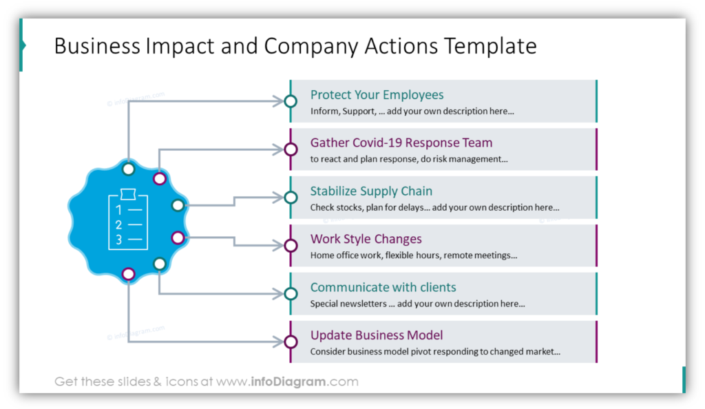
You can present the next steps this way – grouping them in phases. This will help people to see the future path and current focus:
Importance of visuals
These are hard times when proper communication is even more important. Providing clear and sound information can help people to orientate and avoid misinformation.
Using pictures and graphical symbols is a great way to create material that will be noticed and remembered. I hope those graphical tips will inspire you.
I wish we all go through this pandemic safely and quickly. Stay safe and healthy.
Resources
All graphical examples presented here are available to get and reuse from Coronavirus Protection Actions PPT Graphics deck on our webpage. We want to support our global fight against coronavirus disease, at least by providing you those visuals.
We decided to share them at no cost for people who can’t afford them, so if you are non-profit, public healthcare, government or educational organization, contact us and we’ll share this PowerPoint deck with you free of charge.
For the latest facts about Coronavirus check those resources:
- For health guidelines: World Health Organization, European ECDC or American CDC.
- For latest statistics on infectioncases: Worldometer, John Hopkins university website.


