Use Net Promoter Score Dashboard Graphics to Present Customer Loyalty Metrics
How do you gauge customer loyalty? You probably know that customer satisfaction is essential to the success of your business. Share how likely your customers are to recommend your products or services using Net Promoter Score metrics graphics. If your organization doesn’t already use NPS you can explain how you might benefit from using this metric, how to calculate it, and then make plans for visualizing and tracking customer loyalty over time.
Do you already use NPS? Make your Net Promoter Score presentations easier to follow with cohesive, elegant visuals. Check out the full NPS Analysis Dashboards for Customer Loyalty Metrics PPT diagrams set.
Present the benefits of the Net Promoter Score
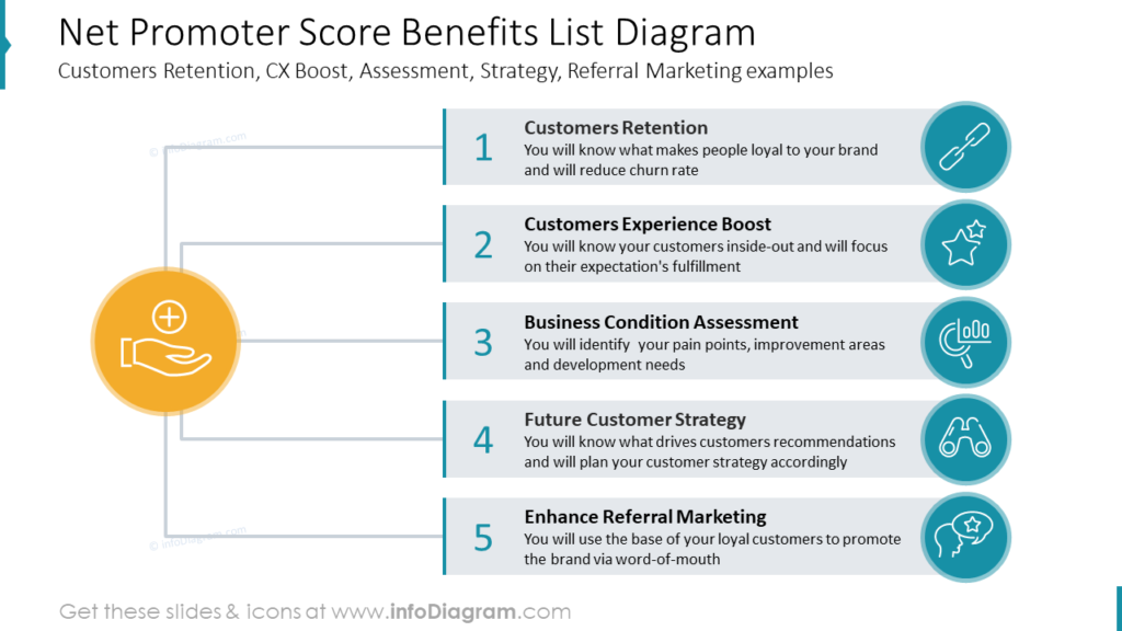
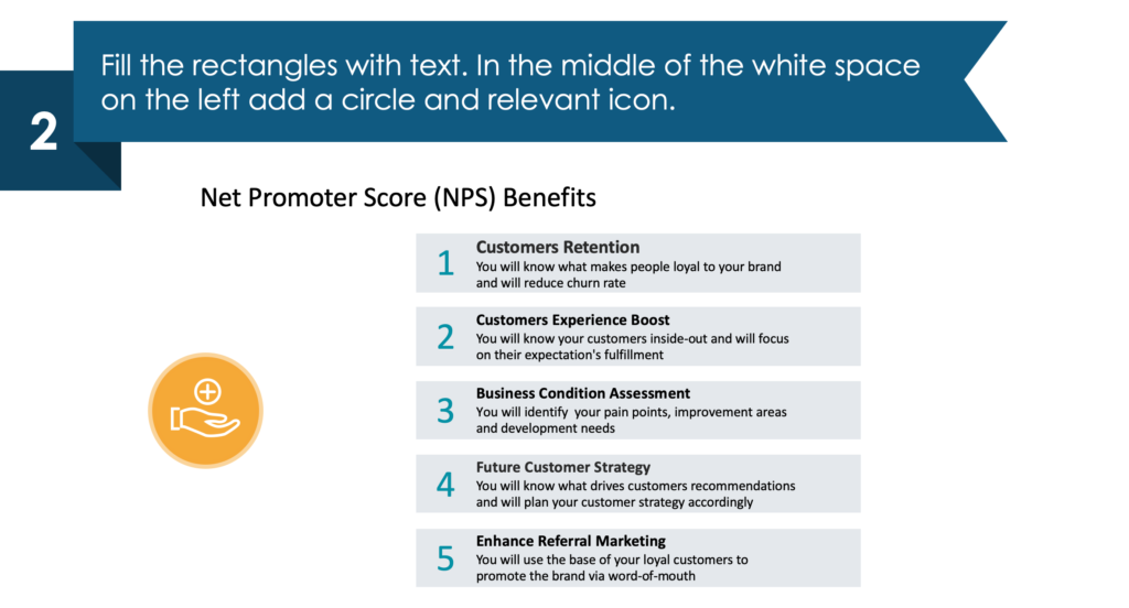
If your audience is unfamiliar with Net Promoter Score metrics you may want to present the benefits before you dive in too deeply. After you explain what NPS is, explaining the benefits will help your audience understand why the rest of your presentation is important. When presenting your Net Promoter Score benefits list diagram you’ll want to acknowledge all the essential benefits of NPS. Some of the benefits of NPS we share in our example slide are increases in customer retention, customer experience boost, business condition assessment, insight into your future customer strategy, and enhancing referral marketing or sharing referral marketing examples.
What NPS benefits would you share? The text, icons and color schemes can all be customized so you can focus on the benefits of Net Promoter Score as a tool that would be the most useful to your organization.
Explain the Net Promoter Score calculation formula in PowerPoint
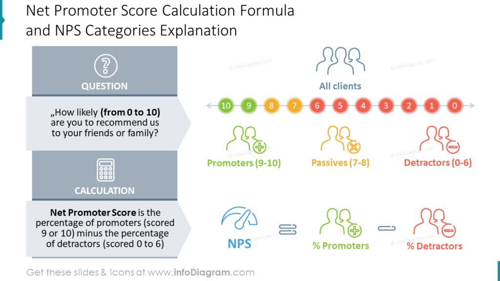
Does your audience understand how to calculate a Net Promoter Score? Make sure they understand the NPS formula. You should also provide an explanation of NPS categories. Giving your audience an explanation of promoters, passives, and detractors will help them understand the significance of your NPS findings. In the example slide, we use icons and a color code as a visual metaphor. Promoters are positive, so they are green. Passives are neutral, so they are yellow. Detractors are negative, so they are red. Using the traffic light color scheme is a great visual shortcut for your presentations.
Share your Net Promoter Score with a funnels dashboard
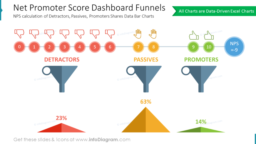
Do you already have the results of the NPS analysis and need to present the data? If you need to show NPS metrics you don’t have to use complex tables. The example slide uses data-driven Excel charts without incorporating boring, default graphs.
The pyramids are used to express the percentage of customers in each Net Promoter Score category. The traffic light color scheme (Red = Detractors, Yellow = Passives, and Green = Promoters) makes this slide easy to understand. The NPS calculation of Detractors, Passives, and Promoters shares without using boring data bar charts. The funnels and hand icons, in addition to making your presentation easier to understand will also make it more memorable for your audience.
Present customer experience Net Promoter Score efficiently in PowerPoint
Turn an unattractive, boring PowerPoint slide into an eye-catching, symbolic infographic in four easy steps.
1. Divide the area into five rows by creating a rectangle for each. Mark every shape with a number on the right.
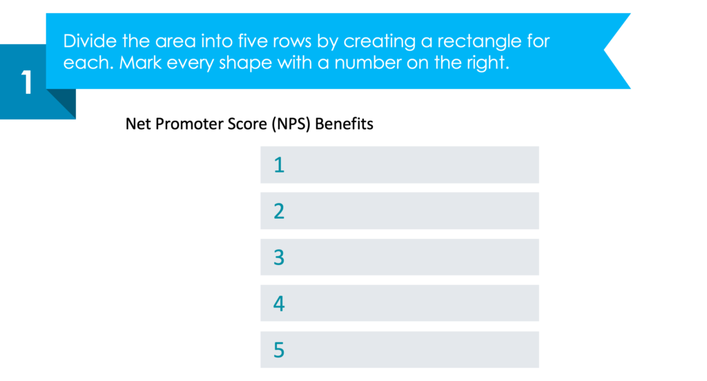
2. Fill the rectangles with text. In the middle of the white space on the left add a circle and relevant icon.
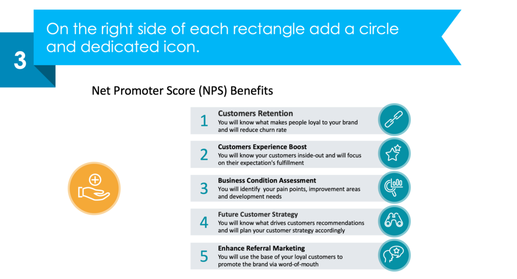
3. On the right side of each rectangle add a circle and dedicated icon.
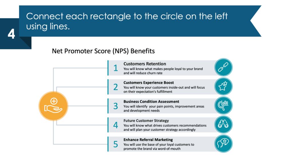
4. Connect each rectangle to the circle on the left using lines.
Resource: NPS Analysis Dashboards For Customer Loyalty Metrics
Explaining your organization’s customer satisfaction levels and loyalty can be difficult due to big data volume. Our designers created the NPS Analysis Dashboards for Customer Loyalty metrics PowerPoint graphics set so that everyone can create eye-catching, elegant slides, see the full deck:
Save time and make more easy-to-understand, data-driven presentations by using ready-made, concise visual metaphors. Keep your detail and data-heavy slides from being too busy with sleek visual metaphors.
Communicate your full NPS ideas through infographics and creative visuals when you use the NPS Analysis Dashboards for Customer Loyalty Metrics icon set. If you need to share additional customer experience metrics, check out the Customer Experience Metrics Diagrams set for more graphics resources and slide ideas.


