Creative Use of Quadrant Diagrams in PowerPoint
Are you preparing slides about market segmentation? Or you’re working on a presentation about brand positioning, consumer markets, or geographic segmentation? Consider using a visual form of quadrant diagrams for presenting such information. This is a common way used by leading consulting companies. For example, a well-known Gartner’s Magic Quadrant divides market players into four segments: leaders, challengers, visionaries, and niche entities.
Let me show you a few slide examples with quadrant graphics and get inspired on how you could prepare similar slides yourself.
What is a Quadrant Matrix?
The quadrant Matrix method helps you to analyze and present data organized in a 2-dimensional matrix with two parameters, e.g. a company vision and execution, or a company offering and strategy.
Using such a simple matrix illustration you can show a movement of market players’ positions over the years.
In other more simple words, this visualization method is based on making a diagram with two categories with a 2×2 matrix. That gives you a space for 4 segments that are easy to organize and explain. So let’s see how it can be used in practice.
I put together a few examples of charts and templates included in the Quadrant Matrix topic area. Those slides examples can help you to express your information efficiently:
- companies segmentation by Vision and Execution
- BCG Growth Share matrix
- Market Analysis Magic Quadrant Matrix
- Radar Wave Chart for companies evaluation
Get all the graphics presented here – click on the slide pictures to see and download the source illustration. Check the full Quadrant Matrix Diagrams and Market Segmentation Charts deck here.
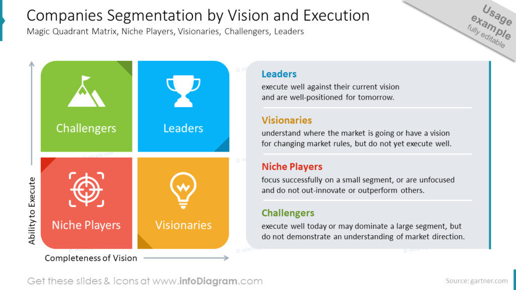
Companies Segmentation by Vision and Execution Diagram
The companies’ segmentations presented on the quadrant matrix diagram below are a good example how you can use icons to illustrate specific segments. One icon can express the essence sometimes better than series of words. So to create that slide we chose four icons. Each of them represents each of the 4 parts we would like to introduce to the audience.

In our case these are: Leaders – symbolized with the winner’s cup, Visionaries – presented with the idea’s bulb, Niche Players – shown with the game viewfinder, and Challengers symbolized with the flag on the top of the mountain. I’m sure thanks to that visualizations your audience can remember the content easily.
We wanted to emphasize which of the four segments presents which text. The solution for that is a color correspondence between segments and headers. So for example the green color represents challengers. Such designed content is visually attractive and pays attention to the main message.
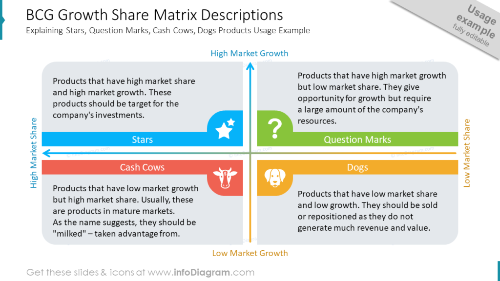
Quadrants Description Slide – BCG Growth Share
Making a block of text attractive and readable on a slide is a frequent presentation design challenge.
So how to present plain text on one concise slide? First of all, do not use a typical number list or bullet points. Instead of it, you can use a simple shape from a PowerPoint list of shapes. On the slide below I’m presenting shapes of a rectangle with one rounded corner distributed in each slide’s corner.
It’s important to plan the vision before you start to design. As you can see, all four rectangles make another one complete shape (rounded corners rectangle), which is our matrix diagram.

To make content more memorable we added icons representing each segment of the quadrant matrix and assigned them to their own colors.
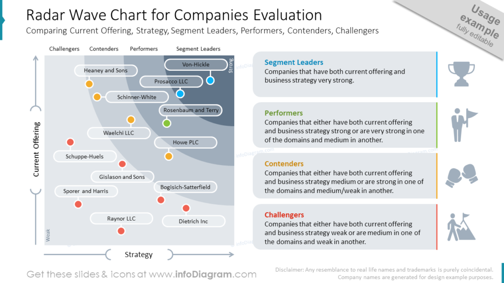
Presenting Radar Wave Chart for Companies Evaluation
It happens often that radar charts are too complicated or contain too much data to be readable. To avoid such mistakes it’s important to analyze how the plain data can be represented graphically.
We chose a kind of marker to represent our data on the radar chart. Such a marker is created from simple shapes available in PowerPoint. We used circles and rounded shapes. It’s really easy to play with fill’s and stroke’s colors to achieve the subtle effect.
It is easy to see that the slide is divided into two halves. The left one represents the section from the radar chart. While the one on the right side represents the chart’s legend. Because the slide contains much content we keep the colors grey (only markers correspond coloristically with the legend). It helps to avoid littering the slide.

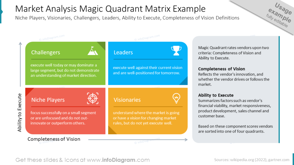
Market Analysis Magic Quadrant Matrix Slide
Here let’s focus on the structure of the slide, which is presented below. You can recognize that the quadrant matrix covers 2/3 of the slide while the box with comments takes 1/3 of the space of the slide. During filling slides with text it’s very easy to cover most of the free space with content that is not so important to be presented. To not struggle much with text formatting (which can be very onerous), it’s very significant to plan the space for content in advance.
In PowerPoint, you can use for it vertical and horizontal guides which will help you to divide space into smaller parts. For main content, you should designate more space than for less important information. After that, you can fill your structure with the content.

Concluding Ways of Presenting Quadrant Diagrams Segmentations
To present various types of 2-dimensional segmentation consider using Quadrant Matrix methods in an attractive and easy-to-digest way that you can create using PowerPoint. It can be a visual form of radar chart for presenting companies evaluation, a rounded corner rectangles diagram for BCG growth share descriptions, or icons symbolizing for companies segmentation by vision and execution.
With basic design rules such as consistent style of icons and colors, not overloading the slide with content, and the use of graphical symbols, you can make a stunning presentation and overall impression.
Resource: Quadrant Matrix Diagrams for PowerPoint
The examples presented above used the graphics from a PowerPoint template on the topic of Quadrant Diagrams and Market segmentation Charts. Check the whole presentation in the infoDiagram collection under the following link.
In addition, you can extend the deck with a universal set of elegant outline style diagrams right here with different graphics, styles, and a lot more.


