How to Present Social Sustainability of ESG Report With Visual PowerPoint Slides
While presenting ESG issues in your sustainability report, they may be a moment when you’ll need to go in-depth with the social sustainability aspects of the study. Listing your company’s goals, actions, and achievements in this field could end with a bunch of similar descriptions.
Using visuals to support your messages proves to be an effective way to stand out. They help in creating logic across your slides, color-coding crucial information, and winning your audience’s attention. Not to mention emphasizing the professionalism of the presenter.
Feel encouraged to convince yourself of these statements by checking our example slides in the following paragraphs. For your inspiration, we present a detailed design analysis of some of our topic-related diagrams:
- a list of target social beneficiaries
- a social sustainability examples
- a list of diversity & inclusion achievements
- a presenting employee satisfaction
- explaining GDPR policy areas
Source of graphics presented here is available for download (link to visuals: Social Sustainability Report ESG Presentation).
Why Use Visual Way of Presenting Social Sustainability in ESG Report?
Presentation composed of similar-looking content slides often causes a loss of interest in your audience. In the case of text descriptions and lists, alteration possibilities are constrained.
It is generally accepted to limit font types, colors, and sizes; therefore, graphic elements come in handy when there is a need for differing slides from each other. Conscious use of colors, text containers, or icons allows the creation of a coherent deck of slides with similar content but varied appearance. This way, we can juice up the presentation to everyone’s benefit.
If you struggle with diversifying your data-rich slides or searching for visual ideas for your social sustainability report, this blog post may be a great source of inspiration.
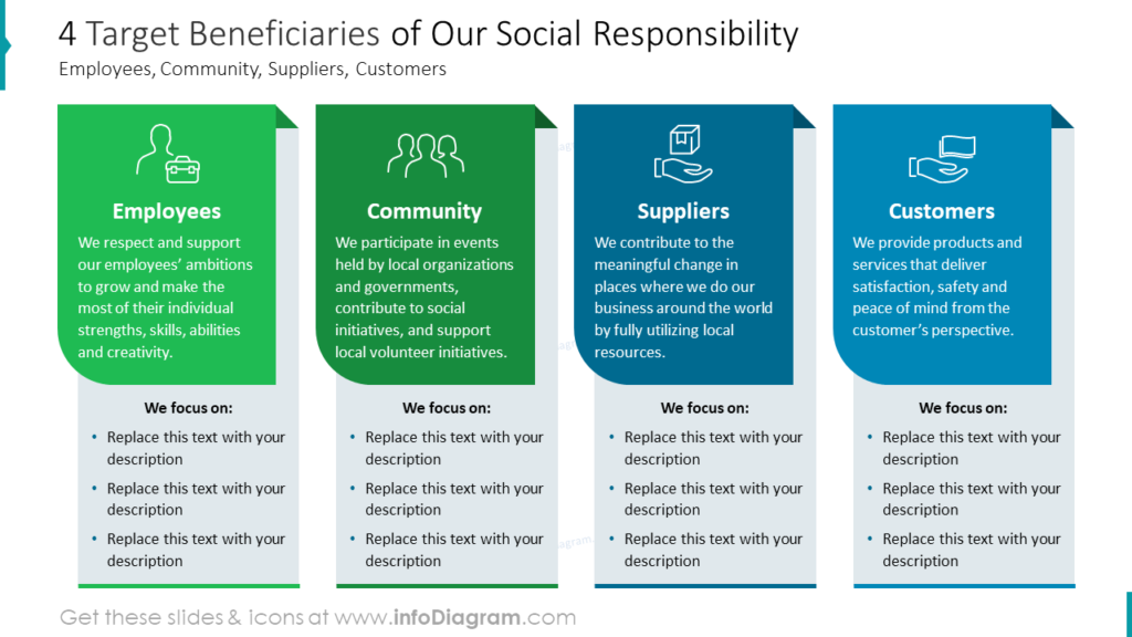
Present a List of Target Beneficiaries of the Social Responsibility Strategy
Defining the beneficiaries of social sustainability policy may help open a chapter of the ESG report. This topic is closely linked with defining goals, conducting a SWOT analysis, or understanding supply chain connections. Describing actors in the social responsibility scene (employees, community, suppliers, and customers) lays the foundation for further discussing their relations.
In order to make the list of elements more appealing to the audience, we propose to present its items horizontally on our example slide. It creates an effect of personas cards which fits the topic very well. On top of that, we used meaningful outline icons illustrating each card to make the information memorable. Bold titles and detailed descriptions introduce participants before moving on to the detailed lists of their benefits. Such reading logic is achieved through the horizontal listing and popping out dark text backgrounds, which attract attention.
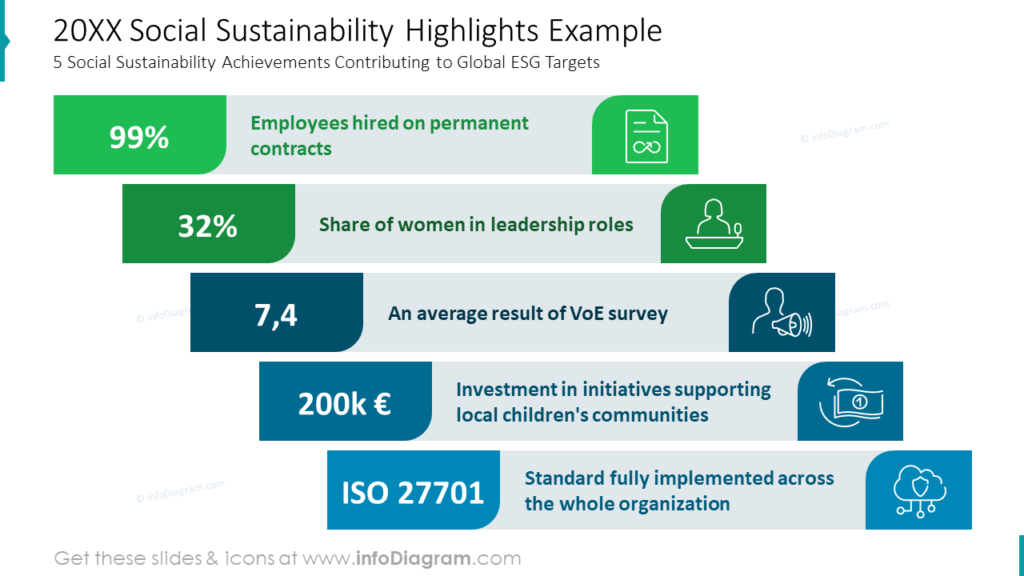
Highlight Social Sustainability Achievements Contributing to Global ESG Targets
Lists of short text descriptions related to numbers find use in chapter summaries and are meant to fall into the reader’s memory. In social sustainability reporting, they can be used to highlight metrics such as percentage shares, rating results, financial investments, or ISO standards.
Such slides are an excellent opportunity for creating solid visual messages of great resonance. The following diagram illustrates how adding colors, icons, and big numbers transforms a simple list into an appealing infographic. In this example, all elements were combined into long horizontal tickets designed in the presentation color palette and arranged diagonally using the entire slide area. We know from our professional experience that information conveyed in this way is easy to read, engaging, and impactful.
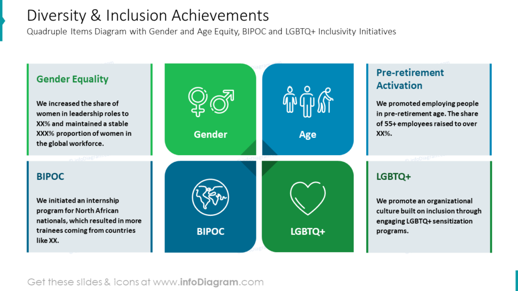
Illustrate Diversity & Inclusion Initiatives with Quadruple Diagram
Inclusivity initiatives have become a flag achievement for many businesses nowadays. It is one of the most critical aspects of social sustainability, and this is why we are sharing our example slide covering this topic. Take a closer look and notice how design decisions enriched content that would be more of a simple list.
The first decision that catches the eye is distributing list elements in the matrix layout. This approach allows for utilizing the entire slide space. The second visible design decision is assigning colorful title tiles to each description and illustrating it with extensive outline icons suitable for topics such as:
- Gender
- Age
- BIPOC
- LGBTQ+
The last visual decision noticeable on this slide is linking text container graphical titles and additions with illustrative tiles mentioned before. This action results in a clear and coherent slide conveying the message effortlessly.
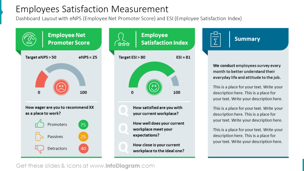
Employees Satisfaction Measurement Dashboard Example
When thinking about how social sustainability is obtained conducting the research plays a fundamental role. One of the aspects of social balance in the working environment is employee satisfaction which can be rated in terms of employee net promoter score and employee satisfaction index. Displaying statistics data becomes interesting when visuals are incorporated. Let’s analyze the slide below and check how it works.
In this example slide space has been divided into three sections – two for presenting eNPS and ESI measures and one for a written summary. They can be easily distinguished thanks to the dedicated use of green and navy graphics. What’s special about the result section is the application of gauge charts and icons supporting the message. Also, the conscious use of red, yellow, and green among evaluation graphics refers to universally used color coding expressing success or failure. Replacing text data with visuals resulted in an orderly and legible dashboard of human resources metrics.
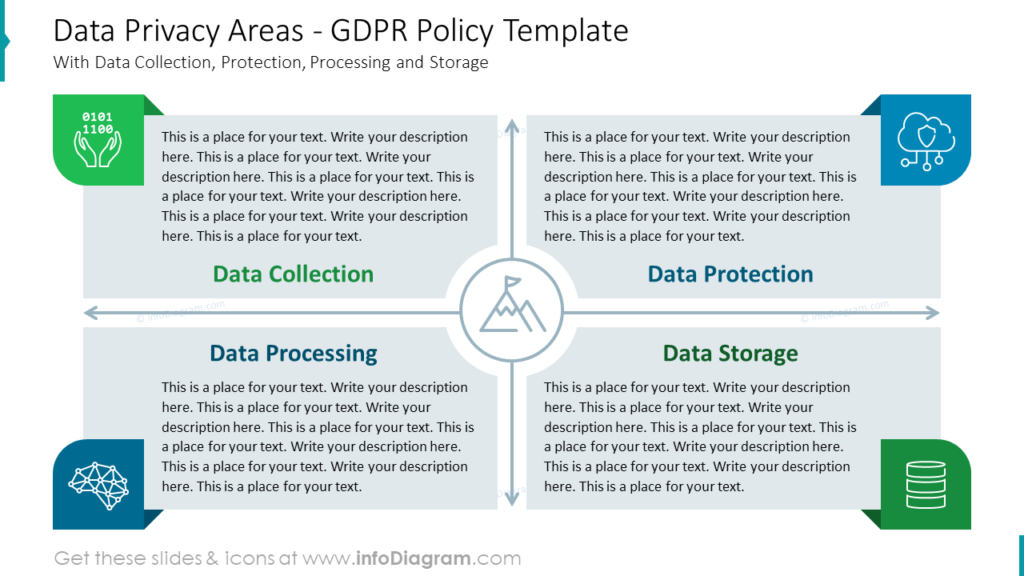
Compose GDPR Policy Slide With Descriptions of Data Privacy Areas
Data management is considered part of social sustainability policy. Whenever people are involved, some information starts circulating, especially in the business environment. Employees and customers became genuinely concerned about their privacy and the security of sensitive data collected about them. Presenting a company’s attitude to GDPR Policy is nowadays often included in ESG reporting and covers topics such as:
- data collection,
- data protection,
- data processing,
- data storage.
When you add a text description to each topic, you will get a pretty dense text slide. Such text-rich slides may be overwhelming to the audience, so we prepared an example of a visual template helping to solve that problem. You can see how even and total usage of the slide area created an interesting structure for detailed descriptions. Narrow paragraphs are easier to read than full-width-long ones and adding large titles, colors, and icons to the composition make it easy to navigate the content quickly. As the whole slide is about the company’s goals, there has been a symbol of a mountain with arrows in all directions added in the central area.
Summary of Design Tips for Social Sustainability Report ESG Presentation
Sustainability reports usually contain an extensive amount of information. Using PowerPoint format for such ESG reports gives you the opportunity to introduce graphical structure and elements that help comprehension of more complex documents.
Composing the presentation of text-rich slides often requires a dose of imagination to diversify them and keep the audience interested. The horizontal layout of PowerPoint documents may be challenging when filling in descriptions and lists. Some design tricks help to enrich slides and use the whole slide space; others make the composition more readable and engaging. Check the summary below and feel free to draw from it as you’ll be working on your following social sustainability report:
- distribute elements of your lists alternately in horizontal, vertical, diagonal, or distracted order
- keep your color pallet simple and coherent throughout the whole presentation
- choose colors symbolizing harmony, responsibility, and trust to discuss social sustainability
- use large titles to help readers navigate slides easily
- support the content with meaningful icons to make slides memorable
- use text containers to implement a structure to your slides
- illustrate data metrics with color-compatible data charts
Resource: Social Sustainability Report ESG PowerPoint Presentation Template and Layouts
The social sustainability report ESG layouts presented on this blog are available for download in the format of a PowerPoint file within the infoDiagram collection of ready-to-use PPTX templates. You will find many slides appropriate for institutional, business, and civil audiences in this presentation, including social sustainability definitions, ESG achievements, employees policy, diversity & inclusion, employees satisfaction, community engagement, company CSR investments, circular consumption, GDPR policy, supply chain management, and more.
Don’t hesitate to check the details and click the link to the Social Sustainability Report ESG Presentation Template below:
If you look for more visuals to illustrate sustainability topics try our template for the circular economy and sustainability.