How to Design the Training Services Proposal in PowerPoint
Do you need to prepare a training program proposal for a learning course or coaching? How would you like to create a structure of your offer and present it? As a pure text document or maybe a more graphical one? I would recommend using PowerPoint to create a template for your training services proposal. Its flexibility will allow you to use visual layouts with places for training topics, pricing, or trainers’ team. You need just a bit of creativity to prepare an impressive presentation for your potential clients.
Let me inspire you with examples of training offer slides created in PowerPoint:
- writing the executive summary of your proposal
- presenting the structure and table of content
- showing the pricing offer
- presenting the training implementation plan
- introducing the training team members
Get all the graphics presented here – click on the slide pictures to see and download the source illustration. Check the full Training Services Offer PPT Template.
Why Prepare the Summary of the Training Services Proposal and How To Make it Visually Appealing
The executive summary outlines the key points of your training proposal. The interest of the potential clients depends on its quality. That’s why it should be presented in an attractive and clear way.
Have a look at the slide below, and see how you can nicely add graphical elements next to a text.

The slide is divided into two columns. The left side contains the description of the training sections. A good practice is to arrange it as a bullet-point list for faster reading. The right side of the slide is fully covered with the picture. There’s an icon symbolizing the summary located in the middle of both sections. Such joining of the text with the picture makes a slide easier to remember.
By the way, adding symbols to your slides is a great way to make your slide professional-looking and innovative, see five easy ways to embed icons in your design.
Presenting the Training Offer Pricing Clearly
The recommended way of presenting the numbers is to arrange them in a table. The format of a table makes it easy to organize numbers in a regular structure.
However to make our table content clear and easy to understand we should improve such pricing tables visually. The typical PowerPoint or Excel tables are so common that it becomes boring to look at them. Notice that the most eye-catching element in the table below it’s the appearance of the first column.
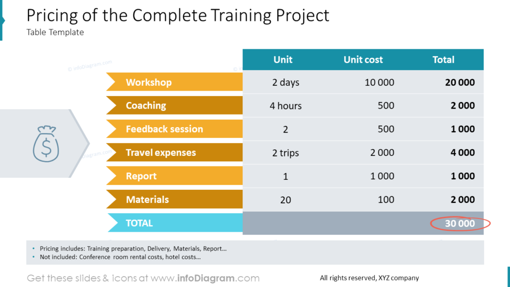
Headers in the first column are written with white text and placed on chevron shapes instead of typical table cells. Also, the headers from the first row of the table are white on a turquoise background. It shows plainly what kind of content is presented in the table’s cells. Note that the numbers are aligned to the right. It’s an intentional procedure to make the total sum easier to count.
We enriched the slide with the corresponding icon illustrating the finance topic, and there is a dedicated place at the bottom for the additional notes e.g. showing your training pricing includes certificate and report but excludes room rental costs. It may be a small but important fact to add to your proposal.
If you are looking for more ideas on table design, explore how to make infographic tables stand out with the colorful flat designs.
Visualizing the Implementation Plan for the Training Services Step by Step
An implementation plan for a complex training program will probably contain several phases. Let’s see what visualizations you can use for presenting such a plan. The simplest solution is to make a list and describe each phase of the implementation with a bullet point. But do you think that your audience would enjoy reading the slide full of plain text?
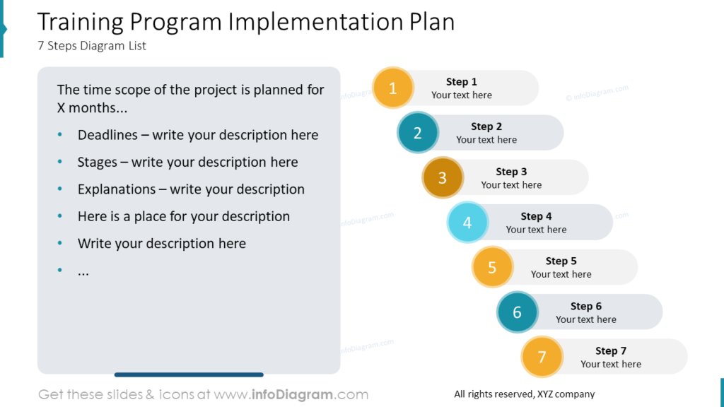
I think they would not. People can remember the information easier and faster when it’s visualized with graphics. The order of actions can be perfectly visualized with the steps diagram. It’s a metaphor for going forward and reaching the next levels.
Each step on the diagram above is one step of the training program implementation plan. Note that the step’s shape is created by combining simple rounded shapes in PowerPoint. Each step has a number assigned to it so finding the order of the whole process comes naturally. The combination of the text box with a list describing the process and a diagram visualizing the order is a very efficient tactic to make your implementation plan attractive to read and convenient to remember.
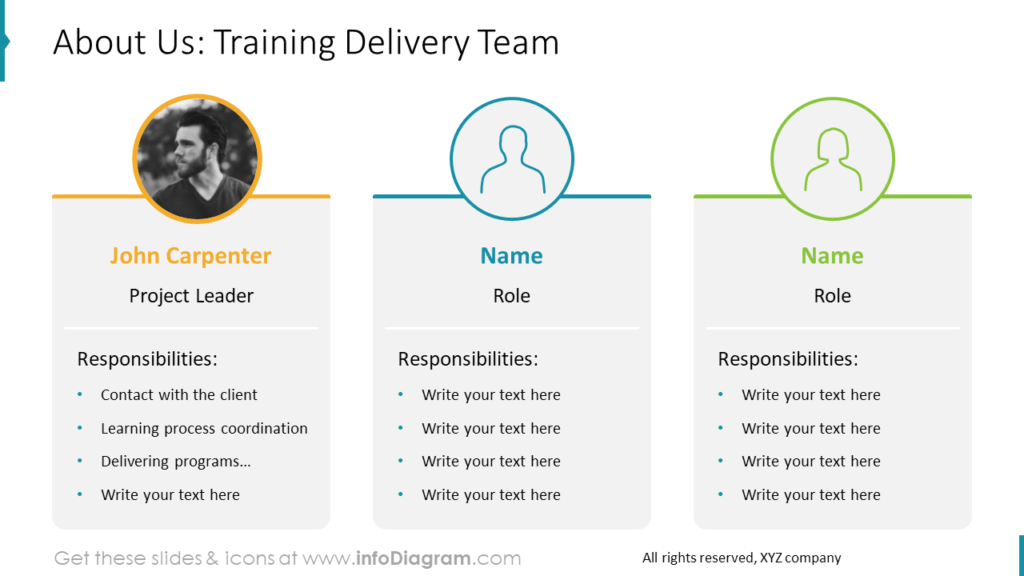
Introducing the Training Delivery Team Graphically
To make a presentation of your training team I would recommend presenting all the key information altogether:
- name and surname of the training project participant
- role in the training team – to know who is training manager, who is a trainer, and who is a support person
- listed responsibilities of a specific person, so a client would see complex work behind the training delivery
And then all the data of each person arranging into blocks which makes the presented information easy to compare. If you have a person’s picture you can upload it easily to a placeholder or just represent them with the icon of the man or woman. Additionally, you can tell each profile apart with a dedicated color.
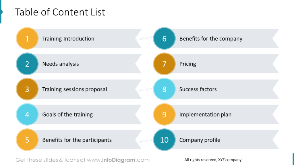
Visualize the Content of the Training Project Creatively
When your training proposal is a longer document, with over 10 pages and lots of details, it’s good to organize it into separate sections. Present clearly the section structure at the start of your proposal. Make a table of the content on one of the first slides, but use some easy-to-read and attractive visual form.
In my example, I decided to use chevron ribbons with numbers representation instead of making a typical numbered list on a slide. At the first glance, it’s clear how many positions the list contains and what the content of each is.
Creating the Training Services Proposal Document in PowerPoint – Benefits of Graphical Visualization
The training delivery offer and plan can be a quite complex document. It’s worth diversifying your content not to make your audience bored and keep their attention throughout the whole presentation. That’s why I recommend visualizing your data graphically like replacing bullet points with shapes or ribbons, combining attractive tables, or using pictures and icons. Understanding the presented information can be more efficient when it’s presented in an attractive and comprehensible way. Additionally, there are a few more benefits of data visualization:
- it lets your audience achieve the quick insights
- you can highlight the most important content
- you can explain complicated parts in the easy to digest way
- it provides the ability to see and understand information intuitively
In this post, I shared best-practice examples of presenting the content graphically and attractively. I hope it will inspire and help you create your training services proposal easier.
Resource: Training Services Proposal PowerPoint Template
The examples above are based on the graphics from a PPT template for training sales materials. All slides are available in the infoDiagram collection of presentation graphics:
Moreover, you can extend your data presentation with modern flat diagrams bundle right here.