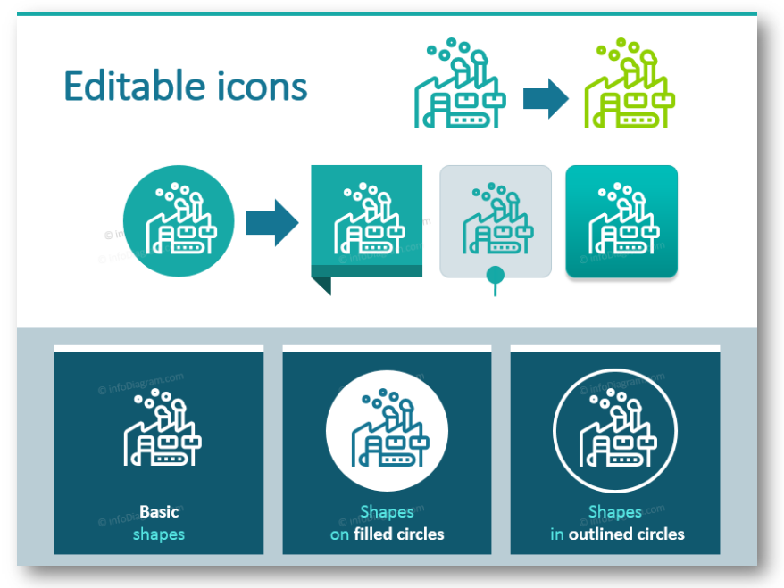
Five Creative Ways to Embed an Icon in Your Slide Design
Adding icons to your PowerPoint presentation is a great way to make your slide better understood. Of course, if you have a space for them. A little illustration for your key points creates a visual association and that makes it easier for the reader to remember the slide content.
I am sharing here several design ways how you can blend symbols with your content, to make your presentation look professional.
I assume you have already chosen the proper icon for your content. If you didn’t yet, check my hints in the article How to Find the Right Icon. For my example, I will use graphics from the infoDiagram sample, that contains a set of our free icons.

Check and download our sample of infoDiagram PowerPoint Icons and Diagrams here at no cost.
The next step is to make the symbol play nicely with the rest of your slide. I recommend the following 5 simple graphical ways how you can embed the icon. From simple and quick to more creative ones. Let’s go through them and see the slide examples.
1. Add icons on white space as they are
If you are on a tight deadline and every minute counts, simply copy the icon in its original form. You may need to change its size, however, remember two things:
- keep the symbol proportions. Don’t stretch it, don’t make it wider or taller. Usually, it makes the icon look bad.
- Make sure there is enough space for the icon, so it is not too close to other slide elements.
See the example of a slide with agenda, where each item has its own icon.

2. Recolor icon to fit assigned point
The next way to make the icon fit nicely on the slide is to alter its color to fit the point they refer to.
To freely edit the color of the icon you need to have them in a vector format. In the case of non-vector bitmap formats such as PNG or JPG, the icon recoloring is limited.

By the way, this is also a reason why we provide icons in vector format in our infoDiagram templates, so the users can modify their look. All infoDiagram presentations have an instruction slide on how to edit icon color.

3. Put an icon inside a shape, for higher contrast
If you want to emphasize the symbol, a good design trick is to place it inside a shape, a circle, or a square for example. Then you can apply stronger background color and make the symbol white.

4. Integrate icons with other content
Another idea is to make your pictograms blend into the other slide graphics. This way you can create one nice consistent infographic. And it does not need to be time-consuming. The trick is to use background shapes in the color of other graphics, or slightly darker.
See how we integrated symbols of pie chart categories with a chart itself:

Designer tip: To pick exactly the same color of a shape as some other object, use the Eyedropper tool. You can find in Shape Fill options, under a set of colors.
5. Use the icon as the slide’s main visual
You can also add a graphic symbol as the main element on a slide. That works well, especially in the title slides or transition slides.
Check the example below – we applied here also placing the icon inside the shape.

Conclusion
Icons are a powerful way to make a presentation or any other document more visually appealing. I hope the examples above will give you inspiration on how to use those icons so you can create an attractive slide that will engage your audience.
You can see more examples of using icons in the various presentations in the resources section below.
Peter Zvirinsky
slide design wizard, and diagram-nerd
infoDiagram co-founder
More resources to get you started
PowerPoint Graphics
- Best-value icon bundles with 700+ symbols or 200+ diagrams
- Smaller specific icon sets e.g. logistics, IT, or medical icons
- Content-ready business topics e.g. project management, finance, or ecology.
Learn more
- How to Find the Right Icon
- Outline vs Flat Icon Style Graphics
- How to choose a diagram? 18 Categories to Cover Major Structures and Processes


