Visualizing the Process and Structure with Train Graphics in PowerPoint
Are you looking for ideas on how to visualize a process or a roadmap? Today I’d like to show you a wide usage of the train graphics in the presentation. With locomotive and carriage shapes, you can symbolize the following chapters, steps, or periods. With those graphics, you can build on the creative and meaningful touch of your presentation.
Let me inspire you with examples of trains graphics used:
- presenting the company structure infographics
- visualizing the problem-solving process roadmap
- presenting the statistics with a train iconographic chart
- illustrating the gap analysis with the railway bridge
- showing the several steps process with the railroad timeline
Get all the graphics presented here – click on the slide pictures to see and download the source illustration. Check the full Train Presentation Graphics PowerPoint Template.
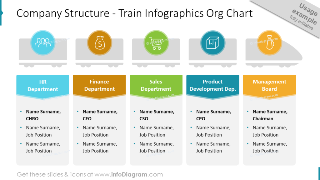
Presenting the Company Structure on the Slide with Train Graphics
If you want to present the organizational structure of your company, consider using creative infographics. The metaphor of a train with carriages can represent nicely the idea of company departments – connected together, going in one direction.
On the slide below I decided to present the five departments of the company:
- HR department
- finance department
- sales department
- product development department
- management board
However, the train theme is very flexible to use and you can add (by copying and pasting) new carriages if you need to present more departments or remove (by selecting and deleting) unnecessary shapes if you present less amount.
Every carriage is symbolizing each department from the company structure, it’s visualized with representative icons. The management board is located in the locomotive shape as the leaders of all departments. Under the train graphic, I placed text holders for departments’ naming and descriptions. To make the content easy to understand, each department is assigned a color, and departments’ names are placed on arrow shapes directing the column where the proper description is provided.
If you’re looking for a way to make your organizational chart look creative and modern, check this blog out.
Visualizing the Problem-solving Process with the Train Roadmap Slide
Another creative use of the train graphics is to visualize the process on the roadmap. Here you can apply the idea of a rail track.
My example contains six steps to solve the problem and the road with locomotives and carriages. As the locomotive pulls all the carriages from point A to B, the same we go step by step through the whole process to achieve the last point.
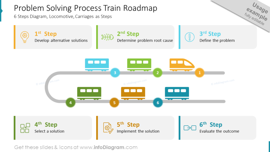
I used color coding between the train and text frames. Each step has a dedicated color which is reflected on the roadmap. I also enriched the steps’ descriptions with icons to make the content visually attractive. I used the light outline-style icons to not overwhelm the slide and to keep the train illustration the main one.
See three creative ways to design a roadmap slide.
Presenting the Statistics with a Train Iconographic
To visualize numbers interestingly, you can create a simple infographic with icons. If your data are transport-related, then the icon of a train is obvious to use. Let me show this on the example of the passenger statistics iconographic.
All the shapes, I use to create graphics for PowerPoint slides, are vectors. It means that they are scaleable and can have reduced and enlarged sizes without quality loss. It gives many possibilities for creative designs. Take a look at the slide below.
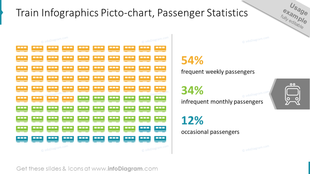
I resized one of the carriage’s shapes and duplicated it in such a way as to create a matrix. Then it’s just a matter of assigning colors and providing proper data adequate to the presented content. It’s an unusual and visually pleasing way to present statistics.
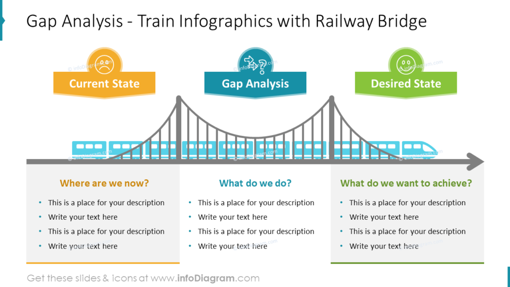
Illustrating the Gap Analysis on the Slide with the Railway Bridge
An illustration of a train crossing a bridge is a great metaphor for the gap analysis process, where the current status transforms into the desired one.
Such business analysis has usually three sections – analyzing the current situation, a goal we want to reach, and the path to get there. The slide with gap analysis content can be divided into three columns representing:
- current state
- gap analysis
- desired state
Every column has a text frame to provide the description and is visualized with an adequate status icon. As the final result, I decided to connect columns with a bridge illustration and a long train crossing it, to show the dynamic of the process.
Explore more ideas on illustrating gap analysis here.
Showing the Multiple Steps Process with the Railroad Train Timeline
Do you have the same dilemma as me sometimes? How to fit the dense list of items on the slide and keep it readable and visually attractive? I think this is one of the hardest challenges during working with slides in PowerPoint. That’s why I decide to use the train graphics to visualize the process containing 10 steps, to show you that dense lists can look good.
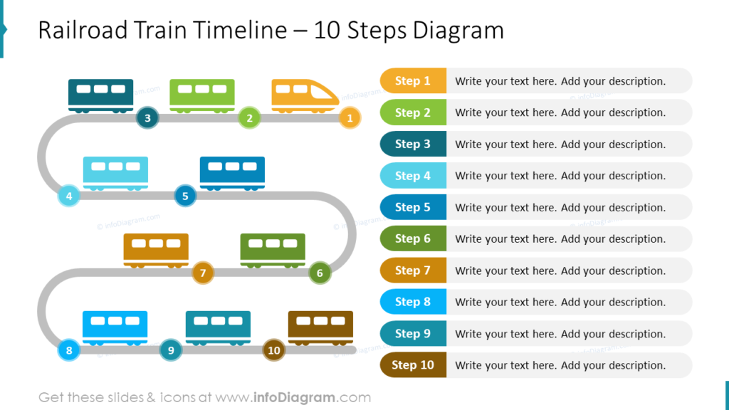
Each carriage is symbolizing one step from the list. As the first step is the beginning of the whole process, it’s symbolized by a train locomotive. Because of big amount of elements on the slide, it’s necessary to keep the colors consistent and not put too much text (only the most important information) otherwise, the slide can be overwhelming and hard to read.
Things to Remember about Visual Presenting of the Process and Structure
Graphical visualizations such as locomotives and carriages make the PowerPoint slides more creative and attractive to the audience but it’s needed to remember about few simple rules to not overdo the presentation:
- too much information on the slide disturbs the attention
- keep color consistency
- use vector shapes to resize them quickly and reuse
- make content easy to understand by representing it with icons
I’m sure that with the train graphics I just presented, you can create awe-inspiring and unique slides.
Resource: Train Graphics PowerPoint Template
The examples above used the graphics from a PowerPoint template on the concept of train graphics. All slides are available in the infoDiagram collection of presentation graphics:
Moreover, you can extend your data presentation with the outline business icons deck.