How to Illustrate Levels Clearly Using a Hierarchy Diagram
A hierarchy diagram is a visual representation of a system or organization, showing the relationships between different levels or components. It can be used in a variety of fields, from business management to education to computer programming. In this blog, we’ll explore the benefits of using such diagrams, different types of diagrams to show the concept of hierarchy and a guide for creating your own.
Purpose and benefits of a hierarchy diagram
Before diving into creating a hierarchy diagram, it’s important to understand its purpose and benefits. It helps to organize complex information into a clear and concise visual representation.
A hierarchy diagram allows you to see the relationships between different levels or components of a system or organization, making it easier to understand and communicate. Additionally, it can help identify areas for improvement or optimization within the system or organization.
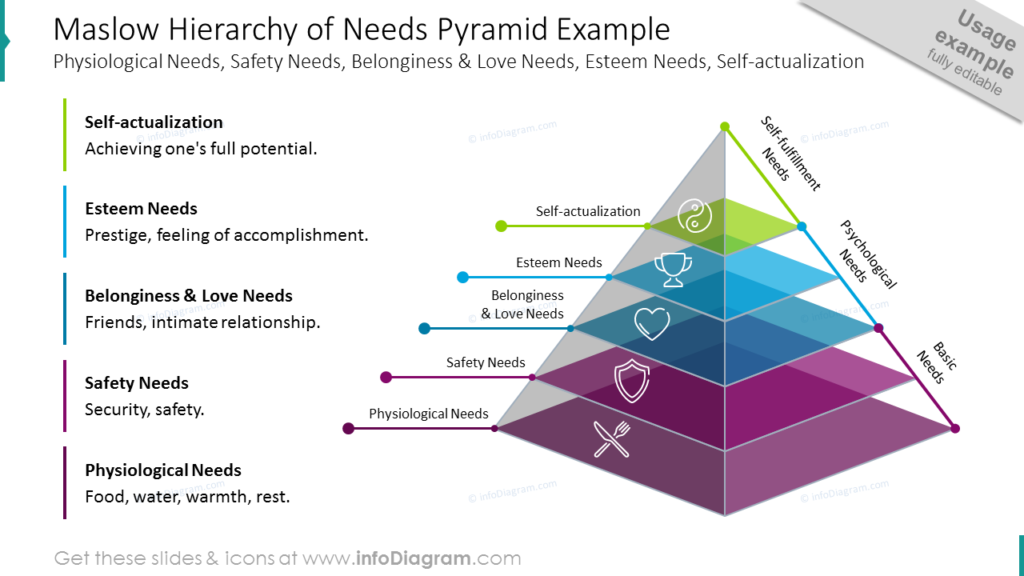
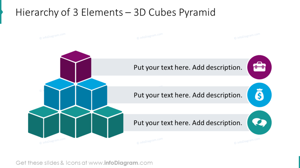
Here are some examples of the hierarchy diagrams you can use in your presentations:
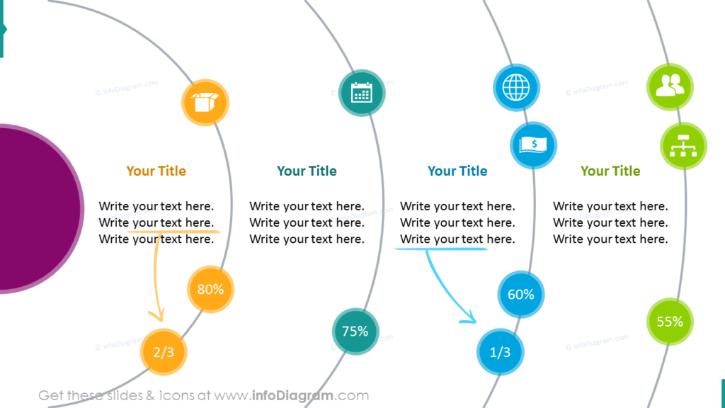
And a more creative option for illustrating levels of hierarchy with orbit infographics:
Choose a layout and design for your diagram
Once you have a clear understanding of the information you want to show and the relationships between different components, it’s time to choose a layout and design for your hierarchy diagram.
There are many different options to choose from, including tree diagrams and organizational charts. Consider the purpose of your diagram and the audience you will be presenting it to when selecting a layout and design. It’s important to keep the diagram clear and easy to understand, so avoid clutter and unnecessary details.
Example guide on creating a hierarchy diagram in PowerPoint
In this guide, our chief designer shares a case study of creating an appealing hierarchy diagram on the example of a risk levels pyramid. He explains why it’s important to spend time on content analysis, shares the types of diagrams you can use, shows how to use the SmartArt tool, and a few tips on how to make such a diagram look more appealing.
You’ll also learn why consistency is important, how to use color coding, and see how to redesign plain text in 5 minutes!
Follow our YouTube channel if you want to see more of such guides, and subscribe to our newsletter to get more design tips and slide inspiration.