How to Present Quoted Company Financial Report in PowerPoint
Do you want to present a quoted company financial report in an eye-catching way? Consider using visual diagrams and customized data charts in PowerPoint. It’s an easy way to showcase financial information and engage your audiences. In this article, we share slide ideas to effectively demonstrate quoted company financial results, including ownership structure, revenue and profit snapshot, and capital market ratios.
Get all the graphics presented here – click on the slide pictures to see and download the source illustration. Check the full Listed Company Financial Report Presentation Template.
Presenting Overview of the Listed Company Financial Profile
We propose to start a presentation with general information about the quoted company. You can visualize the most important facts related to the company such as the compound annual growth rate, a number of brands, the growth ratio, and the current shareholding structure.
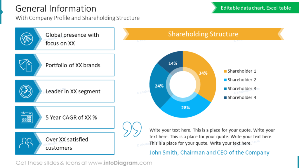
To show this information in a compact way we suggest using simple shapes and icons related to the content. For example, global presence is illustrated by the icon of the world, and leadership is illustrated by the icon of the compass. The icons can evoke emotions or associations, helping to create a connection with the audience and enhance the persuasive power of the presentation.
In the slide picture above you can see we used a pie chart to show the shareholding structure. We suggest using a simple chart look, avoiding 3D effects or shines, and keeping the flat design. You can add some minimalistic strokes to enhance the visual appeal of such a slide.
Showing Ownership Structure in an Attractive Way
If you are looking for another way to show shareholder structure than the one above, here’s a different idea of how you can create simple ownership chart infographics.
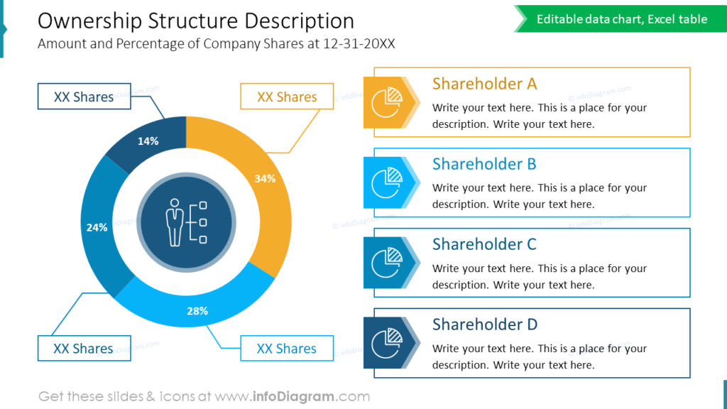
For illustrating the ownership structure of a quoted company get inspired by the slide above. We proposed a way how you can present a major shareholder of a publicly traded company chart. We used a doughnut chart with separately designed legends. To highlight the main stakeholders, you can enhance the legend with icons.
Notice that the slide gains a professional look if you use one distinctive graphical style – here outlined shapes and if there is enough whitespace.
Revenue and Profit Snapshot Dashboard in PowerPoint
If you want to present a financial snapshot of a company you can create a dashboard slide like the one below, showing revenue and profit data.
The slide shows sales and profitability evolution including a visual presentation of key financial indicators such as:
- net sales
- operating expenses
- EBITDA
- PBT
See a slide design we proposed for such a financial dashboard.
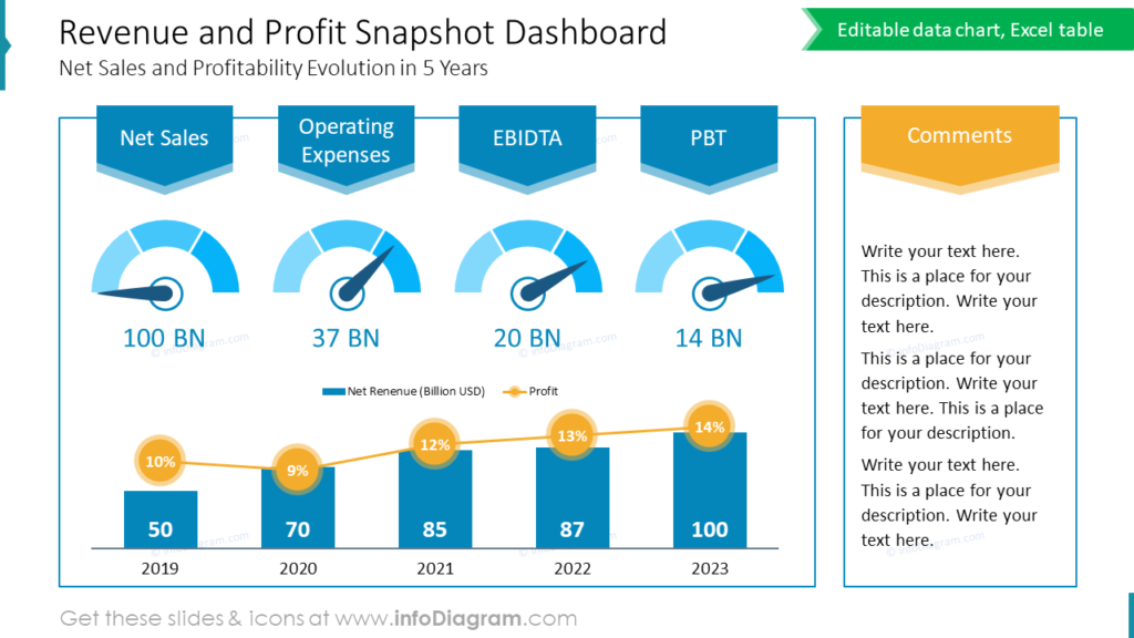
During the design of this slide, we decided to group the content of two sections (data and comment parts) using light outline rectangles. It’s a good way to support the intended reading flow. Remember about using white space wisely – don’t stuff too many objects too close to each other, and keep objects aligned. Here, the reader will logically first read the left side with data details and afterward move to a frame on the right with comments and remarks offering an interpretation of this data
We suggest using gauge indicators to show if the financial KPIs reached target levels. These gauge charts quickly convey current value versus target value information attractively. For illustrating revenue and profit we used a bar chart with a line graph showing profit percentage value.
Financial Performance Data Visualization of Listed Company
Do you need to show an easy comparison of multiple performance data across different periods, business units, or competitors? Use a one-sheeter slide format. It’s a good way to present the listed company’s relative performance in the market at a glance.
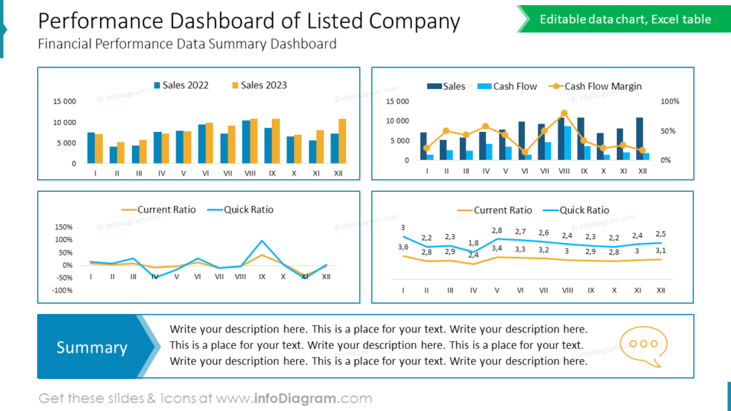
Notice how we compiled several financial data charts and a summary together in one consistent slide. The trick is to use a regular layout with aligned objects. The charts are of the same width, as well as gaps between them. This creates a professional slide look. A summary placeholder is at the slide bottom area to follow the natural reading flow from top to bottom.
Visualizing performance data through visually consistent charts, and diagrams in clear PowerPoint slides helps to make financial reports easier to understand, enhancing clarity for the audience.
What to Remember about Visual Presenting of a Quoted Company Financial Report
If you are working on the similar presentation of the financial results of your company, remember a few simple design rules for an eye-catching, and easy-to-understand presentation:
- pick one graphical style that aligns with your theme and apply it consistently,
- create clear charts and diagrams helping the audience to analyze trends more effectively, gaining deeper insights into the quoted company’s performance over time,
- use simple shapes, outlines, and graphical elements to highlight key content,
- add illustrative icons, making the slide universally understandable and impactful.
I’m sure that with these basic design rules, you can make a stunning presentation and overall impression.
Resource: Listed Company Financial Report Presentation Presentation PowerPoint Template
Examples above used the graphics from a PowerPoint template on the topic of Listed Company Financial Report Presentation. All slides are available in the infoDiagram collection of presentation graphics
Moreover, you can extend your presentation with business growth strategy visuals.
Subscribe to the newsletter and follow our YouTube channel to get more design tips and slide inspiration.