How to Present Real Estate Property with Impact Using PowerPoint
Do you need to present real estate property in an impactful way, or create an eye-catching leaflet showcasing apartments to sell or rent? Without investing a ton of money for a designer, you can use a tool you are already probably familiar with – Microsoft PowerPoint. Let me inspire you with examples of slides that not only convey information but do so with style and visual appeal.
A property presentation materials have typically structure like this:
- General information about the property (what it is, how big, best pictures).
- Main characteristics like location, number of bedrooms and bathrooms, and area of property.
- Interior, with a description of the living area, kitchen, bedrooms, and bathrooms.
- Exterior with examples.
- Overview with a few pictures gallery of property.
- Contact information.
All this information can be easily represented within a PowerPoint presentation that you can export to PDF and print. Additionally, PowerPoint gives you the flexibility to change content or replace pictures even when you are offline.
I’d like to share a few layouts that I would use as a presentation designer for creating a real estate leaflet.
Get all the graphics presented here – click on the slide pictures to see and download the source illustration. Check the full Real Estate Property Presentation.
Start with Property Introduction
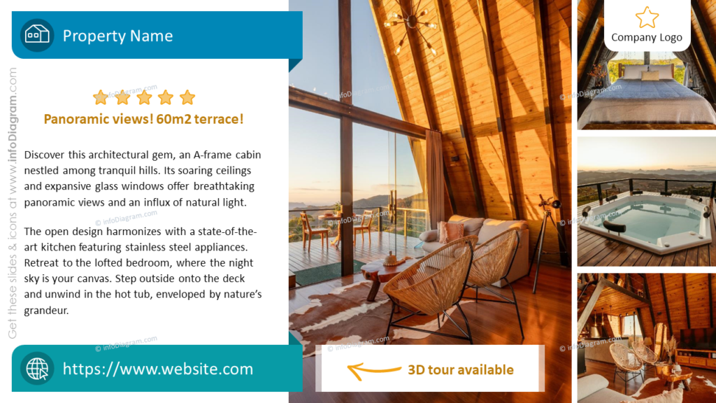
This slide is all about showing off your property. On the right, there is a place for putting stunning photos that show off the home’s best features — like that cozy A-frame cabin bathed in sunlight. On the left, add a quick rundown of the important details. A bold text at the top with the property’s highlight, like the ’60m2 terrace’, makes sure it stands out. This design is easy to change up with different photos and facts to match any property. Notice also ribbons on top and at the bottom with icons and names of the property and website.
Main Characteristics Display
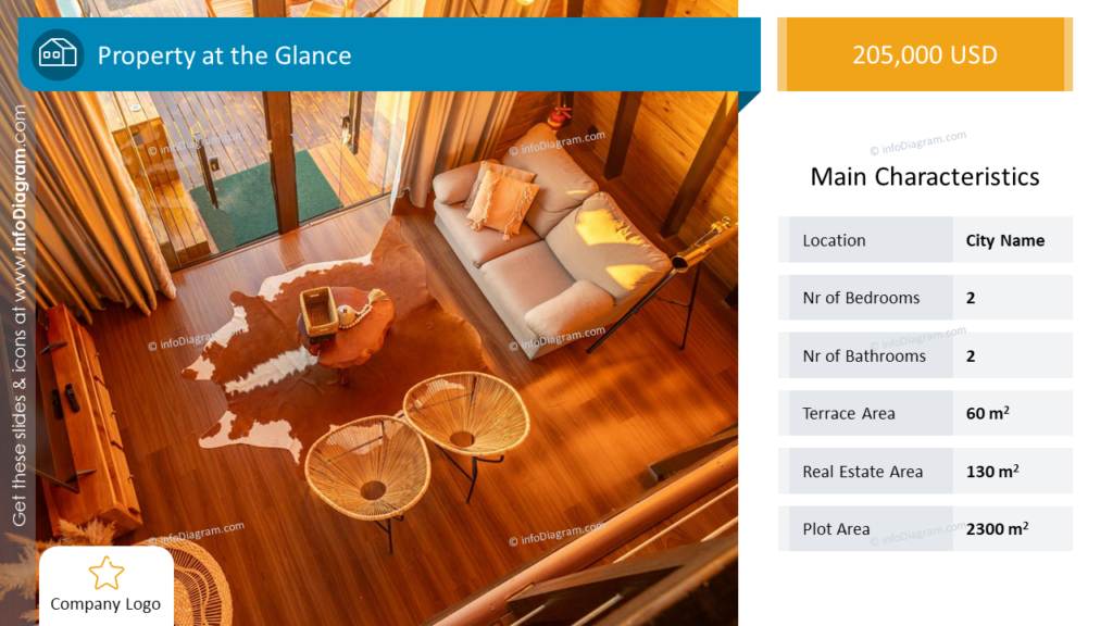
Here is a snapshot of the property’s essentials, making it simple for viewers to get the key details at a glance. It’s clean, direct, and to the point. A welcoming image on the left invites the eye. The right side could feature a list of characteristics, from the number of bedrooms to the total area, each visualized with a corresponding icon to make them stand out. A subtle color block behind the text helps to draw the eye, while a soft background can give the slide a professional and polished look.
Interior Exploration
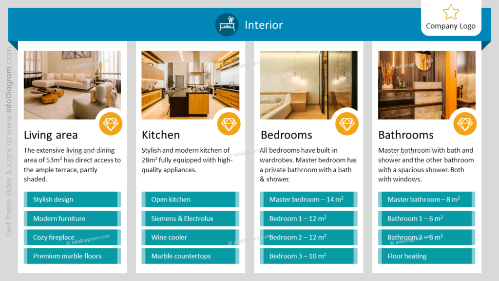
Take a quick peek inside the home with this ‘Interior’ slide. It’s laid out with four clear photos that show off the main spots: the living room, kitchen, bedrooms, and bathrooms. Below each photo, there’s a place for a little list of highlights, like a ‘cozy fireplace’ or ‘fancy appliances’, each on a nice vibrant rectangular background. The design is super straightforward, so you can get the feel of the place and the details.
Exterior Showcase
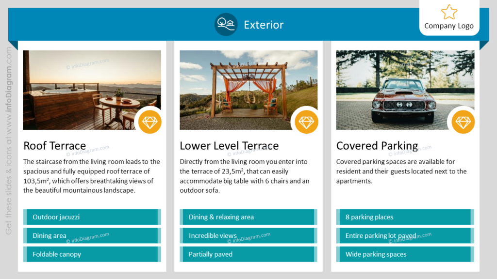
Presenting real estate is also about showcasing the exterior. Check out this slide – it’s like giving people a virtual tour of what’s outside the house. You’ve got three photos that show off different spots: it might be a roof terrace that’s all about the views, a lower terrace that’s perfect for hanging out with friends, and a covered spot to park cars. Under each photo, there’s a quick list with a color background that tells you what’s cool about each place, like a hot tub on the roof or lots of room to park. The design is super straightforward, so you can get the feel of the place and the details.
Visual Summary
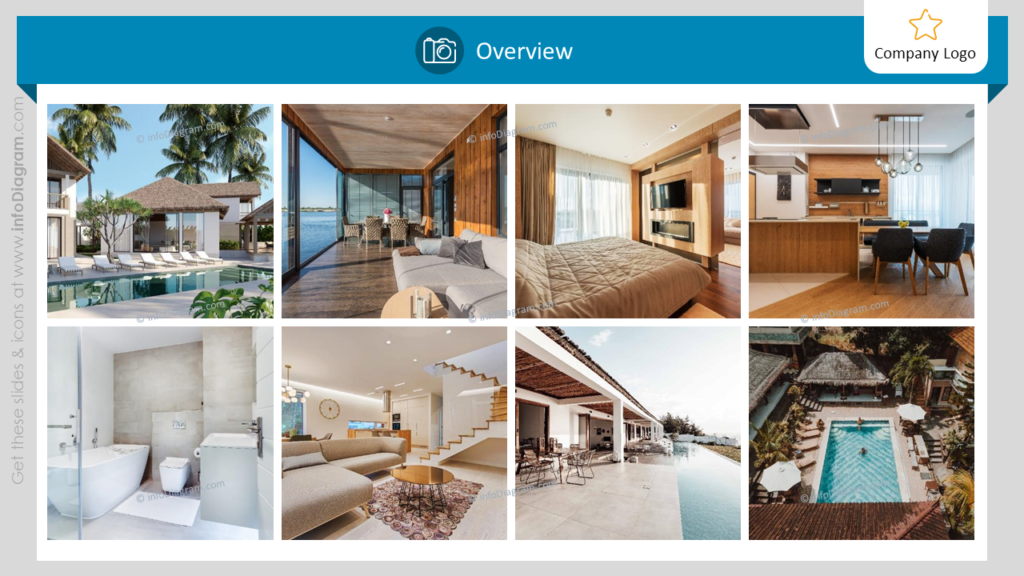
Create a mosaic of images on this slide, giving a visual summary of the property. The use of a grid layout allows you to present a variety of spaces and angles, giving a well-rounded impression of the property. You can place a translucent banner with the title e.g. overview, above the images for a modern touch and consistency with other slides.
Designing a presentation for real estate is about creating an experience. Through thoughtful design, strategic layout, and the clever use of visuals, you can present real estate in a way that is not only informative but also inspiring and memorable.
What to Remember about how to Present Real Estate Visually
It’s useful to know a few simple design rules connected with creating real estate presentations:
- Stick to one style and color palette for consistency.
- Enrich your text with icons – properly chosen icons can perfectly show what you are talking about e.g. icon of the interior.
- Use the same margins on each slide, it will make your presentation look more professional.
- Choose the best photoshoots you will find, and keep it visually welcoming.
I’m sure you can make an impactful presentation and overall impression with these basic design rules.
Shortcut to create stunning Real Estate presentation
The examples above used the graphics from a PowerPoint template Real Estate Property Presentation.
All slides are available in the infoDiagram collection of presentation graphics here:
So if you want to create your real estate presentation quickly and visually appealing you can use this template. Simply add your pictures into predefined placeholders, replace texts, and enjoy a beautifully craft deck.
Subscribe to the newsletter and follow our YouTube channel to get more design tips and slide inspiration.

