How to Present Time Management Matrix in PowerPoint
Do you want to present time management topics? Consider using a visual way of explaining decision-making and time management methods, such as the Eisenhower matrix.
We show how to present the four quadrant boxes of decision-making and planning of action priorities.
The graphics presented here are based on our diagram design experience for presentations that focus on clarity and information visualization.
Get all the graphics presented here – click on the slide pictures to see and download the source illustration. Check the full Eisenhower Matrix for Time Management Presentation (PPT Template).
What is a time management matrix?
It is also called the Eisenhower Matrix which is a simple tool for prioritizing actions. Organizing tasks in the matrix layout helps you decide on task priority and focus on what’s critical.
The idea is to group actions into four boxes, organized by two categories: urgency and importance, as you can see below.
It helps you to decide what task to do first, what to schedule for later, what to delegate, and what to eliminate. This time management framework suggests you to classify your tasks as:
- Urgent & Important (tasks that require immediate attention and have a significant impact),
- Important & Not Urgent (important but not time-sensitive task),
- Urgent & Not Important (time-sensitive but not crucial issues),
- Not Urgent & Not Important (neither pressing nor critical).
If you want to present the time management approach visually, create a visual representation that is simple and clear. We created such a slide with this in mind.
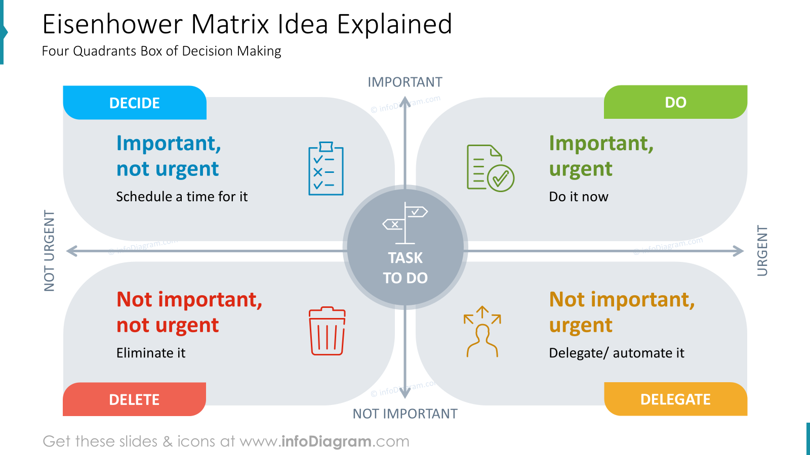
The slide with the Eisenhower Matrix consists of four parts. We used non-standard shapes to make the visual effect more interesting. Each box refers to one prioritizing action. Each of them is highlighted with a distinctive color. Therefore, green is used to signify tasks to be done and red signifies tasks to be deleted. Thanks to this distinction, you can easily show actions by category. Additionally to each box, we added icons that symbolize categories.
Such a composed slide helps users focus on what matters most, ensuring a quicker way to explain the idea of the time management framework.
Presenting benefits of using Eisenhower matrix based decision making
If you want to list the benefits of this time management method, do it in some interesting visual way instead of having only a list of bullet points. For example, you can use diagrams with icons illustrating each benefit. It is easy for your audience to grasp the advantages at a glance.
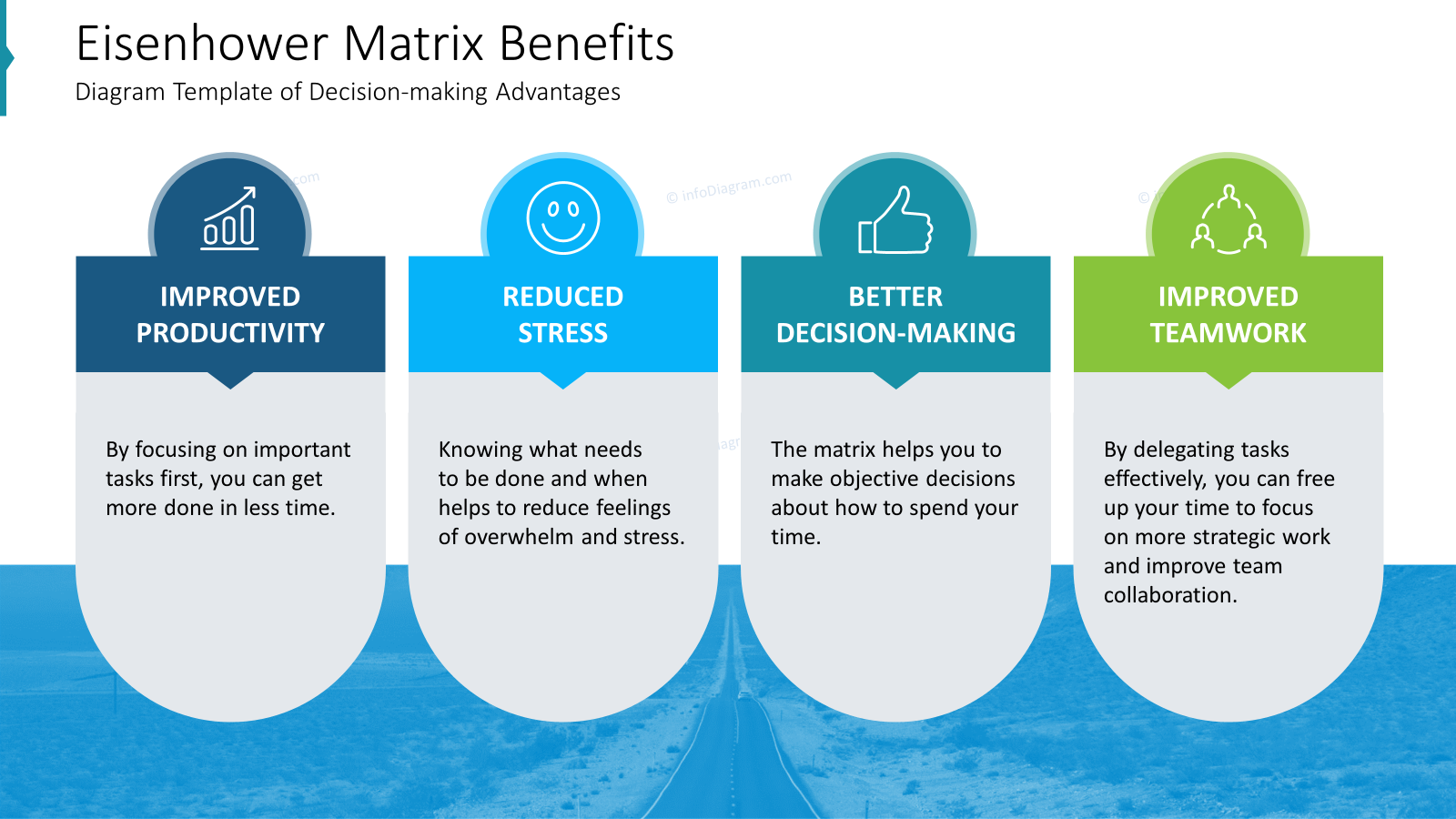
In the slide above, we show you the idea of a slide about decision-making advantages. Here we had four benefits, but this design is easy to change for more and fewer points.
We used round shapes. The shape of a circle is softer and signifies continuation and flow. If you want to evoke a positive association, consider using round shapes in design. Of course, these associations can vary based on personal experiences, but it’s some common principle. In this case, we combined a few different shapes to create visual interest. Remember that simplicity is key in design, so avoid using too many shapes, just try to convey a complex message in a simple way.
Share examples – Time Management from Financial sector
Here’s an example of how such a matrix can look filled with specific tasks from the fintech industry.
Example tasks can include each section:
- Responding to a critical tax audit – this would be Do First
- Negotiating with a key lender to restructure debt – this would be Do First
- Developing a long-term financial forecast – this would be Scheduled
- Analyzing costs and benefits of new software – this would be Scheduled
- Regularly browsing personal social media at work – this would be Deleted
- Responding to every single email notification – this would be Deleted
- Preparing travel arrangements for an upcoming conference – this would be Delegated
- Generating routine financial reports – this would be Delegated
From the design point of view, notice how we used small details to make the slide consistent … bullet-point coloring corresponds to meaning – red for delete, yellow for delegate, blue for schedule, and finally green to do.
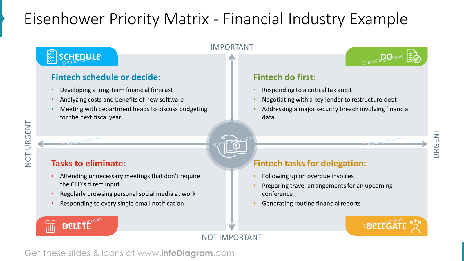
One of the important roles of a slide is creating impactful and effective designs that not only look beautiful but also communicate the right message to her target audience. In this example, we focus on the design flow between tasks and each section so that it can be easily read.
It’s an example of the financial industry, so we also used the financial icon in the middle of the slide to illustrate the subject.
Example of Net Zero Actions Priorities for a municipality
Here’s another example of prioritizing actions of Net Zero activities that a city can do. Following the Eisenhower matrix, those tasks can be assigned to 4 groups.
Example of global warming mitigation tasks can include
- Emission Assessment – this would be Do First
- Energy Efficiency Upgrades – this would be Do First
- Fossil Fuel Phase – this would be Scheduled
- Emissions Reduction Milestones – this would be Scheduled
- Supplier Engagement – this would be Delegated
- Research Partnerships – this would be Delegated
- Ignore Stakeholder Engagement – this would be Deleted
- Delay Emission Reductions – this would be Deleted
You can present it as a to-do list graphics on a slide, as we did below.
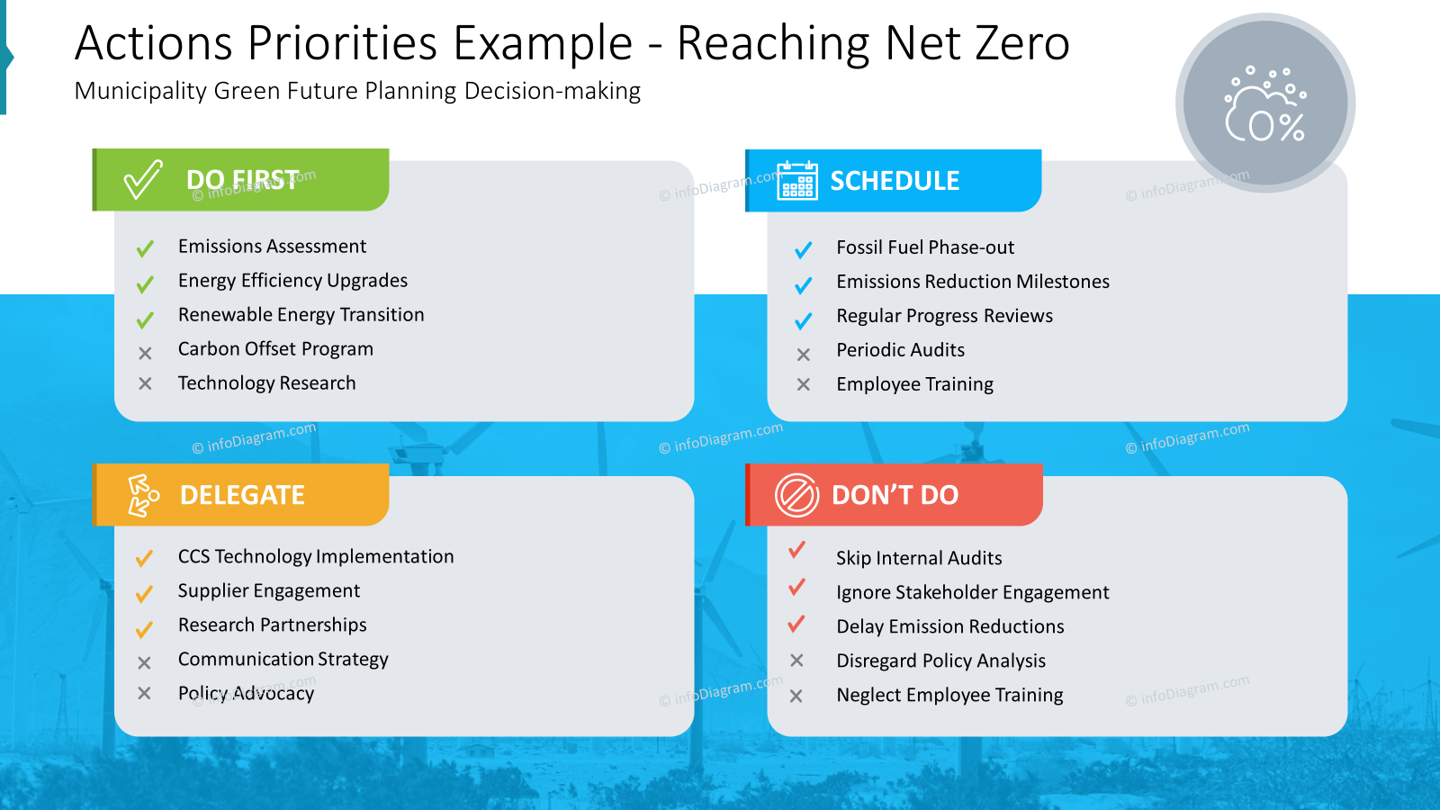
To visualize these tasks we created 4 fields, each for one section. As in the previously discussed slide of Eisenhower Matrix in this slide, we used the same idea about distinctive colors and icons for each section. For better recognition subject we added also the icon of the cloud with 0% which refers to reaching net zero.
If you would like the slide design to be more interesting, you can experiment with the background. We suggest adding some pictures with the mask layer. The slide looks more balanced and sophisticated.
Example of IT Tasks ToDo matrix
Another example is for IT department or IT-related tasks organization. This can include
- Server Outage Fix – this would be Do First
- Critical Security Breach – this would be Do First
- Strategic Planning – this would be Scheduled
- Travel Arrangements – this would be Delegated
- Routine Report Review – this would be Delegated
- Social Media Monitoring – this could go to the Don’t Do Group
You can present it as a to-do list graphics on a slide, as we did below.
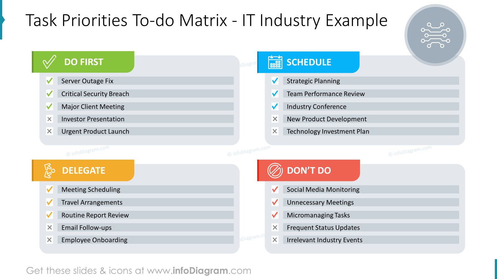
This tasks management slide design focuses on the visual way of representing a To-do list. Each task is placed in a separate field with various colors. You can add visual markers to indicate the status, of what is done and what is not done. It’s an easy way to make a harmonized slide with a to-do list.
Illustrating time management presentation by a quote
To make your presentation more engaging, you can present time management quotes. To do so you can consider using the slide design idea we show below.
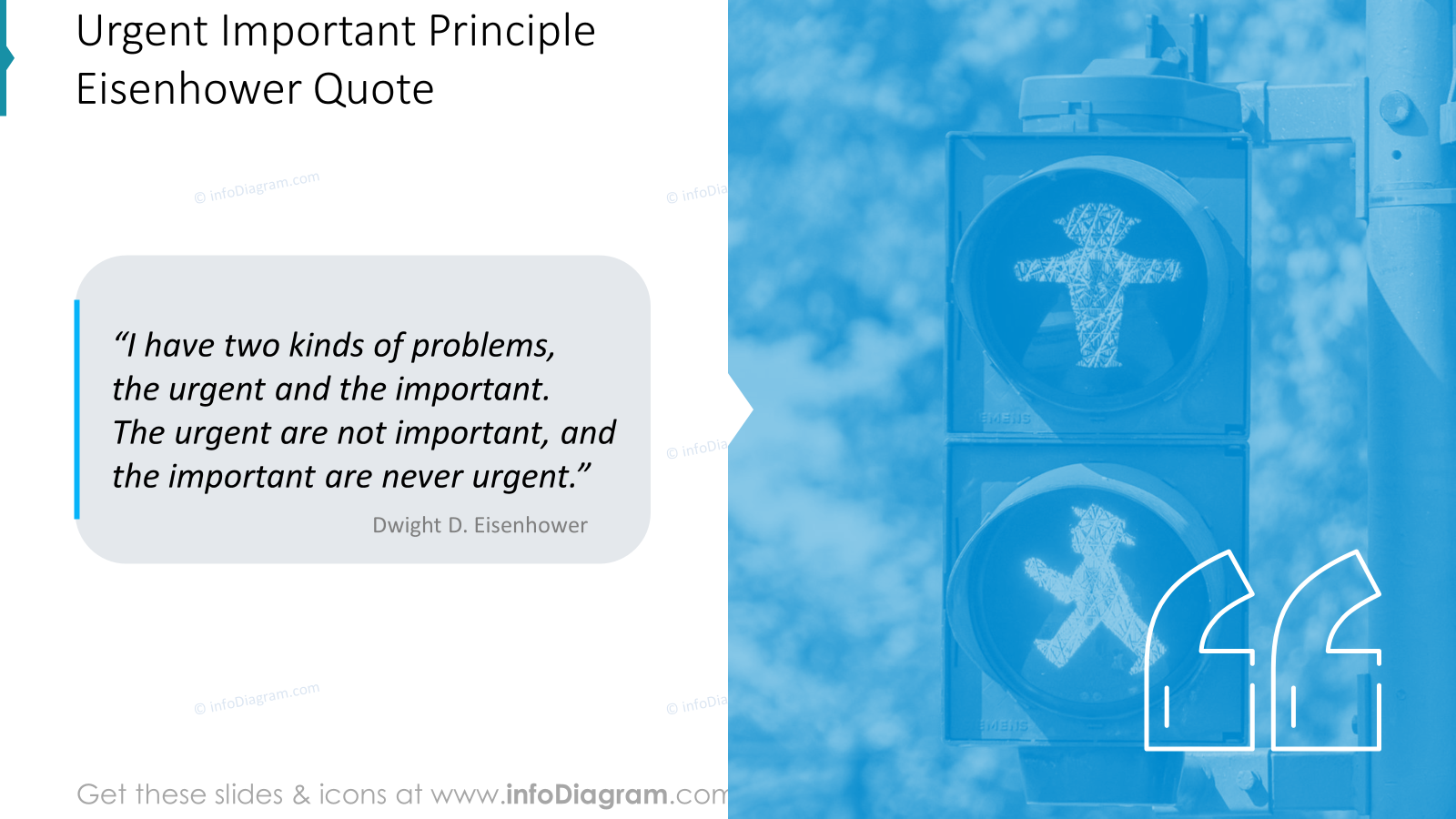
We suggest inputting the quote in a speech bubble, it’s a common way to draw the eye to important elements in your design. Moreover, you can add icons with quotation marks thanks to which the audience will know that the slide is about citation. We also added a picture on the background to present time management approach.
Key Tips How to Present …
When you create a Time Management presentation, keep these simple design guidelines in mind for a clear, captivating, and easily understandable delivery:
- use a consistent graphical style throughout your presentation to maintain visual coherence,
- plan the layout of your slides, particularly for those containing a lot of text or data, to ensure a well-balanced and engaging design,
- add icons to enhance the visual appeal of your presentation,
- consider using distinctive shapes and colors to highlight the content,
- convey your message with a simple and balanced design, for visual interest, you can add a picture with a mask layer on the background.
By following these basic design principles, you can create a compelling presentation that leaves a lasting impact on your audience.
Resource: Eisenhower Matrix for Time Management Presentation PowerPoint Template
The examples above used the graphics from an Eisenhower Matrix for Time Management Presentation (PPT Template). All slides are available in the infoDiagram collection of presentation graphics.
Moreover, you can extend your data presentation with an Eisenhower Matrix for Time Management Presentation (PPT Template) right here.