Elevate Your eBook Design: Unleashing the Power of PowerPoint
Are you looking to create an attractive e-book to share tips, and best practices, or present a knowledge-rich lead magnet? PowerPoint is the perfect tool to help you with effortless ebook design. With its familiar interface, ease of use, and the ability to add graphics, pictures, and even MS Office objects such as Excel data charts or video links, PowerPoint provides the ideal platform for crafting your e-book and sharing it as a PDF document.
To make your e-book creation process easier, let me share a few inspirations, from a slide designer. Here I prepared a few examples of eye-catching e-book slides:
- incorporating a diagram into the content
- introducing the quote in an eye-catchy way
- arranging the content with appropriate layouts
- presenting the content with key points
- layout for stronger illustration impact – example of 2-column slide split
Get all the graphics presented here – click on the slide pictures to see and download the source illustration. Check the full E-Book PowerPoint Template for Lead Magnet Presentation (PPT format).
Modern style for ebook design
What makes an ebook document look up-to-date is the style you use.
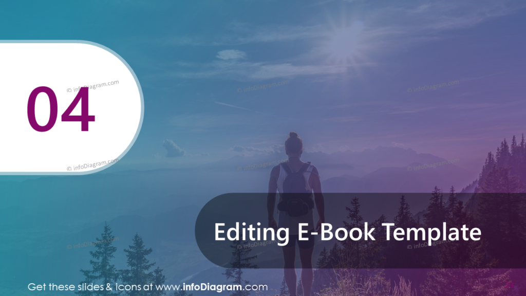
Here I present an example of a gradient graphical style – that is again getting very popular now in marketing materials. Additionally using violet base color gives it a modern vibrant and vivid touch. Notice the whole material is using this style consistently.
Incorporate a diagram into the content on a slide
Diagrams provide a visual way to represent complex information, making it easier for the audience to understand and process the content. So why not incorporate it into your ebook content? I like very much to verify the content with graphical elements (it makes the reading more interesting). Take a look on the slide below how I mixed a diagram with text and picture.
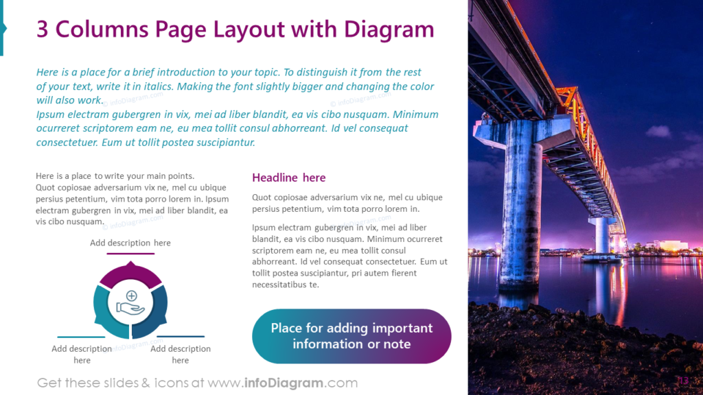
The picture covers one-third of the slide space, leaving the remaining area for the introduction and the text arranged in two columns. The diagram doesn’t need to be large. I intentionally kept it relatively small to allow space above for the description.
Highlight the quote inside the ebook in an eye-catchy way
Using a gradient background can add visual interest and create a more impactful and aesthetically pleasing slide. A gradient background draws the audience’s attention and makes the quote stand out. It adds depth and dimension to the slide, making it visually appealing and capturing the viewers’ focus. What’s more, gradients are a popular design trend in modern presentations, and using them can give your slides a contemporary and stylish appearance.
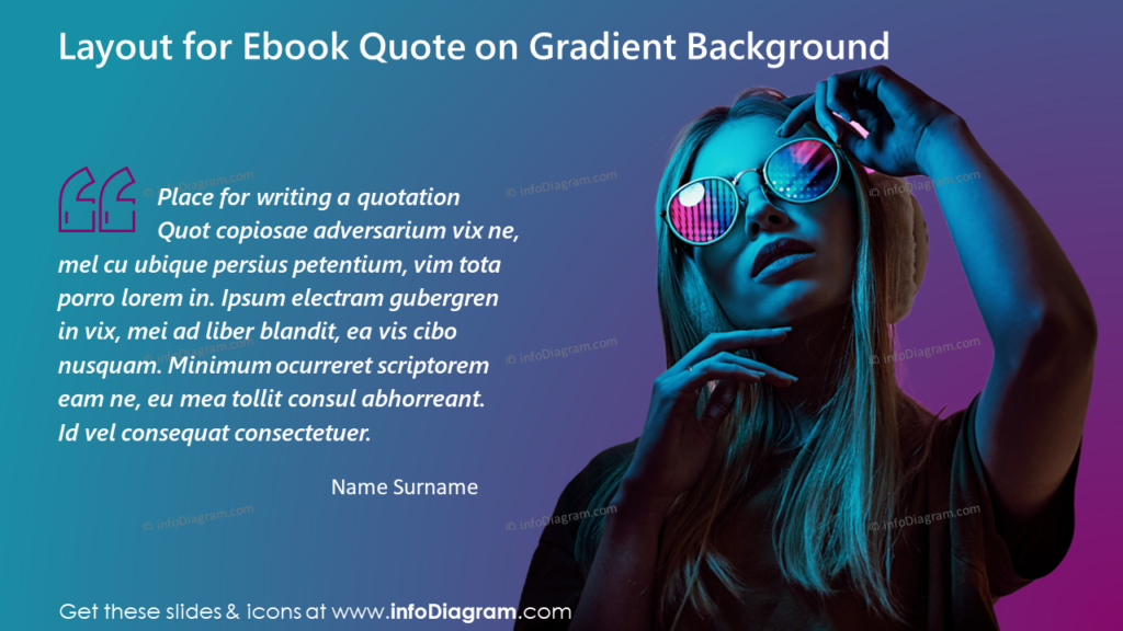
For my quote slide, I used a full slide of turquoise and magenta gradient. To emphasize the message I added an eye-catching picture and icon of quotation marks. But keep in mind that the effectiveness of using a gradient background depends on the specific message you want to convey. When used thoughtfully and in harmony with the content, a gradient background can elevate the impact and memorability of the quote in your presentation.
Arrange ebook content using layouts
If your ebook content can be organized in several sections, use that structure also in the ebook design. For example, if you have three parts you describe, use a column slide layout. Enrich it with thematic pictures or charts.
Arranging content with three pictures on a slide can be done in various ways, IMHO the most suitable for the ebook with horizontal slides is the three-column layout. The three-column arrangement provides a clear and structured organization of information. Each column can represent a distinct idea or topic, making it easier for the audience to follow the content and understand the relationships between different elements.
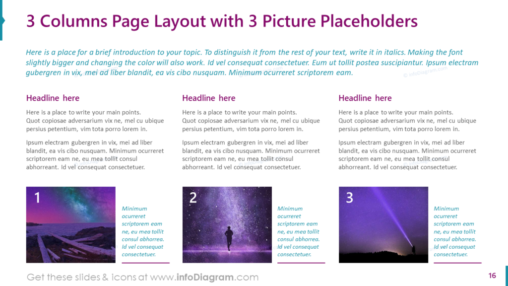
To make the content easier to understand I decided to number the columns and provide the picture description with a different color. Remember to leave some space around the images to avoid a cluttered appearance. Additionally, consider the placement of any text or additional content that complements the pictures.
Present ebook content with several key points or facts
Another way you can organize the content of your ebook design is to present it along with supportive data. In the example below I have four key points to show. Therefore I decided to create a 4-column layout.
Two of them are summarized with text on a gradient background and another two are enriched with a gauge chart that can present an important data value, fact, or status information. Let’s have a look at the slide below.
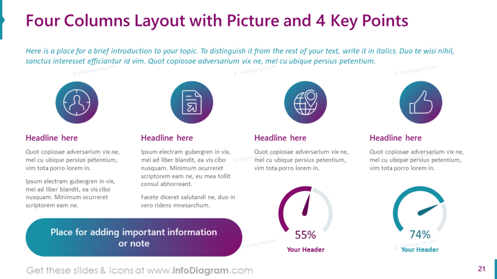
The gauge chart can be used to visualize efficiency measures, and accomplishment levels or show progress, depending on your needs. It’s essential for good ebook design to maintain color consistency. Otherwise, your slide may become cluttered and challenging to understand.
Ebook layout for stronger illustration impact – example of 2-column slide content split
Why it’s worth presenting the contents on the two-column layout with a picture?
Firstly, it allows for efficient use of space, enabling the inclusion of more information without overwhelming the audience. The two-column structure provides a clear separation of ideas, making it easier for viewers to follow along and comprehend the content.
Secondly, the picture placeholder adds visual appeal to the slide, making it more engaging and memorable for your readers. Images can help reinforce key points, evoke emotions, and enhance overall understanding.
Moreover, this layout ensures a balanced presentation, avoiding clutter and maintaining a professional appearance. The combination of concise text and relevant visuals captures the attention of the audience and increases retention.
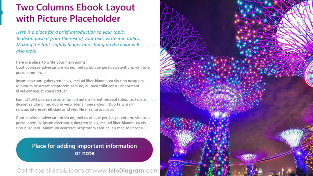
In my two-column layout, I have incorporated a full slide height picture placeholder, accompanied by a gradient space reserved for important notes. The text introduction is highlighted with a distinct color, further enhancing the visual appeal of the slide. These elements combine harmoniously to create a captivating and engaging presentation.
Creating the ebook design in PowerPoint – What to remember about various layouts
The ebook format is a popular way to create marketing material to be shared with your clients or leads.
And Microsoft PowerPoint is a handy and easy-to-use tool for creating visually attractive ebooks if you keep a few good design practices.
As a designer, I would recommend remembering those points when you will be crafting your ebook:
- Consistency: Maintain a consistent design theme throughout the ebook to create a cohesive and professional look. Notice how we used one set of outline icons and one set of colors.
- Visual Appeal: Use visually engaging layouts to capture the audience’s attention and make the content more appealing (arrange content into several columns, instead of just long blocks of text, and add theme-related pictures and backgrounds).
- Content Organization: Choose layouts that effectively organize information, making it easy for readers to follow and understand.
- Balance: Ensure a balanced distribution of text and visuals to avoid overwhelming the reader. Enrich text with photographs, and add diagrams and icons, as I presented on the ebook slides above.
- Variety: Utilize different layouts to add variety and keep readers interested as they progress through the ebook. Don’t repeat the same 3 column layout over the ebook.
- Accessibility: Keep layouts simple and user-friendly to ensure easy navigation and readability. Don’t stuff too much into one page, better split it into more. The ebook is an electronic format, so one more page won’t cost more.
- Contrast for emphasis: Use layouts to emphasize key points, important data, or quotes to make them stand out.
- Adapt for your branding: If you need to modify the ebook to incorporate your branding elements in the layouts to reinforce your brand identity throughout the ebook (like logo, colors, or fonts). Working with fully editable content in PowerPoint, such modifications are easy to do. However, remember about point nr 1. – consistency. Be careful with mixing too many styles, they should match somehow. For example, using icons is rather a neutral way to add graphics, but changing or extending the color palette you use will require more attention.
- Testing: Test the ebook on different devices to ensure compatibility and optimal viewing experience. The wide panoramic slide layout we present here fits perfectly for on-screen viewing. However, if you want to distribute the ebook as printed material, consider changing it to portrait format or standard 4:3 slide format.
By considering these points, you can create a visually appealing, well-organized, and engaging ebook in PowerPoint.
Resource: Ebook Design Template for Lead Magnet Presentation (PPT format)
The examples above used the graphics from a PowerPoint template on the topic of Ebook Layouts. All slides are available in the infoDiagram collection of presentation graphics:
Moreover, you can improve your ebook design with a 6 Best Design Practices PDF ebook.


