Visual Ways to Present Manufacturing KPI Metrics in PowerPoint
Are you about to present the manufacturing KPI or performance of a plant or a production company?
Get ideas on how you can show it visually. The manufacturing KPIs presentation typically can include the following topics:
- Summary and takeaways
- Manufacturing metrics explanations and definitions
- Overall equipment effectiveness
- Sustainable production elements
- Environmental KPIs presentation
- Capacity utilization data
- Labor productivity data
- Health and safety metrics
Why to present Manufacturing KPI data as Dashboards in PowerPoint
Company performance presentations are usually full of data and compiling them into simpler messages is difficult. What helps is to use visual aids that support clarity and data storytelling by the presenter.
Below we present examples of showing production company metrics and performance data charts.
Get all the graphics presented here – click on the slide pictures to see and download the source illustration. Check the full set of Manufacturing Metrics & Production KPI PowerPoint Charts Template.
Presenting key manufacturing company metrics and KPIs
You may start by listing the common Key Performance Indicators used to measure the performance of a production company.
Here are four categories of key metrics to consider:
- Productivity Indicators, such as Throughput, Cycle time, Capacity utilization, standard operating efficiency (OOE), Overall equipment effectiveness (OEE)
- Financial Indicators: Manufacturing costs per unit, energy costs per unit
- Process Indicators, for example First-pass yield, Quality measures (scrap rate, defects rate), On-time delivery, Machine set-up time, and downtime
- Human Indicators such as Labor costs, Employee turnover rate, Overtime rate, Total recordable injury frequency rate (TRIFR), Employee efficiency, engagement and satisfaction
As you can see, the list is quite long and hard to remember. To present it in a digestible way, consider using a list diagram instead of bullet points to enhance clarity and visual understanding. The following slide demonstrates our proposal on how you can effectively organize and present these metrics in a visually appealing manner.
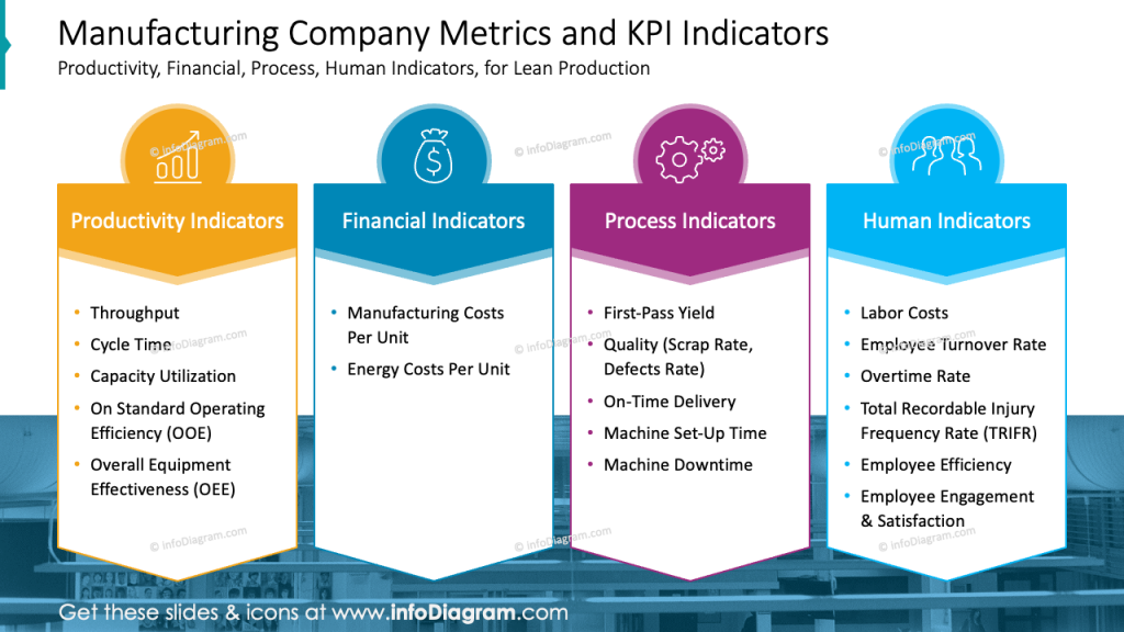
Each of the indicators is distinguished with a different color and the icons were added, to symbolize each of KPIs. Also, we improved readability due to the horizontal layout, which is more natural for human eyes.
Presenting Overall Equipment Effectiveness OEE dashboard
To show a set of data charts on OEE together in a readable way, apply two design tricks
- grid location – apply charts, graphs, or diagrams into sections to make the data more engaging and easier to understand
- color coding – choose colors that are easy to distinguish and visually appealing
To make the dashboard more attractive, try creating some custom charts – they will stand out and get more attention- e.g. gauge or progress bar charts.
Notice how we designed the slide below. We decided to use a three-column layout where the first column has two rows. It helps to avoid overwhelming the audience with too much information and lets focus on the most critical metrics.
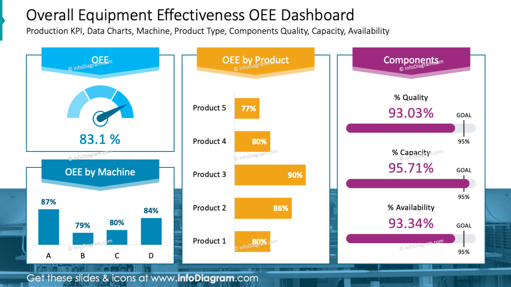
As you can see on the slide, all charts, titles, and descriptions are clear and easily understandable. This is achieved by using consistent colors for each section and highlighting titles with a label (in our case, a ribbon). Additionally, ensure that all data is presented in consistent units (e.g., hours, minutes, percentages) for clarity and accuracy.
Show sustainable production elements by a catchy diagram
To present a list of sustainable production elements and their dependencies, you can use a visual form of a diagram. It can be simple (e.g. PowerPoint offers a SmartArt tool to create diagrams). If you have more time you can enhance it with some additional graphics and shapes like we did on the slide below.
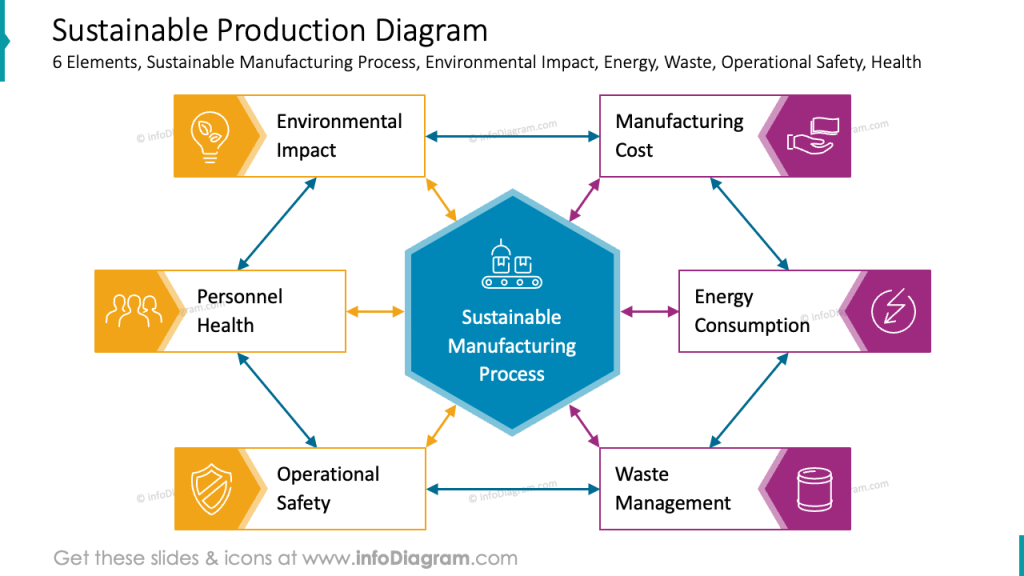
For each component of the diagram, we selected a simple symbol or icon, such as an environmental impact represented by a bulb with leaves inside. While creating such a diagram, you can customize the colors and shapes of arrows or create graphical labels for components (we used the chevron shape). These visual enhancements contribute to a more engaging and informative presentation.
Present environmental KPI as dashboard mixed with diagram
Presenting data on a dashboard is a powerful way to make complex data more understandable. For example, you can mix presenting the dependencies flow (by diagram) and include values of your KPI inside.
See how we designed such a slide where the KPI data are presented as a dashboard mixed with a diagram.
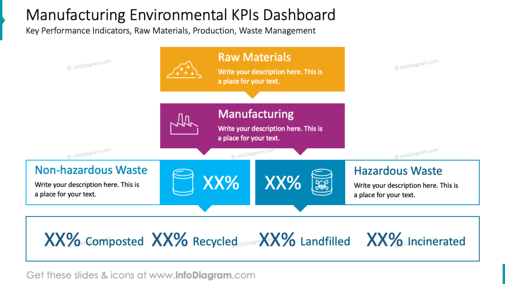
The structure of the slide is from top to down not like in most presentations from left to right. Such a way of presenting provides more options to distribute shapes and diagrams on a slide and clearly shows dependencies between each level (like on the slide above, the way from raw materials to different kinds of wastes)
Keep in mind that visual representation of data can facilitate more effective communication and discussion.
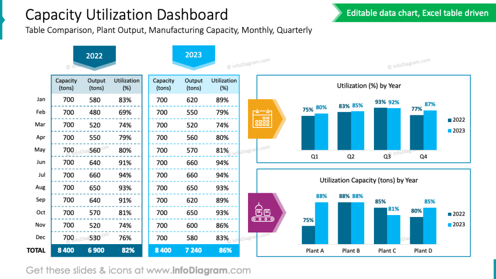
Presenting Capacity utilization data in a PowerPoint table and chart
See the example of PowerPoint dense data table presentations.
The slide below effectively uses color coding and visual elements to present a clear and informative comparison of plant output, manufacturer capacity, and utilization.
Notice color coding to show specific categories over slide:
- color variety – the addition of purple and orange to the charts adds visual interest and helps to break up the monotony of the blue color scheme
- visually differentiate between the two time periods – the current year is represented with a light blue while the previous year is represented with a darker blue
By effectively using color coding, visual elements, and a clear structure, you can create a slide that is not only visually appealing but also easy to understand. This will help your audience quickly grasp the key points and avoid feeling overwhelmed by the large amount of data.
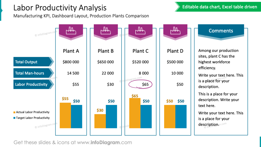
Creative way of presenting Labor productivity data
Here’s an example of presenting a table with labor productivity – where we redesigned a standard table to look much more attractive. We used custom-design headers and frames to clearly connect specific plant data. To reduce the amount of raw numbers we decided to add bar charts for comparison of actual and targeted labor productivity. The whole design is kept in only 3 colors, too many colors on the slide make it chaotic and hard to read.
Overall, this redesigned table effectively communicates the labor productivity data in a way that is both informative and visually appealing.
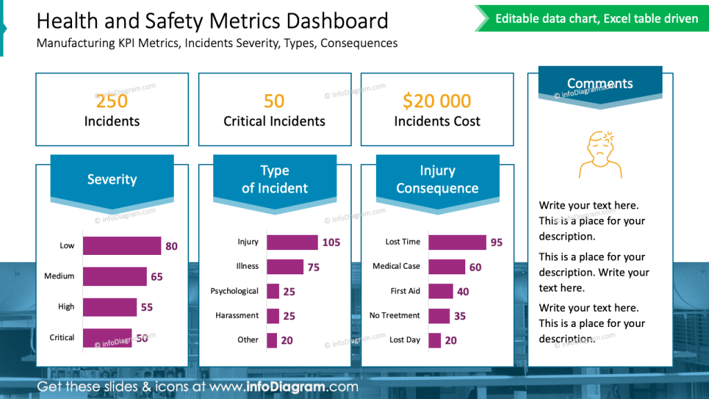
Illustrating health and safety metrics on a slide
If you also need to present the H&S metrics of a production company professionally, apply the design rules we mentioned above (grid, color use). But also remember that the trick to a professional look is consistency and layout. Look at the slide below and see how we divided the space into columns and rows and kept it in the same style.
I would remind one more design rule – the contrast. Ask yourself what’s the most important information on a slide you want to pass and then make it more contrasting than the rest of the content on a slide.
On the H&S example below it’s the total number of incidents (hopefully a low number), critical ones, and incident costs. We placed this number with a bigger whitespace. So it makes the number visible at first and that’s the effect we wanted to achieve.
Design hints to remember
To sum up, if you want to present a production company metrics and KPIs, remember a few design rules that will help you to create a professionally looking presentation:
- Use a color coding to visually differentiate data
- Adjust and customize tables and data charts for clear structure and readability.
- Keep the layout simple and clean.
- Work with grids to add structure to your slides, especially when creating a dashboard slide with multiple data charts.
- Enrich your data with icons – properly chosen icons can nicely reflect the meaning of your content.
- Replace standard bullet lists with a graphical version
I’m sure that with these basic design rules and tips, you can make a stunning presentation and overall impression.
Resources: Manufacturing Metrics Dashboard PowerPoint Template
The slide examples above are from one of our financial PowerPoint templates. Full presentation is available in the infoDiagram collection of PPT graphics:
Check more articles with slide examples related to company performance: