1 message rule (Prezentio’s Rules of good presentation)
Imagine a situation – you are working on a presentation, you know your content, you have a structure, and there is one key message you want to make sure every body will remember from your talk. You know that just saying or writing that message is not good enough. What else can you do? What about supporting it by graphical illustration that tells your key message in visual way.
I was in such situation when working on my training. In this article I am going to present you a simple visualization example of a such key message.
My task was to present visually a key rule from our slide design training. I was illustrating there “1 = A+B+C” rule. Here’s a brief summary, what that strange looking math formula expressed:
1 = A +B +C Rule of a Good Presentation Structure
Each part of that magic formula has its meaning:
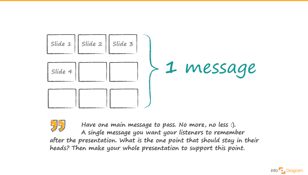
- 1: Have one main message to pass. No more, no less :). A single message you want your listeners to remember after the presentation. Think it over, what is the one point that should stay in their heads. Then make your whole presentation to support this point.
- A + B + C: Present three arguments supporting your main message. Three reasons why your message is important to your listeners. Enrich each argument by giving examples, stories, facts. Why three arguments? Because remembering three points is easy for all of us. Three key points have a strong impact. Adding more key points will make them weaker and they will not be any more the “KEY” points. You risk that your listeners will lose a track.
The essence of this rule lies in message that all presentation slides should support that “one” main message. Below you can see how I finally expressed this rule visually.

Visualisation was made in PowerPoint with design elements from this infodiagram.com hand drawn shapes library.
My visual thinking process
This was rather fast and simple. There were only two things to visualize: the structure of the presentation and their common message:
- Structure of presentation, represented by a sequence of slides: I chose to show the whole presentation from bird view, to underline ‘What’s a big picture’ idea. Showing it as a long line of slides didn’t look good – it didn’t fit on the screen on one side 🙂 and when looking at last slide, you lost view on the first slide. So it was better to “break the lines”, and show it as more compact shape.
- Illustrating one message that all elements should support – I have chosen the curly brackets because it nicely fit the empty space on right side. Eventually, I could make a big marker circle around the slides.
More ideas for presentation graphics
Check out these articles if you search for more inspiration on how to visualize your presentation:
- Do it Yourself presentation infographics using Simple Flat Icons library
- How to visualize a concept – Strategy Illustration
- 3 diagram mistakes to avoid in slides design
Want to be notified about new blog posts on visualization topics? Sign up to our newsletter and get a bonus of free sample diagram PowerPoint graphics.


