Making organizational structure presentation
My guess is that you met several times with presentation of an organizational structure of a company or institution. I saw it many times when making a classical company presentation, for a pitch or funds application.
Here we’ve prepared a few slide design examples how you can illustrate such org charts.
Note: all presented slides can be found in Company Structure People Silhouettes collection.
Two steps to go beyond default organizational structure charts
By default, people use org charts created manually or using PowerPoint’s SmartArt diagram tool.
I suggest you go beyond that and create a unique and clear presentation of your company structure. Apply at least those two steps:
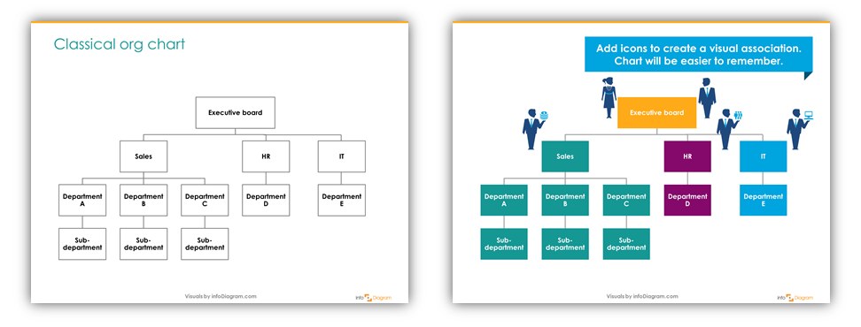
1. Add color to correspond to organizational logic
Use color coding depending on what you want to present or highlight. For example:
- one color for each company department or branch (verticals in your organization) e.g. Production, Quality control, Sales, Marketing, IT support, Customer Care …
- one color for every hierarchy level (horizontal color coding) like a Supervisory Commission, Board, Directors, Managers, Team leaders …
- color only the part you want to highlight and keep the rest neutral gray, for example. See the illustrations below.

2. Add icons to make charts easier to remember
Adding a visual symbol for each department or position makes the org chart more interesting to look at. It helps to create a visual association so your presentation audience will remember longer your slides.
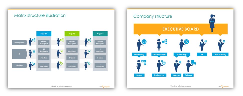
You can recolor those symbols to match the color of a department or hierarchy if you have editable vector symbols.

Adjusting graphical style a bit, adding some simple graphical symbols for positions and departments can make such presentation much more visually engaging. Using colors that correspond to organizational logic makes it easier for an audience to see the structure divisions at a first glance.
Then your presentation of even more complex matrix structure or classical organizational hierarchy can get a new attractive look.
Examples of facelifted org charts
Check the examples below in our Slideshare deck about visual enhancing of organization charts using PowerPoint tools:
Source of organizational structure graphics:
All presented slides were made in PowerPoint using the Company Structure People Silhouettes PPT icons.
This PowerPoint graphics library contains symbols for company HR and organizational structures. There are 31 editable pictograms of various roles and positions.
- Positions icons: CEO, Manager, Salesman, IT.
- Departments icons: Marketing, Sales, Logistics, Research, Analysis
- Technical departments symbols: Architecture, Engineering, Development, Design, Support
Missing some important org structure element there? Let me know, we will gladly design new organization slides graphics. Leave a comment below or contact us by our contact page.
If you want to try out some icons, get our free Creative slide design guide with a few flat and hand-drawn PPT graphics.
Further articles on presentation graphics
For more inspiration on using visuals in your presentations, check out also those articles:


