How to Visualize Customer Segment in Presentation
If you work in a company handling numerous customers, customer insight is an important part of your work. Customer segmentation is a way that helps to personalize the approach to customers even if there are many of them. Identifying customer segments and profiles is a tool not to treat all clients as the same. Because we are not the same. We differ by age, interests, value, and purchase frequency.
Elevate your business performance presentations with our curated resources – visit our financial performance PPT reports webpage.
Check our latest B2B Customer Segmentation Models presentation.
Three tips for illustrating customer segment
To help you visualize different segments, we created a presentation illustrating how you can present various segments using various avatars, and colors, assigning them labels.
I saw companies using various segmentation approaches. Some are pretty simple – only based on customer demographics such as age or country. Some more complex, e.g. RFM-based segments, based on purchase Recency, Frequency, or Monetary value. Or name the segments by the importance of a client (VIP, Gold segment, Silver, Bronze…).
And some pretty sophisticated segmentations – using also predictive customer lifetime value or some statistical scores for each customer. For that, you usually need more advanced analytics, but it can be worth it. Especially if you have thousands of customers and you want to treat them personally.
The three visualization tools you can use are:
- Customer segment-specific avatar icons for each customer profile
- Color coding differentiating specific segments
- Adding flag labels to the segments – for example, a call-out speech bubble shape
In the case of presenting the segments, for market analysis or sales strategy, it’s good to visualize each segment. If you have a separate icon for each client profile – that’s great.
Additionally, if you have editable vector icons, you can recolor them for each segment.
However, having several segments is not always easy to have an icon for each one. Unless you have your own designer on a team. But you can just add visual labels – a simple flag with your text:

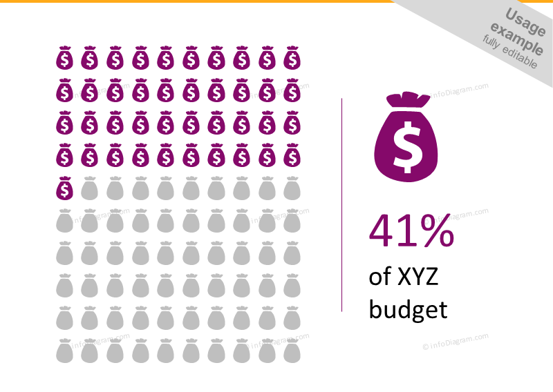
Alternatively, you can use not a people icon, but a symbol representing the client group, e.g. sack of money icon. See these infographics I created in a PowerPoint:
If you like the slide examples above, you can download them directly here:
For more inspiration, subscribe to our YouTube channel:
Have a suggestion for new segmentation graphics? Let me know.
Further articles on presentation graphics
For more inspiration on using visuals in your customer segmentation presentations, or on how to implement graphics engagingly, check out these helpful articles:
- How to Present Your Customer Experience Strategy With Graphics
- Use Net Promoter Score Dashboards to Present Customer Loyalty Metrics
- 3 diagram mistakes to avoid in slide design
- Using Modern Diagrams to Illustrate Customer Experience Metrics
Want to be notified when we make an announcement? Never miss out on creative presentation graphics and stay informed about our latest updates and news. We’ll also send you a Creative slide design guide with free hand-drawn shapes for you to begin using right away!


