Consistency in Presentation Design
Consistency is the key design principle of good design. When your materials are consistent, your audience can focus on what you have to say. Inconsistent materials, by comparison, tend to distract from your message and keep your customers or employees from absorbing what you’re trying to say.
How can you be sure you’re being consistent in a presentation?
Here are a few ways you can make your presentations not only uniform but more impactful:
1. Use one graphical style
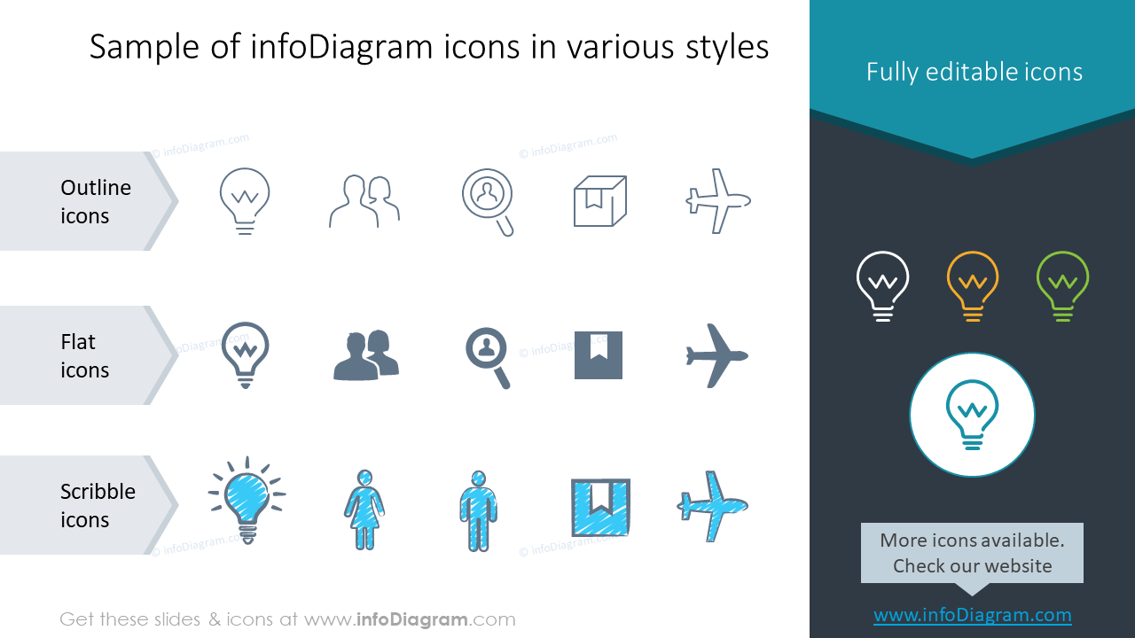
When you choose images for your presentation you can foster stability by using one graphical style. If your shapes are in the modern flat filling, use that overall slides. If you go for hand-drawn graphics, use those elements as decoration in more places.
Avoid mixing various styles. For example, use one graphical line of icons – outlines, scribble, or flat filling:

The same goes for shapes effects and images. Using combinations of 2-D and 3-D illustrations can confuse your audience or obscure your message in addition to making your presentation displeasing to the eyes.

2. Use the same set of colors
Generally, you should use a limited set of colors. Colors that will keep your presentation or document pleasing to the eye, easy to read, and easy to follow.
When you choose a properly set PowerPoint template, it will contain some or all of your brand colors. It should also contain a set of complementary colors that create harmony together but are also functional. That means you will have there a color to express positive and negative data values, for example. Wrongfully set PowerPoint templates usually have only a set of one-color shades – and that’s not very handy. Usually, you need to have one more eye-catchy color (to highlight warning information).
If you’re not unhappy with your PPT palette, let us know. We can do its audit and help you improve it.
Whatever color set you will finally use, remember to ensure high contrast of text and background. The safest is the combination of black and white colors, but it’s also the most obvious one. You can create functional color combinations also using other colors.
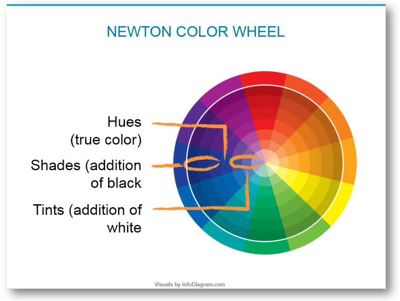
For non-designers I suggest learning some color theory – check the rules used for the Newton Color Wheel, for example.

3. Use the same font or two fonts
If you use a variety of fonts in your presentation you can make the information difficult to follow. If there are many types of fonts featured on posters or any covers, they look busy, disorganized, and cluttered. The way to make your content speak volumes is to use the same 1-2 fonts throughout the project so your text will flow logically and achieve the best results.
PowerPoint Master Slide template contains pre-set fonts for slide title and body text. Use those if they are properly set in your template. Or talk to us to help you set them up.

5-minute slide check for design consistency
Checking for those three consistency areas is not timely. I suggest that next time you do a presentation, spend 5 minutes doing a final check of fonts, colors, and style.
We have compiled together main things to do for quick check-up of your presentation:
What else have you tried to keep your presentations consistent? If you’re not certain if you’re making solid PowerPoints go along with your talks, I’d love to review them or help you review them (reach me using the chat icon in the right corner below).
For more ideas about how you can create better or more effective presentations, check out these posts:


