Using Visuals in Customer Experience Measurement, Analysis, and Improvement [interview with an expert]
Hey, I am happy to share with you my talk with Katarzyna, our contributor to three customer experience presentation decks and at the same time lifelong enthusiast of CX.
Anastasia: Tell us please a few words about yourself. What do you do?
Katarzyna: I am a consultant supporting customers in the field of customer experience and retail performance. If your want to successfully implement customer experience projects across the organizations and show how important customer-centricity and satisfaction are, the best way is to use visualizations that help to convey the message in an eye-catching and attractive format.
That’s why I have also become infoDiagram’s contributor in my area of specialization. My role is to deliver content and your fantastic designers’ team turns it into appealing pre-designed and ready to use and edit presentations.
Anastasia: How do you use presentations in your business, eventually what’s your usual challenge when preparing slides?
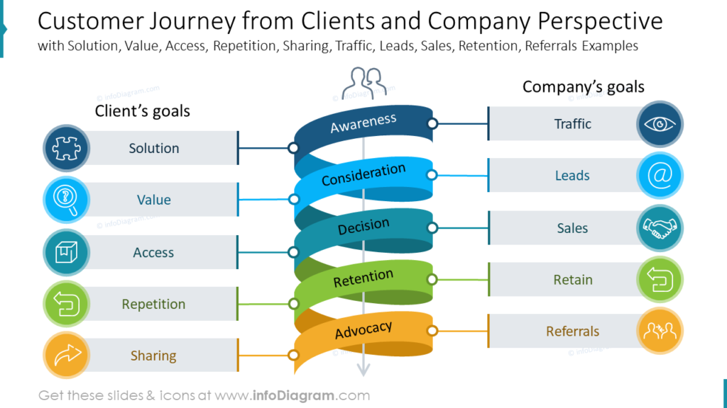
Katarzyna: The cooperation with my customers usually starts with the evaluation phase, in which we measure customer experience via various methodologies, tailored to the customer’s needs. The main goal of this stage is to identify which parts of it are crucial to boost performance and increase customer satisfaction.
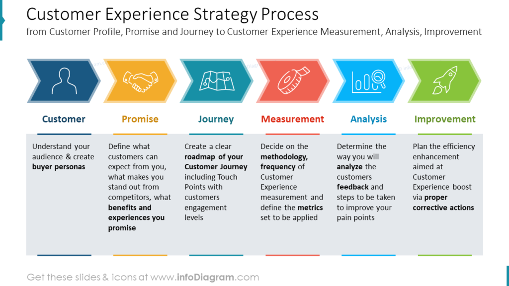
To present the outcome of the research, apart from pure data, I prepare management reports in the ppt presentation format, which includes data, key findings, and recommendations. A picture is worth a thousand words so I try to avoid texts as much as possible and I use creative customer experience presentation infographics to emphasize the importance of the data or conclusions that I want to highlight.
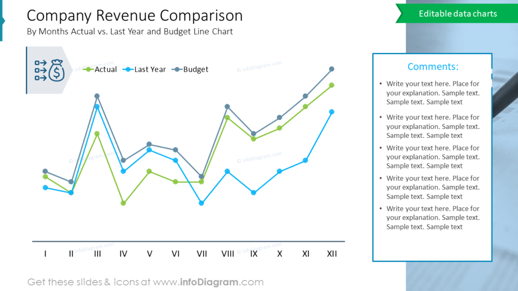
On top, whenever I can, I rather use creative charts that are much more memorable as people are sick and tired of boring and traditional bar or pie charts. Presenting data in an attractive way is the biggest challenge for me. Too many details, too many numbers in one slide may disrupt the main idea or the most important information I want to present.
A picture is worth a thousand words so I try to avoid texts as much as possible and I use creative infographics to emphasize the importance of the data or conclusions that I want to highlight.
Anastasia: How our graphics helped you?
Katarzyna: Well, since I was a contributor to all 3 CX decks from the content point of view I can find in them all I actually need. Your graphics help me to create a story while I present the content. It is really fantastic how easy it is to edit the slides and customize them to the customers’ needs and branding.
On top, the majority of your pre-designed slides have space for text/comments, so it is very convenient to extend the ideas. I do also like your data-driven excel charts. Especially for the users that work with data presentation, this feature is extremely handy.
You can reach Katarzyna through her Linkedin profile.
If you need to illustrate customer experience metrics or present your new CX strategy, check our recent blogs (Katarzyna made a valuable contribution to the development of those decks):
- Use Modern Diagrams to Illustrate Customer Experience Metrics
- How to Present Your Customer Experience Strategy With Graphics
I hope you enjoyed the post and see you in the next ones!
Anastasia, Head of Marketing


