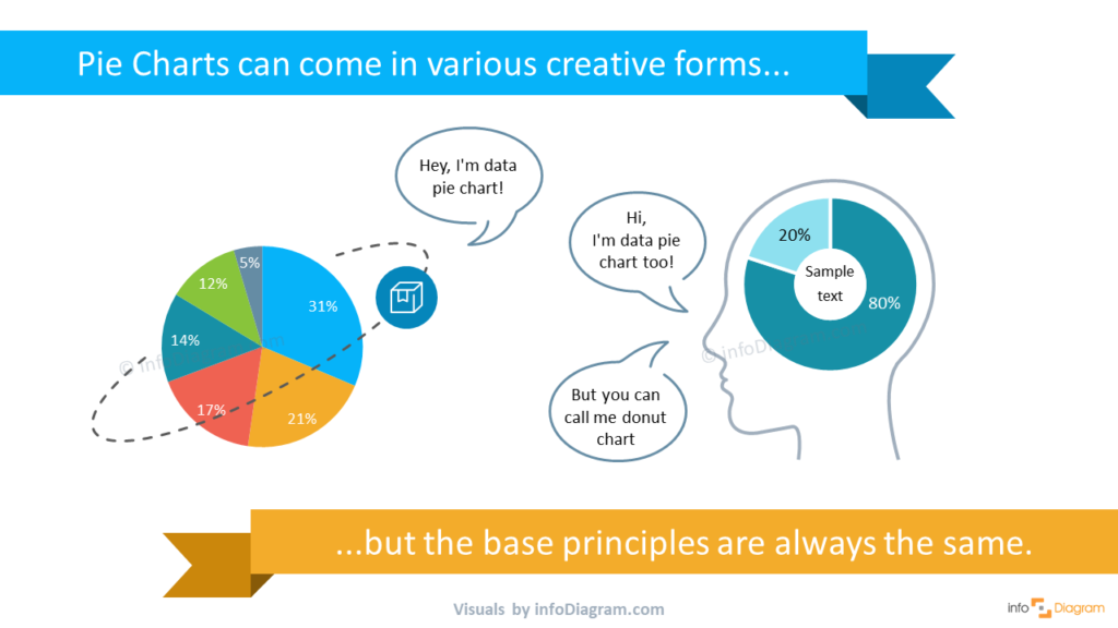
6 Creative Alternatives for Pie Charts in PowerPoint
A pie chart is a very popular data visualization used in business presentations. It’s visually simple to interpret. If you need to emphasize part-to-whole, illustrate proportions or visualize shares, a pie chart is a tool to consider.
We put together six unusual alternatives to boring data visualization, read on to get some inspiration and examples.
All slides presented here are downloadable as PPT file. Click here or on slide pictures to see the full collection of Creative Percentage Shares Pie Charts for PowerPoint.
What is a pie chart?
A Pie Chart (or its variation a Doughnut Graph) is a circle shape data visualization. The circle is divided into slices to illustrate the numerical proportion of underlying data.
Pie charts are widely used in business presentations to show the proportions among a large variety of categories including expenses, segments of a population, or answers to a survey. If you need to present revenue split by channel, market share, or expenses breakdown by category, a pie chart is a perfect graphic to convey your message. Using creative visuals for illustrating proportions makes the information clear in the mind of the audience.
Design tip: If you have over 6-8 data categories, the pie chart becomes less effective. It gets hard to read. We suggest using a bar or column chart in such cases.
Check the following creative pie chart versions. With a few design additions, you can create an unusual data visualization that will support your presentation message.
Present scientific topic with data pie chart as part of atom structure
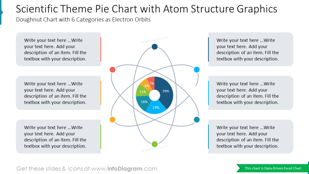
On the slide above you can a donut chart with 6 categories as electron orbits. You can use such atom structure graphics to support scientific or non-scientific facts, and there’s also a place for your notes or description.
Visualize innovations statistics with chart pie in shape of lightbulb
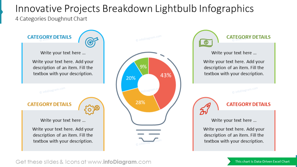
The bulb is a clear and easy-to-follow metaphor for new ideas. Why not make it bigger and use it as a shape for a data pie chart? The example visualization shows the innovative project breakdown, which includes four categories supported with color coding and icons.
Use camera pie chart or head infographics to present your creative projects
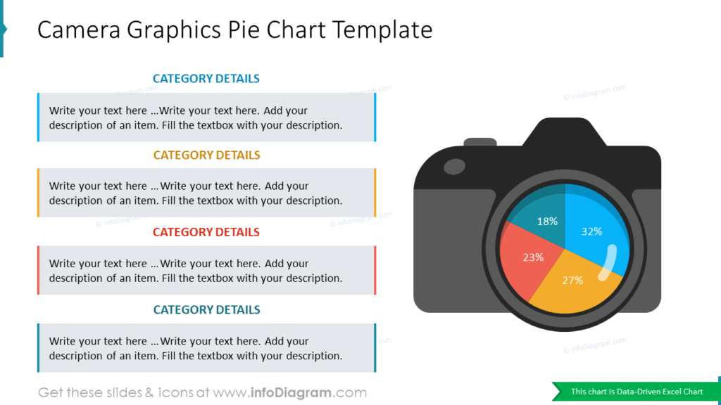
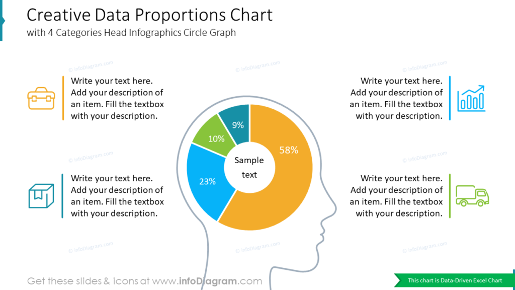
If you can afford to add creative elements and shapes, you can try using one of the above templates: camera or head graphics. Both charts are data-driven and have a place for category descriptions. You can also use head infographics while brainstorming or presenting new ideas or concepts.
Enrich your pie chart with extra elements: icons and shadows
In case of a more formal presentation, you can try such a simple circle pie chart with shadows and illustrative symbols. It looks very clean, and at the same time, it will allow you to add any details you need.
Create globe data pie chart to show worldwide statistics
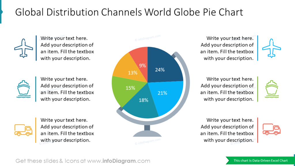
What can be a better metaphor while talking about global distribution channels than a world globe? All icons you see above are also included in the package, and you can alter them freely if needed.
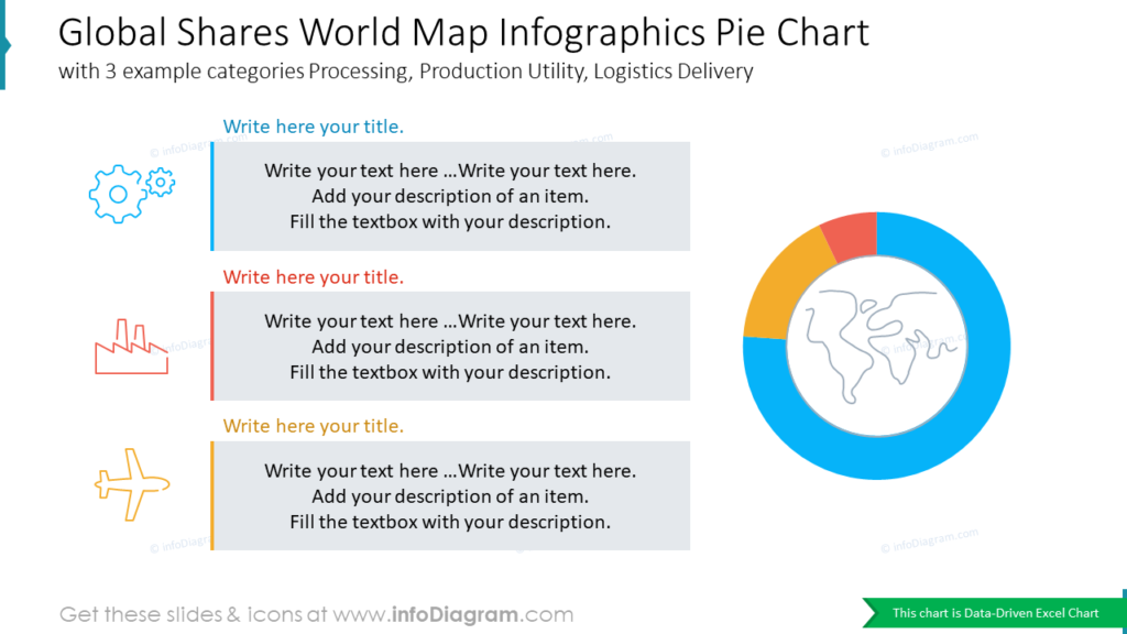
To illustrate global shares, you can also use the chart above, with 3 example categories: Production, Manufacturing Factory, and Supply Chain. An abstract map icon gives an idea of what you will be discussing right away.
Present gender comparison with male and female symbols
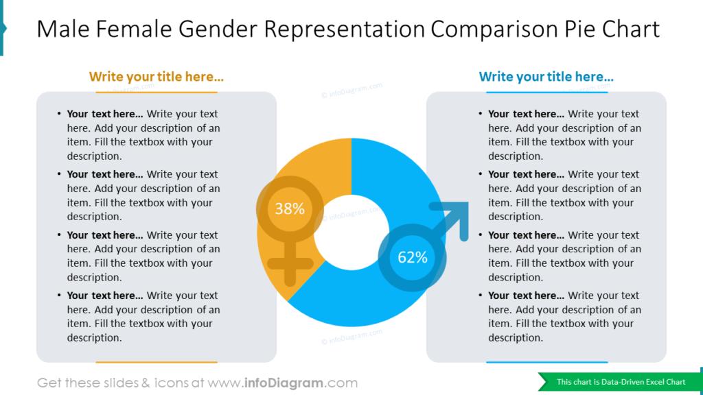
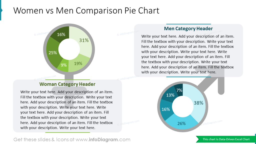
Need to compare two groups or categories? In such a case, you can choose images that will reflect the concepts, like the male and female symbols we used in our example. If you add colors and simple elements, such as lines, your chart will look more professional than a default one.
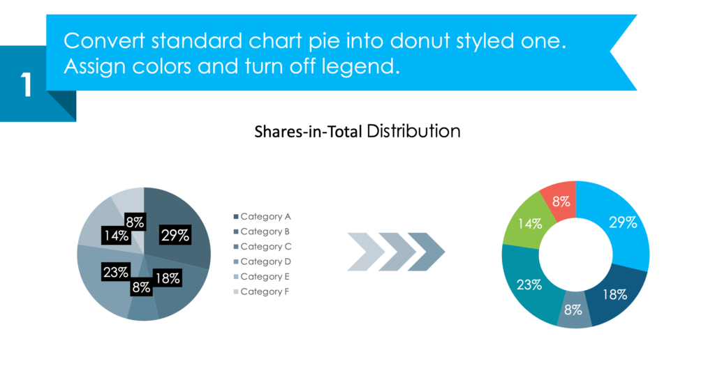
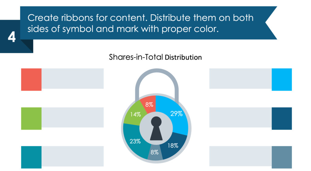
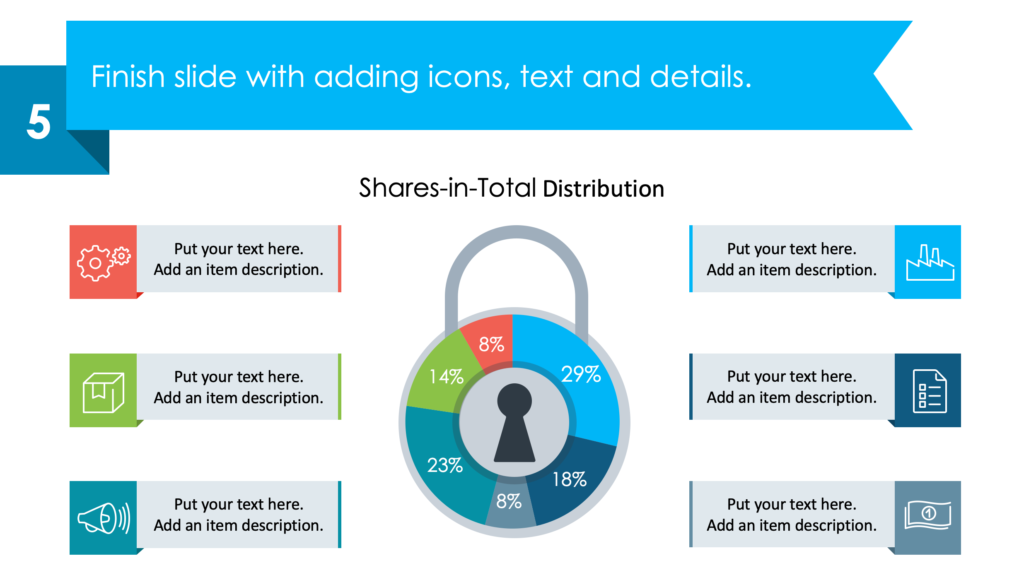
Tutorial on how to visualize shares distribution by a stylish pie chart infographic
We also prepared a quick instruction illustrating how you can transform an unattractive standard chart into a symbolic infographic. You can see an example where we created a Shares-in-Total Distribution donut chart, which you can reuse for presenting any data.
1. Convert standard chart pie into donut-styled one.
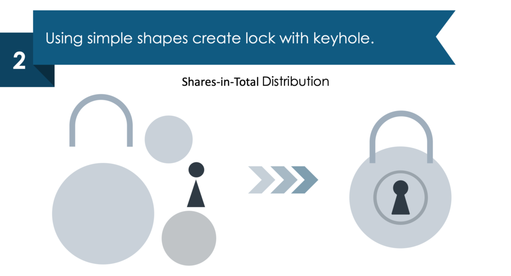
2. Create a lock with a keyhole using simple PowerPoint shapes.
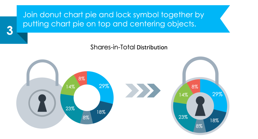
3. Join donut chart and lock symbol together.
4. Create ribbons for data categories description.
Add stylish text placeholders to describe categories of your chart. You can distribute them on both sides of the graph and mark them with the same colors as the pie chart categories.
5. Finish slide with adding icons, text, and details.
Check the whole step-by-step guide and other examples here: Illustrating Data Effectively Using Creative PowerPoint Pie Charts.
If you are looking for more inspiration on data pie chart design, check these articles:
- Present Industry Trends, Survey Results and more with Radial Charts
- Ways to Use Donut and Pie Chart Graphics
- or explore our Business Performance PPT Reports category on the website for more resources to boost your presentation impact.
For more inspiration, subscribe to our YouTube channel:
Resource: Creative Percentage Shares Pie Charts
The examples above are only a part of our data pie charts PPT collection. You can reuse our diagrams, tailor them to your needs and nicely upgrade your slides. The pie charts in the collection are Data-Driven Excel Charts, so it is very easy to change the presented values. We also added a general icon collection and detailed instructions on how to alter the content, colors, look, and feel of our slides.
Click on the button to see the full charts collection:
Need a wider variety of graphics? Diagrams and charts from this collection of editable diagram templates might help you take your next PowerPoint further and will make the process of preparing the next presentation less time-consuming.


