3 Secrets of Good PowerPoint Animation [PPT best-practice]
Adding animation to your slides is something to consider when you want to make your presentation more dynamic. Or when you don’t want to reveal all slide content at once and show it point by point.
In this blog, I’d like to share tips on making professional animations in PowerPoint that will ensure your presentation will look attractive and professional.
I have collected those animation hints during my 15+ years of working as a slide designer. In the context of business presentations, animations are used less than in education or marketing. But when you use them, it’s worth making it right. Ensure the PowerPoint animation will add value to your slides, and not decrease the attention of your audience.
Three secrets towards good animations
There are three main points to make the animation look good: simplicity, speed, and animation logic with proper grouping use. Let me explain each of them.
1. Simplicity
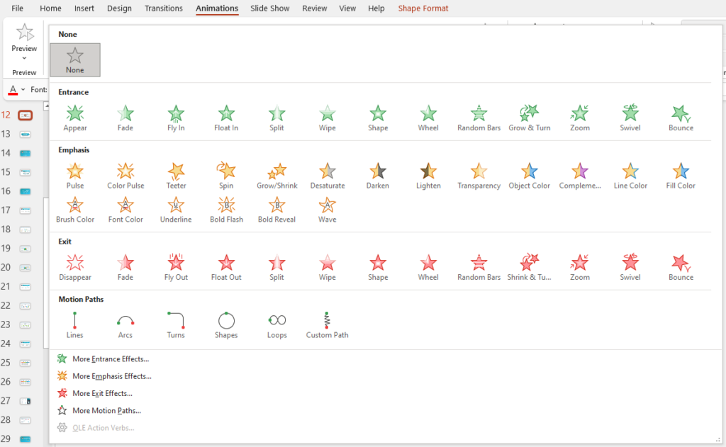
PowerPoint offers quite a number of various animations. This is a list of animations currently offered by PowerPoint (Office 365) – you can see there a wild variety – from subtle to crazy ones:

For a business or educational presentation, I strongly recommend using subtle effects – Appear, Fade, Fly-in. Avoid crazy animation styles, such as Swivel, Bounce, Spin.
The animation should not get more attention than your content.
Design Hint: Don’t go crazy with animations. Remember, here less is more. Choose rather simple ones, or you will risk loosing attention on your content.
2. Speed of animation
The timing of the animation should be rather short. Imagine your audience has to watch 10 flying objects on each of the 30 slides. After the second slide, they will get enough of it.
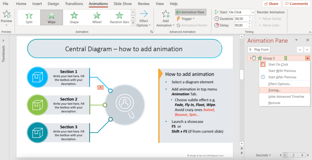
Remember, your presentation is about content, not about animation. It should only support it. Therefore choose the fastest timing in animation options (in Animation top menu tab / Animation Pane / Timing in selected step).

PowerPoint tip: Test often, to see how your animated slide will look like. For that, I use shortcuts F5 or Shift + F5 to run showcase from the current slide. Or use the top menu Slide Show and the first icons there.
3. Animation logic & grouping
The order of animation should be logical. That means the direction of fly-in should not be a random one but aligned with content design. Choose direction aligned visually with other slide elements, for example along with the diagram or graphic shape lines. See example in this YouTube presentation – notice how bricks fly in.
I also recommend using the shortest flight path, not across the whole slide over other elements.
Design Hint: To animate bigger segments at once, group the objects first. It’s easier to add animation to one grouped object than to a set of separate objects. It also looks better.
Shortcut for grouping of selected objects is Ctrl+G (or Cmd+G) and Ctrl+Shift+G for ungrouping.
Notice, that grouping and ungrouping of slide elements remove animations associated with them. So be careful not to lose your animation work.
To sum up, PowerPoint animations are a strong tool that can make your presentation stand out if you will apply animations properly. A few examples of what animation can be used for:
- suport your story-telling when showing point by point your slide content
- explain dependencies and evolution of points by letting them appear in sequence
- create a effect of surprise, by uncovering the final essence at the end
I wish you good luck when playing with animations.
Peter Zvirinsky
slide design wizard, and diagram-nerd
infoDiagram co-founder
More resources to get you started
Graphics
- Content-ready business topics
- Best-value icon bundles with 700+ icons or 200+ diagrams
- Smaller specific icon sets
Learning resources
- Blog: How to choose a diagram? 18 Categories of Structures & Processes
- Blog: How to speed up work with PowerPoint – basic shortcuts
Done-for-you service
- Custom design service , in case you want to leave adding animations and facelifting to us.


