How to Stand Out With Impactful ESG Sustainability Report – PowerPoint made
If sustainability reporting is important part of your company’s communication, we share a few ideas how to improve them. It can start with using visuals for presenting three pillars of the ESG sustainability report – Environmental, Social, and Governance. Follow through this text to discover some presentation examples that can enhance your next ESG reporting.
We’ve prepared a diagram overview to inspire creative thinking in illustrating ESG issues. You will find a few slides with design analysis below. Feel free to grab the ideas for topics such as:
- explaining ESG reporting components with pillars infographic
- manifesting the company’s sustainability statements
- illustrating the company’s ESG strategy with a flowchart
- comparing the company’s performance in environmental, social, and governance initiatives
- planning ESG sustainability projects for four quarters of a year
Source of graphics presented here is available for download. Check the complete ESG Report Presentation here.
Why Use Diagram Visuals in ESG Sustainability Report?
Reporting data related to three different areas of sustainability may be challenging for a presenter. In the case of ESG development, we are talking about environmental, social, and governance responsibilities and it’s crucial for the whole presentation to state this difference clearly. That is where visuals come in handy as they support information architecture and convey the message in a digestible way. Using diagrams, color-coding, adding meaningful icons, enriching data with appealing charts, or placing it in a composition of containers helps organize the information logically and absorb it into your audience.
If you plan to cover all areas of ESG in your report mixing several message areas in one presentation may help you succeed.
Explore more of ESG related presentations with our curated resources – visit Sustainability & climate topics presentations library webpage.
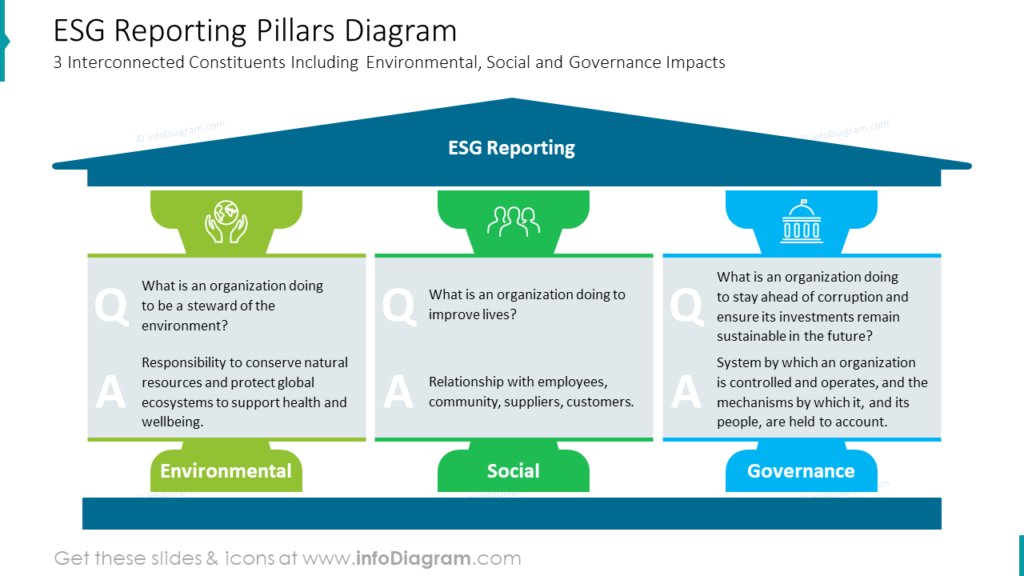
Explain 3 Interconnected Constituents of ESG Reporting With a Pillars Diagram
Explaining the ESG sustainability approach is often the first step in opening the presentation. It helps grab the audience’s attention and is fundamental for understanding the following slides with detailed analysis and descriptions. Presenting the company’s statements in the form of questions and answers adds a human factor that may be helpful to your audience in relating to the message.
What catches attention on this slide is a symbolic, graphical representation of three sustainability components in the form of pillars supporting ESG reporting. Each principle is assigned a different color, continuing throughout the presentation. This layout creates well-defined Q&A space, and the initial letters added to each section highlight the convention. The exact role of strengthening clarity was given to icons on top of pillars.
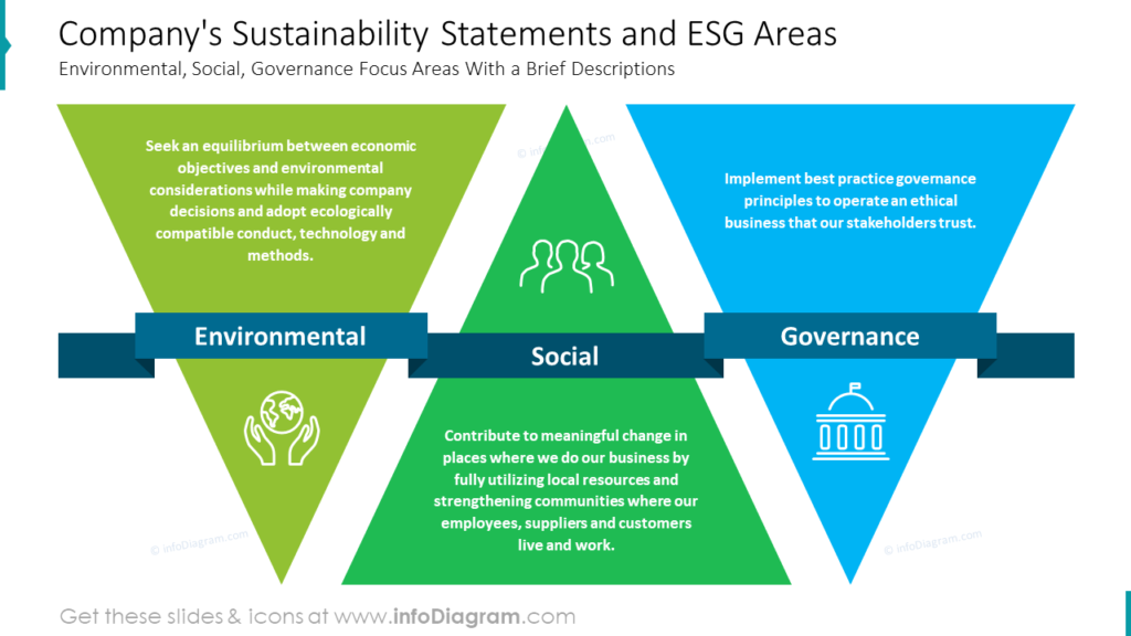
Manifest Company’s Sustainability Statements and ESG Areas With Bold Infographic
While reporting performance data, one may struggle with the company’s overall goal in its sustainability development. It’s a matter of values shared among all employees that make the change possible, and strong visuals seem to be very effective in delivering inspirational messages. Environmental, Social, and Governance ideas dressed in bold infographics can be read and memorized.
Notice on the slide below how color-coding from the previous example was continued and helps to learn to distinguish sustainability areas in a glance. The proposed color palette refers to nature, liveliness, solidity, and peace, and complementary triangular shapes connected with one ribbon with titles symbolizes their connection and wholeness. Some statements are given by us but can be easily transformed into unique ideas.
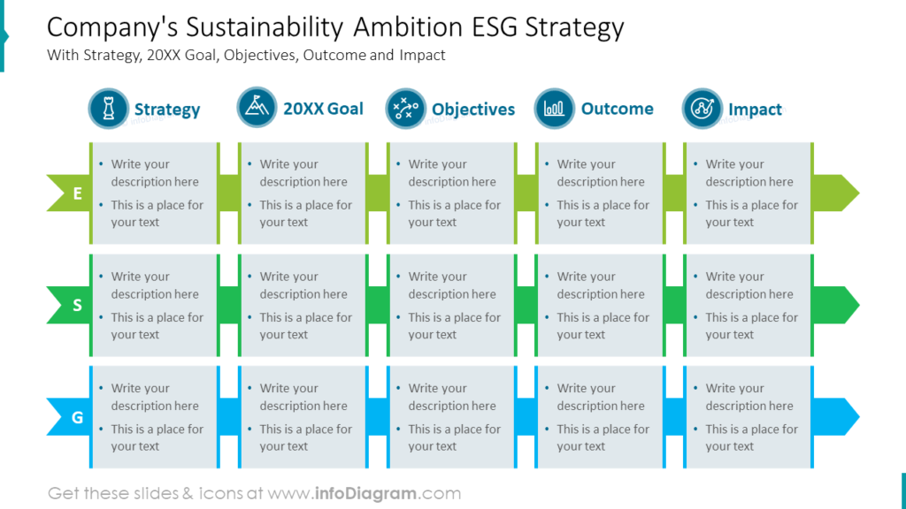
Illustrate Company’s Sustainability Ambition With ESG Strategy Flowchart
Presenting strategic milestones is crucial to many development studies. Reaching sustainability goals is no different; therefore, a PowerPoint flowchart may be an important addition to the ESG presentation.
What is worth noticing is that we deal with the triple process chart in this situation. A simple table doesn’t seem enough in this case due to a lack of flow indicators. Take a look at the example below where we combined in one diagram ESG stages such as:
- ESG Strategy
- Annual Goals
- Objectives
- Outcome
- Impact
As set in previous slides color-coded environmental, social, and governance information are set apart. The overall flow of the process is marked with three easy-to-notice arrow-shaped ribbons binding description containers. To empower ease of reading stage titles, outline icons were added.
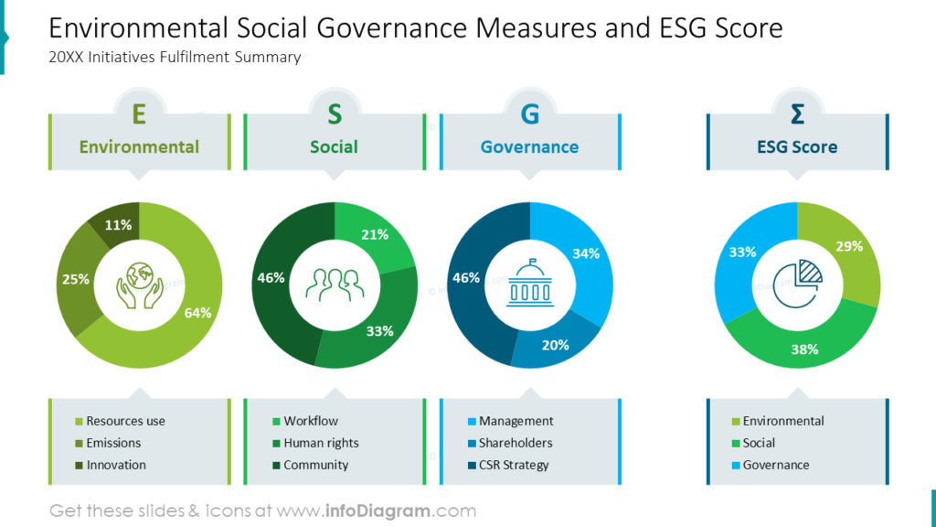
Compare Environmental Social Governance Measures and ESG Scores on Data Charts
After going into details in sustainability analysis, a brief summary of results may be a helpful addition to the ESG report. Such a slide helps to determine whether the objectives have been achieved and is a base ground for further planning. Environmental, social, and governance performance can be compared against each other, or each factor can be broken down into its parts.
Comparing the share of the result is especially clear when using pie charts, as the example below shows. They are useful in all scenarios, and their round shape allows for strengthening identification with icons. Thanks to the consistent use of colors, it is easy to distinguish charts despite the amount of data shown. Shades of green and blue are persistently used in charts and title and legend containers which results in a logical and easy-to-read infographic.
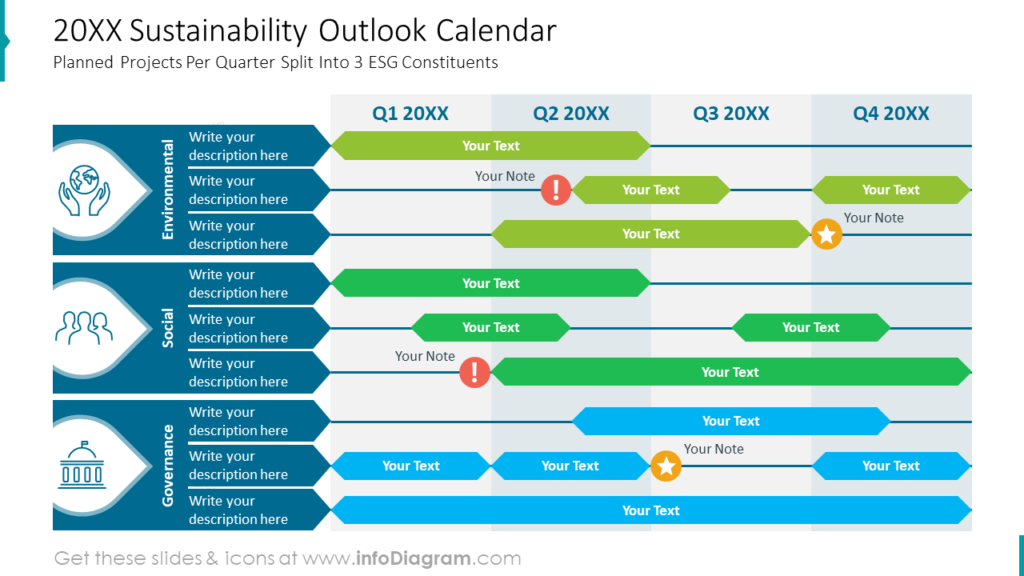
Plan ESG Sustainability Business Projects for the Next 4 Quarters With an Outlook Calendar Table
Calendar PowerPoint slides apply to past achievements and to set goals for the future. In this paragraph, we’re presenting the possible use of multiple timelines in the planning process. You can see on the slide below how versatile this template is in showcasing long-term and short-term plans in one layout.
This specific diagram simultaneously presents goals and planned actions in every area of ESG scope. What helps organize information in this data-rich calendar is the consistent use of colors for environmental, social, and governance issues, along with a bold title column containing titles, icons, and a list part. Also, in the bottom layer of this matrix, colored columns representing four quarters of the year increase the readability of this diagram. What stands out against this background are vivid yellow and red markers with icons that highlight critical points on the timeline.
Summary of Design Tips for Corporate ESG Sustainability Report Presentation
Covering ESG sustainability topics in presentation slides requires a plan and a dose of the consequence of its implementation. Avoiding ambiguity may be challenging when we simultaneously convey three different threads – environmental, social, and governance). We wrote this article to share our visual approach to complex slide messages because it worked for us and our clients in many situations. Feel free to inspire yourself and remember some useful tips we have revealed to you in this article:
- assign different colors to each of the ESG threads
- be consequent in colors used throughout the whole presentation
- if you need more colors within a thread, use shades of the primary thread color
- use bold, colorful text containers for descriptions you wish to stand out
- apply meaningful symbolic graphics like pillars to tell a story in your report
- consider using less common shapes like triangles to arouse curiosity in your audience
- emphasize flow relation using arrow-shaped ribbons connecting stages of the process
- illustrate data metrics with color-compatible charts
- strengthen your message with meaningful icons and colorful markers
- use the whole space of the slide to compose your diagrams within it
F
Resource: PowerPoint Templates for Corporate ESG Sustainability Reports
The ESG sustainability report diagrams presented on this blog are available for download in our infoDiagram collection of ready-to-use templates. You will find many slides appropriate for institutional, business, and civil audiences in this presentation, including development goals, sustainability roadmap, annual highlights and KPIs, RASIC table, and meritorious lists of examples for environmental, social, and governance actions.
Check more slide examples contained in the ESG Sustainability ReportPresentation below:
Read other related posts featuring examples of presenting sustainability topics:
- Visual data storytelling of ESG metrics
- Social Sustainability Report ESG Presentation
- Circular Economy and Sustainability Diagrams
Or watch our video with slide redesign instruction: