How to Draw Attention to the Main Message on a Slide [PPT Design Tips]
Are you looking for ways to facelift your presentation and make a professional impression on your audience? See how tricks you can increase the visual appeal of your decks, and make sure every slide is polished and professional-looking.
One of the most common presentation challenges is how to make your main message stand out. In this blog, we’re sharing the most effective ways to focus the audience’s attention on the key points you want to convey.
This article is a part of our Design Tips for Professional Presentation series, see more on our blog. You can also download the full e-book with six critical design issues and examples that will help you make a strong presentation:
Inside you’ll find more actionable steps for a professional slide look, including:
- Slide margins and white space – make your slide easy to read
- Alignment of texts, charts & tables
- Consistency – how to keep one style through the presentation
- Natural and easy-to-follow reading flow
- Spellcheck for a professional reading experience
We also added practical PowerPoint shortcuts that will speed up your work.
So let’s explore how you can highlight the main point with all that data crammed on a slide.
How to highlight the message point of a slide
Each slide should convey one main message. Make that message a key focus point of the slide. Present it with the strongest visual element.
Use graphical contrast to draw attention to your key message. Here are a few ways how to do it:
- by size: Make that key element bigger than other elements. Use bigger font or shape size. Additionally, add emphasis on key points by using unique fonts that stand out from the rest of the text.
- by color intensity: Use the most vivid color to highlight the key message. A good practice used by top consulting companies, such as Bain or McKinsey, is to make all slide context in a grey scale or other monotone set and have one color reserved only for highlighting the key data.
- by inverse color contrast: For example, white text on a darker shape background. See our banner below as an example:

- by space: Make the message stand out by creating a much bigger white space around it. That alone will attract attention to that point.
- by style: Highlight your key point with a hand-drawn underline or marker swoosh shape.
Choose only one of those options, don’t combine them all. Also, remember to stay consistent. If you use color for your key message of the slide, use the same color over the whole presentation for other key messages on other slides.
For unifying the message look, use the Format Painter tool, present in PowerPoint and other MS Office applications. This tool allows you to copy the style of selected text (its size, color, font style) and apply it to the destination text.
Designer tip: Apply the 80:20 Pareto rule: 80% of attention should be directed to 20% of the content. Therefore, don’t highlight more than 20% of your content, otherwise, the contrast and highlight will be lost.
Here are a few examples of slides with the clearly visible main idea.
Slide highlighting the key number value by size:
Notice how using a simple typography move – making the 73% value much bigger than the rest of text – you can create a clear focus point on the slide.

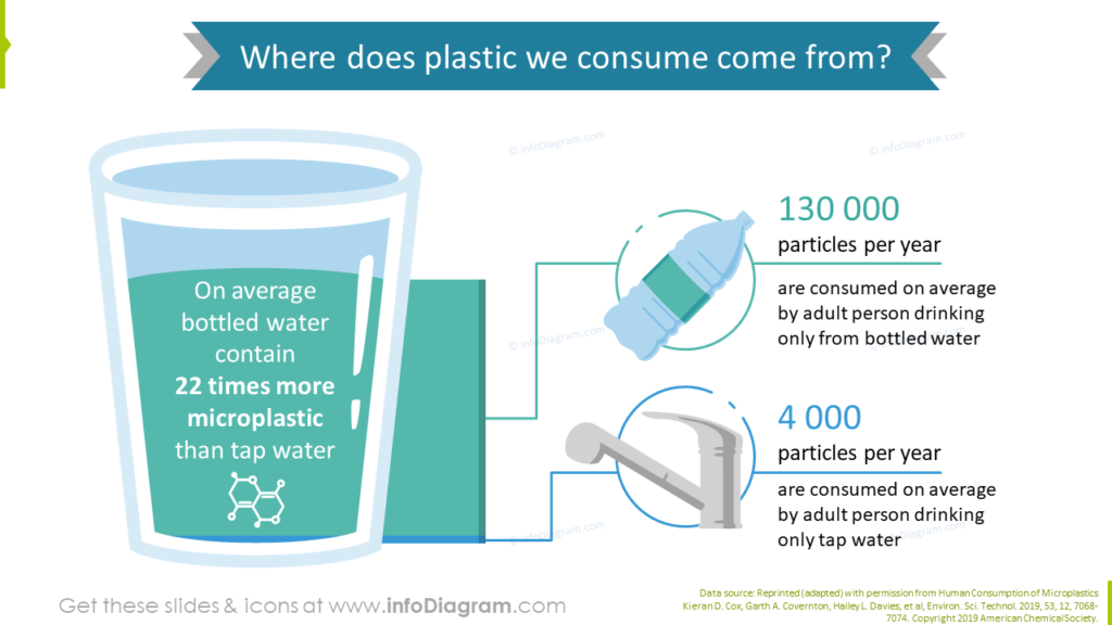
The message is highlighted by color contrast:
On the slide below we used a reversed text color (white font of turquoise background shape) to express the main message about the high level of microplastics in bottled water.
Slide focus by color and space use
In this third example, you can see another way to ensure focus. Using white space and background shape color to make the quote the main focus point on this slide. This trick is suitable if you have e.g. a busy picture background.
These are five ways how you can highlight a key point on your presentation slide. Working with design through color contrast, shape, space, or style lets you clearly express what part of the slide is the most important one. Along with using other good design rules, such as consistency or repetition, you can create a presentation that will look professional and attractive at the same time.
More slide design resources to get you going
If you want to know how you can improve your slides further, check those resources:
- 6 presentation design tips conveniently gathered in an ebook (including this trick)
- Too much info on a slide? Simplify complex presentation in three steps
- 5 Ideas for Writing Eye-Catching Title for Your Presentation
- Consistency in Presentation Design
Get our free sample and let’s stay in touch for more tips and resources!