How to Make Presentation Slide Reading Flow Easy-to-follow [PPT Design Tips]
Want to take your presentation skills up a notch? We’ve pulled together some easy tricks our designer team uses for making slides look clean.
One of the often design mistakes is unclear and chaotic reading flow, which results in lost focus. Especially if you have a slide with lots of information on it, with a bunch of charts, presenting several key data, maybe product pictures, and additional text commentary. How people will read your slide can help or harm your presentation delivery.
In this blog, we’re sharing how to ensure the flow is natural and intuitive, so you display the slide content in a way that is fast to grasp.
This blog is a part of our Design Tips for Professional Presentation series, see more here. The six most important things you need to remember about while designing a presentation are also covered in this e-book:
Inside you’ll find more actionable steps for a professional slide look, including:
- Margins and white space – how to avoid stuffed slides
- Alignment of texts, charts & tables
- Consistency – how to keep one style through the presentation
- How to make 1 main idea stand out
- Spellcheck for a professional reading experience
We also added practical PowerPoint shortcuts that will speed up your work.
So let’s see how you can improve slide reading flow in order to keep the attention of your listeners.
Importance of reading flow for your presentation
Good slide design should naturally lead the reader’s eye movement. Your reader should know at once – where to look at first and where to follow. If a reader has a hard time understanding the order of elements on a slide, that means something needs to be improved.
When finishing your presentation preparation, go over your slides and check their flow structure. Review the position and order of the slide elements:
- What text should be read first? Usually, it’s the one most important point you want to make.
- Is the reading order intuitive enough?
- What is the next element to look at? Is it close enough or will the reader hesitate about where to jump next? The location of elements should make this clear without a doubt.
How to focus attention on a content element
Each slide should be built around presenting one main message. It can be a key number, trend line, or some important statement. You may want people not to overlook that message, but see it as a first one.
To ensure that, in slide design, we use the contrast technique. Make that element the most visible, the biggest, and use the most contrasting color, e.g. use a big white text on a shape with a dark background. You can read more about using contrast along with some slide examples in this blog (once published, till then) in our ebook.
Design for natural flow on a slide

The top-left area of the slide is where we tend to look at first. Then we naturally follow to the right.
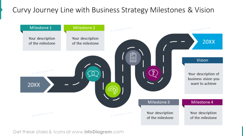
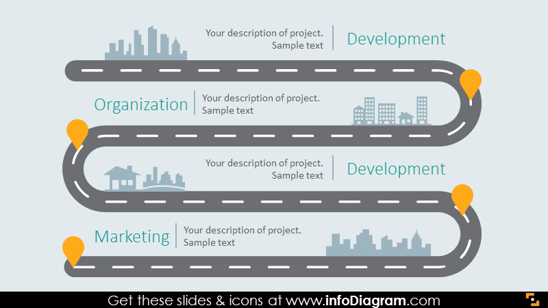
If you want to arrange a reading flow in another way than the usual “Z” shape, use graphics with a clear path and direction of reading, for example, a roadmap or arrows.
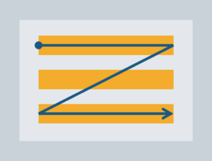
How to design for atypical slide flow
If you have a presentation content that does follow the Z shape, you should add graphical elements that will clearly show how the content should be read. It can be an arrow shape, work with space or eventually, you can literally add numbers to the content to show their order.
Here are a couple of slide examples with the clear reading flow, despite these are not typical from top to bottom, left to right always. Notice how a strong graphical element such as a roadmap line leads the eye:
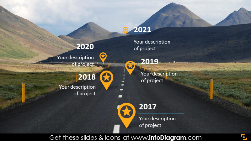
In this slide, we used a photograph with a curvy road to suggest a perspective reading flow from closer elements at the bottom to elements further up, farther away in distance and time.
Using white space is also a good design way to create a gap in the reading flow. People tend to read objects that are close together.
So next time you are designing a slide, check with someone how it is seen, and what’s the person’s natural way of reading it. If it is different than you intended, adjust it by using space and strong graphical elements. This will ensure your presentation is quick to grasp and your audience will not get lost in your slides.
More presentation resources to get you going
The slides can make or break it, so check these resources if want to improve further:
- 6 design tips conveniently gathered in an ebook (including this one)
- Storytelling: the Secret of Powerful Presentations
- How to Copy and Adapt Diagrams to Your Content
- 5 Creative Ways to Embed Icons in Your Slide Design
Get our sample deck and let’s stay in touch for more tips and resources!