Illustrating Company’s Performance: Tips and Tricks for Successful Presentation
Presenting your company’s performance is crucial for showcasing your achievements to a supervisory board or investors. In this article, we will explore various methods and strategies to effectively communicate your company’s performance, including data visualization, key performance indicators, and storytelling techniques. By implementing these tips, you can add compelling graphics to your presentation that accurately represent your company’s success and drive growth.
When you need to visualize your company’s performance in a concise form e.g. during your town hall, monthly review, or all-hands meeting, you will probably finish creating a dense slide with several charts together. It is better to split details into several slides and keep only the key performance measures on one slide for better readability.
Determine the Key Metrics
Before searching for suitable visuals to illustrate your data, it’s important to spend time identifying the key performance indicators (KPIs) that are most relevant to your presentation and you want to include.
KPIs will vary depending on your industry and business goals. Some common KPIs to consider include revenue growth, customer satisfaction, market share, and employee productivity. By identifying these key metrics, you can focus on showcasing the areas where your company is excelling and driving success. Additionally, it’s important to regularly track and analyze these KPIs to ensure that you are staying on track and making informed decisions to drive growth.
Choose the Right Visuals
When choosing visuals to illustrate your company’s performance, it’s important to select the appropriate representations that effectively convey your data.
It’s crucial to ensure that these visuals are clear, easy to understand, and visually appealing. Consider the audience you are targeting and choose visuals that resonate with them. Also, make sure to use colors, fonts, and design elements that align with your brand and enhance the overall visual appeal.
By choosing the right visuals, you can effectively communicate your achievements and make a lasting impression on your audience.
Let us share some examples of slides presenting the performance of a company in several areas:
#1: Executive Summary Slide
An executive summary is a condensed snapshot of a company’s performance, offering a quick and clear understanding of its key achievements, challenges, and direction. By distilling complex financial and operational data into concise points and engaging visuals, executive summary efficiently communicates critical information to time-strapped stakeholders. Here are a couple of executive summary slide examples:
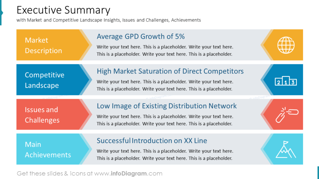
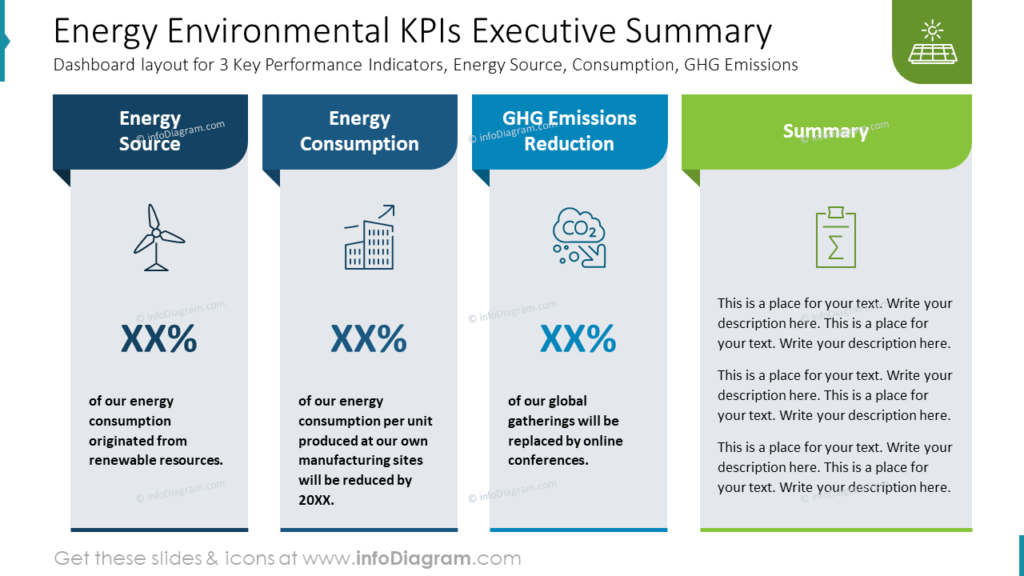
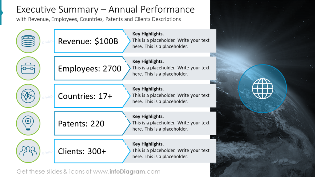
The executive summary is a flexible tool that works well for diverse audiences. From executives and investors to employees and customers, the summary captures attention and provides a common point of reference.
Get inspired by more examples of summary PowerPoint slides here.
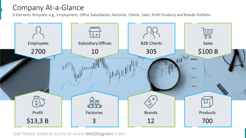
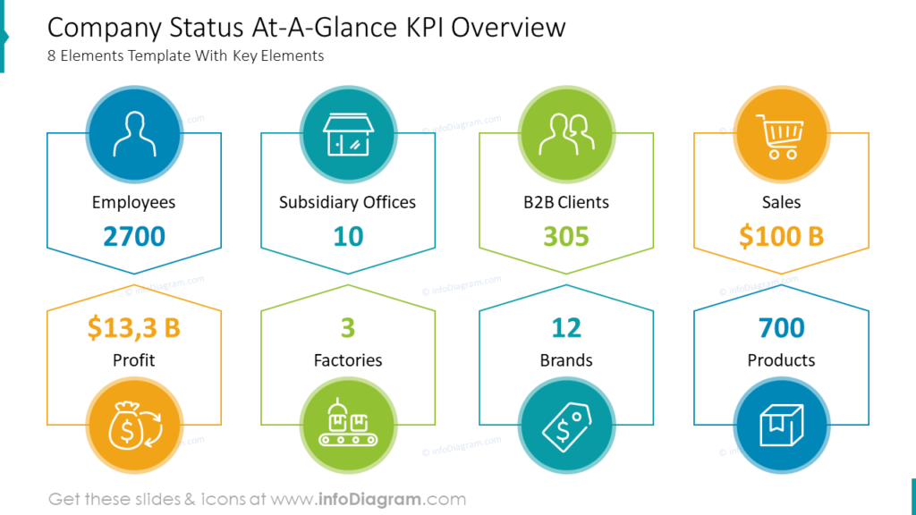
#2: Overall Company-at-a-glance Layouts
A “Company-at-a-glance” slide provides a quick overview of all the essential information about a company. Here are the common key elements you may include on such a slide:
- Company Name and Logo: Display the company’s name prominently at the top of the slide along with its logo. This establishes the company’s identity right from the start.
- Employee and Customer Count: Mention the number of employees and customers to give an idea of the company’s scale and reach.
- Key Achievements: Highlight significant achievements or milestones the company has reached. This could include awards, notable clients, or any exceptional accomplishments.
- Financial Highlights: Showcase key financial data such as revenue growth, profit margins, and other relevant financial metrics. Use charts or graphs to visualize these numbers.
- Market Positioning: Briefly describe the company’s position in the market, its competitive advantages, and unique selling propositions, brands, and products.
- Geographical Presence: If the company operates in multiple locations, show a map or list of the regions where it has a presence.
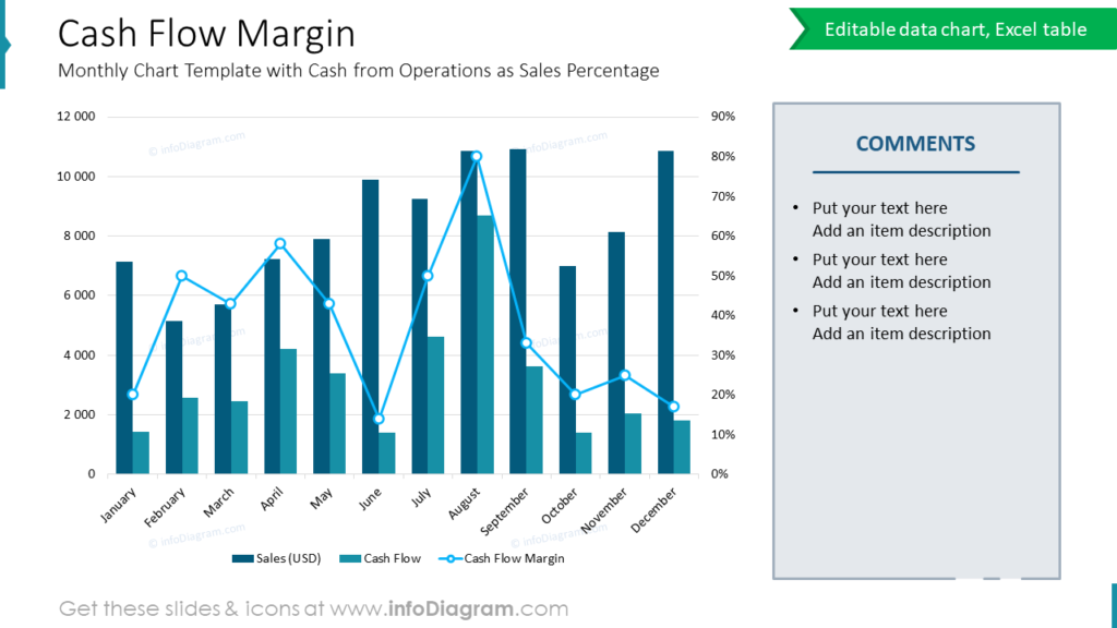
#3: Financial Performance Slides
When illustrating financial performance, you can use a variety of layouts and diagrams to present the data effectively and clearly. The choice of diagrams depends on the type of data you want to represent and the story you want to tell. Here are some commonly used data visualization forms for illustrating financial performance:
Line Chart: Ideal for showing trends over time, such as revenue growth, profit/loss, or stock prices. It provides a smooth visual representation of how the data changes over a specific period.
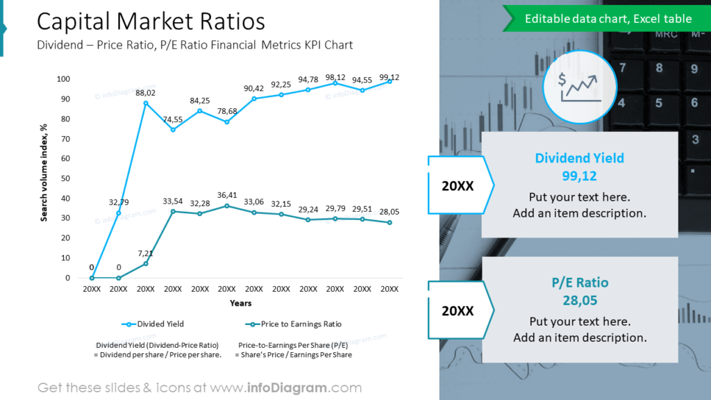
Bar Chart: Effective for comparing different categories of financial data, such as quarterly sales, expenses, or market share. Vertical or horizontal bars can be used, depending on the data and the presentation’s aesthetics. Below you can see a PowerPoint slide with a combined bar and line chart.
Pie Chart: Suitable for showing proportions and percentages, such as the composition of total revenue by product line or expense categories.
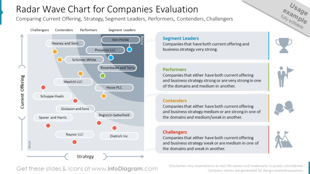
Radar Chart: Suitable for comparing multiple financial metrics across different dimensions, such as comparing the performance of other products or market competitors based on specific criteria.
Financial reviews packed with data and analysis often prove challenging for non-financial audiences to grasp. If you are working on the financial report deck, check 10 creative slide design ideas here.
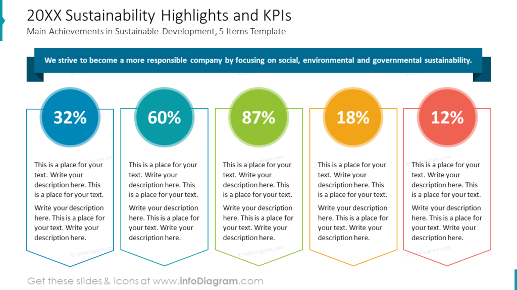
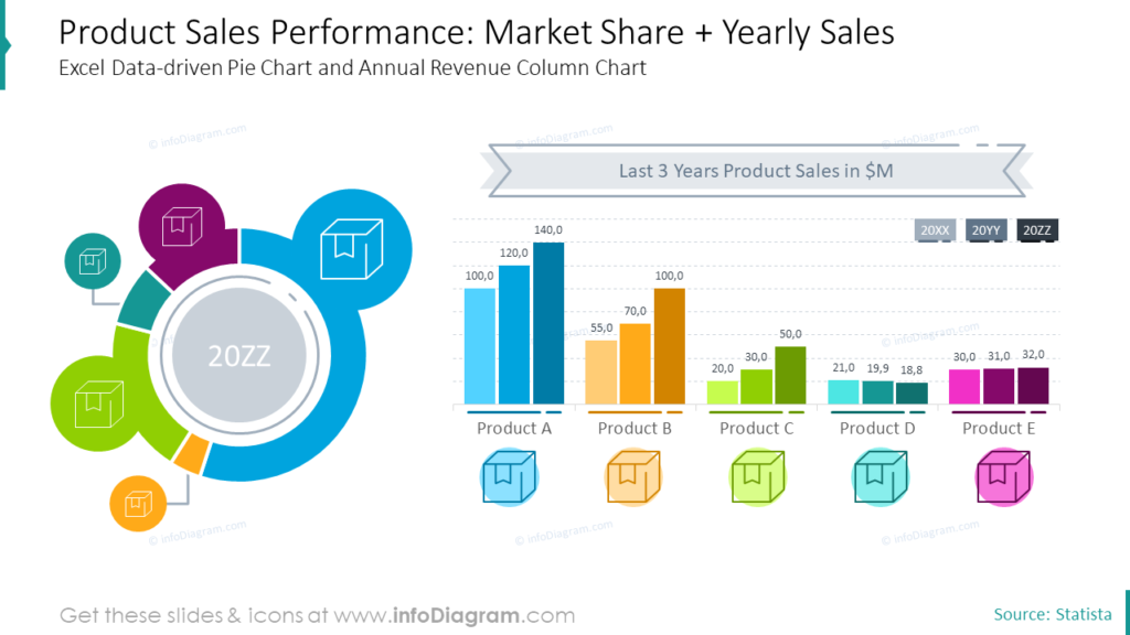
#4: Showing Progress by Pie Chart Percentage Metrics
When you want to present a progress status in a nice visual way, e.g. a target achievement percentage or market share, consider using pie charts. Pie charts can effectively showcase the distribution of performance across different segments or departments. Use colors strategically to emphasize essential segments and add labels for clarity.
Here’s an example of how you can illustrate product sales performance using both pie and bar charts on one layout:
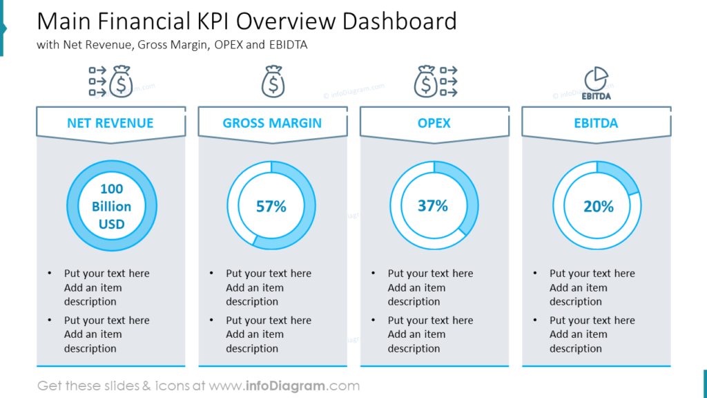
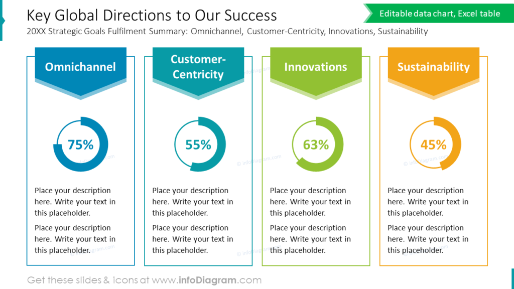
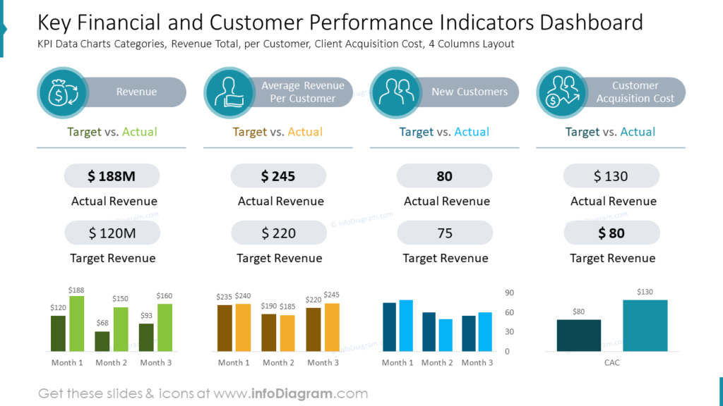
#5: Dashboard Slide Visualization
A dashboard slide presents several data measures altogether on one screen. It allows the audience to quickly assess the overall performance at a glance and see correlations between variables. It is an effective way to visually communicate complex data and insights to an audience.
To make your presentation more impactful, consider adding textual insights or annotations alongside the dashboard visuals. Provide context for the KPIs and explain their significance to the overall performance of the business or project. Limit the number of KPIs per slide to avoid overwhelming your audience and focus on presenting the most critical metrics.
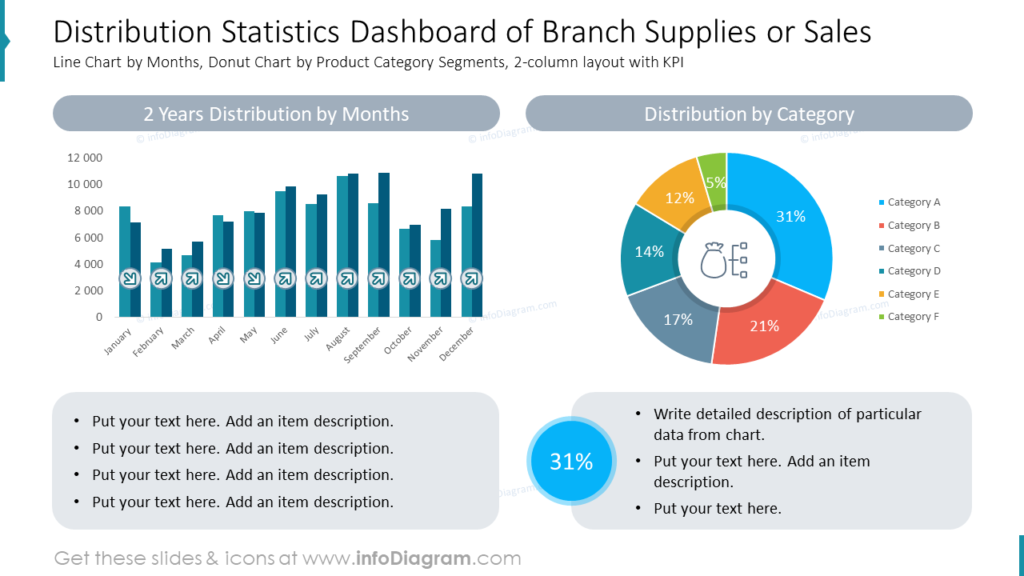
Utilize appropriate data visualization formats, such as line charts for trends, pie charts for proportions, and bar graphs for comparisons. Ensure the visuals are large enough to be easily read by everyone in the audience and use a consistent theme to maintain a professional look. Lastly, practice your presentation to become familiar with navigating the dashboards smoothly, and be prepared to answer questions and provide further analysis on the KPIs during the Q&A session.
Creating an Effective Company’s Performance Slide: Practical Tips
Use your data visuals to tell a story
When illustrating your company’s performance, it’s important to go beyond just presenting dry numbers and statistics. Instead, use your data visuals to tell a compelling story about your company’s journey. Highlight the progress you have made, showcasing any milestones or achievements along the way.
Additionally, don’t shy away from discussing any challenges or obstacles you have overcome, as this adds depth and authenticity to your story. Finally, make sure to include your future goals and aspirations, demonstrating the direction in which your company is headed. By telling a story with your data visuals, you can engage your audience better.
Provide context
Contextualize your data by comparing it to industry benchmarks or previous performance. This can help your audience understand your achievements’ significance and identify improvement areas. This not only adds credibility to your data visuals but also gives your audience a clear understanding of where your company stands concerning others in the industry.
Additionally, providing context allows you to highlight any growth or progress your company has made over time, further enhancing your success story.
Further Inspiration
If you’re looking for more design ideas, check out the following articles:
- Make Engaging OKR and Performance Review Presentations
- Templates for Informative & Powerful Financial Presentations
- 10 PowerPoint Decks To Illustrate Projects Review and Yerly Planning
- How to Present Company History Creatively in PowerPoint


