How to Find the Right Icon for a Slide Visualization [PPT best-practice]
Using the power of icons is a great way to make your PowerPoint slide more visual. Adding a graphical symbol helps to explain better the points you want to make. However, choosing a proper icon and incorporating it into your slide in a consistent way may take you some time.
I would like to share a bunch of designer tips on how to select and quickly adapt icons to enrich your presentation. I am using these tips almost daily with every slide redesign project we work with.
There are four criteria to consider when choosing an icon: Idea, Contrast, Space, and Style. Let me explore and explain each of those areas.
1. Icon Idea
When you want to add an icon to your slide, firstly decide what that icon should represent. It can be a specific object, quality, feature, or keyword from your message.
For example, for an idea of “benefit”, you can use a thumb-up icon or swoosh sign.

Icon symbol should be simple, so your audience can understand its meaning in a glimpse of an eye. It should also represent well the concept that you want to convey. Find a balance between being too general and not too complex.
If you work with PowerPoint templates from infoDiagram, use the Find function (Ctrl+F) to search for an icon inside our presentation decks. We include an icon set at the end of our templates. If your icon is not there, try the search on infoDiagram.com webpage. Or ask us for an icon suggestion in the webpage chat.
If you have an abstract concept to show, it can be harder to find an icon idea quickly. For example, to express Action, Change, Tax, or Outcome. It’s not that easy. Therefore we created an idea pool you can use – check our blog article 50+ Business Concepts Visualized by Icons.
2. Icon Power – Contrast
After you’ve found your icon, decide what visual power you want to give it. Ask yourself, how much you want to expose the symbol by using visual contrast.
The visual contrast is set by icon size and color.
- the bigger the icon is, the more attention it will take from the reader and that person will be less focused on other content.
- the same with the color – the light grey icon is less “screaming” than a dark black pictogram.
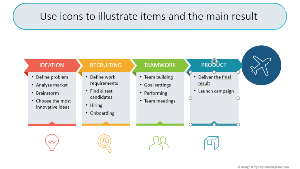
Notice the different contrast of icons in the example below – the symbols at the bottom serve as a light illustration of the 4 stages. On the other hand, the plane icon inside the dark blue circle gets most of the attention because of its size and strong colors.

Design Hint: Watch out when resizing the icon – don’t change the overal proportions of the symbol. Click the corner white point and hold Shift to keep the icon proportions. If you also press Ctrl, the resizing will happen centrally.
3. Space for Icons
You should also consider how much space you have on your slide. Adding icons should not make your slide too dense. It should make it easier to understand but not harder to read.
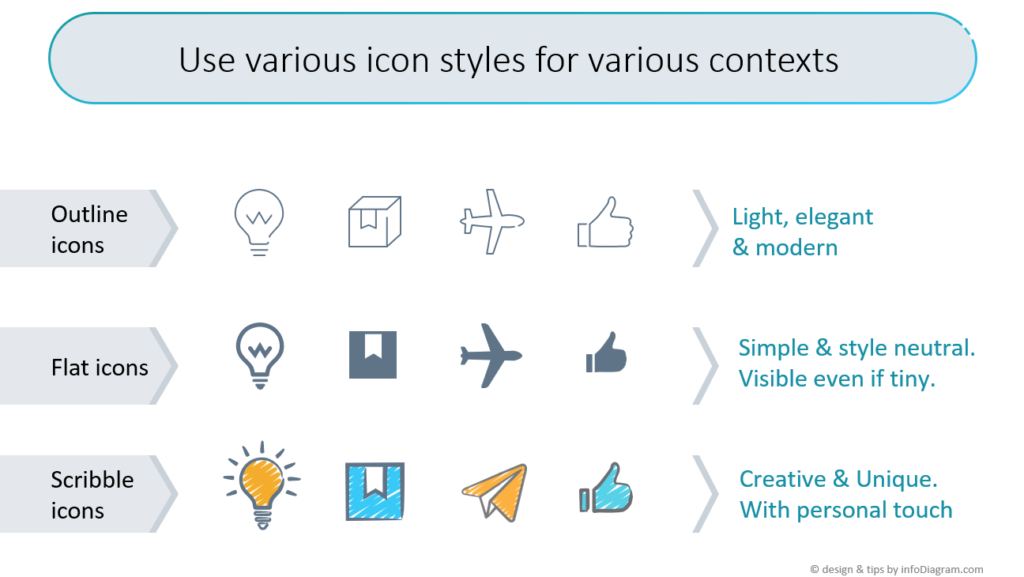
Be aware that some graphical styles of the icon symbols don’t look good if they are too tiny or too big. If your slide is already overcrowded with content, choose an icon that looks good even if it is small. For example, outline icons look better if they are over half an inch big (or 1cm). And simple flat icons are recognizable even if they are tiny, as you can see here:

4. Icon Style
The fourth thing is the style that you want to express in your presentation. Ask yourself a question:
- Do you want your icons to look neutral, not to steal too much attention? Then consider simple flat icons.
- Should symbols express modern elegance? Try outline style.
- Do you want to express out-of-the-box thinking and a creative approach? Check hand drawn scribble style.

Design Hint: A secret of a professional presentation look is consistency. Speaking of icons – avoid the mistake of mixing icon styles (gradient, hand-drawn, flat, outline style…). Because then your presentation will look as glued together from a mix of sources.
After choosing the right icon by its topic and style, let’s look at how you can incorporate it inside your slide.
You can check more examples of using icons in the various context in our Resource section mentioned below.
I hope these tips will help you create slides that will be visually attractive and clear to understand. Good luck with your next presentation.
Peter Zvirinsky
slide design wizard, and diagram-nerd
infoDiagram co-founder
More resources to get you started
Graphics
- Best-value icon bundles with 700+ icons or 200+ diagrams
- Smaller specific icon sets
- Content-ready business topics
Learning resources
- Blog: Outline vs Flat Icon Style Graphics
- Blog: How to choose a diagram? 18 Categories of Structures & Processes


