Presenting Monthly Business Report with Charts and Tables in PowerPoint
Are you doing regular business reviews? Whether it is monthly or quarterly reports, consider using a visual way of explaining your data on slides. In this blog post, we’ll explore the benefits of presenting your monthly business report in PowerPoint and how visual elements can enhance clarity and engagement for your audience.
The graphics presented here are crafted by our team and the result of over two decades of experience in designing corporate presentations.
Get all the graphics presented here – click on the slide pictures to see and download the source illustration. Check the fulla Monthly Business Report with Financial Performance Review (PowerPoint Template).
What is a Company MBR?
MBR stands for Monthly Business Review and it is an internal “all hands” regular presentation where a company looks at how well it’s doing, checks important numbers, and sees if it’s meeting its goals.
Monthly management reports help the company see how it’s doing financially and operationally. They let the management team see what’s been happening and make proper decisions for the future.
If you want to make your business performance tracking look nice and easy to understand, try using a visually appealing presentation format. Here are some examples to inspire you!
What is Included in a Monthly Report?
The typical structure of a corporate MBR presentation that includes as financial review has the following sections:
- General overview of the Month – an Executive summary
- Revenue status – Month & YTD
- Gross margin status – Month & YTD
- Expenses overview – Month & YTD
- Cashflow status
- Accounts Receivable status
- Review of Monthly operational goals
- Next month or other period outlook
We show you an easy way to present the data of the monthly business report. To design this information we added simple shapes to arrange slide. Using rectangular outlines and simple shapes with visual elements such as icon of a financial document keeps your audience from feeling overwhelmed by the text and the content is easy to read.
Presenting an Executive Summary of a Monthly Report
MBR presentation usually starts with an executive summary, to wrap up the most important facts and show them in the beginning.
This is especially important when the MBR presentation is longer or when you want the audience to scan through major results right from the start. Sometimes the main decision-makers need to get such an overview at the beginning, e.g. because they will delegate details by discussions and run to other meeting
Here’s how you can show such an executive summary on one slide. Select the key facts, such what’s your
- top line e.g. this month revenue, compare it with last year revenue of the same month
- what’s bottom line
- what’s outlook for the next month
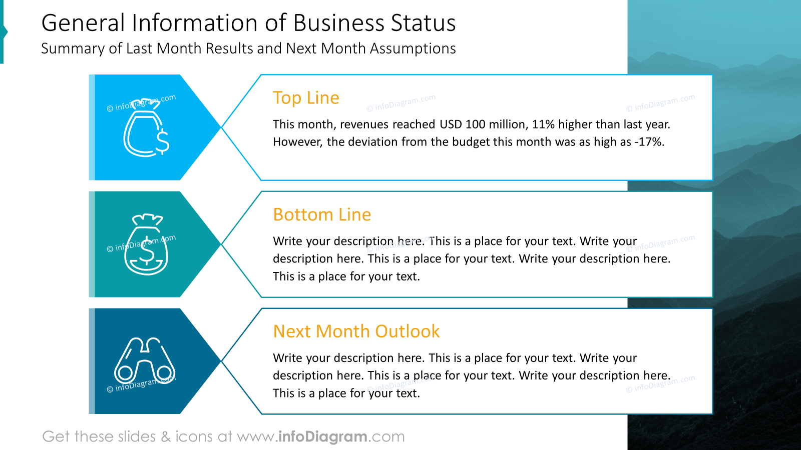
Idea of such slide design: in the picture above you can see how to create this layout. There are three parts composed of connector shapes. By composing a slide in this way, we create hierarchies of the key facts. It would be good to consider what information should be at the top and what at the bottom.
Each of the factors we highlight thanks to adding icons and distinctive color. At the end, you can add some picture in the background to enhance the overall aesthetics of the slide. Images can help tell a story and convey a message more effectively than text alone. In this case, the colors refer to factors in the picture for better visual appeal.
Presenting KPI Dashboard with Business Units Performance
When you want to show several key financial indicators altogether of your MBR on one slide, below you see an example of how you can organize such information on one concise page.
Notice the clear layout, with each indicator clearly labeled and accompanied by relevant data.
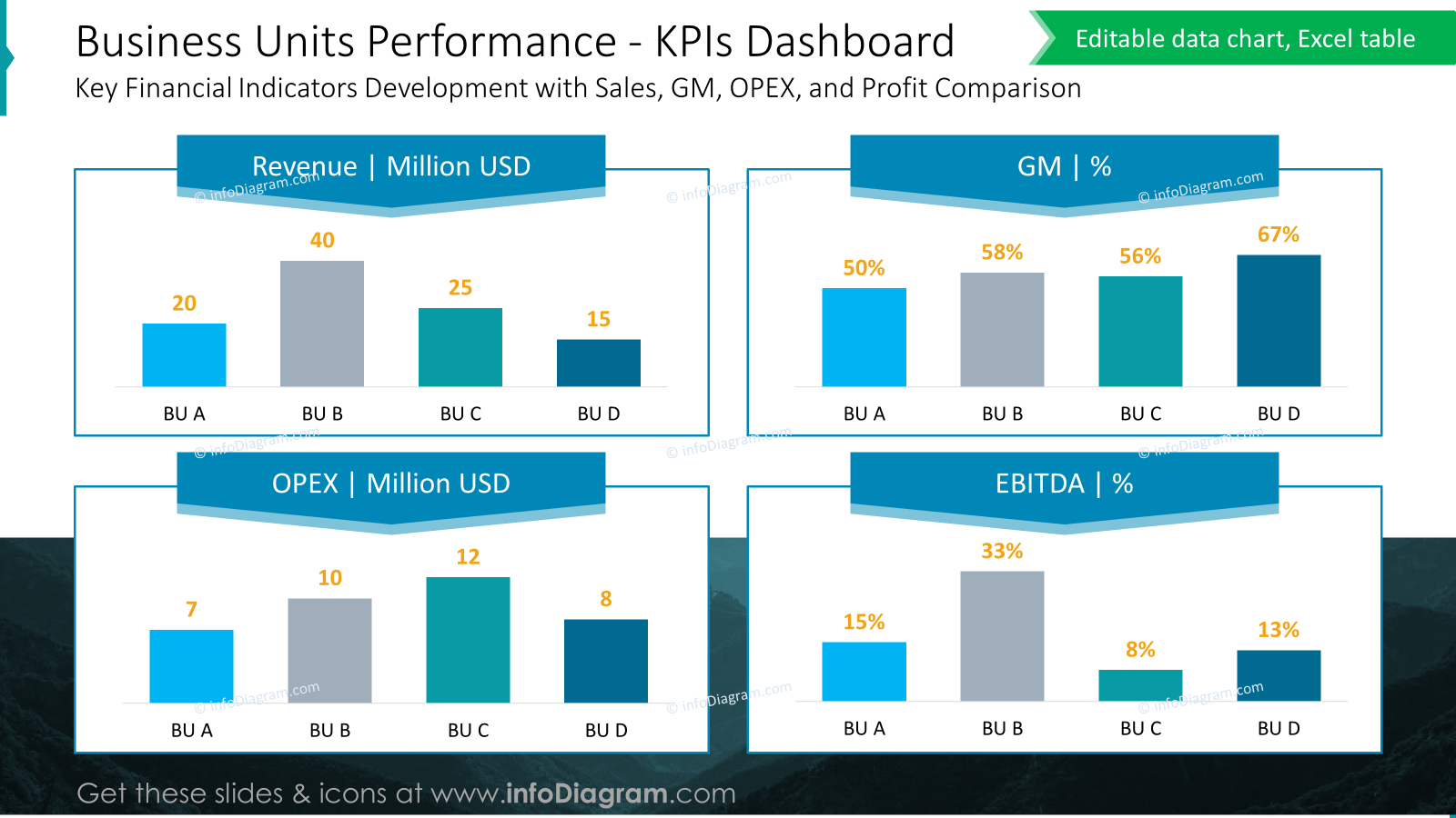
If you need to add a lot of data on one slide, we suggest adding visual elements such as charts in their simplest form – without axis details, repeating legends, and short number format. Additionally, the use of color and spacing helps to emphasize important information while maintaining visual clarity.
Keep the text on each slide short and to the point thanks to the audience reading a slide much faster, but if it’s necessary to add more data on one slide, just remember about white space, visual consistency, and emphasizing key data.
Showing Main Profit Drivers
If you want to present also more qualitative data such as text explanation of your main business lines profit drivers and their analysis, you can create such slide with short text information about each of the main drivers.
From the design point of view, you can organize it as follows below.
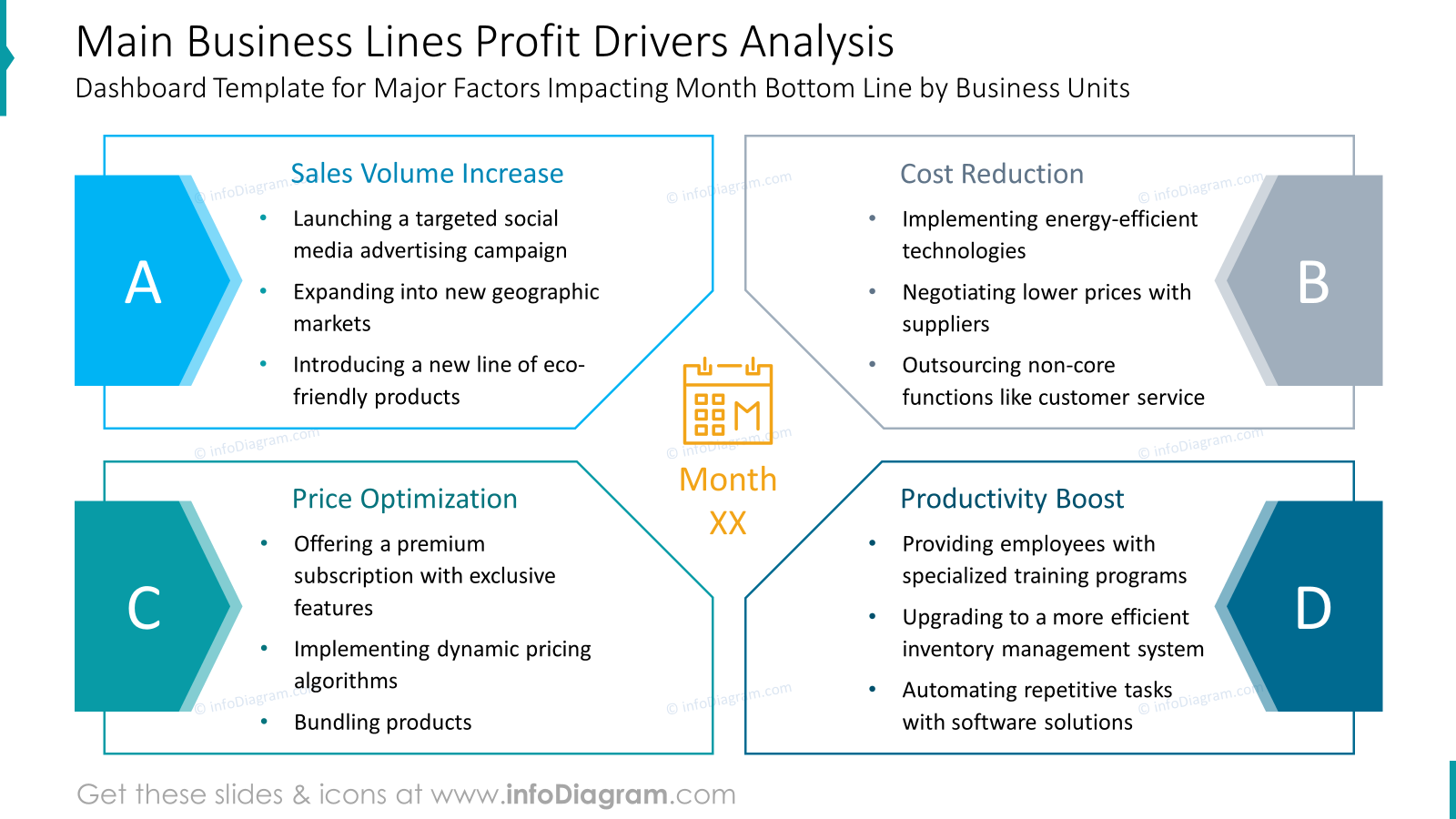
We arranged visuals in a logical sequence, reading flow is underlined visually by adding section numbers or letters. Remember to use white space and a cohesive look (font styles, sizes, and colors). You don’t want to overdesign. A balanced arrangement ensures the slide remains visually appealing and easy to read.
The importance is also a clear contrast between text and background color, especially if the slide has a lot of text and is quite small in size. You can also add visuals such as icons or images to complement the text.
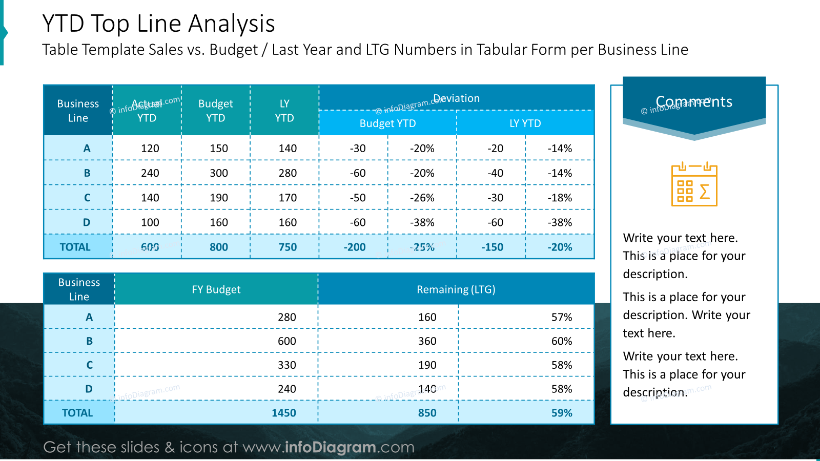
Presenting Monthly Revenue Analysis
Do you need to show a table with reviews of sales, and budget per business line?
You can boost up standard Excel table and create customized nice-looking tabular form in PowerPoint.
See 2 slides below, and check how we designed such a financial table, using table colors and some additional graphics.
Notice the use of enough space between text elements to enhance readability and avoid overcrowding. Ensure consistency of colors and shape styles throughout the slide for a cohesive and professional appearance.
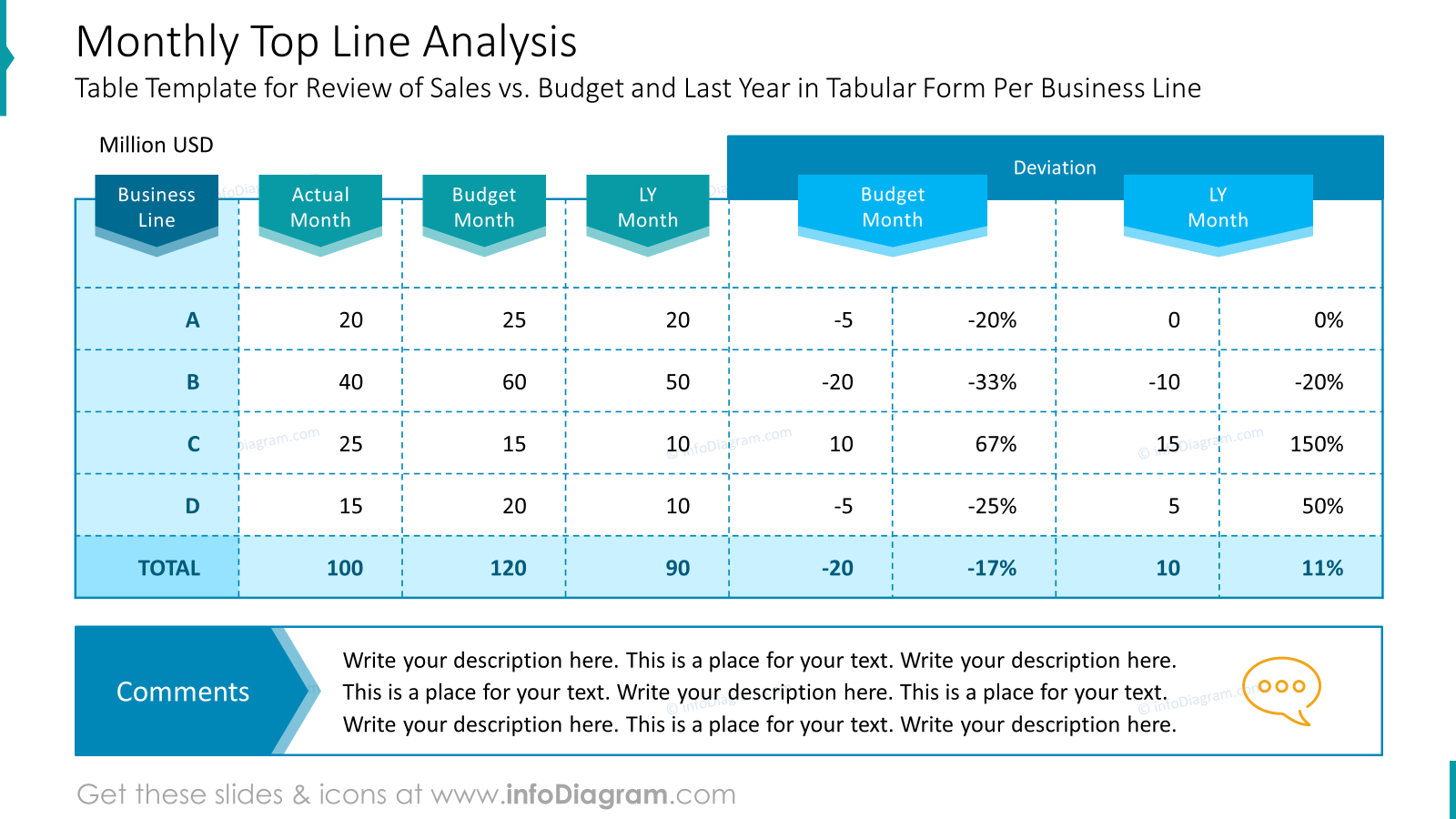
The table for presenting monthly revenue analysis is a typical form allowing you to showcase comparison data. You can enhance it using PowerPoint table tools. To highlight key metrics we used formatting features like bold and color text to emphasize important figures or trends within the table.
If you would like to have more custom tables we suggest adding the shapes for column headings ensuring clarity for the audience. Additionally, you can use visual elements like color-coded cells or icons to draw attention to significant changes or outliers in the data.
In the second sample of the table with financial analysis, we show you how to create a design, that looks professional and easy to read. You can use an ordinary table with your data and highlight the main data using distinctive color for each of the factors. Then you can use dashed lines and the color of the table lines. It improves the design of the slide.
Additionally, we added a place for brief analysis or commentary text to provide context and insights into the financial data presented.
Presenting Monthly OPEX Data Chart
To show monthly operational expenses, you can customize the Excel bar chart in the following way, to present a monthly business report in a more engaging way.
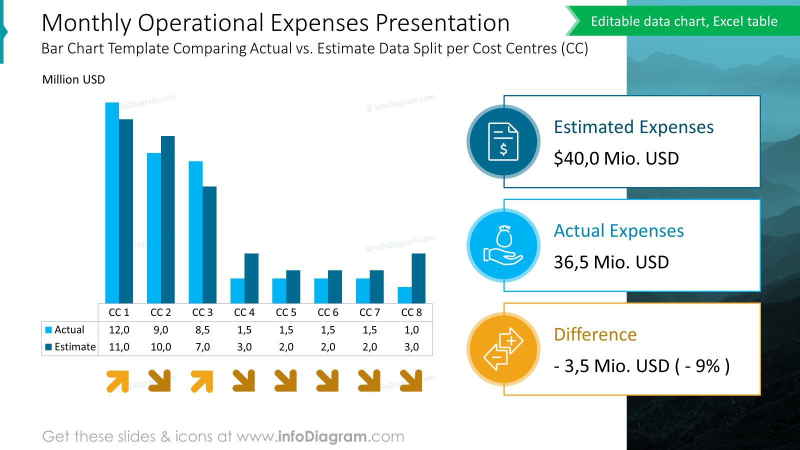
We added a custom arrow shaped under each bar chart column to underline the status of Actual versus Estimated value per cost center. Here arrows are manually added, as there is no way to add them automatically in PowerPoint. It takes a minute more but you get the advantage of using nicer non-default custom signs, that make your presentation look different than default charts.
You can also consider creating separate data legend, adding bigger icons representing 3 categories:
- estimated expenses expressed as paper with planned financial figures
- actual expenses illustrated by icon showing giving money away
- difference shown as plus minus sign
In the end, adding a subtle picture in the background can create a nice visual touch. However be careful so the picture will be only a light addition to your content, not the main element.
Showing Debt Structure in A/R Section of MBR Presentation
The financial review part of the MBR report can contain an Account Receivable dashboard and cash flow development charts.
If you need to present a structure of debt, here is a slide with debt structure analysis.
We reused the Excel table and transformed it into a more readable form, showing various levels of debt by age, their monetary value, and percentage.
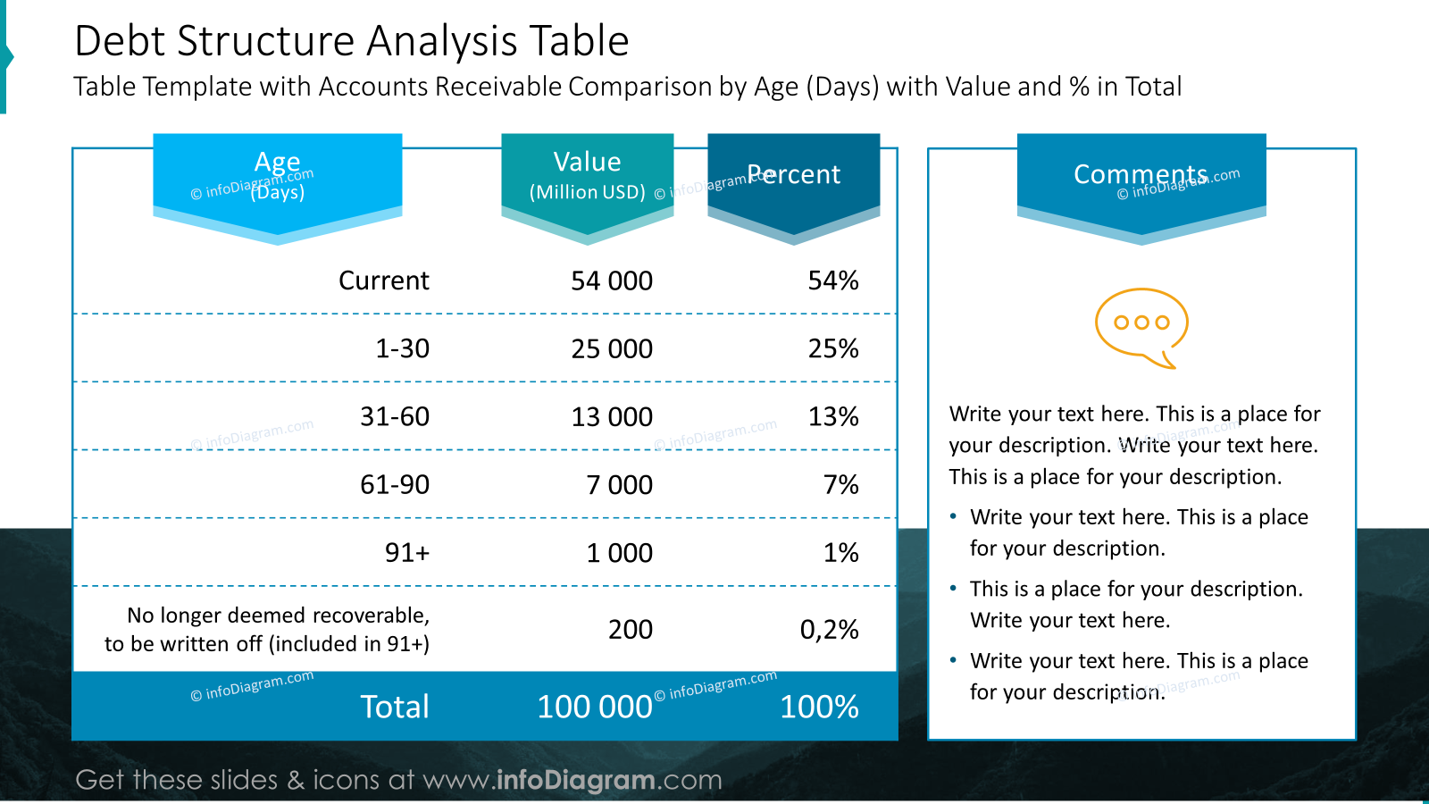
To create a nicer design, you can embed such a debt table with part of the picture, as we did on the bottom. Notice how this is done, so the picture does not overlap data presentation. The design trick we used here is making a table with a white background.
Usually, you also need some place for commenting on the debt structure. For that, we created a separate comment box on the right where you can add a text description of the debt analysis. That can be especially useful if you present a monthly business report that will be read without direct presentation.
Finish with Presenting the Action Plan for Next Month
At the end of the MBR presentation usually people also present next month’s outlook with next month’s targets and action plan.
We are sharing an example of how we designed such a slide presenting a set of goals, objectives, and actions in an easy-to-understand form. We used a table for that, as it’s easy to expand and gives a structure to the presented information. There is an important last column with a place to show who’s responsible for a specific action, so task assignment is clearly presented. This allows you to make people accountable or discuss eventual reassignments during the meeting.
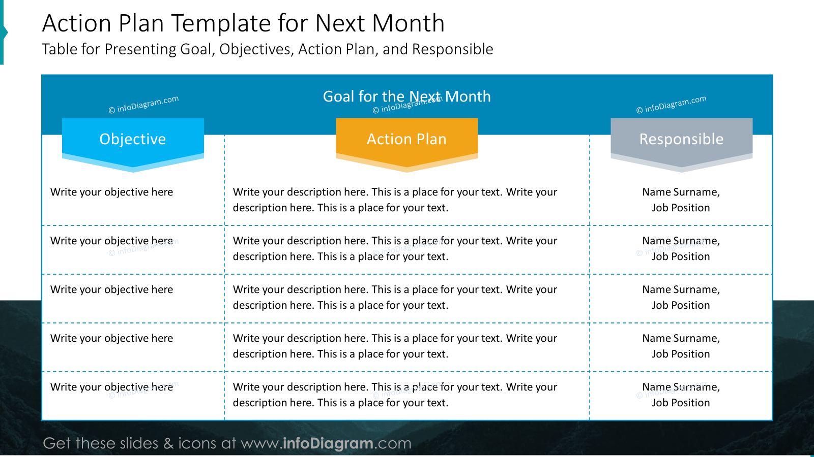
On this slide we used the tips, which we wrote about in the previous examples. We designed the table using simple shapes with shadow and color to highlight and harmonize the column headers. To improve visual effects we added dashed lines inside the table.
Key Tips How to Present Monthly Business Report
When you create a presentation of your monthly business report, keep these few tips thanks your presentation will be more eye-catching and easier to remember:
- use a highlight color to emphasize key factors and headlines,
- customize tables and charts for clear structure and readability,
- keep the layout simple and clean,
- remember about white space and contrast text,
- consider using graphics such as icons or subtle background images to complement the text and enhance visual appeal.
By following these basic design principles, you can create a compelling presentation that leaves a lasting impact on your audience.
Resource: Monthly Business Report with Financial Performance Review PowerPoint Template
The examples above used the graphics from an Monthly Business Report with Financial Performance Review (PPT Template). All slides are available in the infoDiagram collection of presentation graphics.
Further reading and resournces:
- Examples of Listed Company Financial Report presentation slides
- Article Best Practices for Financial Excellence of a Company
- video examples of MBR slides: