How to Present Balanced Scorecard Framework: PowerPoint Design Tips
Do you need to present a Balanced scorecard framework? How it works, and what it includes? You can boost your showcase thanks to a PowerPoint presentation with diagrams.
Let us inspire you with examples of Balanced Scorecard explaining slides. You can see how to design four major perspectives of your organization with visual aids to enhance readability.
A presentation explaining the concept of a balanced scorecard can have this structure:
- introducing BSC with its definition
- showing the process from strategy to implementation
- illustrate the analysis of finance, customer, business process, learning, and growth element
- presenting a BSC performance by data charts
- showing tiers of BSC integration
- translating strategy objectives through the organizational hierarchy
Get all the graphics presented here – click on the slide pictures to see and download the source illustration. Check the full Balanced Scorecard Strategy
What is Balanced Scorecard – defining the term visually
To define the term “Balanced Scorecard,” consider creating an attractive visual slide. This approach can capture attention and make the information more memorable for your audience.
You could write as a text that BSC is a strategic management tool for:
- Communicating objectives across the main areas of the organization
- Aligning the day-to-day work with the company strategy
- Prioritizing projects, products, and services
- Measuring and monitoring progress towards strategic targets
BSC provides a comprehensive view of an organization’s performance.
If you want a more attractive visual way to present this term, look at the example below.
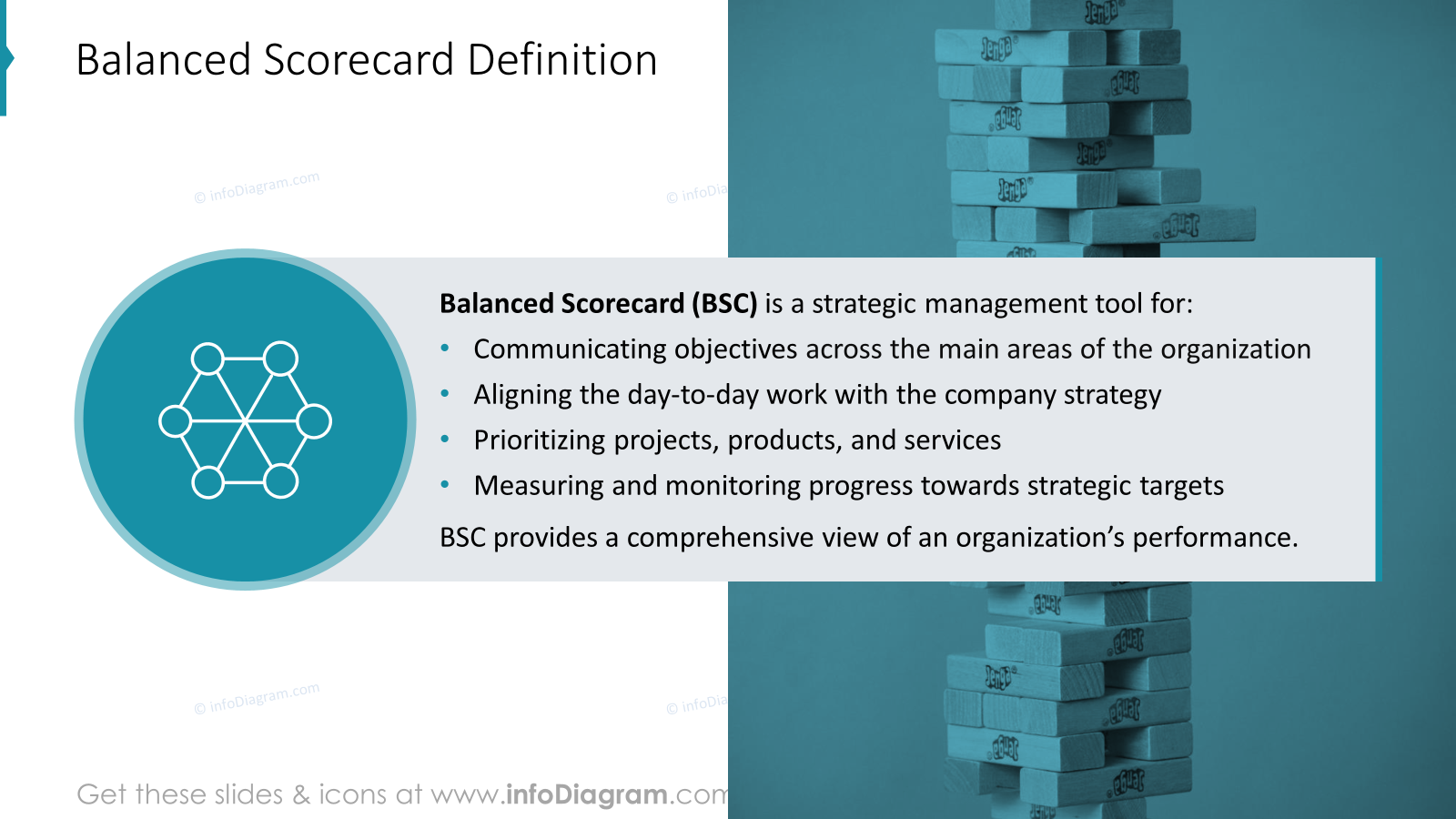
As designers, we suggest presenting the term Balanced Scorecard in a layout that also offers this concept illustration. We used a rectangle to highlight the text and added the icon to refer to the Balanced Scorecard definition. Additionally, on the right side, we added the picture on the background. This trick aids in keeping harmony in composition.
Presenting Roadmap from Strategy Objectives to Actions on a Slide
If you want to present the proceeding of strategy objectives to actions, consider using a visual roadmap. Such a flowchart visually outlines the path from strategy to action, making it easier to understand the steps and objectives.
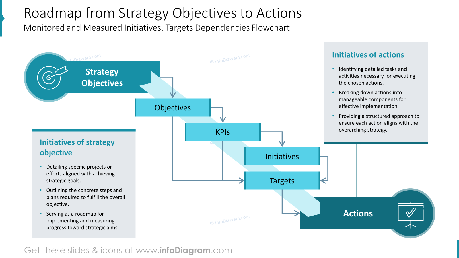
To visualize this roadmap we focused on showing initiatives by process flow diagram. In this example strategy objectives are overriding, that’s why they are at the top, and the actions at the bottom. Placing strategy objectives at the top establishes a clear reading flow and hierarchy, emphasizing their importance. The top-down design guides the audience naturally from overarching goals to specific actions. This layout enhances understanding by clearly distinguishing between objectives and actions. As you see, you can combine arrows with other shapes like circles or boxes. Ensure arrows are aligned properly.
We designed this structured format to create a clean, organized look that is visually appealing and easy to follow. The design maintains a cohesive narrative, showing the direct link between strategy and execution.
Show Major Perspectives of the BSC
When you want to express 4 perspectives of the Balanced Scorecard, you can visualize it as a diagram layout, that organizes the items in one cohesive component. You can see our proposal below.
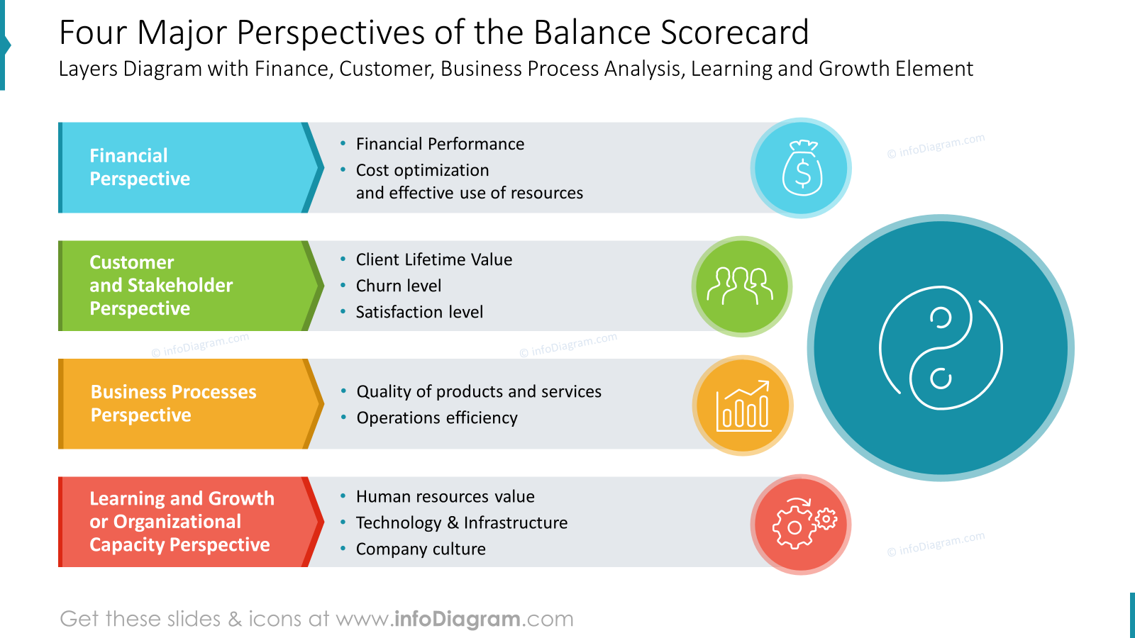
In this slide, we decided to show 4 perspectives of the cooperating system as a visual list map. The shapes are building blocks in the structure of this slide. On the right, you can see a circle with icons referring to the coexistence of each other. We used the circle because it conveys good flow.
Circular designs are visually balanced, and circles effectively show connections and relationships between different parts of the process. Additionally, we underlined the idea of balance by using a Yin-yang icon.
Presenting BSC as a Matrix framework
You can show a similar idea of interlinked 4 perspectives as a matrix and show dependencies by arrows, that indicate the flow direction and relationships between elements. They visually link related concepts, making dependencies easy to understand.
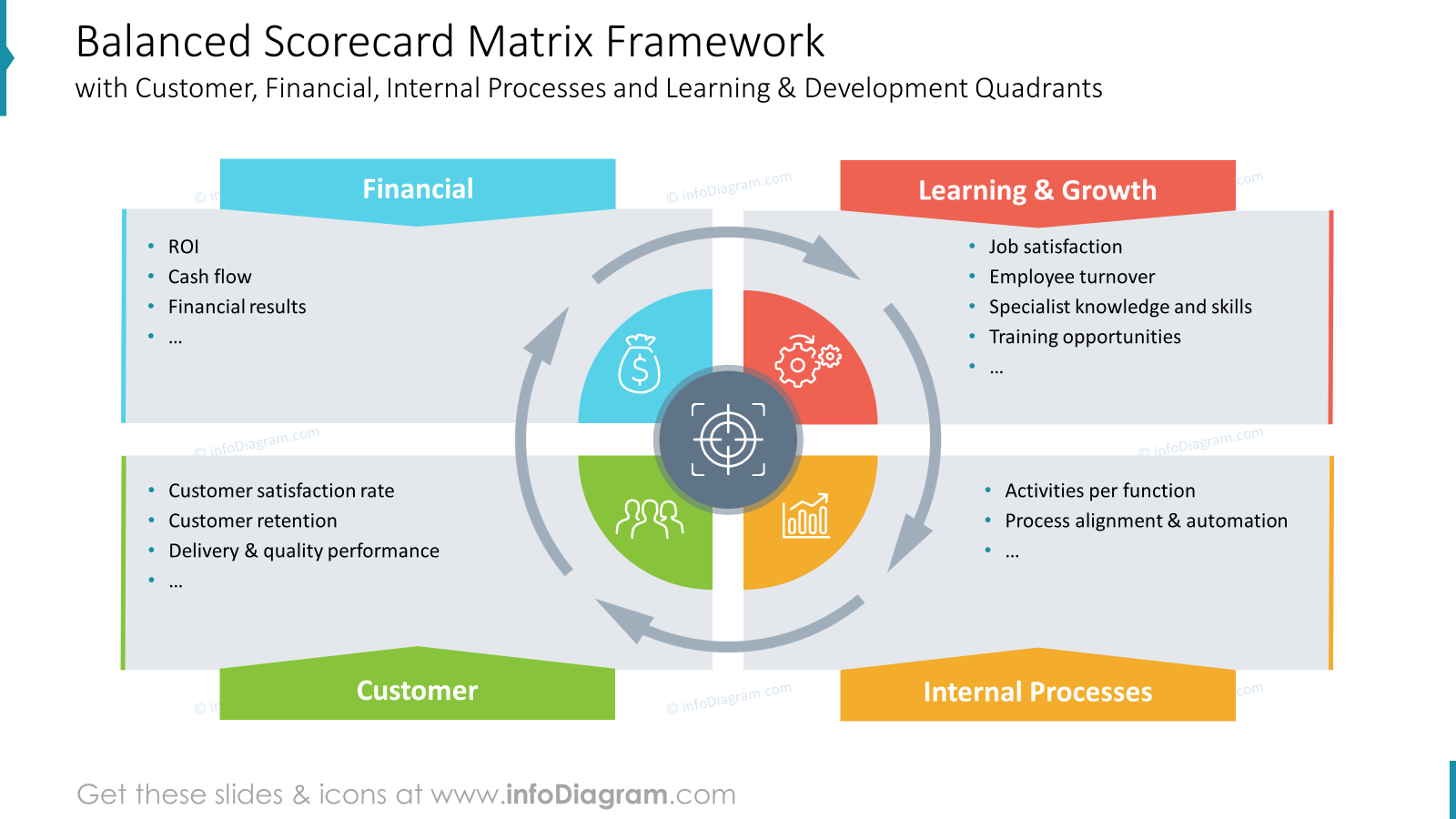
This matrix framework is a good way to focus attention on movement and progression, enhancing the visual appeal of a slide.
We suggest to organize information through connection and separation. Similar to the previous example each element has a characteristic color to emphasize its role. The layout with the circular element in the middle highlights the interplay of elements.
Data Dashboard Slide of 4 BSC Perspectives
To present also numeric data associated with various perspectives of the balanced scorecard, you can create a slide like the one below. When you have more information to present, remember to keep visual clarity and consistency.
The BSC dashboard layout is presented in 4 various sections:
- Financial perspective with the icon in blue
- Customer BSC perspective with the icon in green
- Internal perspective with the icon in yellow
- Learning & Growth perspective with the icon in red
Performance data of each section are represented in two ways
- as line chart showing goals achievement progress over time
- as gauge chart expressing overall target achievement level
Using color coding to categorize and differentiate data sets enhances readability and flow.
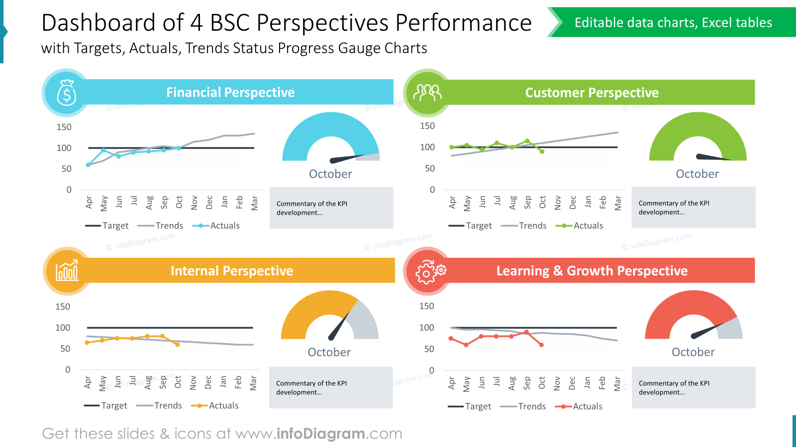
Using charts helps comprehension, and highlights the insights of the data rather than presenting raw numbers alone.
Visualize Tiers Cascading of Balanced Scorecard for Goals Alignment
Here’s an example of how to visualize a cascading workflow and data dependencies on different organizational levels. concept diagram visualization below.

We created a clear flowchart to show the step-by-step progression and arrange information in tiers. Cells of each level are highlighted with different colors to express various tiers hierarchy. Additionally, icons illustrate the top organizational view tier and bottom tier of teams and individuals.
If you want to show a similar concept of hierarchy over company departments, let’s take a look at the proposal below.
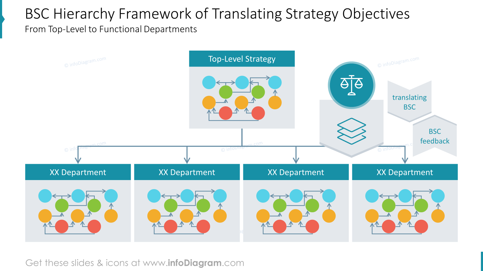
In this slide, we started with overarching strategic objectives at the top, and then break them down into smaller, actionable goals for specific departments as you move down.
The important is to ensure proper spacing and alignment to avoid clutter and maintain a clear, organized layout. We distributed elements evenly on the slide to maintain a balanced and visually appealing design.
What to Remember about Visual Presenting of Balanced Scorecard
If you want to present a Balanced Scorecard on the slide, remember about a few simple rules:
- show create structures and hierarchies of data by visual diagrams and flowcharts,
- remember about spacing and alignment,
- use color coding for faster understanding of the concepts,
- enrich your data with icons – properly chosen icons can perfectly reflect the meaning of your content.
I’m sure that with these basic design rules, you can make a stunning presentation and overall impression.
Resource: Balanced Scorecard Strategy Presentation PowerPoint Template
The examples above used the graphics from a PowerPoint template on the topic of the Balanced Scorecard Strategy. All slides are available in the infoDiagram collection of presentation graphics.
So if you want to create your balanced scorecard presentation quickly and visually appealing you can use this template. Simply add your pictures into predefined placeholders, replace texts, and enjoy a beautifully craft deck.
Subscribe to the newsletter and follow our YouTube channel to get more design tips and slide inspiration.