Presenting Sustainable Corporate Governance Report with PowerPoint Lists and Diagrams
Do you need to focus on the governance aspect more while presenting your sustainability report? This post is about using visual aids for this topic. Making an eye-catching presentation about sustainable corporate governance strategies can be fun with a creative result. You just need to involve some visual thinking and play with shapes in PowerPoint. Check my examples and guidance on how to convert (often even boring) data into attractive infographics slides.
I prepared for you a few instances of sustainable corporate governance slides, covering typical ESG presentation structure:
- creating an attractive definition slide
- visualizing the corporate values on a diagram
- showing components of corporate sustainable governance
- presenting the steps of the sustainability risk management process visually
- listing rules of conduct in the ESG report
Source of graphics presented here is available for download (link to visuals: Sustainable Corporate Governance ESG Presentation PPT Template).
Slide Defining the Sustainable Corporate Governance
What is sustainability governance in the context of the business ESG framework? The definition our ESG consultant gave me was: sustainability governance helps a company to implement a sustainability strategy across the business, manage goal-setting, and reporting processes, strengthen relations with external stakeholders, and ensure overall accountability.

So we know what the definition sounds like but let’s analyze how it’s presented on the PowerPoint slide above. I decided to divide the slide into two parts. One part is for the content of the definition and another one is for presenting the picture. Making the compilation of the text and picture makes the definition slide more attractive to look at. People don’t like to look at dry text.
Visualizing the Corporate Values on a Diagram
The example I chose for that part has 5 items to present as Corporate Values concerning sustainability:
- Loyalty
- Integrity
- Commitment
- Caring
- Innovation
I guess it can be quite confusing arranging an odd amount of items on a slide, so take a look below to see my idea.
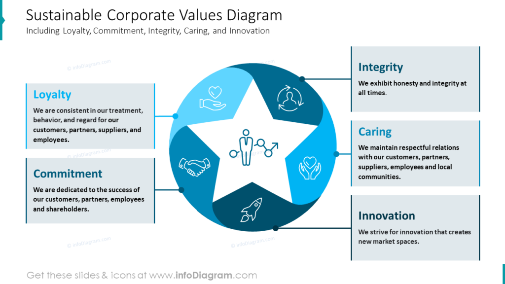
What symbol would you associate with a value while thinking about it? To me, it’s a star. It’s such a universal shape symbolizing quality, high rates, or values. And what’s more, my star is five-armed so it perfectly fits my five values to present. I placed the star in the middle of the slide and surrounded it with five ribbons to create a circle diagram, where the icons are placed. Every icon is assigned one value eg. shake hand symbolizes a commitment value. The last step was to create the frames, fill with the text and connect them with the proper icon.
If you’re looking for inspiration on illustrating corporate social responsibility strategy, have a look at this blog.
Presenting the Components of Corporate Sustainable Governance
Let’s imagine that the whole text from the slide below is listed on the plain white slide. It wouldn’t be an attractive slide, would it? My point is to show you how to create a visually attractive slide with a little text content.
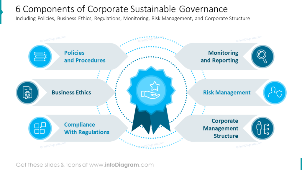
In this example we have only six components to place on the slide, it gives us a great chance to use our imagination and make the slide more graphically varied. I decided to put in the middle of the slide a big graphic of ribbon symbolizing the values. I surrounded it with content, three components for each side. To emphasize that those are separate points I placed the text on the shaped background. Also, I chose adequate icons to symbolize every component and to make it easier to remember. And this is how with a few small steps I created a graphical list.
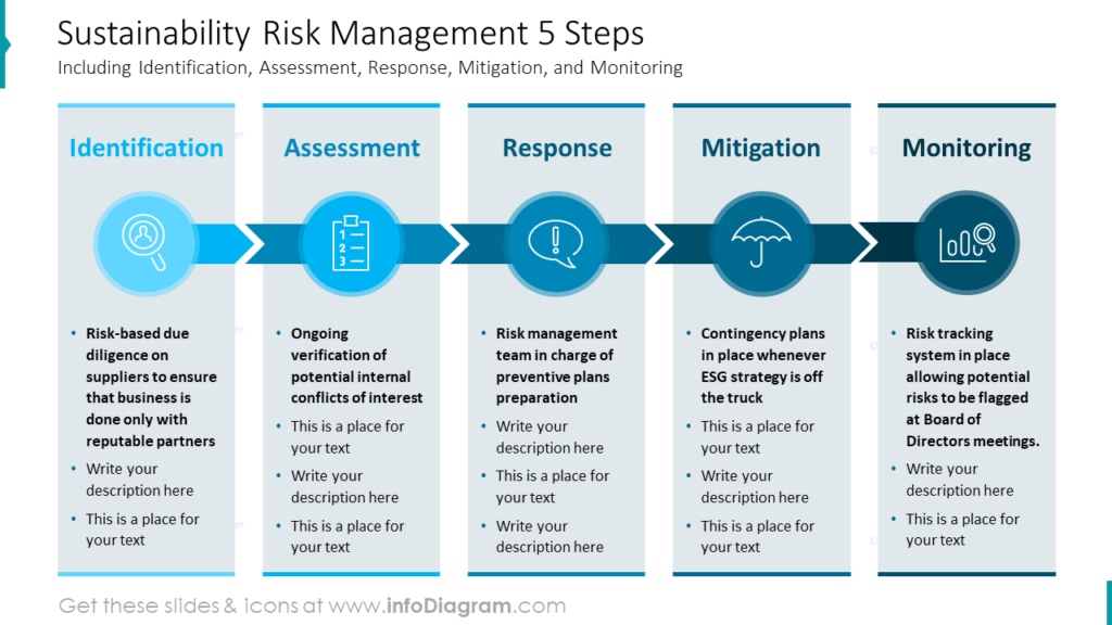
Visualizing the Sustainability Risk Management Process
Sustainability Risk Management can consist of such 5 steps:
- Identification
- Assessment
- Response
- Mitigation
- Monitoring
Each of the steps requires at least a short explanation so it’s needed to plan a space for descriptions. I decided to use rectangle-shaped columns. Each column represents one step in the process. Additionally, to make the content more attractive and clear I assigned an icon to each step. The arrow shapes placed between icons visualize the point of start (identification) until the end (monitoring). Below the graphical part, the descriptions are placed. I used the bullet points to separate the text but you can arrange it as it fits your content.
See how to present risk levels and give an insight into assets or risk factors portfolio.
Listing the Rules of Conduct in ESG Report Creatively
Let me show you on the slide with rules of conduct towards the company’s groups of interests. In my case, it covers customers, employees, shareholders, suppliers, competitors, and communities.
How can you present such a set of rules in your presentation? My example has 6 rules so the easiest way to arrange the space on the slide is to divide them proportionally into three rows with two rules each. Let’s have a look at the slide below.
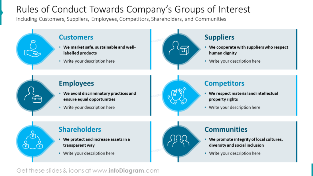
First of all, I visualized text with icons, which enriches the content of the slide. Headers, the main message of each rule, are emphasized with color and bigger font. I created a separate frame for each rule and arrange them in two columns. This kind of layout is very convenient for making changes and adapting frames to the text length. You can easily make them wider or narrower.
Design Tips for Creating the ESG Reports
While preparing the presentation about ESG topics like the one mentioned above, remember a few universal things that will help you make your slides look professional:
- Choose a visual representation of your information. A simple diagram is better then a block of text. Analyze the data you want to present. Think, do they represent a list or process? This will help you to choose the proper visualization form, for example, a flowchart or star diagram.
- Arrange the content adequately to the amount of the content to fill as much of the space of the slide but at the same time keep safe margins around (read our blog about whitespace).
- Visualize your data with icons – properly chosen icons can perfectly reflect the meaning of the title or description. The human brain can remember data better when they are illustrated with symbols. (check our article on how to choose icons)
I’m sure that with these basic design rules, you can make a stunning presentation and impress your audience.
Resources: Corporate Governance ESG PowePoint Template
The examples above used the graphics from a PowerPoint template on the topic of the Sustainable Corporate Governance Report. All slides are available in the infoDiagram collection of presentation graphics:
Moreover, you can extend your sustainability presentation with sustainable corporate management templates for PowerPoint right here.