How to Present Non-profit Annual Report with Impact
Do you want to present your NGO or non-profit annual report a way that will be understood and remembered?
In this article, I’d like to share tips and several examples of how you can prepare a professional report describing activities and the impact of an NGO organization using visual PowerPoint slides.
Get all the graphics presented here – click on the slide pictures to see and download the source illustration. Check the full NGO Annual Report – Nonprofits Impact, Finance, Plans PowerPoint Deck. We offer a discount for non-profits with limited resources – contact us for that.
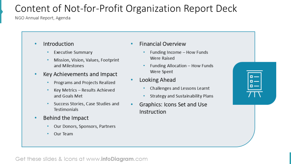
Structure of typical annual report of non-profit org
Annual reports usually follow some variation of this presentation structures
- Introduction part with topics such as
- Quick Executive Summary
- Overview of NGO’s Mission, Vision, Values, Footprint and Milestones
- Key Achievements, done projects and NGO impact
- Key Metrics section presenting results an NGO have achieved, covering success stories, case studies
- Background behind the NGO impact, who are donors, sponsors and partners of an NGO; core team running the NGO
- Financial overview part
- Funding incomes – how NGO raised its funds
- Funding allocation – how funds were spent
- Looking ahead section about future plans
- Challenges and lessons learnt from last year of an NGO
- Strategy and sustainability plans
When preparing a presentation covering all those topics, it’s good to clearly visually illustrate it.
For that you can use the clear agenda slide and presentation section slides that stand out from other slides.
See our example of such a section slide – how we added a simple visual mosaic graphics made of icons on a colorful background stripe.
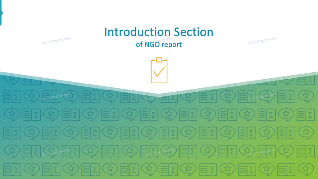
For more examples of using special structure slides, check this blog article.
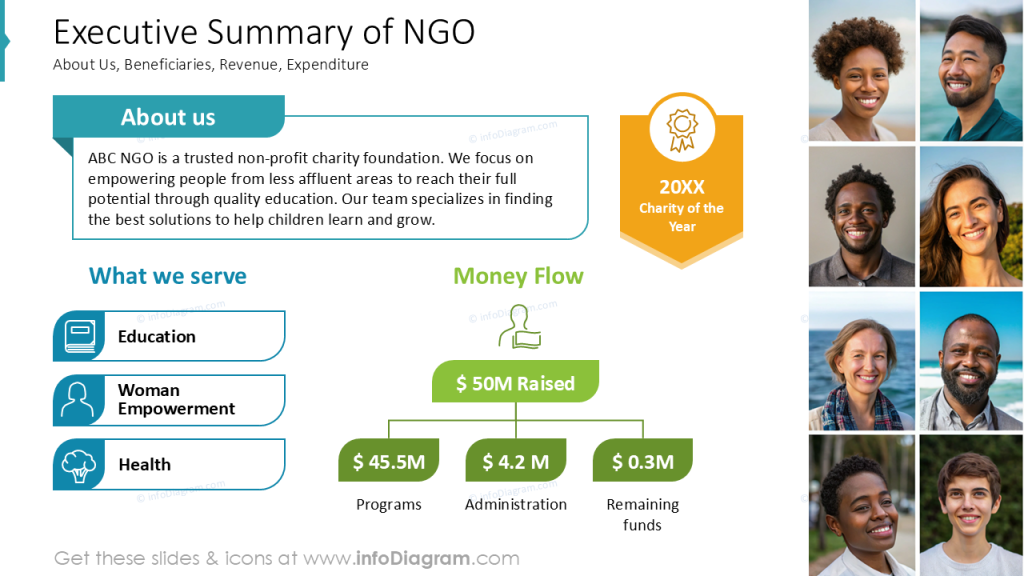
Presenting Executive Summary of a Nonprofit Organization
This can be the most important slide of your presentation. Therefore it’s worth to make it look readable and attractive.
Avoid using text bullet-points, don’t make it overcrowded with information. To make it easy to read, use grid and alignment tools that will help you create a smooth layout.
You can enrich it by adding topic-related graphics – as we did, using icons and pictures of people. Take care that graphics will not overwhelm the presentation, they should stay as supportive elements not main ones.
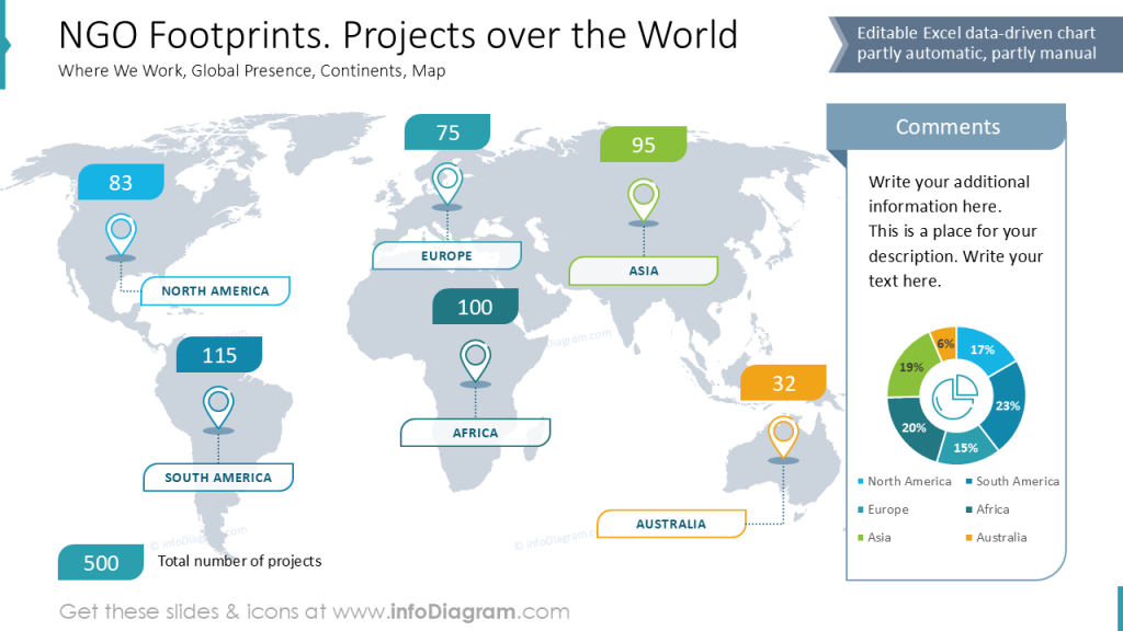
Visualize the footprint of NGO projects
If you act globally or in specific region, you can illustrate it using map so your readers can get better image of NGO impact area.
You can create a presentation slide with a map as a background and place information about your projects over it.
See how we designed such a slide – presenting global presence of NGO programs by showing the number of programs on each continent and a summary data chart on a side.
Notice use of color coding – having a specific color for each region helps a reader to see the connection between categories and chart values.
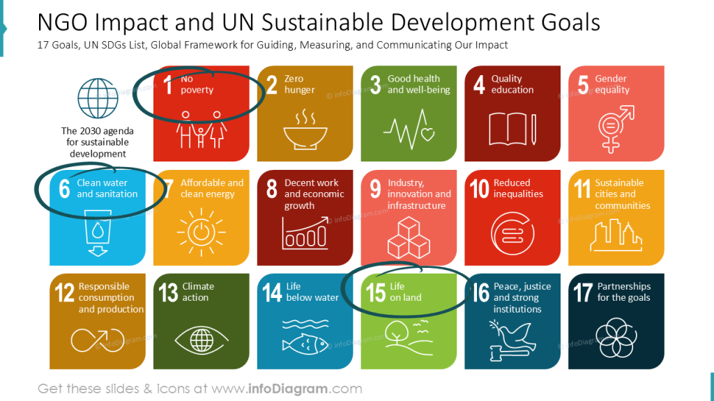
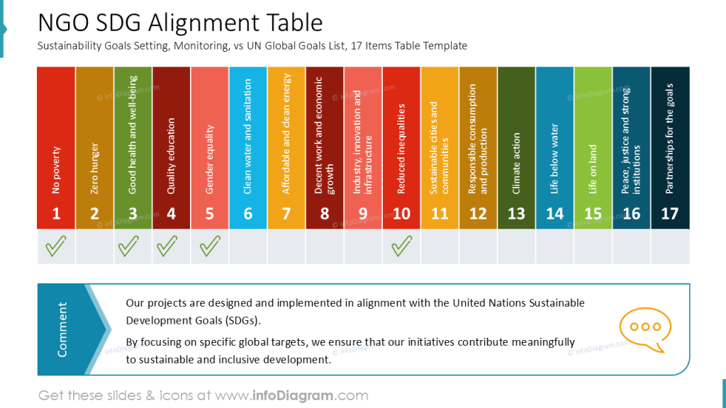
Illustrate NGO impact on the Sustainable Development Goals
If you want to present where your organization is making an impact in the context of UN’s sustainable development goals, you can present it visually in the following way.
Make a slide listing all SDG goals and mark goals where your NGO is active. For that you can use hand-drawn markers placed over the picture of the SDG goals.
Alternatively you can add a table that marks alignment of your organization activity within those 17 SDG areas:
For more examples related to sustainability and ESG topics, check these presentation slides.
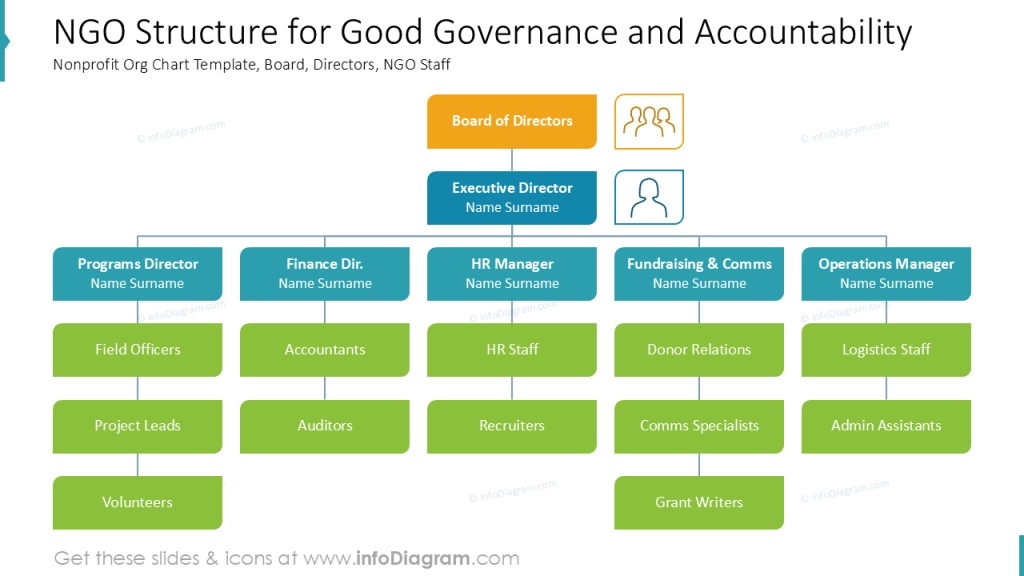
Show the NGO’s organization structure
You may want to present how your NGO is organized internally, so your stakeholders can get understanding of NGO size and structure.
To visualize this information, you can use either a SmartArt tool from PowerPoint – it offers a quick way to create a structure tree diagram. However SmartArt has its limitations and offers quite default looking diagrams. You can make org chart design more creative if you use some custom shapes available in PowerPoint.
See example of such organization chart diagram made from some standard PPT shapes and a few additional icons.
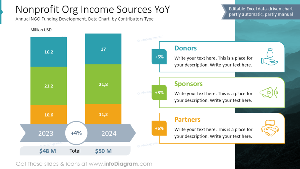
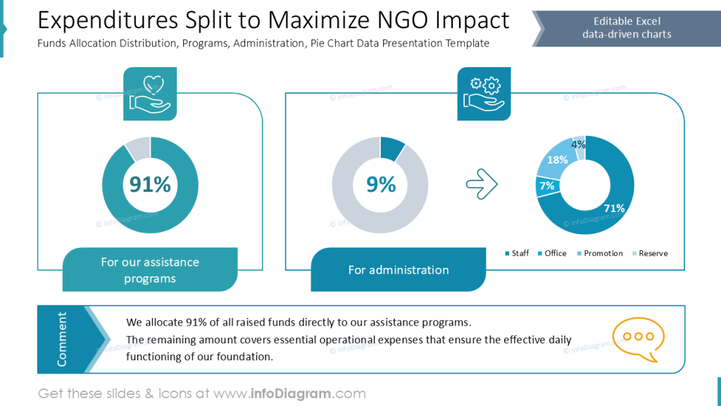
Present financial data – NGO’s incomes and expenditures
Non-profit organization annual report needs to contain also chunk of financial data, presenting income sources and spending structure in a transparent manner.
Here are two example slides presenting such financial information using aligned data charts.
See how we designed a slide with NGO income sources – annual funding development by contributors type:
And here’s an example of presenting NGO expenditures split with funds allocation over programs and administration costs.
Designer Tips for a Professional Non-Profit Annual Report
To present your organization in a professional way, follow those few design tips:
- Create a clearly structured annual report presentation with the help of section slides.
- Illustrate key concepts and data with subtle graphics e.g., simple icons, to help readers quickly associate visuals with key terms.
- Ensure a smooth report reading experience by aligning the presentation elements and avoiding overcrowding the presentation with too much information on one slide.
Resources: Non-profit Annual Report Templates
The slide examples above are part of our PowerPoint slide library. The full presentation is available in the infoDiagram collection of PPT graphics:
Check other posts featuring examples of presenting organization performance and annual reports:
- Presenting Monthly Performance Report with Charts and Tables in PowerPoint
- Make Engaging OKR and Performance Review Presentations
- Social Sustainability Report ESG Presentation
- Circular Economy and Sustainability Diagrams
See our slide redesign tutorial where we show how you can create a similar slide using PowerPoint tools: