7 Creative Timeline Design Ideas for Presentations [With Examples]
If you want to tell a story in your presentation, show it as a series of events in chronological order. A nicely designed creative timeline is what you need to make your slides visually compelling.
For showing detailed plans, there are numerous specialized tools for project management (just google for Gantt charts apps). However, sometimes simplicity is the best path. That’s why here we propose several ways you can do quickly a fancy timeline in a PowerPoint. A timeline that is flexible to show any events and comments. Plus it’s very easy to create and edit.
This article presents several timelines and roadmap illustrations. Click on the pictures to see the source slides.
What is a timeline diagram? A simple visual representation for presenting stories, stages, milestones, deadlines, or strategy steps.
Before doing a slide with a timeline, consider first what you want to show. Check seven ways you can use such visuals in your presentation:
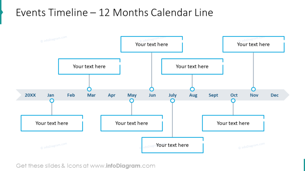
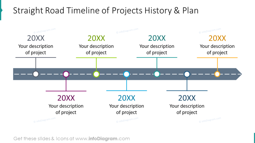
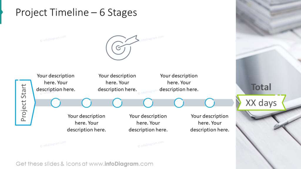
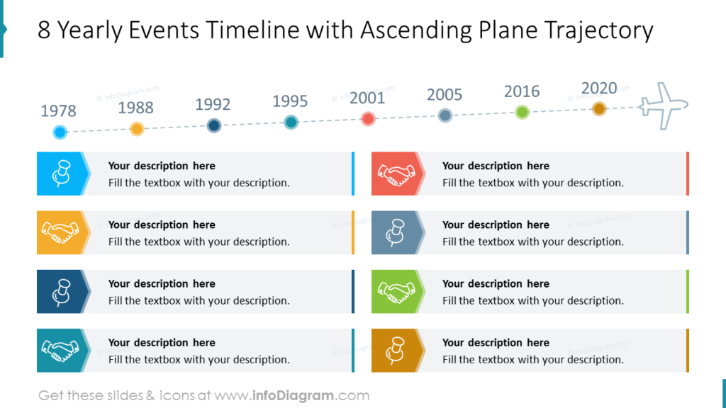
1. Showing progress or sequence by a simple horizontal timeline
Tracking events horizontally from left to right, like reading a book or using a ruler. This is the most common type of timeline, suitable for any meeting and presentation.
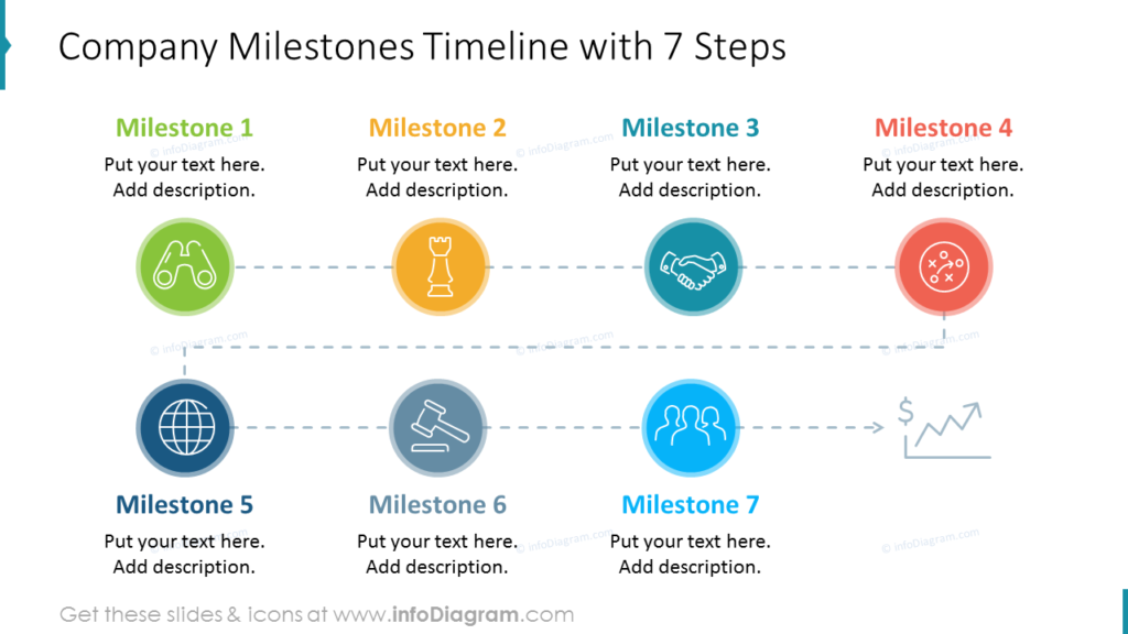
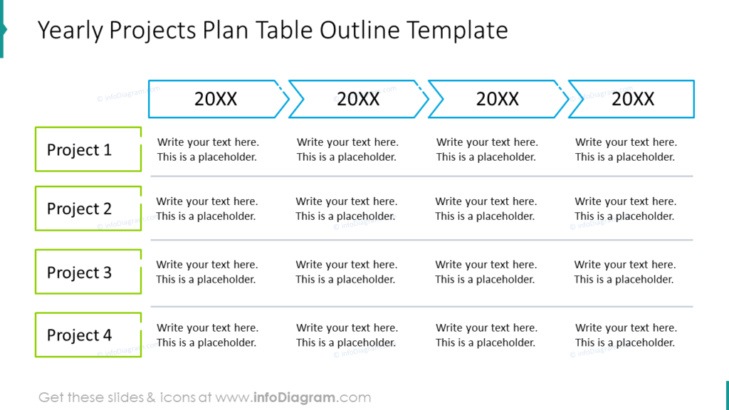
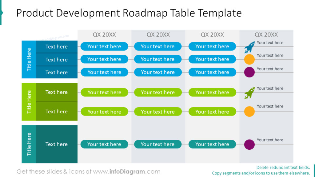
2. Presenting many events or projects on one slide
The golden rule of presentations is to eliminate the amount of text on a slide. However, if you need to show a bigger number of events on one slide, fold or split the timeline into several rows. And they are still attractive, especially if you add some icons 🙂
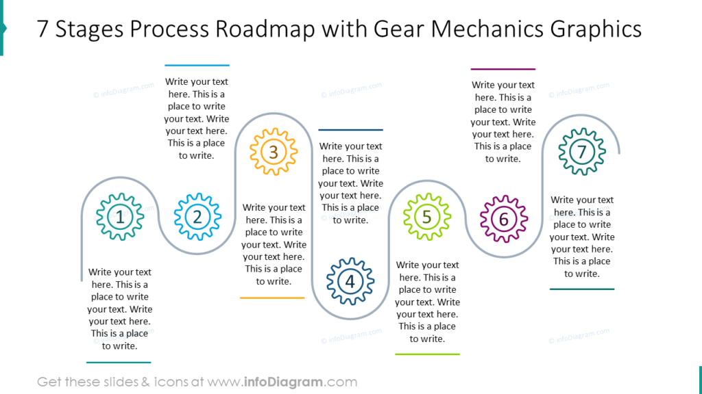
3. Returning chain timelines
If your idea is to show a close connection between the first and last event, the following timeline type is the best. It is suitable also for longer event sequences, that will not fit into one horizontal line.
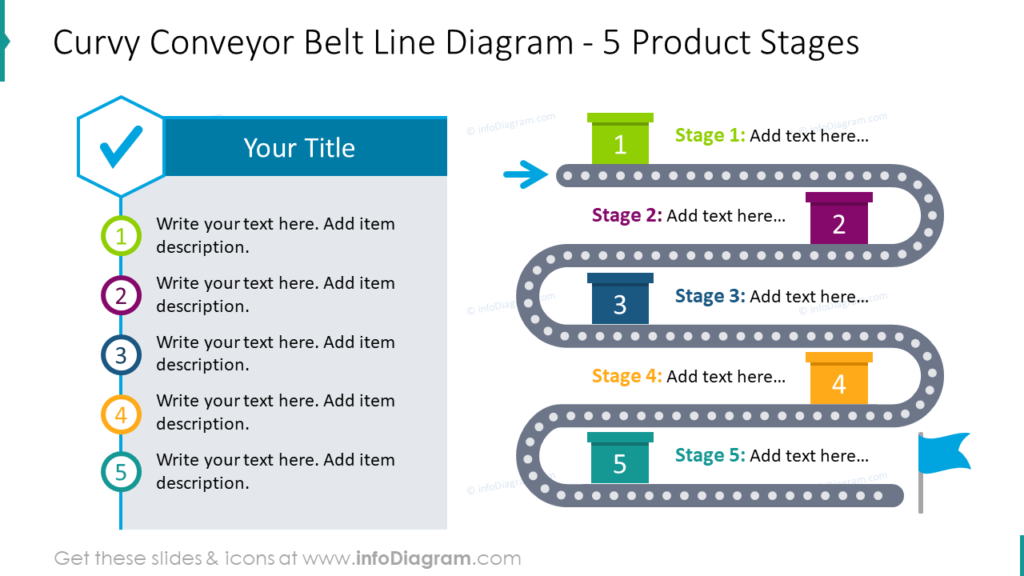
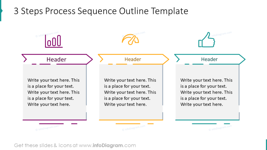
4. Short creative timeline ideas for showing only 3-6 major events
Having a timeline with only a few events allows you to use a stronger design. Such a slide will be more visually attractive than smaller more busy timelines. So you can use it to show the key part of your presentation.
Those timelines are good for illustrating core milestones. Consider using vivid colors for these diagrams as below, to bring freshness to your presentation.
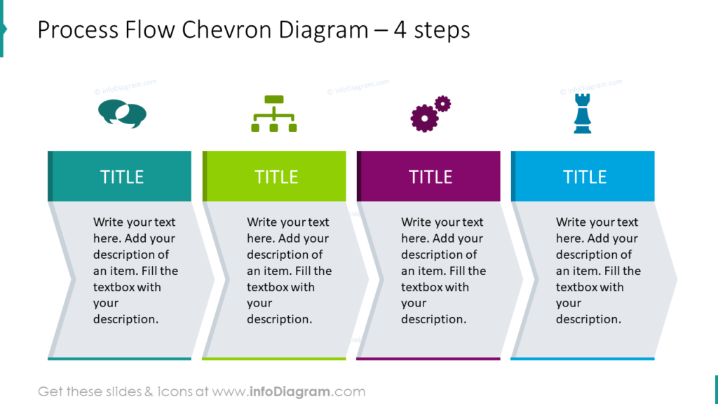
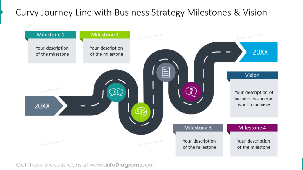
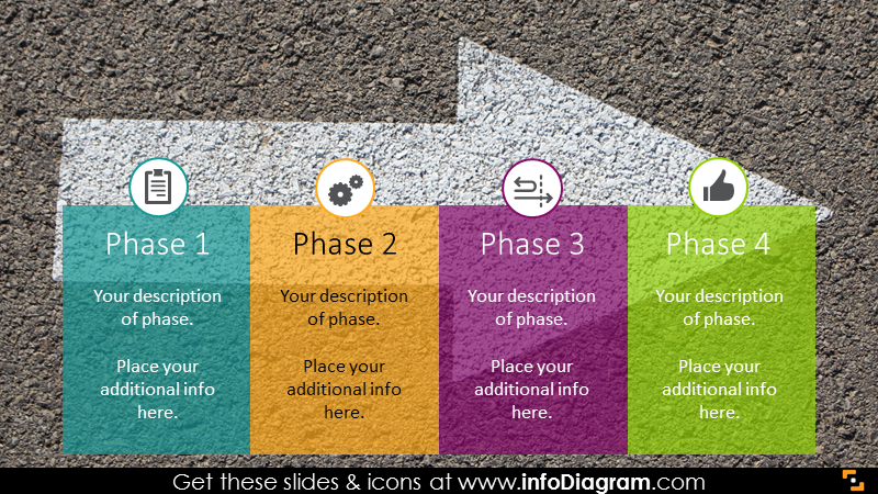
5. Arrow timelines for illustrating the development process toward a goal
You may need to present steps, that will guide your team or company to the desired goal? The good idea is to use a timeline, consisting of one main arrow with colored ribbons on it. This design may not be the best for showing precise event timing but it’s great to attach attention to a few main milestones for achieving desired results.
6. Calendar timelines for planning a year month-by-month
If you do a business review or plan next year’s actions, use a monthly calendar design. Present specific actions by series of monthly events, each represented by a bookmark or ribbon shape, where there’s enough place for putting a description for each month.
7. Presenting the history of the company or long-term strategy vision
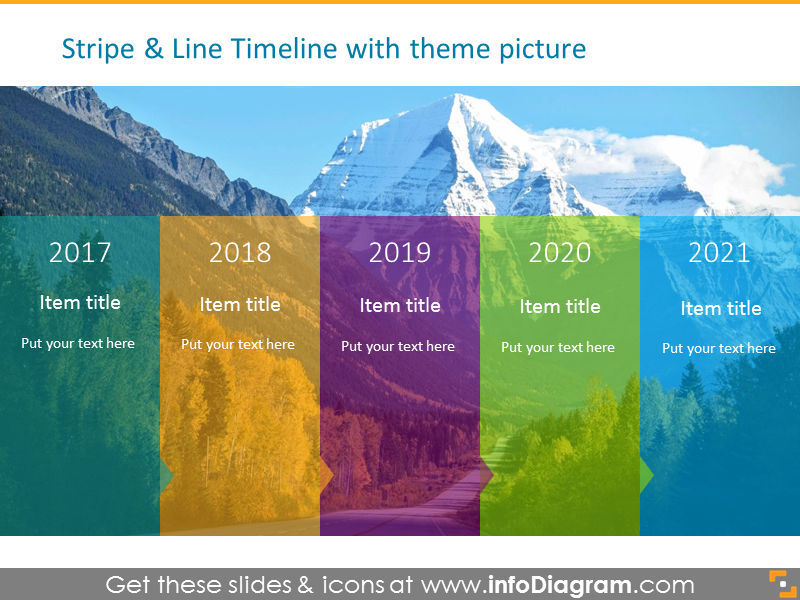
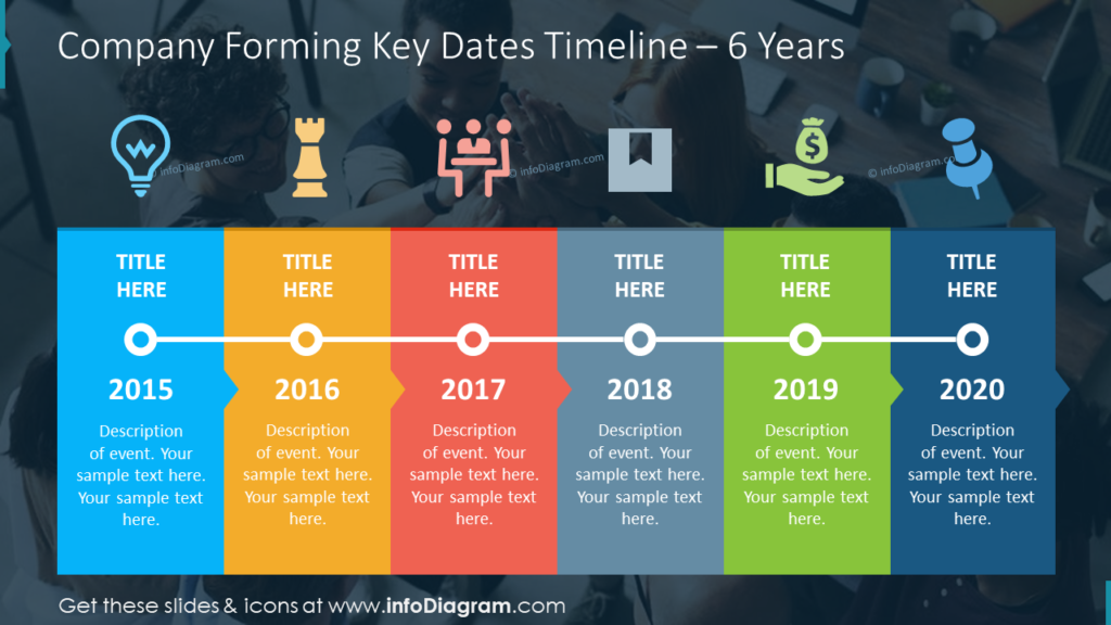
To show a history of events or future objectives over several years period (whether you are talking about a person or company) you can use the creative timeline designs presented below.
Having a non-white background helps the slide stand out. You can replace the background image with your company stock photos if needed.
Extras: Using roadmaps instead of timelines
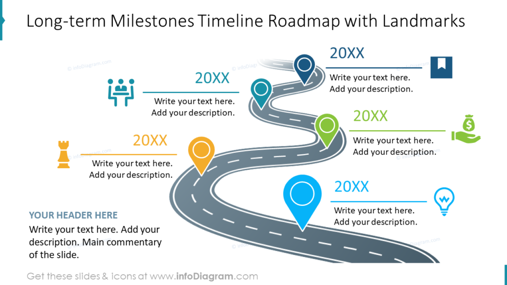
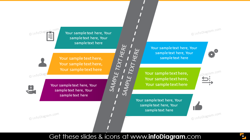
If you create a presentation about new directions and strategies, you can choose visual roadmap diagrams. Explore three ways to create a roadmap slide.
Timelines as a motivation tool
Whatever your planning level and context are, presenting your timelines in a strongly visual way can be a great tool in your communication arsenal. It helps your audience to focus on the story you present and stay motivated by better understanding the pathway you present, whether you talk about future goals, vision, or report past actions.
Without such comprehension of where we are and where we are going, it’s easy for a team to lose internal motivation.
Whichever timeline type you choose, remember basic good design rules:
- keep consistency within your slides. Use a limited number of fonts and colors. Adapt colors to your company palette. Use one style of icons(e.g. only flat ones).
- make all text readable – check especially the detail sub-points if you present at a meeting.
- don’t overdo it with details. Eliminate the number of events to increase focus – better break the timeline into several slides
If you’re looking for more design inspiration, check our movie guide on how to create a timeline of project stages (you’ll find many more practical tips on our YouTube channel):
Subscribe to the newsletter and follow our YouTube channel to get more design tips and slide inspiration.

