Adding Personal Touch to Counseling Business [client story]
We continue interview series with our customers, and today I’d like you to meet Christian – psychotherapist and lecturer from Austria. I had a great conversation with him how the use of a creative graphics can add a personal touch to the presentation.
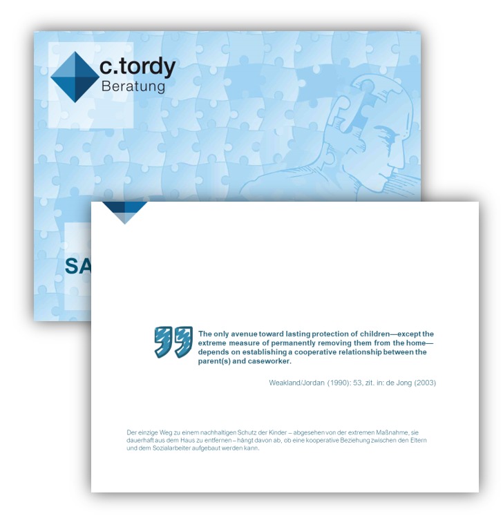
Let me welcome here Christian Tordy, who has discovered us a few years ago. He applies our graphics to his presentations for Case management and Organizational consultancy.
Christian uses a lot of hand-drawn presentation shapes in his slide decks, so our tastes are pretty alike.
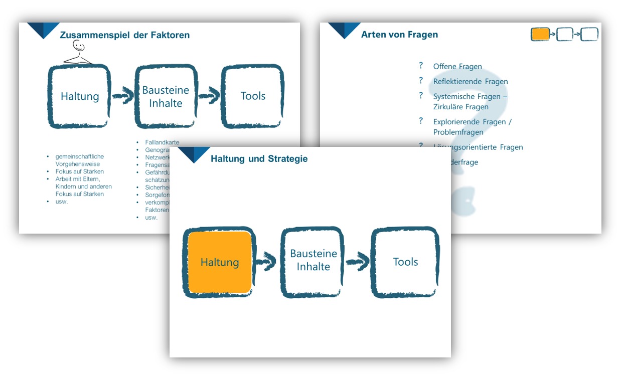
It’s interesting to see how he uses our graphics on his slides. As you can notice, he adapted colors of charcoal diagrams to fit his blueish template.
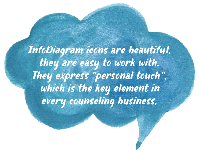
Here are a few words of his feedback:

Enjoy my conversation with Christian Tordy, from Austria.
Anastasia, infoDiagram: Tell please a few words about yourself: What do you do? 
Christian: I am a social worker, psychotherapist, organizational consultant and case management instructor. Both in my practice and with my company, I give lectures on a range of topics, all of which relate to my professions.
Anastasia: How do you use presentations in your business, eventually what’s your usual challenge when preparing slides?
Christian: Among other things, the challenges of my lecturing include developing the subject swiftly, adhering to a catchy structure and focussing the
audience’s attention on the subject. I had to learn the idea of the structure and the topic orientation only laboriously. As a psychotherapist one is more likely to follow the flow of thoughts and the idea of spontaneity… It was also challenging to achieve a good balance between workload and the desired result. To paint flipchart sheets is more direct and invigorating, unfortunately, the effort – in comparison with Slides-Presentation – is much greater. So Slides are the tool of choice when it comes to lectures.
The next challenge is to develop an own formal language. More precisely: a good and distinctive design. This should be meaningful enough to be associated with me and – more importantly – it should serve the content. This is where the icons of InfoDiagram come into play.
Anastasia: What visual aids do you like applying the most in your presentations (photographs, diagrams, iconic symbols …)?
Christian: I have a long history with icons. The first icons that I can remember were the packages of everyday objects: the milk bottle with the cow; the butter with the green meadow; my father’s cigarette pack with the white star on a black background, … later the street signs and later the comics from Walt Disney to Marvel, and since then the graphic novels. However, a speech bubble is a speech bubble and is different from a thought bubble. A signpost is different from a mailbox and both are different from an umbrella. The impression of speed is given by other signs than those of slowness. In short: I do not need photos, icons are more meaningful and universally applicable.
Anastasia: How our graphics helped you?
Christian: The icons of InfoDiagram are beautiful, they are easy to work with and they probably cover 75% of my need for Eye-catchers. Especially the latter I need, if I want to draw the attention of the audience to the content and not to their smartphone. So most of the time, I let the icons do the work and I’m limited to telling their story.
This approach works well. Granted, it’s just the second-best solution. Better yet, I could draw. Because if I could do that, I would wrap my content in picture stories. I mean complete stories. If I had money, I would buy the graphics artist from InfoDiagram; these should translate the contents into iconic graphics. And they would be great, I’m sure.
However, “Stock-“InfoDiagram icons cover a lot of my “image-needs”. To complement my expectations I scribble the rest. With that said, it is also clear that I mainly use the hand-drawn symbols. They express a little more the “personal touch”. And the personal touch is the key element in every counseling business.
“The personal touch is the key element in every counseling business.” C. Tordy
Most of the graphics Christian uses in his presentations are covered in Hand Drawn Icons and Diagram Shapes for PowerPoint, symbols from Health Care Medical and Pharmaceuticals Icons and Simple Flat Icons for infographics.
You can reach Christian through his website.
Thank you again for sharing your experience, Christian. We are proud we can support your work with our graphics 🙂
I hope you enjoyed the post and see you in the next ones


