Use Modern Radar Charts to Present Business Trends and Market Analysis
How to present your market trends and landscapes of new technologies in a simple form? Charts, tables, and graphs you can build in PowerPoint are often unattractive and confusing.
If you would like to see how you can create an engaging and unique business trend presentation using radar charts, keep reading and get inspired.
Radar charts are striking, powerful visuals for market trends. Using Radar PPT Charts for Market Analysis you can present a comparison of several categories, performance metrics, or industry trends.
Compare Multiple Categories Using One PowerPoint Slide
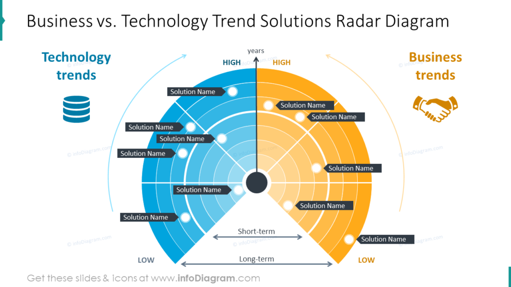
One reason many business trend and market analysis presentations fail is that audiences are overwhelmed. On the example slide you see how two categories can be presented. There is space to label each point or item. The colors of each item can be customized using tools in PowerPoint. No special graphic design software is necessary to create these striking visuals. In the example, time is marked as an axis you can edit and the bottom offers opportunities for you to update the periods of time depicted, even if you describe them only as short and long term.
Present an Analysis of Multiple Markets
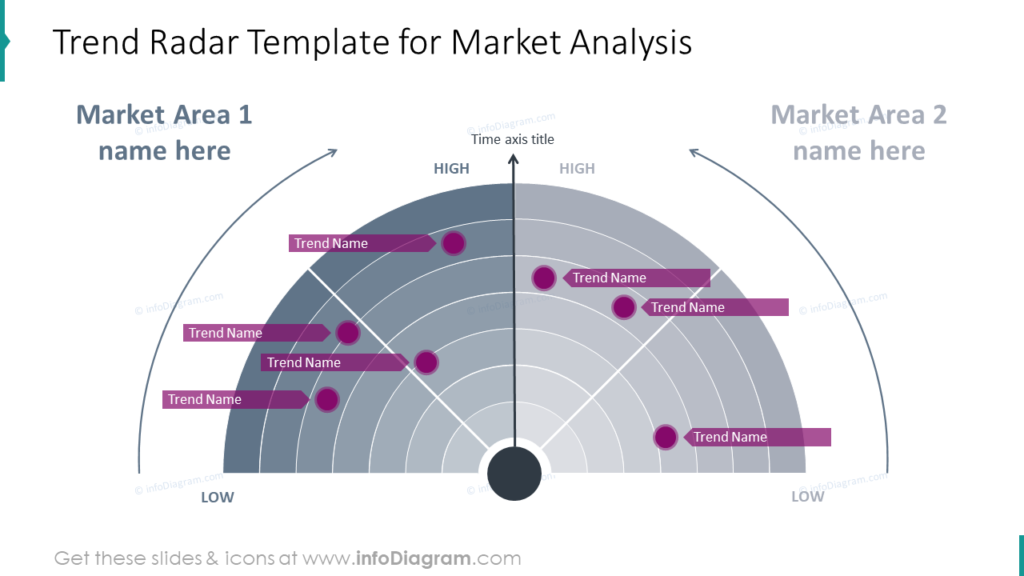
Have you attempted to explain how different markets have performed during a given period? You might wish to compare how different markets responded to something or performed on metrics of your choosing. One of the benefits of using radar chart graphics is this ability to show multiple markets on one PowerPoint presentation slide.
Explain a Given Category of Market or Trend Analysis With Radar Charts
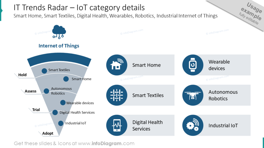
The example slide contains IT Trends. In this slide the hypothetical organization is presenting information about the Internet of Things. The solutions marked on the slide of radar are divided into ‘hold,’ ‘assess,’ ‘trial,’ and ‘adopt.’ You, too can split your categories, processes, and details. Each slide can be customized with icons which are relevant to the categories, solutions, and information you need to present.
Use PowerPoint Tools to Build Creative Radar Graphics for Your Presentations
SlideShare step-by-step guide on How to Show Industry Trends Visually Using PowerPoint
- Prepare the radar shape using standard PowerPoint shapes or use a predesigned vector picture, then divide it using arches and lines.
- Describe categories and distribute dots to represent specific trends.
- Add icons that are related to your presentation theme and subject matter. Customize these slides with colors that suit your presentation and purpose.
You can easily present a comparison of several categories, performance metrics, industry trends with the help of trends radar. You can either use the whole radar trends template to show the overview of all categories to compare them or break it down to focus attention on a specific category or industry and underline more details. Either way, your trend slide will bring harmony to your presentation design and you’ll be able to prepare a more creative presentation.
Resource: Business Trend Radar Charts for Market Analysis
We know using elegant, visually appealing slides will help your business trend presentations look more professional. However, we know many people do not have time to build their own graphics. Our designers want to help you save time. They hope you can avoid having overly busy slides by using the radar charts they created for you to use. Check out the full Business Trend Radar Charts for Market Analysis set:
When you use pre-made graphics you can ensure your audience is able to fully understand and appreciate your message because the visuals will help you share your message.

