Why Diagrams Instead of Text Slides
When we create a presentation, the first draft slides are usually text bullet points. At least, I often do so.
The important thing is not to stay there. Move a step further – change those texts into visual form. And the easiest form is a simple diagram. That’s a reason I promote such schema illustrations as a great way to make strong visual presentations. Why diagrams are perfect solutions for presenting various complex topics.
What is a diagram?
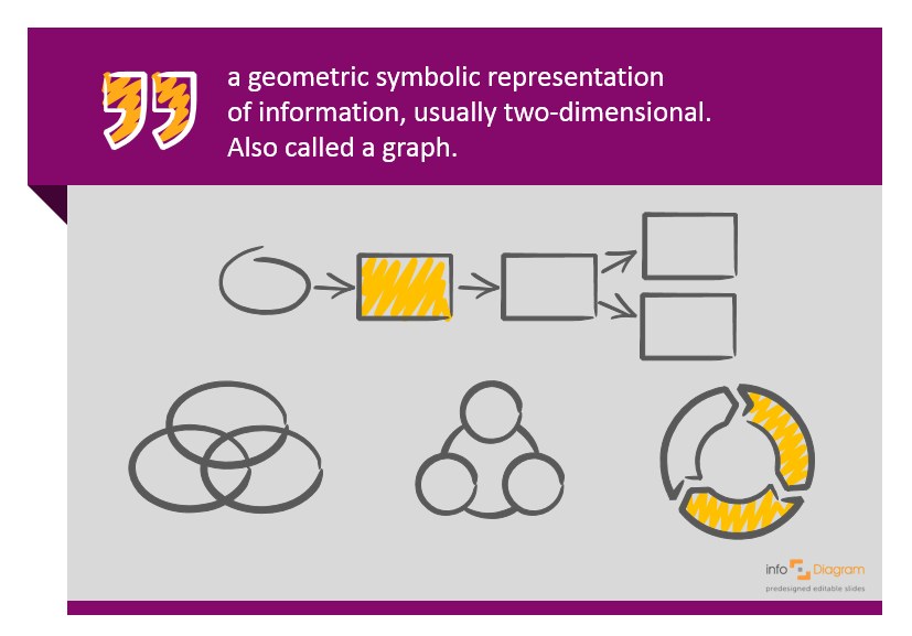
A diagram by definition is any geometric symbolic representation of information. It’s usually two-dimensional, that means a simple rectangle drawing in a paper does qualify.

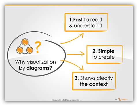
Why are diagrams so cool? I would name three main reasons:

Get the diagram idea in a second
Firstly, diagram drawing is fast to read and understand. It takes only a few seconds to grasp
the essence of the drawing, unlike reading a text.
A few minutes to design a simple diagram
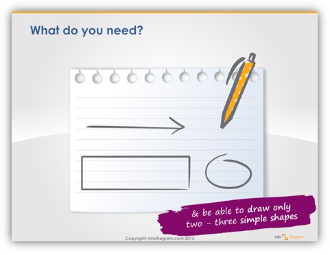
Secondly, the diagrams are really easy to create. All you need is a paper, pen and ability to draw a few simple line shapes.
Or get some pre-designed diagram shapes from here if you like our hand drawn style.

See context of a big picture
The third argument “why diagrams” illustrations is that they present very clearly the full context of the information. It’s visible at first glance what objects are there and how they are related.
Check some diagram examples in Slideshare slide deck below:
Try it out in your next presentation. Take a text slide and replace it with a simple presentation diagram illustration. See for yourself why diagrams are so powerful. The effect is worth the effort.

Let me know if you have any troubles with that, I’ll gladly suggest you a way to do so.
Source of PowerPoint graphics I used for this presentation:
Visualizations from www.infoDiagram.com


