4 Steps to Make Attractive Medical Data Chart in PowerPoint
Working with data charts related to health or medicine? We’ve put together simple 4 step tutorial how you can make your medical data chart visually attractive. It’s a way to create quickly infographics presentation slide.
Actually, you can use these tricks for any kind of statistics visualization.
Remark: You can get all presented diagrams and icons from Health Care Medical and Pharmaceuticals Icons.
So you have a slide with your data chart. Maybe as a result of a medical survey or some healthy living stats.
Let’s take one slide element at a time:
1. Slide Title Makeover
Firstly try to replace the title with some visual banner. Add a background color, insert a few triangle shapes to create a simple flat-style ribbon.
If you don’t want to do it from scratch, check some of those Flat slide banners collection.
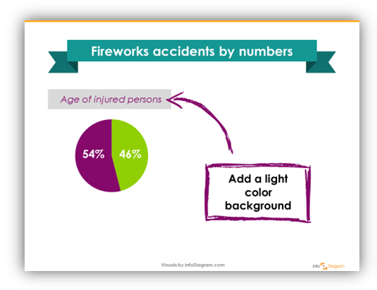
2. Enhance Your Medical Data Charts
Then make a few small changes to standard charts.
- Add a subtle background to chart title.
- If you use gradient filling in the chart, change it to one plain color. Use your presentation color palette to stay consistent.
- Simplify the chart by removing unnecessary axes or doubled information, such as data axes values and values on data bars.
- Redo data labels by adding a simple flat triangle, for example. Check Slideshare show below to get an idea.
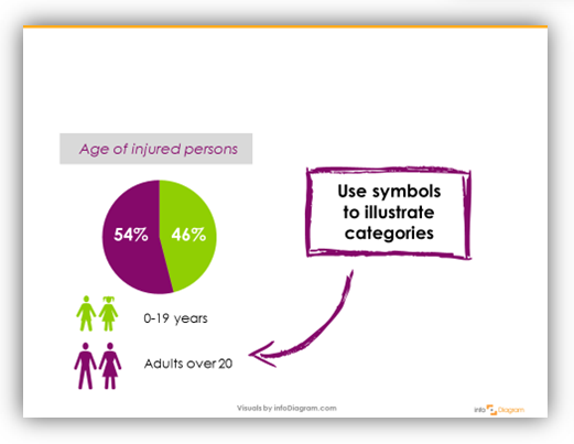
3. Illustrate Data Categories With Simple Symbols
Use simple pictograms to illustrate different data categories. For really simple symbols, check Wingdings from your font. For health-related symbols, see our Health Care and Medical PPT icons.
4. Add a Subtle Slide Background Fill
Replacing a plain white background will make your charts nicely stand out, especially if you use some white title background. Find some subtle pattern – such as a paper pattern, or try to use some light grey color.

See the full instruction on making medical data chart in Powerpoint at our Slideshare slide deck:
Give it a try in your next data presentation. Use at least one of those four points to make your slide visually attractive.
Which step sounds the handiest for you? The title, data chart enhancement, symbol, background? Let me know in comments.
Sources of graphics applied in this presentation:
- Collection of Health Care and Medical PowerPoint icons.
- Pre-made Flat style Ribbons and Banners.