How to Simplify Complex Slides: Fix It in 3 Steps
Dense, text-heavy slides kill board meetings. Learn the 3-step method consultants use to turn wordy decks into clear, visual stories - with editable PPTX.
By Peter, infoDiagram Co-founder & Visual Communication Expert · 15+ years designing decks for corporate clients · Updated April 2026
TL;DR – How to simplify a complex slide in 3 steps: (1) Strip filler words and keep only the keywords carrying meaning. (2) Replace those keywords with a simple diagram – quick picture made of shapes and arrows beats long text sentences. (3) If content still won’t fit, split it across two or three slides rather than cramming. The goal: a slide your audience can grasp in 5 seconds, not 5 minutes.
Do you recall this? Your slide is technically correct. It contains all the information. And it is unreadable.
Whether you are a finance consultant preparing the monthly business review or a consultant or a PM presenting a status update – you probably felt this pain. Dense, text-heavy slides are the #1 killer of executive attention. Below is my three-step method I’ve used with corporate clients for 15+ years to turn wordy decks into clear, visual stories — without losing the substance.
When does a slide become ‘too complex’? (4 warning signs)
Before you start simplifying, it helps to know what you’re actually fixing. If your slide trips any of these four wires, it’s working against you – not for you:
- 50 words: More than 50 words on the slide? At a glance, the audience reads the slide instead of listening to you — and once they’re reading, you’ve lost the room.
- 4+ ideas? More than 3 distinct ideas competing for attention. Each additional idea halves the chance any single one lands. Pick the one that matters and move the rest to the next slide or the appendix.
- 5 seconds? It takes more than 5 seconds to grasp the main point. If a busy executive in your audience can’t tell what the slide is about in five seconds, they’ll stop trying.
- Unclear data? Does slide require you as presented to explain what the slide says?
If your slide hits two or more of these, don’t tweak — restart with the three steps below.
1. Keep only the keywords, eliminate less important “filler words”
Sometimes our presentations are overwhelmed by unnecessary text. Ask yourself, do you need to write a full sentence on a slide? Words on a slide do not have to be in the form of spoken text. It’s not a book to be read. Narration should be told, not read on the slide. Let’s see some examples:
- A sentence with a list of items can be changed to a list of bullet points.
- Words “and”, “example, instance”, “and more”, can be changed to shorter forms “&”, “e.g.”, “…”
- Words expressing the consequence “because of this”, “therefore that”, and “which implies” can be replaced by a graphical way showing the consequence – a simple arrow can do.
- Repeating subjects over several statements can be changed to one subject with a sublist of statements. So you mention the subject only once.
Next time you’ll be working on slides, try to analyze them and decrease the amount of information, saving only the keywords, that carry the main thoughts. It may not be easy, as we tend to think everything is important. However, try doing this exercise more often and you’ll notice the progress.
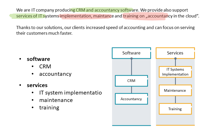
See on the picture above how we underlined only the keywords that should stay on a slide. All the rest can actually be removed. Those details can be explained by the presenter, not necessarily written on a slide.
After this underlining exercise, you can change the keywords to a list of points that are easier to read. And then turn that list into an effective good-looking infographics, so keep on reading 🙂
Need a head start? Our editable bullet-point alternatives PPTX deck gives you 30+ ready-made layouts to replace text-heavy bullets in two clicks.
2. Express the text essence with diagrams
The next step is to replace the keywords you chose previously with the set of shapes, or create simple diagrams instead of texts. Using graphics instead of blocks of text is a great solution when you want to create attractive-looking slides.
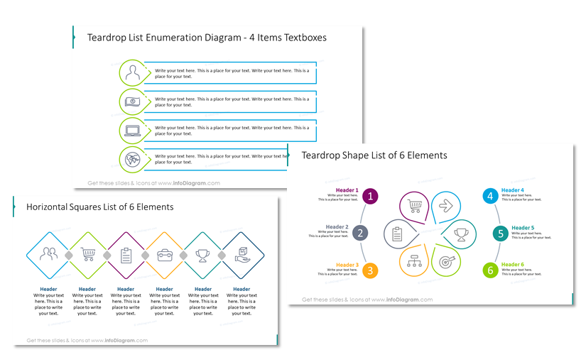
Creating a diagram from scratch is pretty easy. You can design it using simple shapes – rectangles, ovals, arrows. See the symbolic picture below.

If you have more time, you can make them more sophisticated:
Check more types of diagrams you can use in this article: 18 Visual Diagram Categories to Cover Major Structures and Processes.
Another way to approach diagrams is using PowerPoint’s tool called SmartArt which allows you to explore some basic diagram forms.
Don’t have time to draw diagrams from scratch? Browse our business diagram library — every diagram is fully editable and consultant-tested.
3. Split content into more slides to get space
If you feel you definitely need to present all the information, if you cannot reduce it, then this simple trick will help you. Break the text into two or three slides so a slide is less overloaded.
This will allow you to create more space and make your slides more visual. You will have space to use graphics and explain your points more effectively.
If this results in a longer presentation, don’t worry. There are ways to organize slides in a readable form. For example – use structure slides (e.g. title slide, section break slide – see examples in this blog post) as eye-catching “splitters” of your presentation. Avoid putting too many same-looking slides one after another.
Here are ideas on how you can use the new space on the slide, once you have less content:
- add illustrative pictures to express emotions or create visual associations. See our tips on how to find and choose the right icon.
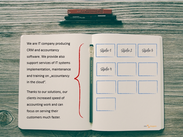
- use markers to highlight the key text parts, as in the slide picture below
- consider adding a personal touch to slides, using doodled shapes, sketched symbols and hand-drawn pictograms
Try following these three steps, to make your next presentation truly engaging and impressive for your audience.
If you’re still stuck with your presentation, reach out to us. We can propose several ideas on how you can illustrate your concept on a slide.
For more inspiration, subscribe to our YouTube channel:
Common mistakes when simplifying slides
Those are ways I see people get simplification wrong. Most of these mistakes come from good intentions – you’re trying to make the slide cleaner, but the result lands worse than the original. Therefore watch out for these:
- Oversimplifying to the point of losing meaning. Stripping a slide down to three words feels minimalist, but if the audience can’t reconstruct what you meant, you haven’t simplified, you’ve deleted. Keep enough context that the slide still makes sense if it’s forwarded by email after the meeting.
- Splitting one idea across two slides instead of compressing. If your three steps now live on three separate slides with one bullet each, it is stretching the content, not simplification. Splitting works when slides hold distinct ideas; compression works when one idea was just expressed in too many words.
- Using PPT’s SmartArt defaults that scream “PowerPoint amateur.” The default SmartArt cycles, pyramids, and Venn diagrams are easily recognizable to any executive who’s seen thousands of decks. They signal “I didn’t have time to think about this.” Even a 30-second customization (your brand colors, cleaner shapes, adjusting text size) lifts a slide from generic to professional.
- “Curse of knowledge” is when you forget about the gap of what you know and what your audience knows. You’ve lived with this content for weeks; your audience has 90 seconds. Double check for acronyms and internal project names that can feel obvious to you but are a wall to other listeners. Therefore always ask “would a new board member understand this slide quickly?”
- Mistaking “less text” for “more visual.” Deleting half the words and leaving the other half in a single dense paragraph isn’t a visual slide — it’s a shorter wordy slide. True simplification replaces text with structure: a diagram, a comparison, a process flow, a table with clear hierarchy.
FAQ about simplifying presentations
How much text is too much on a PowerPoint slide?
My rule of thumb would be to have a slide under 30 words and max 5-6 lines of text. If your audience starts reading the slide instead of listening to you, there’s too much text. Because when that happens, you’ve lost their attention to the screen. So I recommend to make text content as something people scan quickly but don’t read as a book.
Should I use bullet-point phrases or full sentences on slides?
Use short bullet-point phrases, not full sentences. Slides are a visual support for what you say out loud, not a script — full sentences invite the audience to read ahead, while keyword phrases keep them listening to you. The exception can be a quote or a key takeaway statement you want the audience to remember.
What’s the 5-second rule for slides?
The 5-second rule says that anyone in your audience should be able to grasp the main point of a slide within five seconds of seeing it. If they can’t, the slide is doing too much. Either the headline isn’t clear, the visual hierarchy is wrong, or there’s too much competing content. It’s the fastest way to test whether a slide is ready for a board meeting.
When is it better to split a busy slide into two?
Split a slide when it contains two genuinely distinct ideas that each deserve their own headline. For example, “what we did” and “what we’re recommending.” Don’t split when the content is one idea expressed in too many words; in that case, compress instead. The test: if both halves can stand alone with their own clear takeaway, split; if one half is meaningless without the other, compress.
Into how many slides can I split one slide?
There’s no hard limit, but two to three is usually the sweet spot for a single original idea. Beyond that, you risk fragmenting the message and forcing your audience to mentally stitch the slides back together — which defeats the purpose. If you find yourself splitting into four or more, I’d recommend to add a mini-agenda slide with list of idea subtopics.
How do I simplify a slide without losing important information?
Move the detail off the slide, not out of the presentation. Keep the headline and the key visual on the slide; push supporting numbers, footnotes, and methodology into the speaker notes, an appendix slide, or a follow-up handout. Your audience gets a clear message in the room, and the detail is still there for anyone who wants it afterward.
Is it better to use diagrams or bullet points on a slide?
Diagrams almost always beat bullet points when the content has structure: a process, a comparison, a hierarchy, or a relationship between elements. Bullet points work for list-like content where the items are independent and parallel. The mistake most decks make is defaulting to bullets even when the underlying idea is a flow or a relationship, which a diagram would communicate in half the cognitive effort.
How long should I spend simplifying one slide?
For a high-stakes slide e.g. a board meeting, investor pitch, client recommendation, I’d say to book 20 to 30 minutes per slide, including the time to question whether the slide should exist at all. For internal status updates and working sessions, 5 to 10 minutes is usually enough. The signal you’ve spent enough time: you can explain in one sentence what the slide is for and why it’s on that exact slide of the deck.
Further articles on presentation graphics
For more inspiration on using visuals in your presentations, check out these articles as well:
- Five Creative Ways to Embed Icons in Your Slide Design
- How to Get Creative Sketchnoting Your Slides
- Ideas for Writing Eye-Catching Title for Your Presentation
- 3 Mistakes to Avoid in Diagram Design
- How to Create a Hierarchical Chart Example