Want to Make Powerful Slides? Use Watercolor Visuals in PowerPoint
Want to incorporate uniqueness and express your creativity when designing slides and presentations? Add watercolor visuals to better express yourself and to keep your audience engaged.
The whole purpose of incorporating visual elements into presentations is to make them more exciting and compelling for the folks you are presenting for.
Make your presentation more interesting, and they’ll be more likely to tune in!
Why is Watercolor Cool for Presentation Design?
Aquarelle, an almost translucent, watercolor painting style is one of the emerging trends in graphic design. This highly stylized effect is popping up everywhere, from logos and letterhead designs to business presentation design.
In fact, watercolor visuals are becoming so popular, one day they may even replace the ever-present flat design look. Why?
Watercolor is remarkably versatile. No two logos, presentations, or letterheads which use watercolor look exactly alike. (Plus they’re very pleasing to the eye!)
Take a look at my Pinterest board where I’ve collected samples of various hand-drawn designs, including watercolors, used in business settings.
Note: all presented slides can be found in Watercolor Aquarelle Shapes collection.
Three Ways To Spice Up Business Slides Using Watercolor Visuals
Here are the slides I made using watercolor visuals:
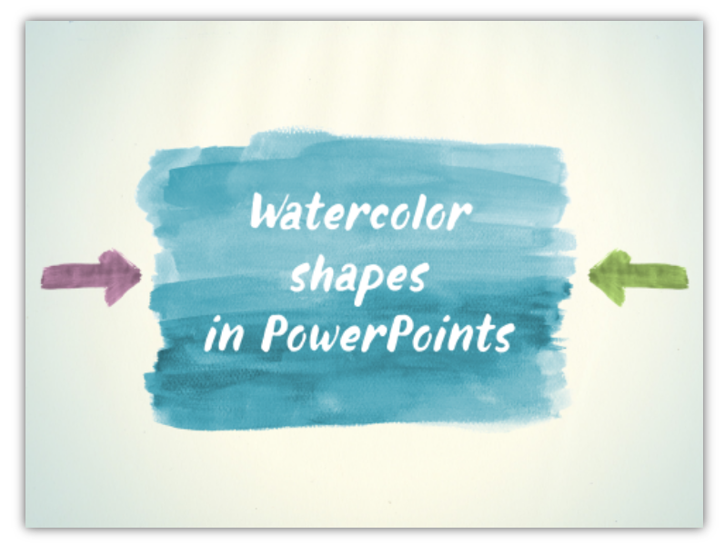
With a little design trick you can create quickly unique diagrams as well:
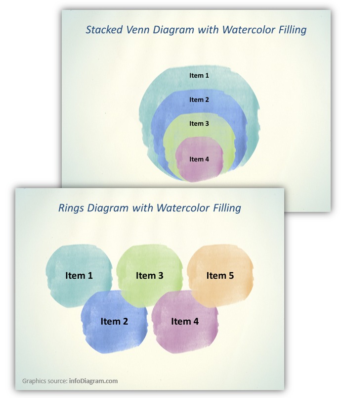
The great thing about watercolor elements is that you can use them in various ways. You have the option to make your entire slide design or presentation layout with these artistic elements, or to incorporate one or two elements in tandem with your classic formal style. (One of our favorite ways to spice up a dull business presentation is to add a single watercolor stripe in place of a more formal stripe element.)
Watercolor elements can easily be used to replace:
- Title slide backgrounds
- Bullet points
- Headline text fields or the whole text area placeholders
- Venn diagrams and timelines
- Cycle process and matrices
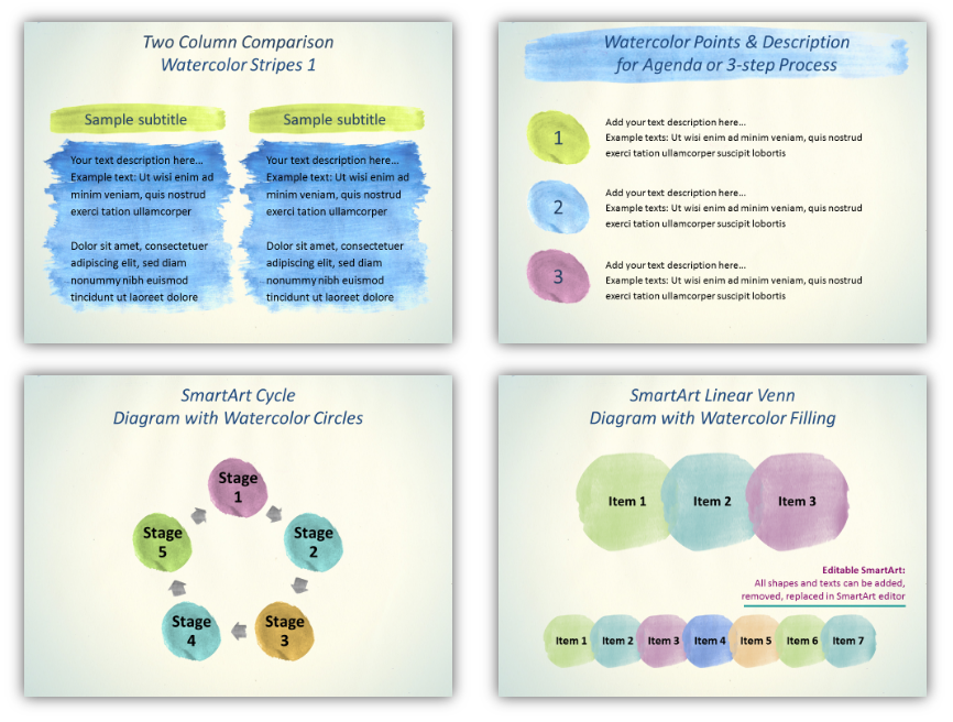
You’ll notice the great thing about watercolor elements is that you can use them in various ways. You have the option to make your entire slide design or presentation layout with these artistic elements, or to incorporate one or two elements in tandem with your classic formal style. (One of our favorite ways to spice up a dull business presentation is t add a single watercolor stripe in place of a more formal stripe element.)
Not sure of how to implement a watercolor stripe? Underline a keyword or quote. (It’s a simple change to make, but is one that EVERYONE will notice!) These elements can work wonders, especially if you have text-heavy slides or you have several monotonous slides conveying detailed information. Make a strong visual break in the form of an atypical transition slide with watercolor stripes.
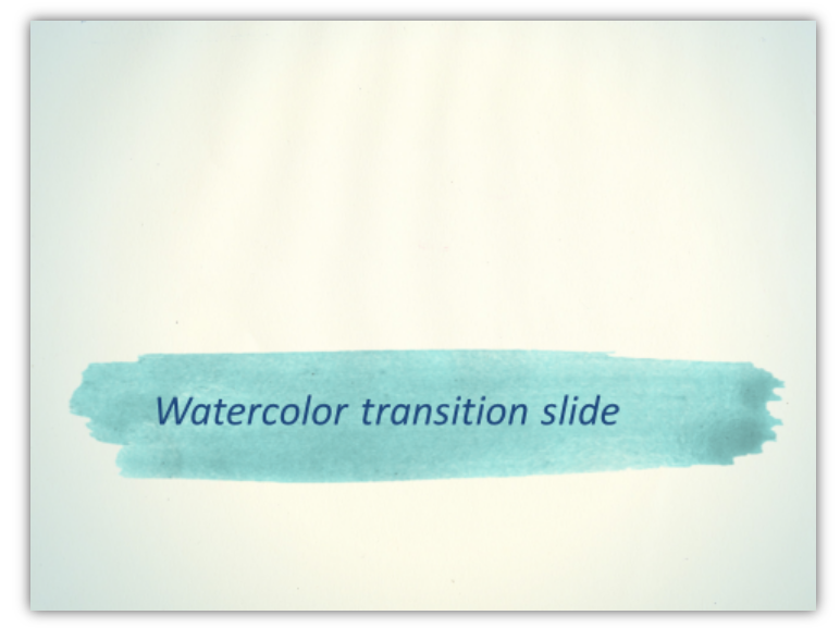
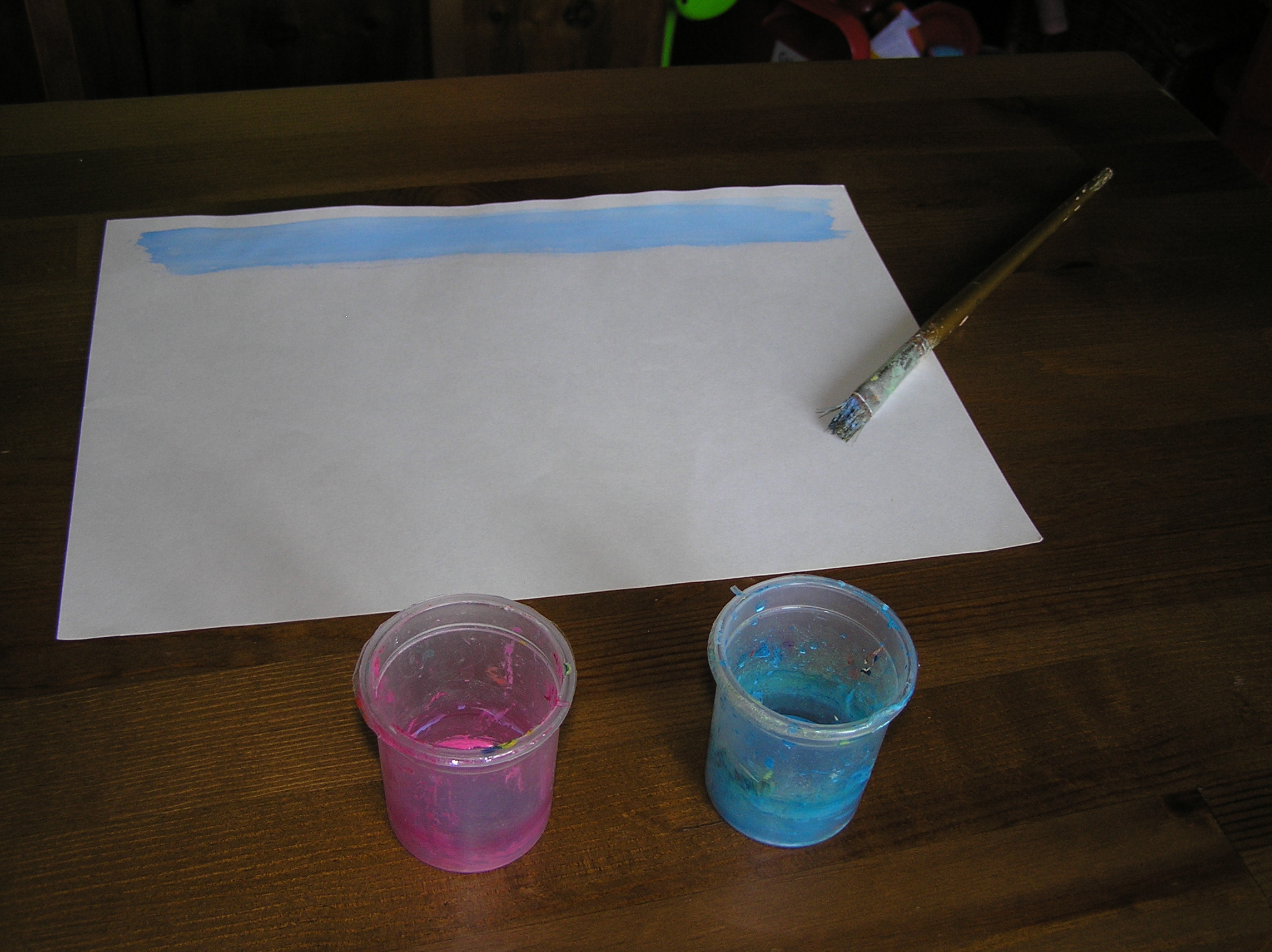
And here’s our behind-the-stage look of drawing such watercolor stripe. It took tens of tries to choose the proper color, paintbrush swipes, and good paper, but the final effects of how you can use it in a presentation are worth it:
To see a whole presentation made using only watercolor elements, take a look at this Slideshare deck with 7 Tips for Stress-free Conference Presentations.
See how nicely the watercolor goes with the white icon on top of the background? The white and watercolor create interesting, subtle illustrations which underline the message without overdoing it.
Watercolor Resources to Change Up Your Presentations
Where can you get watercolor pictures? If you have time and want to match a certain color scheme, you can paint design elements on paper and scan it.
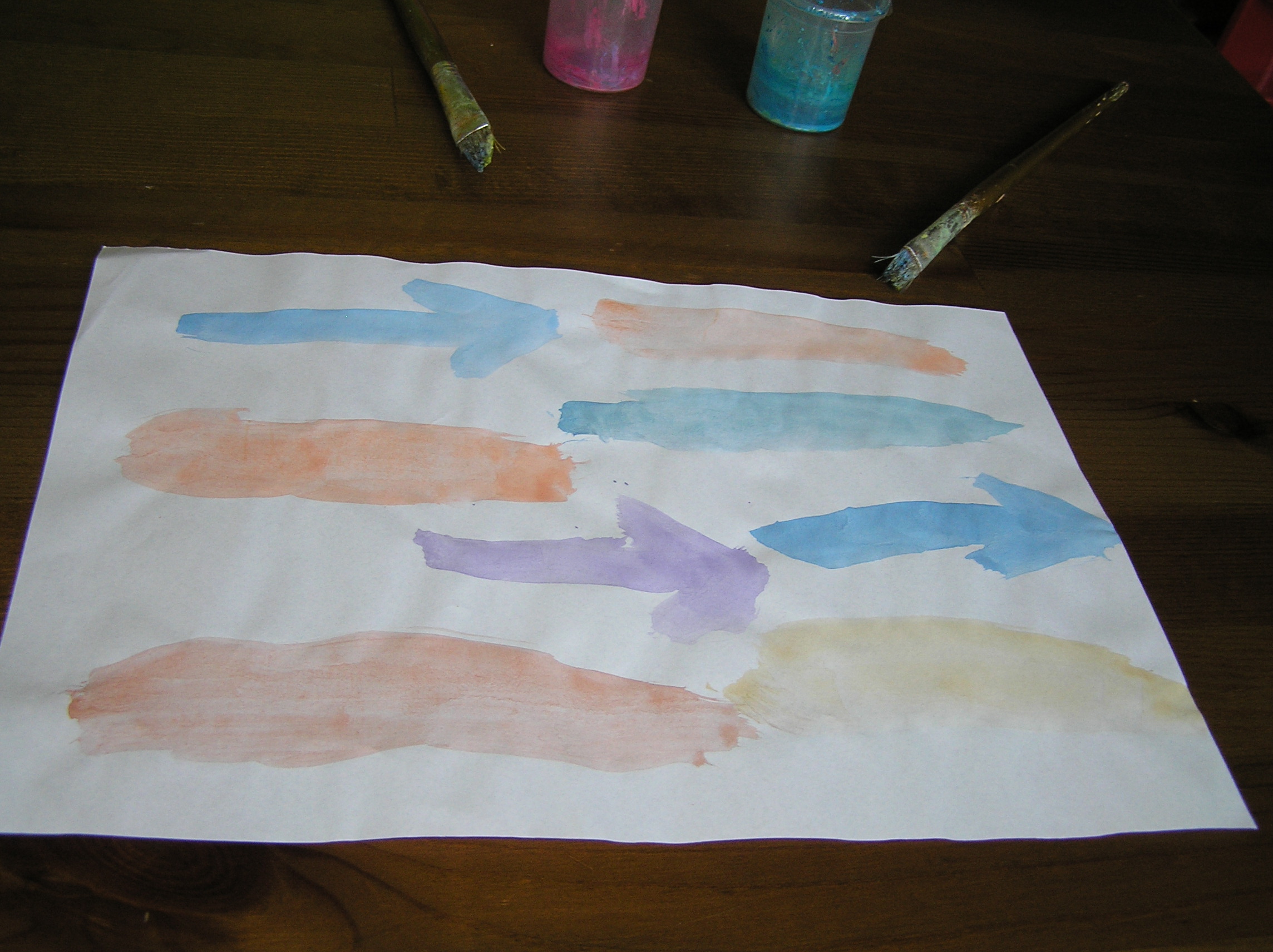
The last time I created watercolor elements with our designer we had great fun and involved our kids!
If you don’t have the time or would rather not take the DIY route, you should look at our set of watercolor shapes in this slide deck to inspire your own watercolor design elements for sprucing up your own presentations:
And if you look for more similar sketchy organic graphics for your slides, check our extensive collection of hand-drawn PowerPoint icons and shapes.


