How to Create a Modern-Looking Sales Chart in PowerPoint [slide makeover]
Preparing for a finance presentation? Or creating a sales chart for Your quarterly report? If you need to express a finance or sales topic, read on. We gathered several visualization ideas on how you can illustrate a financial concept on a slide.
Words or Icons on a slide: Who Wins?
If you want your presentation to be readable and quickly understandable, go for visual symbols. Here are a few benefits of adding a pictogram image to your slide:
- using a consistent style icon set gives the professional look to your documents (let’s assume you will not use an outdated cliche picture of 3D stick figures, but some modern images).
- illustrating the specific key concepts with icons in your report will help your audience focus on those illustrated important parts.
- the presentation or article will be readable because a picture next to the text will create a longer memory of the topic in the mind of your audience.
Note: All presented slides can be found in the Outline Business PowerPoint Icons Bundle.
Visual Symbols Ideas for Finance & Sales Concepts
We grouped the symbols into four groups by topic:
- Finance and Money: can be expressed by a sack of money, symbols, which associate with income and expense
- Retail and Pricing: price tag, shopping cart, and a virtual shop can help you illustrate such concepts
- Payments: credit card, wallet, or ATM machine
- Savings: classical insurance umbrella or credits associated with a piggy bank
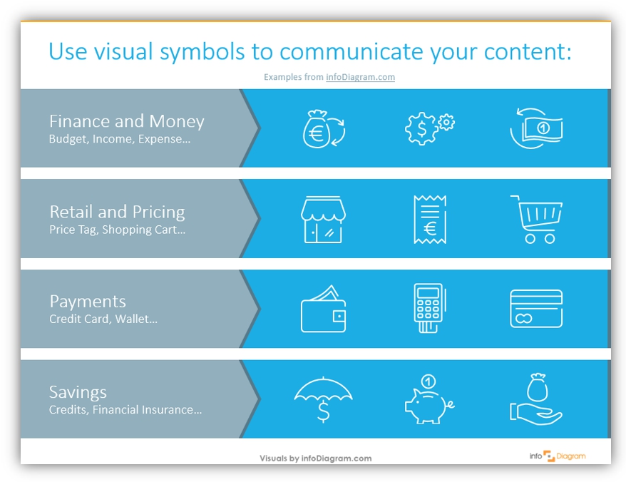
By the way, notice the design of this agenda slide above – to inspire you, as well. We used a white color of outline icons on a plain blue background, to get an effect of light graphics. Remember to keep the consistency and alignment of slide elements (read why in this article) to keep your presentation professional.
Example of the Sales Chart Redesign
I hope I already gave you some inspiration to use icons more 🙂 Let’s see how it works in a real example.
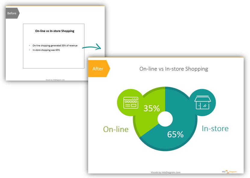
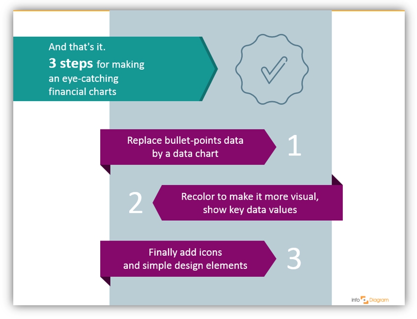
Here are 3 steps for making eye-catchy sales and financial charts:
1. Replace data from text with a data chart.
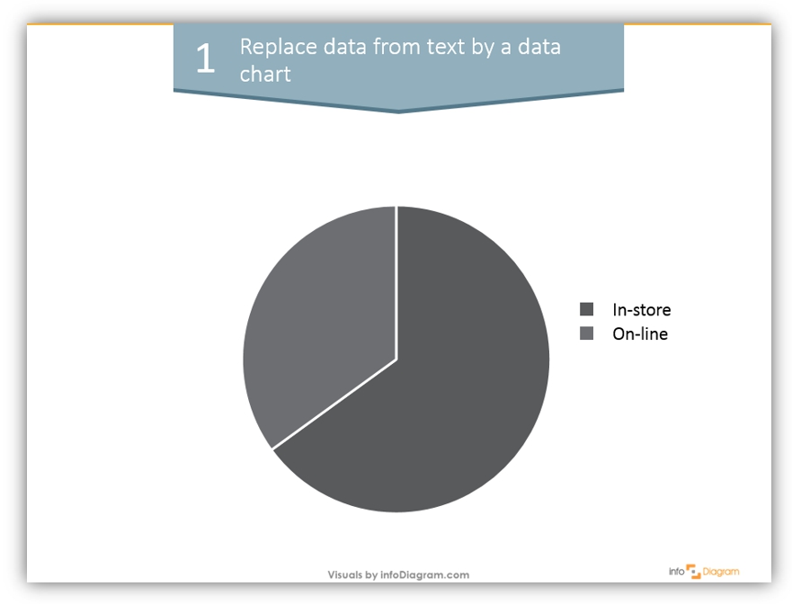
We used a simple pie chart, but choose the diagram type which is best for your data: pie charts are good for market share data visualization, and bar or column charts are better if you have more categories and you want to show more precisely data value differences.
2. Add colors to make the chart more visual, and show key data values.
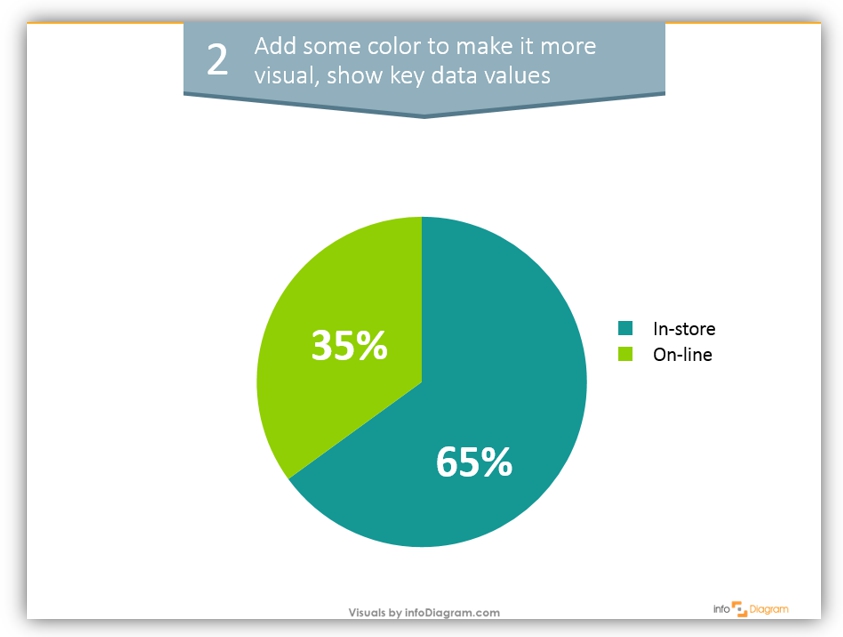
We chose blue and green colors as they look good together, keeping still high enough contrast. Express data values in bigger font, so your audience will not have trouble reading it from far.
3. Add icons and simple design elements to create a visual association with these sales chart categories.
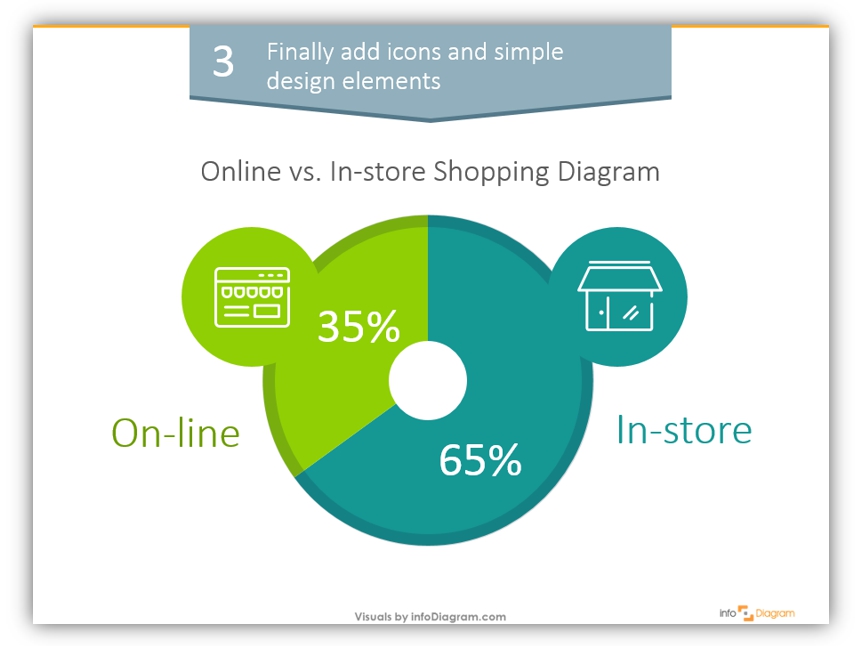
In our case, these are icons of the online and physical store and a small background shadow on the chart to make look less default.
3 steps to change a text slide to an attractive diagram:
As you see it’s not rocket science to do. Sometimes a simple procedure like this will help you create a much nicer presentation even if you are short on time.
With such charts you can express any information: sales performance of your company; monthly or annual KPIs; cash flows or payment systems changes.
Resources
- Abstract concepts visualization ideas: Business concepts visualization list for better PowerPoint slides
- Article about improving data chart presentation slide
- Outline Business PPT Icons:
If you enjoyed the blog and want to try talking visual language, you can get the symbols collection we used (or subscribe and get slides every month for your needs):
Should you need a help with choosing or using the PowerPoint graphics, let us know here. We will gladly assist.