Presenting Cause & Effect visually – DIY Fishbone Ishikawa Diagram in PowerPoint
To present cause and effect analysis, support your message by using proper visuals. A fishbone diagram is popular visual representation for conducting a root cause analysis. But why would you make Fishbone Diagrams in PowerPoint?
Having a customized diagram visualization has two benefits.
- It makes your presentation stand out from the crowd of default graphics.
- It gives you flexibility to change is as you need quickly.
So instead of using text-only slides and dull SmartArt diagram shapes, let me show you how you can create a custom graphics of fishbone diagrams.
You can download all root cause slide examples mentioned here by clicking the pictures below. Or check full library of Cause & Effect Fishbone PPT Diagrams.
Why is showing cause and effect important?
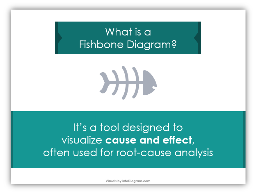
Cause and effect analyses are essential for understanding the root cause of issues. Often, they can be useful when diagnosing causes of problems. Working backward is help when trying to make sense of issues.
In this blog, we’ll share some simple ways you can create your own Fishbone Diagrams and the visually similar Ishikawa Diagrams to help you diagnose issues and present the root cause.
Want to make your own Fishbone and Ishikawa diagrams? Let’s go!
Step 1: Create a Chevron Shape
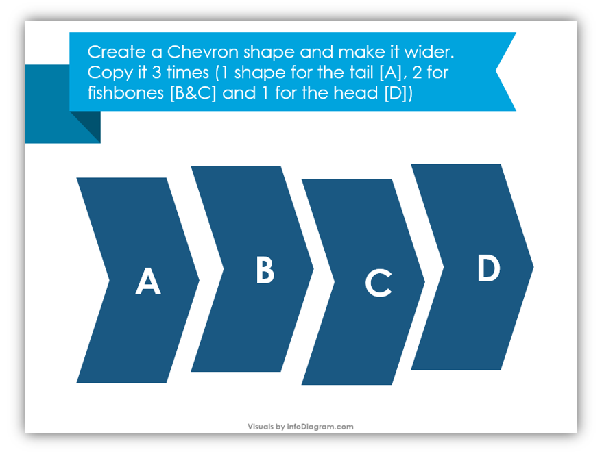
Once you have created a single chevron shape, make it wider. Copy it 3 times so you have a total of 4 chevrons. For future projects, if you require more shapes you may add them, but for the sake of this tutorial, you only need 4.
Step 2: Align Your Shapes

Line the chevrons up horizontally. Make sure your chevrons are all even.
Step 3: Create Two Rectangles
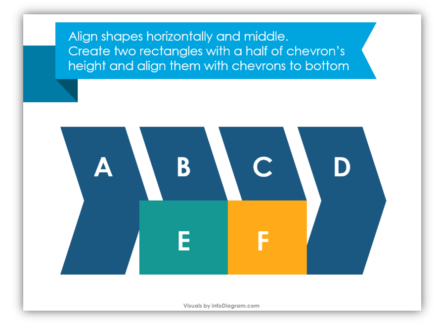
Make the rectangles half of the chevron shapes in height. Align the rectangles with the middle chevron bottoms. The rectangles should cover the second and third chevron shapes.
Step 4: Subtract the Second Chevron and the First Rectangle
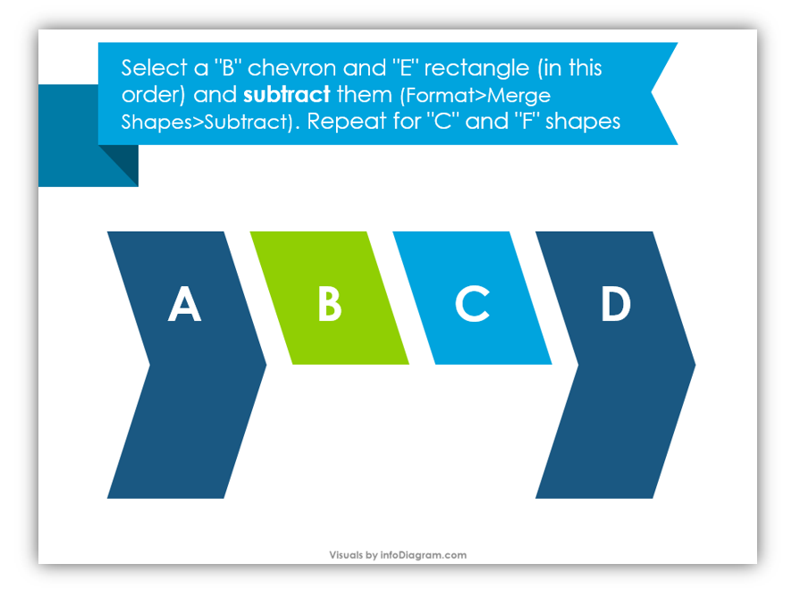
In the example slide, the chevron you want to select is “B”. Then select the “E” rectangle. You’ll subtract them by going to Format > Merge Shapes > Subtract.
Step 5: Subtract the Third Chevron and Second Rectangle
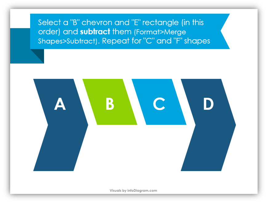
Those shapes were the “E” and “F” shapes in the previous sample. When you’re done with that, your slide should look like the above example.
Step 6: Copy the Half-Chevrons Which Remain
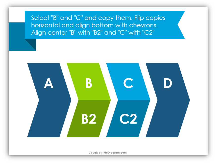
Copy “B” and “C”. Once they are copied, you’ll flip the copies horizontally and align the centers with the originals. When you’re finished, the slide should look like the above example.
Step 7: Make a Long, Light Gray Rectangle
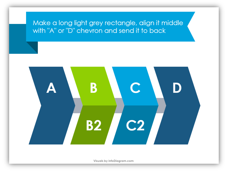
You’ll want to align your rectangle to the middle of the chevrons. Once it’s aligned, send it to the back of the slide.
To see how to use efectively align tools in PowerPoint read this article.
Step 8: Customize Your Design!
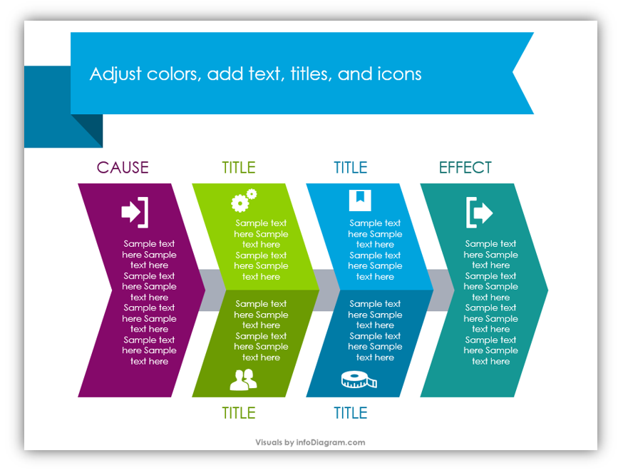
Change the colors of your shapes. Each chevron or half chevron should be its own color and have its own title, text, and even an icon. Use the example slide above as a model for your own diagram.
You can incorporate as many middle sections as you need for your own Fishbone Diagram. Think of the many applications of these cause and effects charts. Do you feel inspired, yet?
Graphical Resources: Cause & Effect Fishbone Diagrams
You can get all slides with Cause & Effect Fishbone Diagrams if you don’t have time to build your own. If you prefer to create your own, keep this tutorial bookmarked. You will be glad you have it handy the next time you need to build a cause and effect graphic.
Whether you build your own images or use our icons, remember you can supplement any slides with additional creative graphics. The images in Simple Flat Icons for infographics are perfect for adding flair to any professional slide designs.
Read more artices about


