
3 Diagram Mistakes That Make Your Slides Look Amateur
Chances are you have used some diagrams or workflow schema in your presentation, right? If you do, great. Diagrams are indeed an excellent way to visualize your message. Here are three design hints to make sure your diagrams are professional looking and remain readable. Three ideas on how to avoid the most common diagram mistakes.
Summary for busy ones (TL;DR): The 3 most common diagram mistakes in presentations: (1) Crowding = no white space; keep ~1 cm or 1/2 inch margins around the diagram and inside shapes. (2) Misalignment – even slightly uneven shapes look sloppy; use PowerPoint’s Format → Align tools. (3) Inconsistency – mixing fonts, colors, and fill styles; pick one style and apply it everywhere. Each fix takes about five minutes.
Those suggestions correspond to mistakes that we often see in presentation diagrams.
The good news is that those tricks are quick to do. Do a 5-minute fix and your diagram will look much better. See examples of a few well-aligned diagrams:
Notice here the equal gaps between stages columns:

And here’s another example with aligned pillars. See how the whole structure is kept centrally on slide:
To ensure professional look of your diagrams check your illustrations for those three issues:
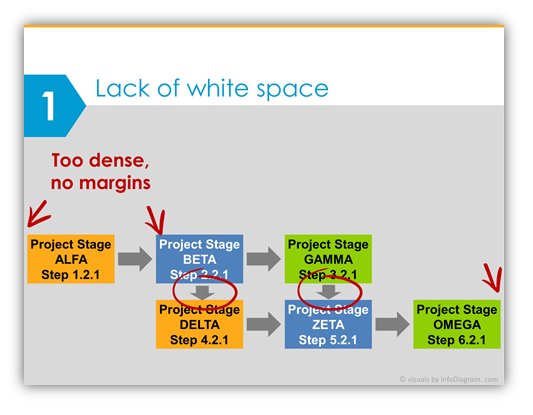
1. Isn’t the slide with diagram too crowded? Is there enough “white space” around diagram?
Don’t add shapes from slide edge to edge, keep some margins (rule of the thumb – 1 cm from each side). Also, don’t fill the diagram shapes with text, have a margin over there too. If needed, downsize the font ( MS Windows PowerPoint shortcut for that is Ctrl + Shift + [ ). Or split the diagram into several slides.
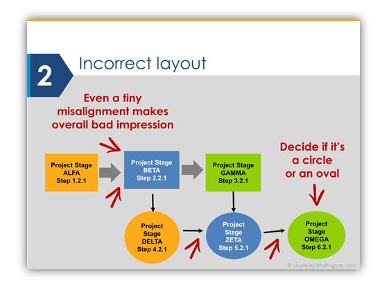
2. Does your diagram look tidy or a bit chaotic, unordered?
Check the layout of diagram shapes – verify the alignment of all your rectangles, arrows, circle shapes. Are they vertically or horizontally aligned? Are they equally distributed?
Even a small misalignment creates a bad impression of your illustration. Well, unless it’s your intention to create a look of randomly located objects. But then make it really messy, not “almost” messy.
Hint: in PowerPoint use menu Format / Align commands, when you have selected diagram objects. Or use intelligent guides when moving your shapes (present in MS Office PowerPoint versions since 2013).
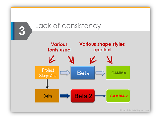
3. How many colors, fonts, and shapes fill patterns are you using?
The diagram illustration (as well as whole presentation) should use a limited set of styles and fonts. Keep it graphically consistent. Stick to one style of fill (gradient, modern flat, an outline of one color or none, the same shadow type or none).
So if you use objects with the white outline border, use it everywhere, in square and arrows too. If you use Arial font, use it in every diagram shape, don’t switch to Calibri here and there. Try to unify font size, if possible.
A quick round up formula for proper presentation diagram charts:
White space for giving your slide space to “breathe”
+ alignment
+ consistency
= three simple design tricks to remember when using diagrams
Simple, isn’t it? 🙂
Further articles on presentation design
For more inspiration on using visuals in your presentations, or on how to implement graphics in an engaging way, check out these helpful articles:
- 18 essential types of diagrams and how to choose them
- How to simplify slides
- Data visualization makeover examples
- How to visualize a concept – Strategy Illustration
- Tricks to get creative with presentation
Want to be notified when we make an announcement? Never miss out on creative presentation graphics and stay informed about our latest updates and news. We’ll also send you a Creative slide design guide with FREE hand drawn shapes for you to begin using right away!
Improve your presentations with Modern Flat Diagrams Ultimate Bundle. Instead of using default lists, charts, or tables use diagrams that have a higher impact.