How to Order Chaotic Slides with Align & Distribute PowerPoint tools [PPT Design Tips]
Presenting your message clearly is crucial to be understood. We’ve got the secrets that will get you there 🙂
One of the common mistakes in slide design is a lack of alignment and chaotically distributed content. In this blog post, we’re going to share tips for positioning your elements so that they look organized and professional — all in a few seconds.
This article is a part of our Design Tips for Professional Presentation series. You can find compilation of all tips in an e-book with six critical design issues to be checked with examples in one handy pdf:
It includes useful PowerPoint shortcuts and guidelines that will help you design a professional slide presentation, create your own unique style, and impress any audience:
- Slide margins and white space – make your slide easy to read
- Consistency – how to keep one style through the presentation
- Natural and easy-to-follow reading flow
- How to make 1 main idea stand out
- Spellcheck for a professional reading experience
Here let’s explore why placing slide elements accurately can make such a big difference to your slides and how to align in PowerPoint.
Alignment of texts, charts & tables in presentations
Proper positioning of the slide elements makes it easier for an eye to follow the content. If the elements are not aligned, this creates an impression of an unfinished presentation.
It is worth doing a quick check if all graphic elements are:
- aligned in relation to other elements. For example, the blocks and arrows of a flowchart should be in one horizontal or vertical line.
- aligned with regard to the slide layout. For instance, a diagram, as a whole, looks balanced if positioned centrally on a slide.
- evenly distributed. For example, in a set of same-size pictures check if the space is equal between each of them.

How to align elements in PowerPoint?
There are several ways to align objects. One is using “smart guides”. When you move a slide element, PowerPoint will show smart guides – lines appearing next to the element when you are moving it. Smart guides should be visible by default (if not, check in the top menu View / Show box and click the tiny arrow icon at the lower bottom corner to open Grid Settings). However these guides are sometimes tricky to use and they work only with one moving object.
Another way to align more objects manually is using PowerPoint’s Align function:
- Select objects you want to align
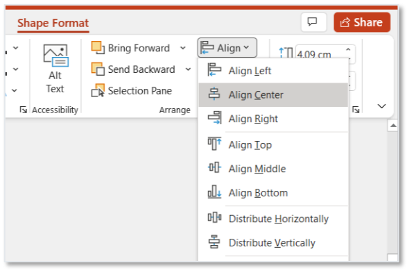
- Go to the top menu Shape Format / Align.
- Choose one of the Align functions
You will see those options. Try them out to see how they work.

You can access this Align function also from a context menu of the object – when you click with right mouse button, context menu should appear next to the object.
There are two more ways to use this Align function. However they require a small tweaking inside PPT settings – such as installing additional plug-ins. Therefore I save this usually for my online training, where I can show live what and where to set up.
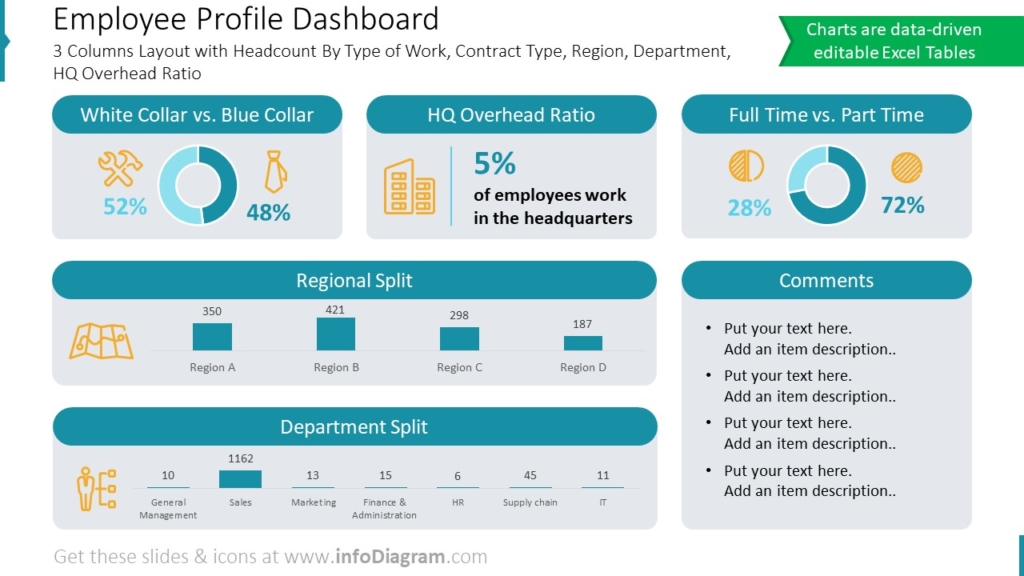
Here are a few examples of properly aligned slides with dashboards for your inspiration:


I hope those tips will help you create professional looking slides faster than you used to.
More slide design resources to get you going
If you want to know how you can improve your slides further, check those resources:
- 6 design tips conveniently gathered in an ebook (including this one)
- 3 Diagram Mistakes to Avoid in Slides Design
- 5 Tips to Boost Your Presentation Slides
- Consistency in Presentation Design
- How to Copy and Adapt Diagrams to Your Content
Get our free sample and let’s stay in touch for more tips and resources!


