Ways to Use Multi-Layer Diagrams in PowerPoint Presentations
Multi-layer diagrams and flow charts are great for presenting many hierarchies and processes. Visual aids like these can easily be customized for your needs as they are highly versatile.
Elevate your business performance presentations with our curated resources – visit our financial performance PPT reports webpage.
By showing several levels over one another you can explain structures with a defined hierarchy visually. You don’t have to keep using boring bullet points. You can change it up!
If you have an idea of how you could benefit and are tired of creating presentations with lackluster visuals, you can see the full Multi-Layer Diagrams set by clicking here.
How Can You Use Multi-Layer Diagrams?
Explain Application Levels or a Three-Layer Structure of Your Choosing
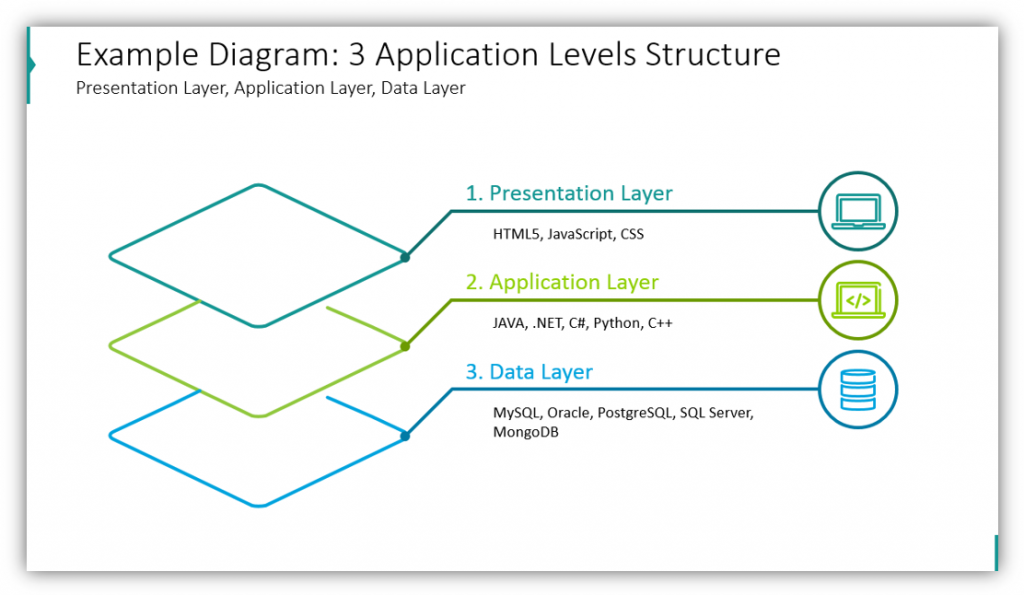
In this example, we’re presenting the three layers of an application. Level one is the presentation layer. It includes HTML5, CSS, and JavaScript. Layer two, the application layer, includes JAVA, .NET, C++, Python, and C#. Layer three is the data layer which includes MySQL, Oracle, PostgreSQL, SQL Server, and MongoDB. If your presentation were more complex or required additional layers, you could easily add them and customize the colors and icons to match your subject matter.
Share Maslow’s Hierarchy of Needs or Another 5 Layer Structure
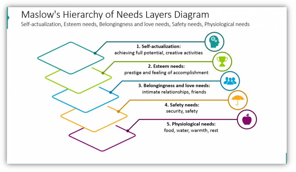
If you have fiver layers, you can easily use the slide deck for your purposes. In this particular example, you see how to present Maslow’s Hierarchy of Needs in an easy to follow manner. You can quickly share the layers: self-actualization, esteem needs, belongingness and love needs, safety needs, and psychological needs. By adding descriptions, color-coding, and unique icons to each layer you can truly make it your own.
Use Centric Dartboard Multi-Layer Diagrams
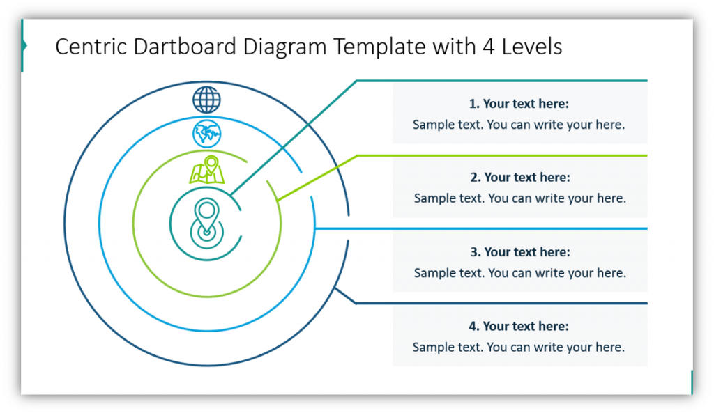
Dartboards can be useful as metaphors, but they also are great for highlighting the structure of a hierarchy in a simple way. In the example you can see how the layers get increasingly more narrow in focus, as does the diameter of each circle. These can be customized by adding your own text, modifying colors, and adding icons to best represent each level of the structure.
Use Centric Globe Orbits Diagrams
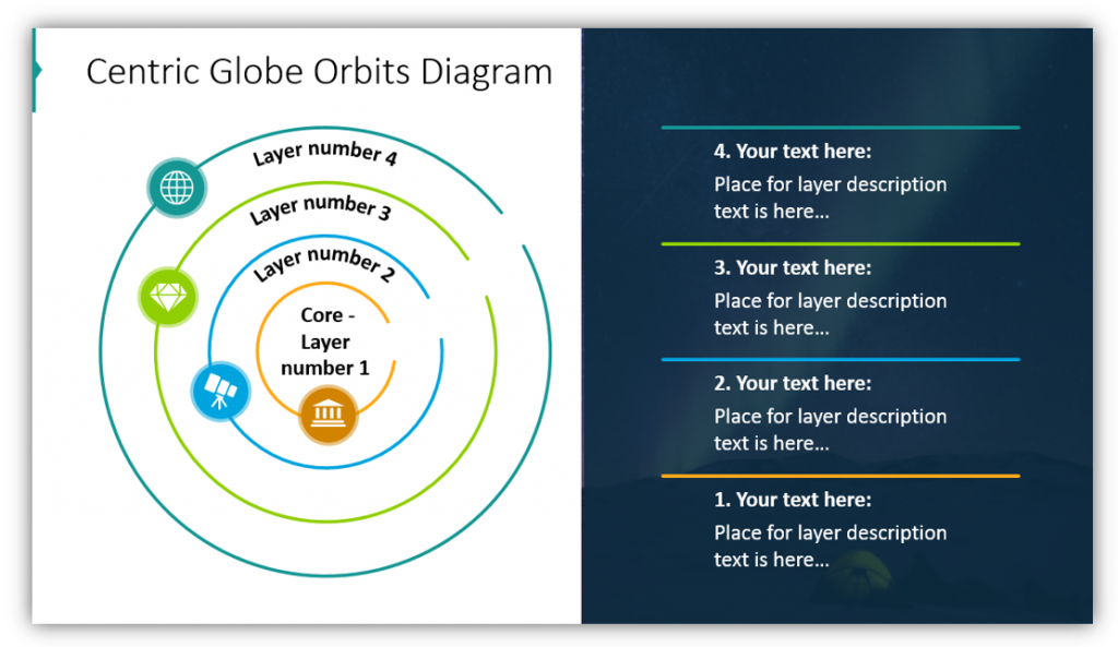
If the dartboard diagram doesn’t feel quite right for your audience or your subject matter, there are many other options. One which has similarities but also features notable differences is the Centric Globe Orbits Diagram. One thing that makes it unique, aside from the solar system-style orbit of the icons you choose, is the way you can seamlessly utilize both a light background and dark background on one slide. This makes for a dynamic, engaging visual without compromising your color scheme.
Use a Quarter Circle Diagram to Explain Market Layers, or Anything Else!
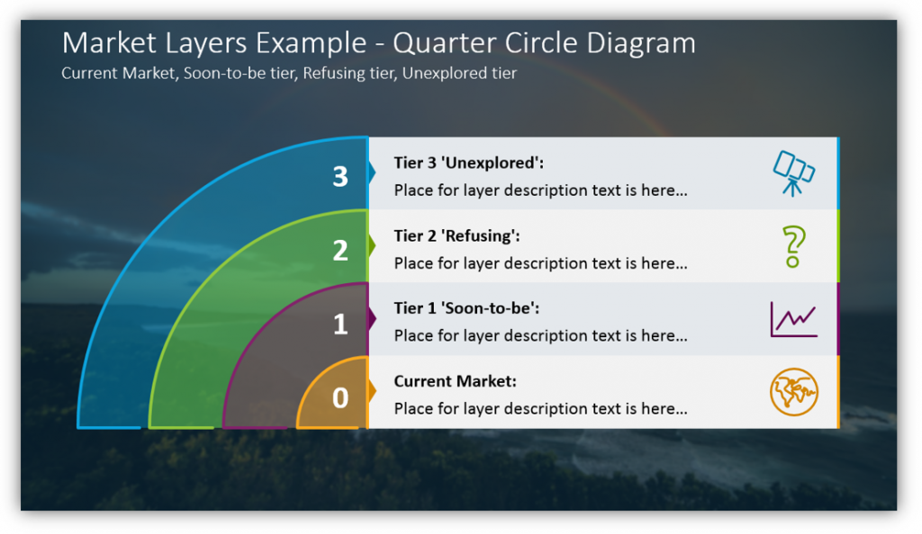
In this specific example, the Quarter Circle Diagram showcases four marketing layers. The current market is ground zero, the inner circle. The Tier 1 layer represents the ‘Soon-to-be’ market. Tier 2 represents ‘Refusing’ market. Tier 3 is meant to represent the ‘Unexplored’ market, a valuable resource. You could easily customize this slide deck to represent your organization or marketing breakdown, or for an entirely different purpose. The choice is yours. The descriptions, colors and icons are all subject to modification and customization.
There are many more uses for Multi-level Layer Diagrams. We couldn’t hope to list them all in one article. There are as many uses for these slide layouts as there are hierarchical structures. Regardless of the number of layers you need to present, you can customize a slide with professional, modern graphics. Whether you’re using a Dartboard, Centric Globe Orbits, or Quarter Circle diagram, you’ll make more compelling arguments when you can explain yourself in an engaging, eye-catching way.
For more inspiration, subscribe to our YouTube channel:
Resource: Multi-level Layer Diagrams
The more parts are in a structure, the harder it becomes to explain. By using visuals you can take the guesswork out of breaking things down. You can more simply explain how parts are connected and overlap. By simplifying your presentation, you make it easier for your audience to follow along. The less time they spend scratching their heads during your speech, the more they’ll retain.
If you find the above examples useful or helpful, check out the full graphics icon set. There are even more examples and even more icons than the ones showcased here:
Think you’ll need more than just Multi-Layer Diagrams? Check out flat infographic templates for PowerPoint for more.