5 Ways to Use Spring and Spiral Diagram in PowerPoint
Do you need to present development processes? Are you explaining or sharing growth? You can easily help your audience understand your timeline with visual flow charts.
When using PowerPoint, imagery, and graphics are more effective than walls of text. If you simplify what you’re trying to explain by using graphics you’ll help your audience understand.
Why use a spiral diagram or spring shape?
There are many possible ways to explain a timeline. You’ve undoubtedly seen many different types of flow charts over the years. You might be wondering what makes spiral shapes different. Springs and spirals can be helpful when you need to explain a one-way process or procedure. It’s especially helpful if the procedure rolls out from a central point or is meant to attract attention to a central point.
If you’re working on presenting a business launch, explaining a historical timeline, or the methodology for developing software you undoubtedly have some ideas for how you can use spiral and spring diagrams already.
If you’d like to go ahead and take a look at the set, click here and see the full Spiral Flow Charts & Spring Diagrams package.
If you need additional help visualizing how you might put these diagrams to work for you, read on!
#1: Use a Spiral Diagram to Show a Timeline
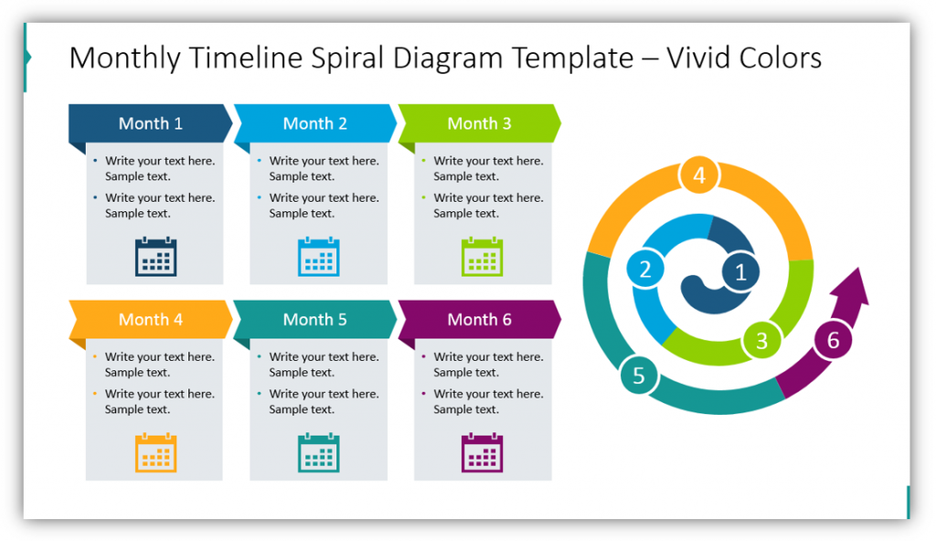
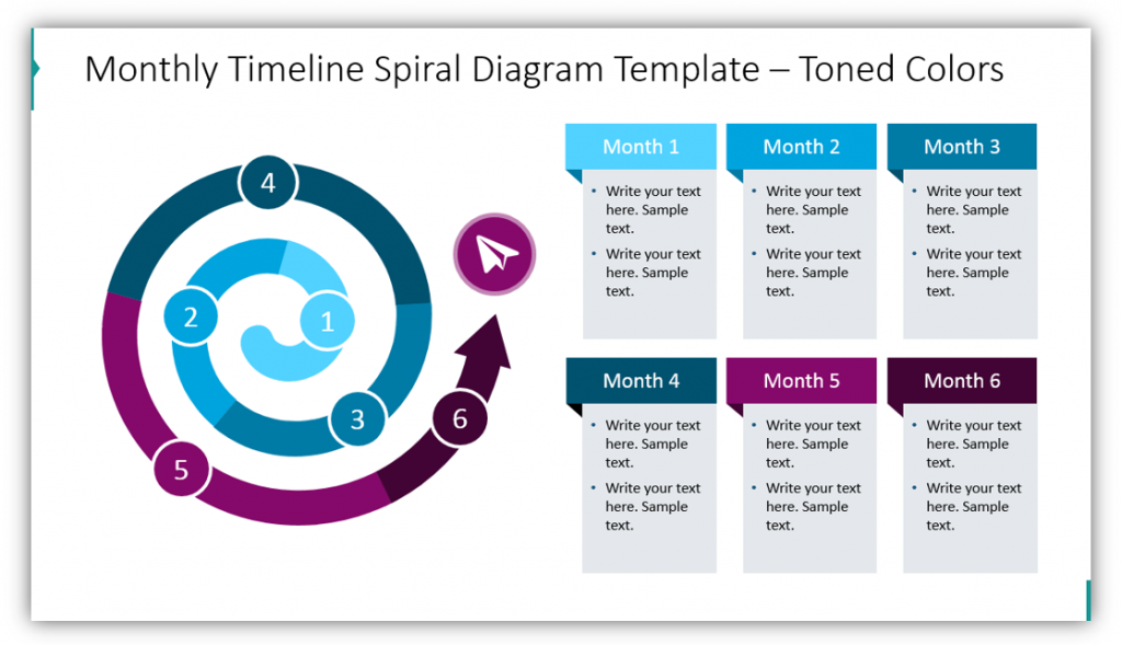
You could easily use a spiral to showcase a six- month process. Each segment of the spiral represents a month in this example. If you need to explain a longer process, the segments could represent quarters or even years! The icons used in each description box could be modified to represent each stage of the process. In the blank example, calendars were the most appropriate and represented the passage of time. In addition to modifying the icons and text, you also have the freedom to change the colors used. Notice how different the diagram looks with the toned color scheme.
#2: Explain a Multi-Step List with a Spiral
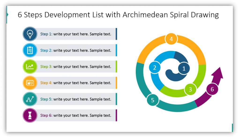
The six steps necessary for your process can be illustrated with an Archimedean Spiral Drawing. Provide additional details for your audience in the text boxes. Be sure to choose icons for each step that matches the step, itself. The slide can be customized to match the color scheme of your brand.
#3: Use a Simplified Snail Line Spiral Pointing Inward or Outward
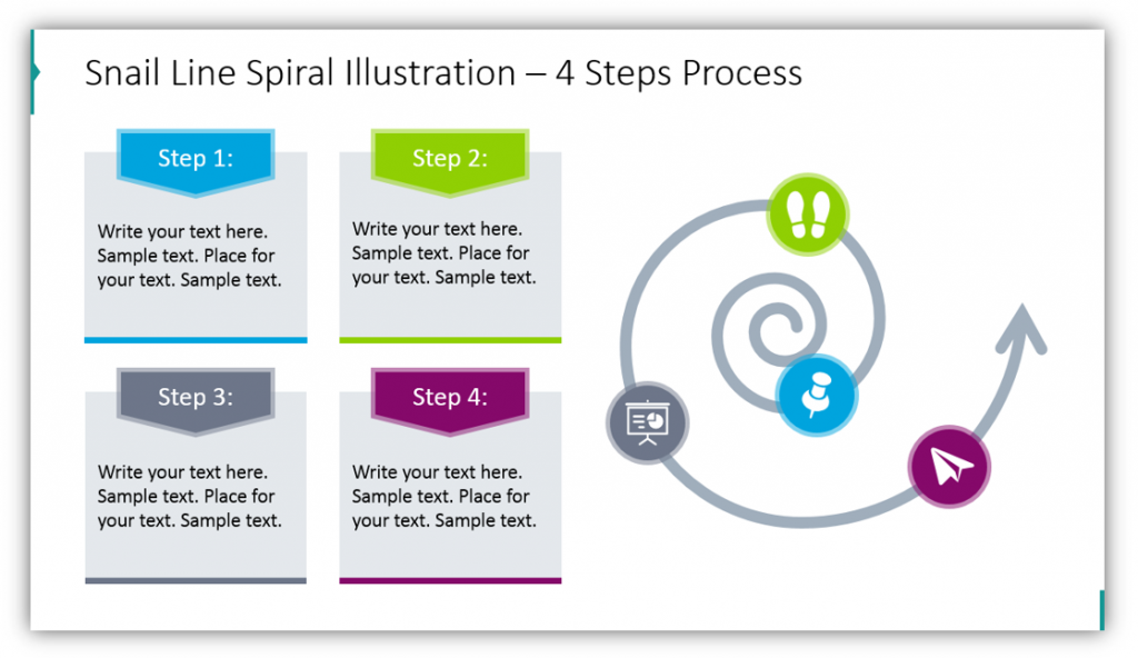
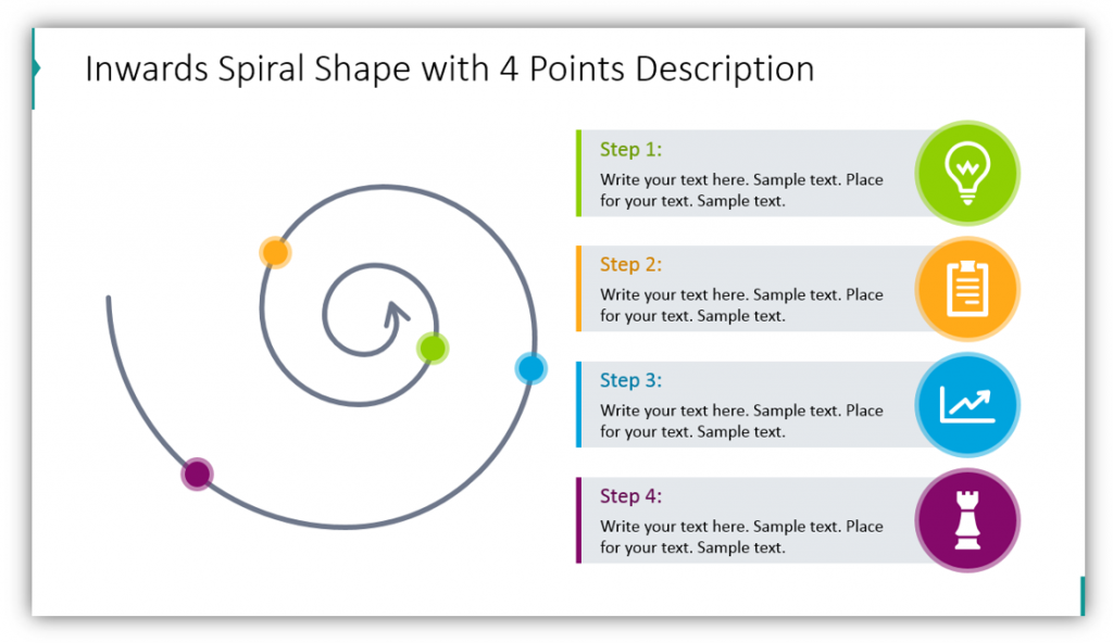
Have a basic process or timeline to explain? Consider using a simple snail-line spiral. You still have the ability to match icons with the steps. The text boxes provide ample space for you to explain the significance of each step. You have more freedom to adjust the placement of steps and control the number of steps featured on the slide. If you have a process that moves toward a focal point, you can still use a snail spiral shape, just use one with the arrow pointing inward. In this example, the text boxes look somewhat different as the indicators are colorful circles rather than the full icon, but they are still easy to follow because the colors are very different from one another.
#4: Using a Larger Snail Shape Spiral with Descriptions on the Diagram
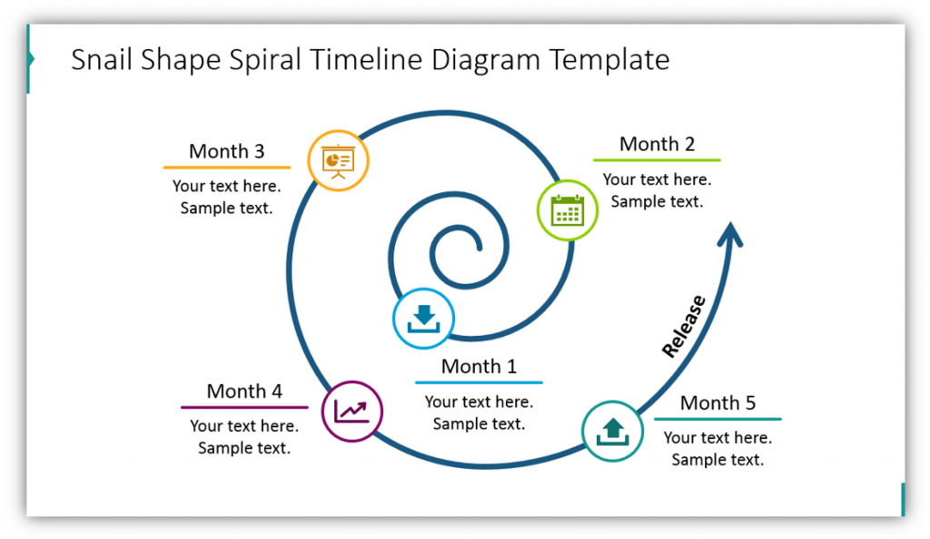
You don’t always have to use a spiral diagram with separate descriptions. In this example, the labels and descriptions are actually part of the spiral. Notice how icons and color-coding are still implemented. This helps to keep the steps separate and make it clear which icon matches which month and description.
#5: Use Spring Spirals for Variety
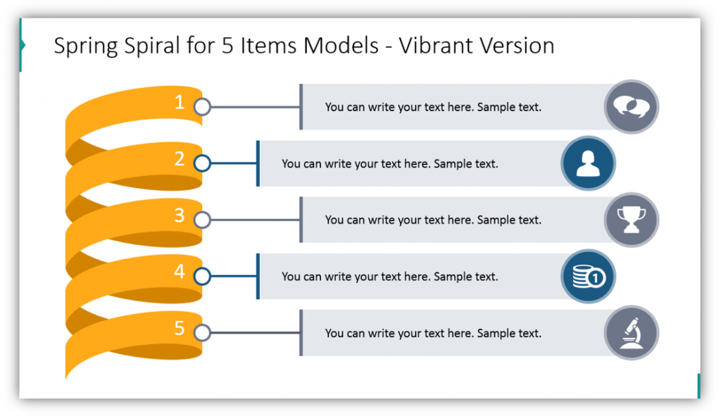
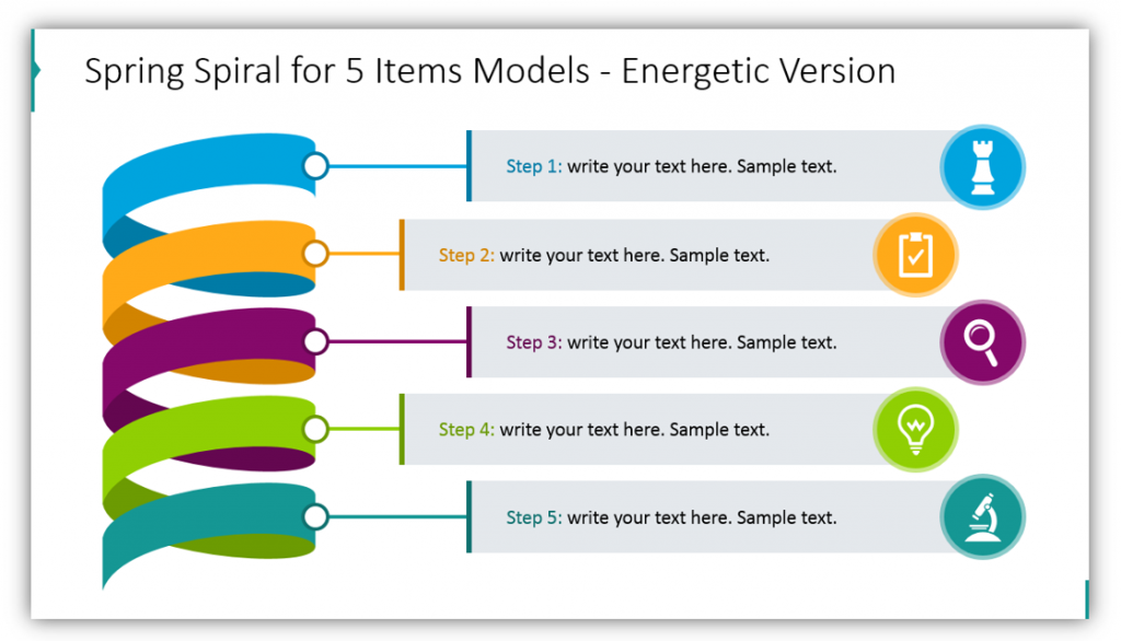
The vibrantly colored Spring Spiral is useful for explaining processes that include five items or steps. The steps are clearly labeled on the spiral itself, and the attached explanation text boxes are easy to follow. Imagine giving a presentation on a complex process where the audience actually follows along and understands. In this example, we chose to have the spring spiral in the same colors because the vibrant color pops. However, as in the second example, you would have the ability to make the number labels for each step a different color, remove them altogether, or change the colors of the spiral loops themselves.
You can present timelines and explain multi-step lists with spirals, springs, and snail shapes. Whether you use vibrant colors or choose to match your icons with your brand identity you’ll have an eye-catching visual to help your audience follow along. You’ll help them understand your message and explanations without needing to do additional work.
Resource: Spiral Flow Charts & Spring Diagrams
Spirals are easy to understand and are much less common than other charts. This will help you make your presentation unique and stand out in the mind and memories of your audience. Springs also tend to be less commonly used than other metaphors for a journey or the passage of time. By using a mix of visualizations you can reach many people. If you’ve used regular flow charts in the past, it might be time to put a twist on your approach – literally – and use spirals!
Feeling inspired? If you found the above examples helpful, check out the full graphics set here to see even more spiral slides:
Want to use a different visual metaphor? Check out the infographics collection for more presentation graphics variety.